The extension is free, created for non-commercial use.
I do not consent to placing it in applications for sale.
Blocks:
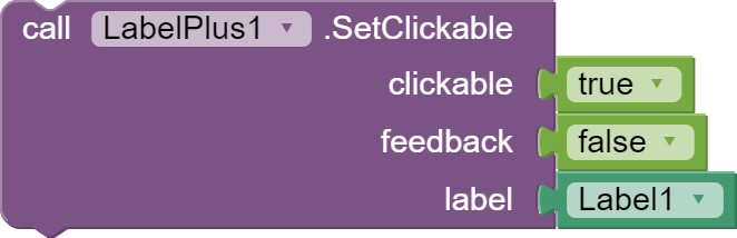
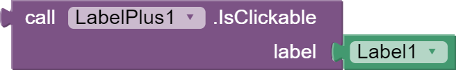
- These blocks set and return whether the entire label is clickable.
clickable - true - label is clickable, false - no clickable,
feedback - determines whether the click should be felt in the form of vibration or sound depending on the phone settings,
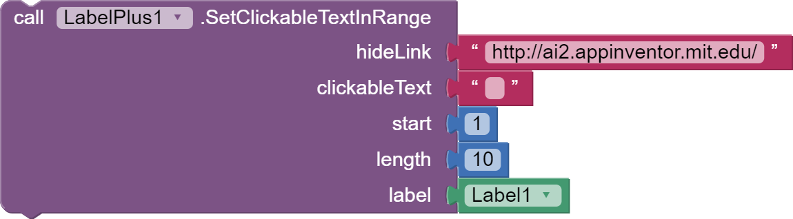
- This block sets the label text range as a clickable link.
hideLink - the text that will be returned to the Click event, if this text is empty, the method will return the clicked text,
clickableText - if this text is not empty, the method will find the first occurrence of this text in the label and replace it with link,
start and length - if the text attached to clickableText is empty, the method replace the text from "start" of length "length" into a link,
- This event detects clicks on the label and clicks on the clickable text. When clicking on a label, it returns component and empty text. When clicking on text, it returns the component and the clicked text.

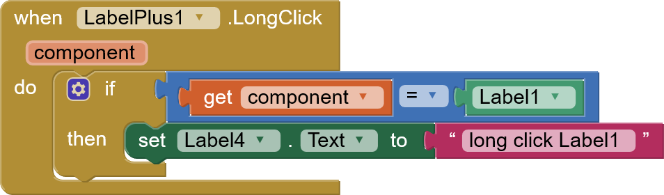
- This event detects long clicks on the label. When long clicking on a label, it returns component.
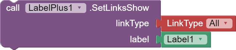
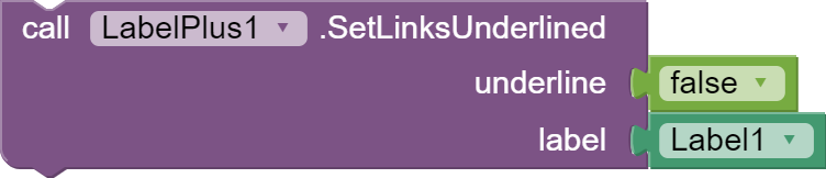
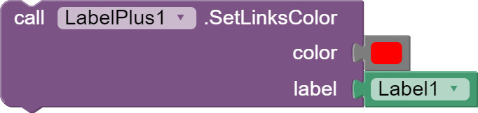
- These blocks are used to set the type of permalinks to detect in label and activation of html links. These links are clickable and will open in your phone's default apps. We define the types of detected links using the LinkType block. We can also set the color of the links and remove the underline.

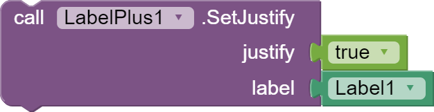
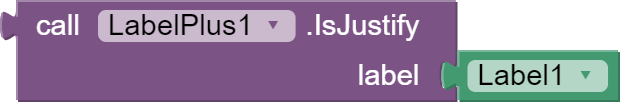
- These blocks set and return whether multiline text is to be aligned on both sides by extending a space.
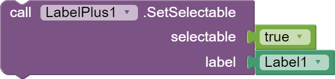
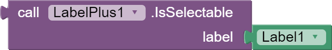
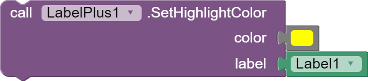
- These blocks set and return whether the label text should be selectable. We can select the text, for example, to copy it. We can also set the color of the selection.

- These blocks return whether the label contains highlighted text, and the position of the beginning and end of the selection.


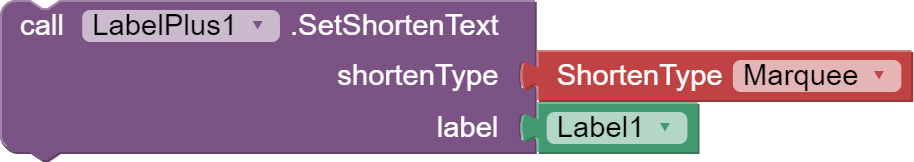
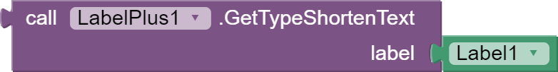
- These blocks set and return the method of truncating the text to one line. The ShortenType block is used to select the method. The START, MIDDLE and END methods truncate the text and place 3 dots at the beginning, middle or end of the text. The MARQUEE method scrolls the text.
These methods do not work when text is selectable.
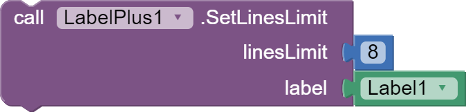
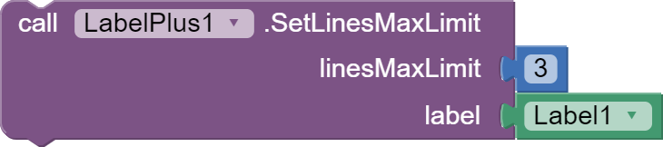
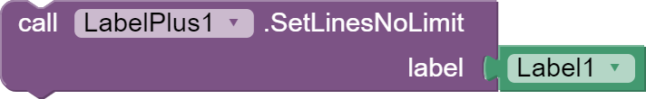
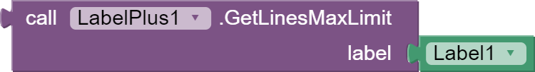
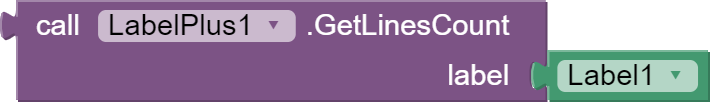
- These blocks manage the number of lines in the label. Set and return the count of lines.
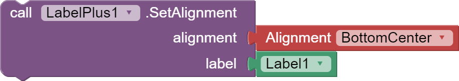
- These blocks set and return text alignment horizontally and vertically.

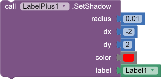
- Set a shadow under text of the specified blur radius and color, and the specified distance from text position.
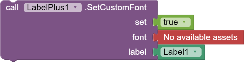
- Sets a custom font for the label. You must add the font file to the app's assets.
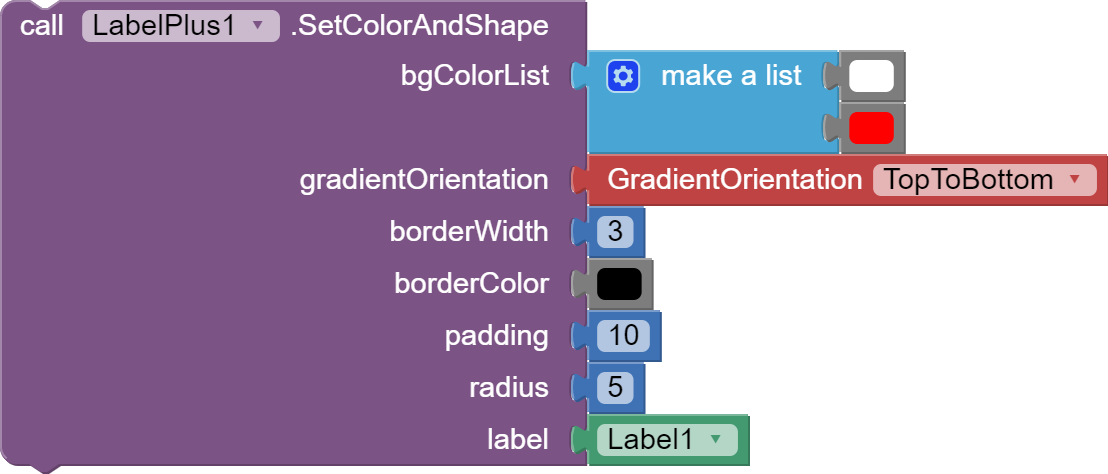
- Sets the colors and shape of the label.
bgColorList - color list for label background gradient, if the list is single element, then the color will be uniform.
gradientOrientation - gradient orientation, four orientation properties in GradienOrientation block are available.
borderWidth - sets the width of the label border, if you do not want the border, set the value to 0.
borderColor - sets the color of the label border, if you don't want the border, set the value to any numeric value or any color.
padding - sets the text spacing from the edges of the label. Useful for a border so that the text does not overlap the border.
radius - sets the radius of the rounded corners, if you don't want rounding set the value to 0.
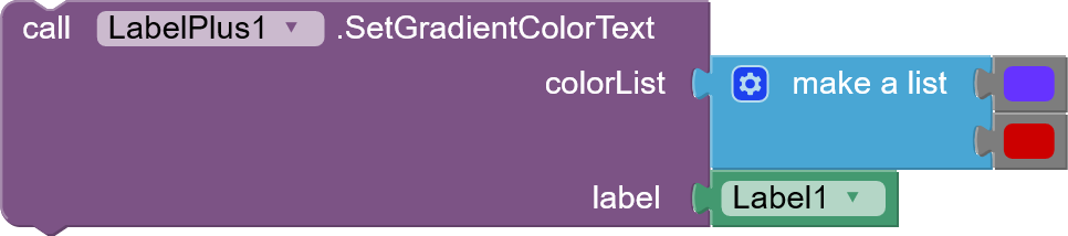
- Sets the color gradient for the label text. This also changes the color of the links.
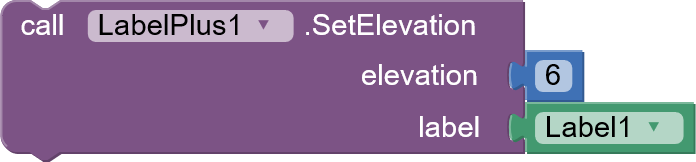
- Sets the height to elevate label. Creates a shadow under the label.
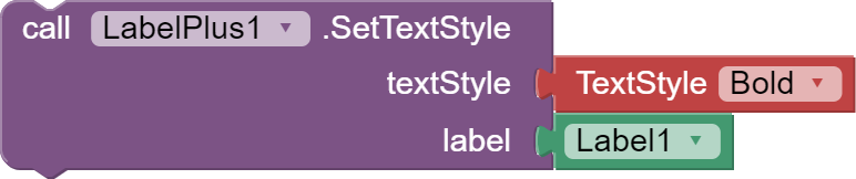
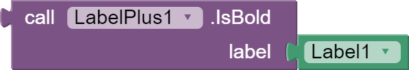
- Sets the text style to bold or/and italic using the TextStyle block. You can also check whether the text is bold or italic.

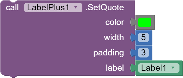
- Sets the quote effect on the label by adding a vertical bar to the left of the label.
color - strip color
width - strip width (works from android9 +)
padding - width of the space between the bar and the text (works from android9 +)
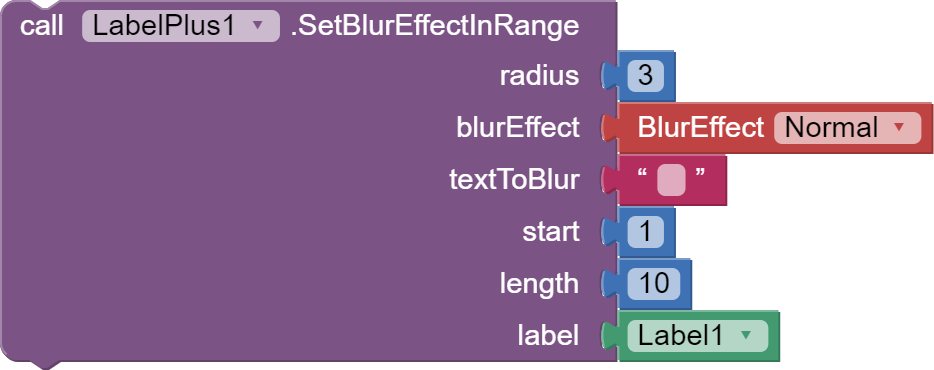
- Sets the blur effect on the text range.
radius - value specifies the amount of blur
blurEffect - the type of blur effect, we indicate with the BlurEffect block
textToBlur - if this text is not empty, the method will find the first occurrence of this text in the label and apply a blur effect to it
start and lenght - if the text attached to textToBlur is empty, specify the starting position and length of the text to which the blur effect is to be applied
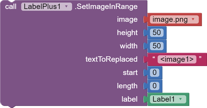
- Inserts an image from the project's assets into the label. (New in v4)
image - select name of the picture from assets
height - image height
width - image width
textToReplaced - if this text is not empty, the method will find the first occurrence of this text in the label and replaces it with a picture
start and lenght - if the text attached to textToReplaced is empty, specify the starting position and length of the text that will be replaced with an image
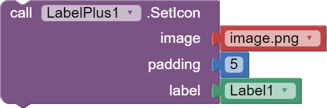
- Sets the icon to the left of the label.
image - select name of the picture from assets
padding - width of the space between the icon and the text
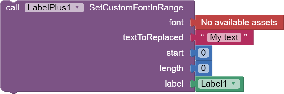
- Sets the font for the selected range of text in the label.
font - select name of the font from assets
textToReplaced - if this text is not empty, the method will find the first occurrence of this text in the label and replaces the font with your own font
start and lenght - if the text attached to textToReplaced is empty, specify the starting position and the length of the text, whose font will be replaced with your font
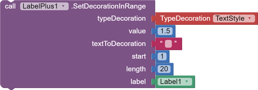
- Sets various decorations for a range of text.
typeDecoration - use the TypeDecoration block to set the decoration type, description below
value - the value that a given type of decoration requires
textToReplaced - if this text is not empty, the method will find the first occurrence of this text in the label and apply a decoration to it
start and lenght - if the text attached to textToReplaced is empty, specify the starting position and the length of the text, to which the decoration is to be applied
stretch - stretches the text horizontally, the value is a factor, and takes float numbers
background color - sets the background color under the text, value takes colors
color - sets the text color, value takes colors
font size - sets the font size, value takes integer values
strikethrough - sets text to strikethrough, set the value to any type
text style - to make text bold and / or italic, set the value with the TextStyle helper block of the TextStyle property.
underline - sets the text to underline, set the value to any type
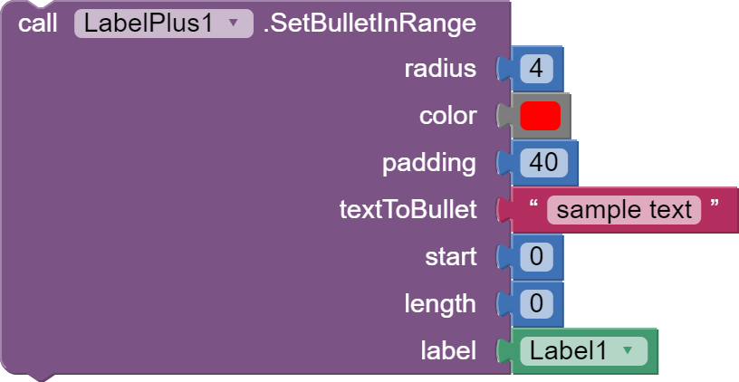
- Set the paragraph bullets. To set a bullet, a paragraph must be a new line in the text.
radius - bullet radius
color - bullet color
padding - width of the space between the bullet and the text
textToReplaced - if this text is not empty, it must be a new line, the method will find the first occurrence of this text in the label and apply a bullet to it
start and lenght - if the text attached to textToReplaced is empty, specify the starting position and the length of the text of paragraph, to which the bullet is to be applied
- Set a scrollable label, we no longer need to put a label in the VerticalScrollArrangement.

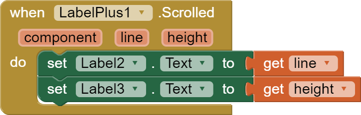
- Enable label scroll detection. As we scroll through the label, the Scrolled event will be triggered.

- The event that is triggered when the label is scrolled. Returns the current highest line displayed and the height in PX.
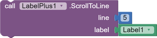
- Methods for scrolling the label programmatically.
- scroll the text to the specified line
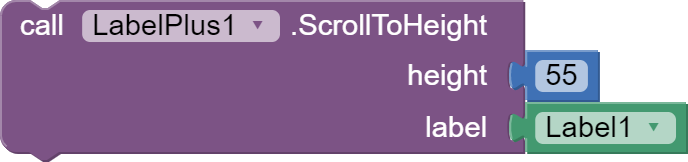
- scroll the text to the specified height, expressed in PX
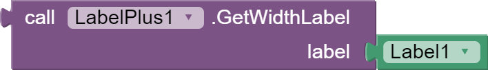
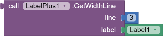
- Methods that return height and width values, expressed in PX.
- height of the displayed label
- the height of the entire text
- width of the displayed label
- width of the displayed text in specific line


- This method returns the height of the beginning of a specific line in label, in PX.

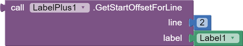
- Methods that return the text offset.
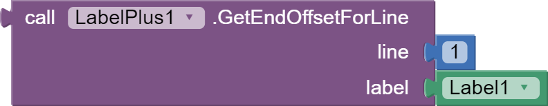
- return the offset of the first character on a given line
- return the offset of the last character on a given line
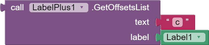
- return a list of all instance offsets of the given text
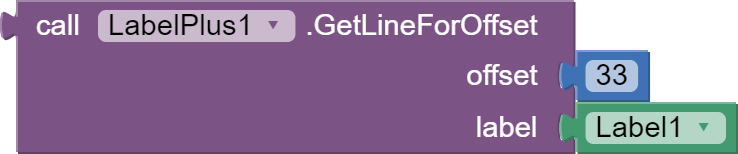
- Returns the line where the given text offset occurs.
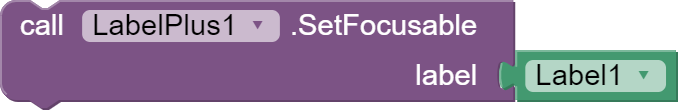
- Sets the ability to set the sharpness of the label. Appropriate events will be triggered when focus is got or lost.
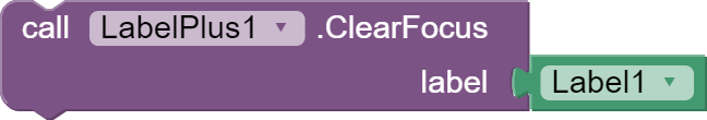
- Methods that programmatically request and clear focus on a label.

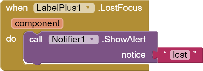
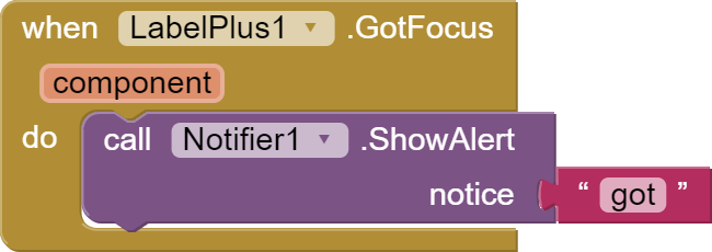
- The events that will be triggered when the focus is changed for the label.
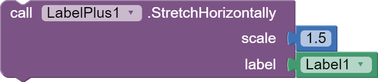
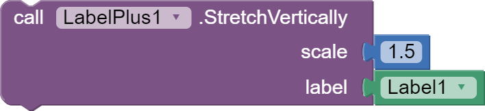
- Methods to stretch text horizontally or vertically by the scale multiplier.
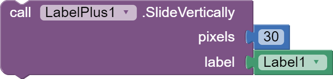
- Methods that shift the label horizontally or vertically by the pixel value.

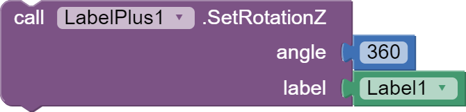
- The methods by which we rotate the label in any axis.
- rotates label vertically by the specified angle
- rotates label horizontaly by the specified angle
- rotates the label along the Z axis
- Set the axis shift by the specified amount horizontally. The standard value is half the label width.
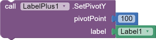
- Set the axis shift by the specified amount vertically. The standard value is half the label heigth.


- A method for stretching the line spacing of a label.
Thanks @Ken

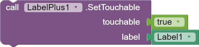
- This block sets the touch label..
touchable - true - label is touchable, false - no,
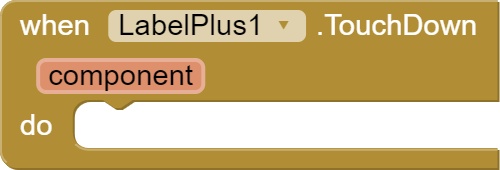
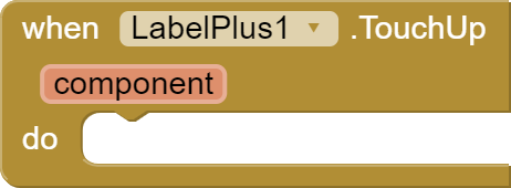
- Events that will be triggered after touching and releasing the label..
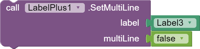
- Method that sets multiple or single lines in a label.
multiline - true - the label has many lines, false - the label has one line,
Extension v12:
- new block "SetMultiLine" added
Extension v13:
- fixed helper blocks
- new block added: SetLinksUnderlined
- new block added: SetActiveHtmlLinks
- block removed: GetTypeLinksShow
- block modified: SetAlignment
Extension v14:
- fixed errors in the SetDecorationInRange block
Extension v15:
- fixed errors in the SetColorAndShape block
com.extension.LabelPlus.aix (59.8 KB)
Test projects:
Using the extension with different links:
LabelPlusLinkTest.aia (57.8 KB)

 .
.