(copied from
)
(part 1, too large to fit in board post)
(App Inventor Charts Documentation
Overview
Summary
In the App Inventor Charts project, two new components have been added - the Chart and the Data.
The Chart component is a single component which represents a single Chart. Multiple Chart types can be selected, including Line, Area, Scatter, Bar and Pie Charts. The Chart component is responsible for the Chart’s visual appearance and type.
The Data component represents a single Data Series in the Chart itself. For instance, if the Chart type is selected to be the Line Chart, a single Data component represents one line in the Chart. This component is responsible for holding the data and managing all manipulation of the data.
Basics
Using the Chart
Summary
The new components can be found under the Charts category in the Palette, as seen in Figure 1.

Figure 1: Charts category in the Palette
Upon adding the Chart component to the Viewer, we will then see an empty Chart, as seen in Figure 2.

Figure 2: Empty Chart as seen in the Viewer
To add a Data Series to the Chart, the Data components can be dragged and dropped onto the Chart directly (see Figure 3). In Figure 3, we can also see how the Chart looks like with a single Data component attached to it.

Figure 3: Dragging & dropping the Data component onto a Chart
In addition, multiple Data Series can be dragged onto the Chart:
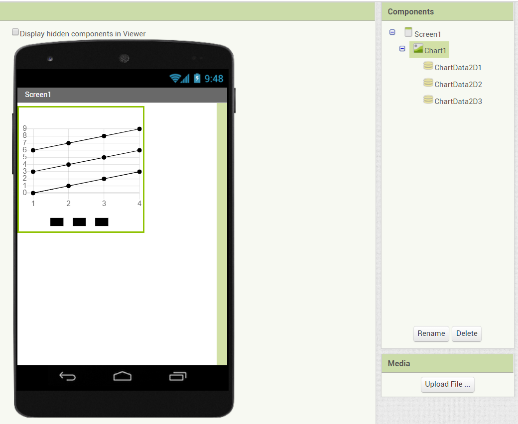
Figure 4: Multiple Data components attached to a Chart
At this point, the Chart has a single Data Series component. The styling of the Data and Chart components can be done via the Designer properties, as we will see in the Customization section.
Types
Summary
The most important property of the Chart components is the Type, which determines what type of data the Chart plots, and how it looks like visually.
The property cannot be changed via the blocks, and has to be set via the Properties menu, as shown in Figure 6.

Figure 5: Chart type selection
Currently, there are five types of Charts available -- Line, Area, Scatter, Bar and Pie.
Line Chart
Summary

Figure 6: LIne Chart
The Line Chart is a type of Chart that plots lines. The Chart’s data points consist of numerical x and y values, and the points are plotted continuously on a line.
Each Data Series corresponds to a Line.
Area Chart
Summary

Figure 7: Area Chart
The Area Chart is also a Line Chart, but a fill effect is applied underneath the lines of the Chart. This Chart shares all the characteristics of the Line Chart.
Scatter Chart
Summary

Figure 8: Scatter Chart
The Scatter Chart is a type of Chart that plots individual data points. The Chart’s data points consist of numerical x and y values (same as the Line Chart), but the points are not plotted continuously, and lines do not connect the points.
Each Data Series corresponds to a single set of points.
Bar Chart
Summary

Figure 9: Bar Chart
The Bar Chart is a type of Chart that plots bars. The Chart’s data points also consist of numerical x and y values, however, the x value is a whole, non-negative number. The x value, in a way, can be thought of as an index to the Chart, since x values are integers. Each data point corresponds to a single bar.
Each Data Series corresponds to a set of bars, and the bars are grouped together in the same positions.
Pie Chart
Summary

Figure 10: Pie Chart
The Pie Chart is a type of Chart that plots a circular graph divided into slices. The Chart’s data entries consist of an x value which is a text value, and a numerical y value. The x value represents the label (or the name) of the entry, while the y value represents the value itself. Each data entry corresponds to a single slice of a Pie Chart ring.
Each Data Series corresponds to a single ring in the Pie Chart. A Pie Chart with more than one Data Series is called a concentric Pie Chart.
Manipulating Data
The component responsible for handling the Data in the Chart is the Data component. Manipulating data in a Data component changes that single Data Series.
Adding Entries
Summary
The simplest way to add entries to a Data component is to use the AddEntry block of the component. For instance, if we would like to add a point to a Line Chart with an x value of 2, and a y value of 3, we would use the following block:

Figure 11: Add Entry block
Note that the block only adds data to that single Data component (Data Series), meaning that other Data Series would require the block to be specified for them separately.
If we would like to add the same value of x = 1, and y = 2 to 3 Data Series, we would specify the blocks as follows:

Figure 12: Importing multiple entries with Add Entry blocks
List Importing
Summary
Suppose that now we would like to add multiple entries to a Data Series at once, and we specify the following blocks:

Figure 13: Importing 5 entries with Add Entry blocks
A simpler way to do so is via the ImportFromList block, which takes a single List as input. The format of the List is that each element of the List should also be a List, which contains 2 values -- one for the x value (the first value), and one for the y value (the second value).
The same 5 blocks can be expressed in 1 as follows:

Figure 14: Importing multiple Entries with the Import From List block
Removing Entries
Summary
Suppose we add two entries, as follows:
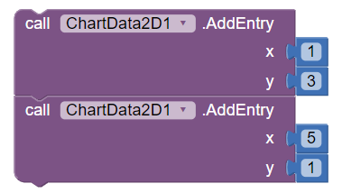
Figure 15: Adding two entries, one of which will be removed
After some time, we would like to remove one of the entries we added. This is possible via the RemoveEntry block, which will then remove the Entry:

Figure 16: Remove Entry block
Finding Entries
Summary
The Data component also has blocks to help finding and retrieving entries.
The most simple block is the GetAllEntries block:

Figure 17: Get All Entries block
This block will return a List of entries, where each entry is a List formatted in the same way as we formatted the entries in the ImportFromList method.
In the case where we would like to know if a specific entry exists, we have the DoesEntryExist block, which takes in an x and y value as input, and returns true if the entry exists in the Data Series, and false otherwise.

Figure 18: Does Entry Exist block
Finally, there are two more blocks to retrieve all entries with the specified x and y value:

Figure 19: Get Entries With X Value Block

Figure 20: Get Entries With Y Value Block
The format of the returned result is the same as the GetAllEntries block.
Customization
Data
Colors
Summary
The color of the Data components can be changed via the Color property (as seen in Figure 21)

Figure 21: Color Property
Alternatively, a List of Colors can be specified via the Colors property setter block to set multiple colors to one Data Series (see Figure 22)

Figure 22: Colors Property
The Chart in the application will then look as shown in Figure 23.

Figure 23: Data Series with multiple Colors
Label
Summary
The label of the Data Series in the Legend can be changed via the Label property, as shown in Figure 24.

FIgure 24: Label Property
Line Type
Summary
If the type of the Chart is either Line or Area, the LineType property shows up in the Data component (see Figure 25). This changes the way the lines are drawn (as shown in Figure 26).

Figure 25: Line Type Property

Figure 26: Line types
Point Shape
Summary
If the type of the Chart is the Scatter Chart, the pointShape property shows up in the Data component (see Figure 27). This changes the shape of the points of the Scatter Charts (as shown in Figure 28).

Figure 27: Point Shape Property
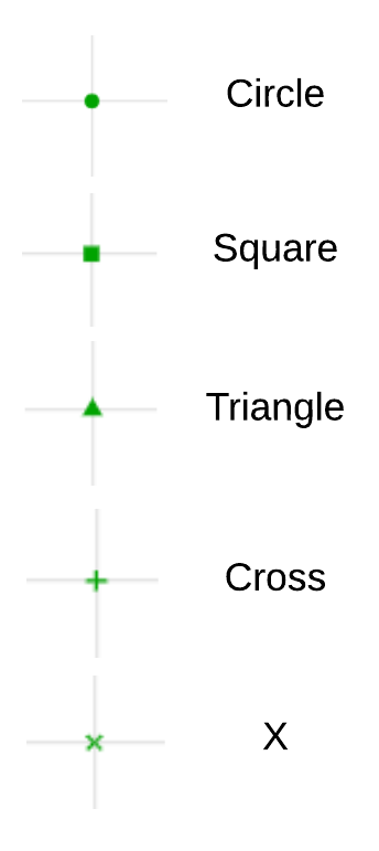
Figure 28: Point shapes
Chart
Description
Summary
The description (title) of the Chart can be changed via the Description property, as shown in Figure 29.

Figure 29: Description property
Background Color
Summary
The background color of the Chart can be specified via the BackgroundColor property, as seen in Figure 30.

Figure 29: BackgroundColor property
Legend Enabled
Summary
The legend of the Chart can either be enabled or disabled via the LegendEnabled property. Figure 31 shows the difference between the property being on and off.

Figure 30: Legend enabled/disabled example. The Legend is enabled on the left, and disabled on the right.
Grid Enabled
Summary
Provided that the type of the Chart selected is an axis-based Chart type (either Line, Area, Scatter or Bar), the GridEnabled property shows up, which specifies whether the grid of the Chart should be drawn. Figure 32 shows the difference between the property being on and off.

Figure 30: Grid enabled/disabled example. The Grid is enabled on the left, and disabled on the right.
Labels
Summary
If the Chart’s selected type is an axis-based Chart (either Line, Area, Scatter or Bar), the Labels property can be used to set custom labels to the x axis. The labels are applied in order starting from the x value of 0 (the second label gets applied to an x value of 1, the third to an x value of 2, and so on). See Figure 31 for an example of the property block, and Figure 32 for how the labels are applied.

Figure 31: Chart Labels property setter block

Figure 32: Custom x axis labels (as set in Figure 31). The x value of 0 is mapped to A, the x value of 1 is mapped to B, 2 to C and 3 to D.
Provided that there are not enough labels, simply the numeric x value is then used instead (see Figure 33)

Figure 33: Example of more x values than labels available. X values which do not have a corresponding label are replaced with the numeric value.
An alternative to using the Labels property setter block is using the LabelsFromString Designer property which allows specifying a CSV formatted String as shown in Figure 34, producing the labels as shown in Figure 35.

Figure 34: LabelsFromString property example value
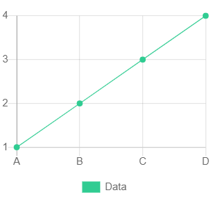
Figure 35: Resulting labels from the property set in Figure 34
Pie Radius
Summary
If the “Pie” Chart type is selected, the Pie Radius property shows up in the Designer properties (as shown in Figure 35). The property specifies the Pie Chart fill in percentage, meaning that the lower the percentage, the hollower the Pie Chart. Figure 36 illustrates the difference between some value choices. The property’s value is a number from 0 to 100.

Figure 36: Pie Radius property

Figure 37: Pie Chart appearance with different Pie Radius values
Chart Data Sources
ElementsFromPairs
Summary
The most simple way to specify the Data to use for the Data component is by using the ElementsFromPairs Designer property. The property’s value is specified as a CSV formatted String, where each 2 values, in order, are considered as one entry (one for the x value, and one for the y value). An example of this is shown in Figure 38.

Figure 38: ElementsFromPairs property example value
The result of the property value shown in the figure above is shown in Figure 39. Note how from the ElementsFromPairs String input, the values 0,5 are used to construct an entry with the x value of 0, and a y value of 5. The next two values, 1,3, are used to construct an entry with the x value of 1, and a y value of 3. Finally, an entry with an x value of 2 and a y value of -3 is added to the Data Series.

Figure 39: Data values as set by the ElementsFromPairs property (in Figure 38)
Data Sources
Summary
With the introduction of the Data component, various components are compatible with the Data component as Data Sources. These components include TinyDB, CloudDB, DataFile, Web, BluetoothClient, AccelerometerSensor, GyroscopeSensor, Pedometer, OrientationSensor, LocationSensor and ProximitySensor. Each component will be covered in its own corresponding section in the document.
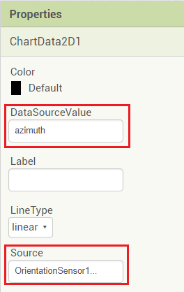
To simplify the process of Data importing, the Data component comes with corresponding Designer properties. The core property is the Source property, as seen in Figure 40.

Figure 40: Source property
Alongside the Source property, a DataSourceValue property has been introduced to specify the value that should be imported from the Data Source to the Data Series (see Figure 41). The DataSourceValue expected input is different for each Data Source, and will be explained in more depth in the individual Data Source component descriptions.

Figure 41: DataSourceValue property
Finally, with regards to Chart Data Source property setting, two new blocks have been introduced.
The first block is the ChangeDataSource method, which is the equivalent of setting the Source property in the Designer properties with the corresponding DataSourceValue (see Figure 42)

Figure 42: Change Data Source block
The second block is the RemoveDataSource method, which completely unlinks the Source component from the Data Series. Since there are components which may update data dynamically (such as real time Data Sources), this method is useful to stop data importing completely from the Source.

Figure 43: Remove Data Source block