📊 [Free] ChartMakerPlus - an extension to make google charts

Look at / Show the values in your arraytable for phosphates

Thank you - I dumped the before dataTable and tableArray2 into a Label. Found in a different group of blocks, I had misspelled a "phosphate" so the target column was responding as "not found".

Now back to my regularly scheduled fiddling. A few more things to sort out.

I have the graph part working but the make list to have two parts of the database into the array table is not. The array with phosphates is working and graphing as normal. Now trying to add "dosing" to be shown on the right axes. Do I need to build to separate dataTables and then merge them, sorta by date/time, then graph?

I provided an example for dual Y axes above:

Thank you for your example of dual Y axes,I had seen it above and been playing with it.
The example shows a graph that works. In my data set, the "Item" is my date/times. The Val1 might be Phosphates, and Val2 might be Dose. But the data is has gaps which makes the graph not correct. If I modify your example with a few more "items" to allow a test to be shown. If Val1 does not have a value on B, or Val 2 does not have a value on D, how does not need to be done?
In my data, the phosphates would be entered at different times than the dose so the there will be more items across the bottom but the data points are not on same date/time.

Hello

"Can I draw two charts in one Webviewer that are displayed simultaneously?"

Not possible, just use two webviewers, it should look fairly seamless...

Alternatively, you could work with google charts directly, creating your own html file, that could show two charts...

1 Like

My webviewer is showing nothing, can anyone help?

You are missing a comma - , here, between colors and slices

image

Also you might want to run a Do It in companion app to check that all your tinydb values are present, and that they are numbers (no quotes around the values)

1 Like

One last thing, how can i make the font size bigger or force it to use a ttf font imported to app inventor?

font size, add these, as required, to your options:

var options = {
  title: 'My Pie Chart',
  titleTextStyle: {
    fontSize: 16, // Sets the font size of the title
  },
  pieSliceTextStyle: {
    fontSize: 12, // Sets the font size of the labels on the slices
  },
  legend: {
    position: 'right',
    textStyle: {
      fontSize: 14, // Sets the font size of the legend text
    }
  }
};

font, not possible to change font at this time (ref)

So im new to this, In my extra options field I have set a string value "slices: { 0: {offset: 0.1}, 1: {offset: 0.1}, 2: {offset: 0.1} }" and i want to include 16px font size for both title and other text in my pie chart. How do I format it?
I get:
The arguments , [com.google.appinventor.components.runtime.WebViewer@dc30a42], [[["string", "number"], ["Level1", 2], ["Level2", 1], ["Level3", 3]]], ["My Progress"], [false], ["backgroundColor:'white',colors:['#b3221b','#a6b31b','#1b8db3'],var options = { title: 'My Pie Chart', titleTextStyle: { fontSize: 16, // Sets the font size of the title }, pieSliceTextStyle: { fontSize: 12, // Sets the font size of the labels on the slices }, legend: { position: 'right', textStyle: { fontSize: 14, // Sets the font size of the legend text } } };"] are the wrong number of arguments for PieChart
Note: You will not see another error reported for 5 seconds.

Show your blocks

Update: I added the css param to an empty string block but i see nothing, no graph showing

Like so:

image

1 Like

Ok it works, thank you @TIMAI2

1 Like

Hi everyone,

I'm working on an autonomous car project that uses PID control for line following (its one of the project's tasks). I want to visualize data like speed, error, and PID output in real time using charts, to help with tuning and debugging.

I'm using the ChartMakerPlus extension to display Google Charts. My question is:
Do I need to set anything specific in the WebViewer's HomeUrl for the charts to display correctly?

I'm streaming data over Bluetooth and generating the chart dynamically in App Inventor. Any guidance or examples would be greatly appreciated!

Thanks in advance.


HomeURL

Be sure to use println() at the end of each message to send from the sending device, to signal end of message.

Only use print() in the middle of a message.

Be sure not to println() in the middle of a message, or you will break it into two short messages and mess up the item count after you split the message in AI2.

Do not rely on timing for this, which is unreliable.

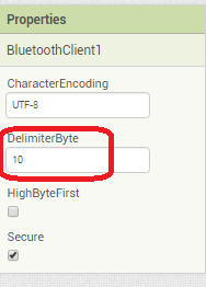
In the AI2 Designer, set the Delimiter attribute of the BlueTooth Client component to 10 to recognize the End of Line character.
BlueToothClient1_Properties
Also, return data is not immediately available after sending a request,
you have to start a Clock Timer repeating and watch for its arrival in the Clock Timer event. The repeat rate of the Clock Timer should be faster than the transmission rate in the sending device, to not flood the AI2 buffers.

In your Clock Timer, you should check

  Is the BlueTooth Client still Connected?
  Is Bytes Available > 0?
     IF Bytes Available > 0 THEN
       set message var  to BT.ReceiveText(-1) 

This takes advantage of a special case in the ReceiveText block:

ReceiveText(numberOfBytes)
Receive text from the connected Bluetooth device. If numberOfBytes is less than 0, read until a delimiter byte value is received.

If you are sending multiple data values per message separated by | or comma, have your message split into a local or global variable for inspection before trying to select list items from it. Test if (length of list(split list result) >= expected list length) before doing any select list item operations, to avoid taking a long walk on a short pier. This bulletproofing is necessary in case your sending device sneaks in some commentary messages with the data values.

Some people send temperature and humidity in separate messages with distinctive prefixes like "t:" (for temperature) and "h:" (for humidity).
(That's YAML format.)

The AI2 Charts component can recognize these and graph them. See Bluetooth Client Polling Rate - #12 by ABG

To receive YAML format messages, test if the incoming message contains ':' . If true, split it at ':' into a list variable, and find the prefix in item 1 and the value in item 2.

...

You would need to work with Google Charts directly in order to display realtime data (e.g. more than once every few seconds - which is the time it would take to update the chart if using the extension)