MIT App 2 ChartMaker Extension Issues

5 posts by only you @MelodyApril? + 3 edits in 1st post.
Have patience, someone will help you.

1 Like

No worries I'll wait, just wanted to express my thoughts upon the issues.

You are going to struggle to update a google chart 10 times a second given you have to send the data up to the internet and get the result back each time. This probably accounts for the flickering. Once a second may work, once every 5 seconds would be better. If you want faster/quicker, the you will need an on device chart builder - e.g. do it yourself on the canvas.

There is an example here of a "moving" chart which might work for you
Martyn_HK's scrolling graph

Compare the inputs (labels/data) for the cats and dogs example to see what you need to display two line charts on the same graph

1 Like

Thank you. I just mentioned I tried setting it up at various time settings because the graph is visibly glitched and I don't get why. I ain't that bothered by the flickering as I am by the fact that it doesn't work properly. As for the other example, I looked and I have it set up the same if you look in the screenshot but it won't work with two lines in my case for some reason.

Edit: The graph you suggested seems to be only working with positive values, I am working with negative ones as well.

The plot seems to show what happens when successive point on the x axis are not increasing in value.
ChartMaker requires points posted to the chart must successive (increasingly higher values) on the x axis, other wise you produce a chart that looks like spaghetti.

You can sort your data pairs prior to posting and probably eliminate this (at least with a single data set). If you use multiple data sets, each would have to be sorted.

I showed how to use a Clock with ChartMaker to eliminate flicker (at least with Clock times of 500 ms or more). You are not using that method. Why not try?

The plot seems to show what happens when successive point on the x axis are not increasing in value.
ChartMaker requires points posted to the chart must successive (increasingly higher values) on the x axis, other wise you produce a chart that looks like spaghetti.

You can sort your data pairs prior to posting and probably eliminate this (at least with a single data set). If you use multiple data sets, each would have to be sorted.

Your data is not a list of (x,y) pairs.
It is a list of (y1,y2) pairs where x is the index of each (y1,y2) pair in the list.

You are plotting two variables in time.

Check if your chart facility has that capability.

I have no clue what you mean there. You guys said I needed a list of lists with two value pairs and that is what I've done, now you're telling me that I'm doing it wrong, after following your own advice with how to do that.

The ChartMaker shows how to use the tool. To provide two simultaneous graphs on a single chart requires two separate list of lists.

You probably do not have that as Abraham indicated. You only show Perhaps7 . Where is your second list of pairs? You need two lists of pairs!

What is happening is the data you provide is not changing in value with additional data. The tool expects ordered distance data like 1 2 3 5 8 10, not 1 2 2 1 5 10 8 so you get a haywire graph. Data has to be ordered 1 1 2 2 5 8 10 might plot rationally, but 1 2 2 1 5 10 8 will not.

The only solution I am aware to eliminate the apparent chaos would be to sort your data list prior to drawing the chart.

1 Like

First of all thank you for trying to shine a light here. Now, the reason my data comes out as:

-1 (rssi strength) , 1.40 (distance in meters)
0, 1.00
-2, 1.50
-1, 1.00

Is because it is normal to come out as that, since it detects the distance as being smaller or larger, depending on what the signal strength is.

If I only have it to show ascending values it would be useless as a graph, since i want the graph to show when I move away (values rising) AND when I move closer (values dropping back).

Isn't this what meassuring distance should mean ? Closer values followed by Further away values then back to closer values, depending on how I move from the esp32?

About the thing that I need two lists of pairs, I understand that you mean it has to come in like this:

"-X","X","-X","X"
"-X","X","-X","X"

Instead of:

"-X","X"
"-X","X"

Right ?

I just discovered to plot two curves simultaneously with ChartMaker the values must be as shown

perhaps8

Providing two lists of pairs, does not work as shown by the x mark. Sorry for the advice w.r.t. a second graph on the chart. What would the second graph chart? the non filtered data or what?

-1 (rssi strength) , 1.40 (distance in meters)
0, 1.00
-2, 1.50
-1, 1.00
you can only have numerals, not the rssi strength, distance in meters annotation.

Exactly. You cannot use a Line Chart to show what you want to show. Your graph should show only points because if you use a line chart, the assumption is you move progressively away . The ChartMaker unfortunately cannot create a graph like that where you a close, then faraway, then nearer etc.

Yes, and you can measure distance; you just cannot plot distance on a graph the way you expect.

1 Like

A chart with lines is inappropriate to visualize this data if you are trying to show a correlation.

A scatter plot of points (RSSI, distance) would make more sense.

For that, you might as well map the RSSI and distance ranges onto the x and y ranges of a canvas, and drop dots onto the canvas.

It doesn't want too render anything:

Guys, all I want is have ChartMaker render a graph just like the Serial Plotter in Arduino does, it works perfect and is exacly what I want and it's actually readable and useful and it's a Line Graph as you can see. I moved away, the lines show that change, I moved back closer, the lines show that:

And it shows excly what I need, the pure RSSI, the Filtered one and the resulting Distance!

You were expecting the block that draws a single dot to draw an entire scatter plot for you?
No way.

I could write one for you, if you apply your algebra skills to give me an algebraic inequality to
define the border of the sand corner at this thread ...

No need to write that for me my dear, I just want the ChartMaker to work like in the screenshots I posted above from my Serial Plotter monitor inside Arduino.

Once again, I share my Arduino code here and the Project as I have them right now so that you guys may see what I'm doing wrong with ChartMaker:

DFPS_APP_EN_ABG.aia (21.4 KB)

And the Arduino Code:

0bin - encrypted pastebin

And I want the ChartMaker to bassically do and show exacly what my serial Plotter does and shows, both are Line Charts so is should be possible right?

Again screenshots from the Serial Plotter Graph I just ran from Arduino here:

This is what I want ChartMaker to do (and without flickering).

That's all I need. I need and I want nothing more that's all for the graph. If I have this then the problem it's solved and I can move on to other things which I know how to do, such as the UI and sutff like that.

If anyone can modify the two codes to do that and send them back to here so I can test that would be perfect and the fastest way to solve out the issue, as it seems when I modify stuff myself I tend to mess things up even more. It's better if someone that knows what they're doing alter them a bit and solve the issue once and for all.

So there are 3 variables that need to be sent to Chartmaker:

-The RSSI
-The Kalman filtered RSSI result
-The Resulting Distance

These have to show as 3 different colored lines if possible so I can tell which is what and maybe for the numbers down at the bottom they'd be better off as time instead of distance.
It would be great if numbers at right could be added for the distance in meters just like the ones at the left that represent the signal values.

And I also tried this @SteveJG and it still won't render:

This is getting ridiculous, almost a week for a simple chart. I am starting to believe I'd be better off learning Java and coding the app in Android Studio together with the chart.

It took much less to write the Arduino code that is much more complex than this issue, it took much less to apply the formulas. Now I spent a week for a chart like it's some impossible thing to do, this should take 15 minutes to implement at most but it's starting to go into a week and so on beause no one seems to be having a clear solution to the issue.

Can't even make it to show a thing as simple as a graph with 3 variables that works, like it's some next gen technology or something we're working at.

Whatever. If you guys have time take a look into my code and blocks and maybe someone can make it work, I am sick of wasting all these days over this simple issue that no one seems to be able to help me with.

If no one can help me then so be it, thanks for all the advice.

Much love.

It doesn't have to be difficult. it is simply a matter of getting your data organised correctly.

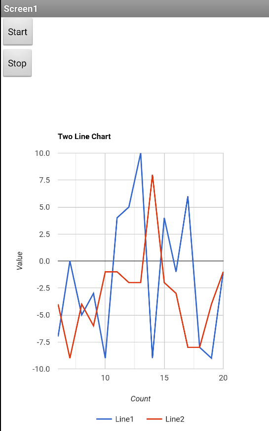
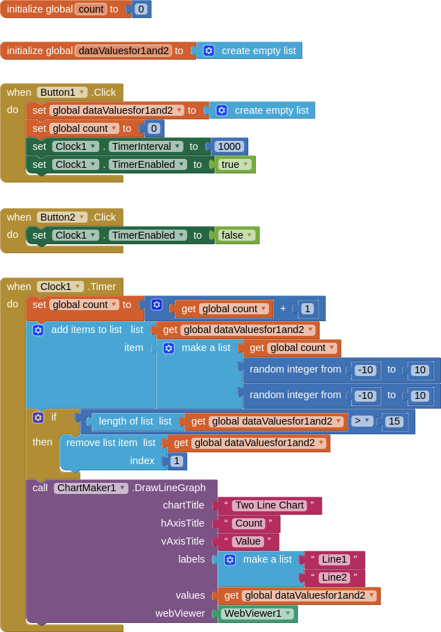
For a two line chart, the Chartmaker extension expects to receive a list of data for each point.
For example:
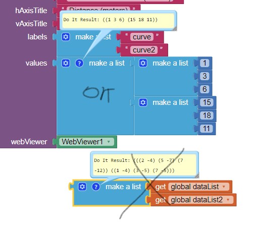
The first point for each line would be a list like this: [[1,5,7]] where 1 is the point number, 5 is the first point for the Line1 data, and 7 is the first point for the Line2 data.
When we add the next point the list would look like this: [[1,5,7],[2,4,8]] where 2 is the point number, 4 is the second point for Line1 and 8 is the second point for Line2.

Most of us will not be receiving/providing data in that way, we will probably have two lists:
[5,4] and [7,8] therefore we have to combine these lists to create a new list that the Chartmaker extension will understand. This can be done with list blocks.

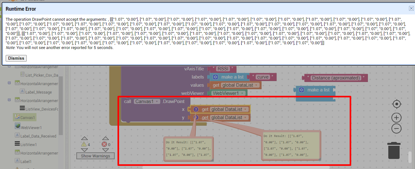
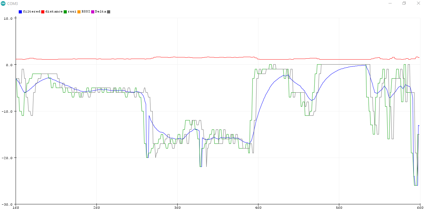
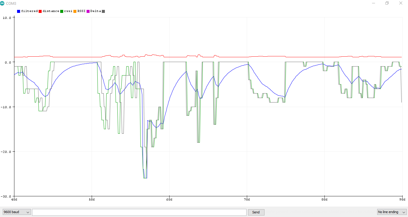
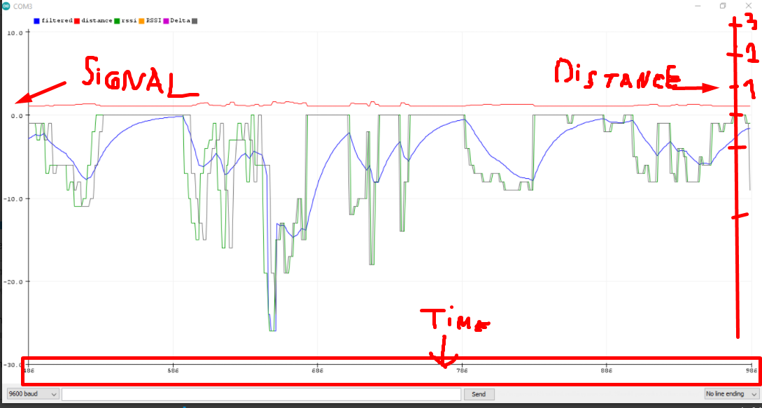
That said, the Google Chart Chartmaker extension is probably not the best method to display data like this if it is constantly updating, you do get a blink or flicker on each refresh, because the entire chart is redrawn, not just the data points. A different method, perhaps using the canvas, may work better.

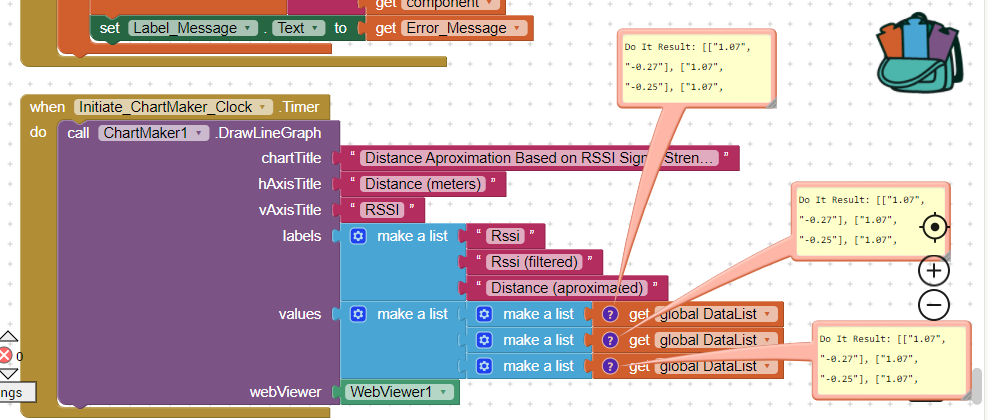
I provide an example that builds the data values with point numbers every second using a clock at 1 second intervals) and a random number generator. It also removes the first item in the list of values after 15 items are displayed, in order that you get a "rolling" effect.

SCREEN

BLOCKS

AIA
TwoLineChart.aia (12.6 KB)

I hope this explanation helps....
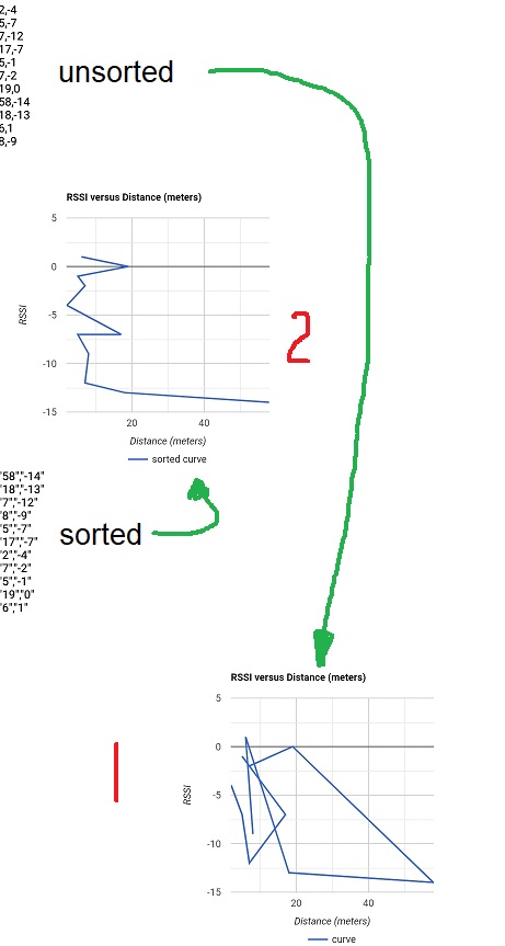
2 Likes

If you use a Line Chart with ChartMaker, the following may be the best you can do with a single curve.

unsorted (1) is what you get now, but the data List can be sorted (2) and no more spaghetti.

Merry Christmas, Wesołych Świąt, Feliz Navidad, God Jul, Joyeux Noel, Καλά Χριστούγεννα, Happy Christmas, Veseloho Rizdva, Prettige Kerstdagen, Frohe Weihnachten!, 성탄 축하 , Buon Natale, 聖誕快樂 , 圣诞快乐, Sretan Božić, C рождеством!, عيد ميلاد مجيدWhat you really want is a scatter plot .

--Steve

1 Like