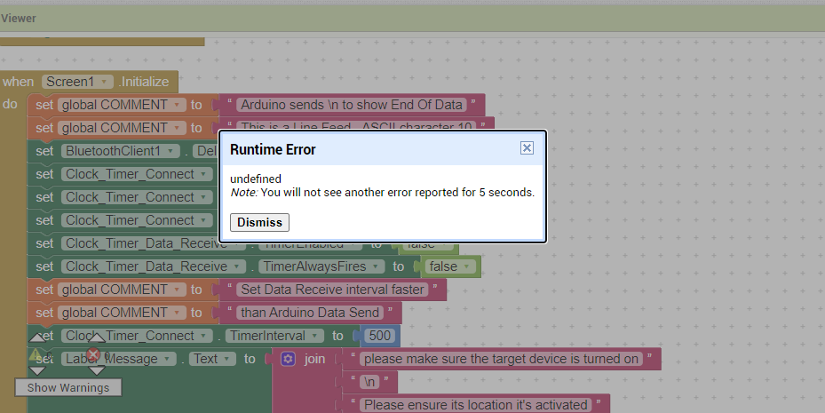
I am having some problems with the graph generated by the ChartMaker extension, the graph is constantly flickering if I set the Clock for the extension at a value of 100.
If I set it at a bigger value of 10 seconds, it updates too slow.
Is there a way to have it not flickering and also update each second ?
Because it keeps dissapearing and it's not readable this way.
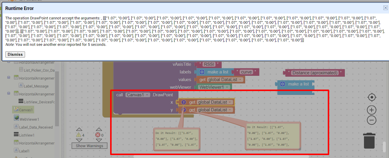
Also, the chart doesn't currently render anything despite having values that go into it.
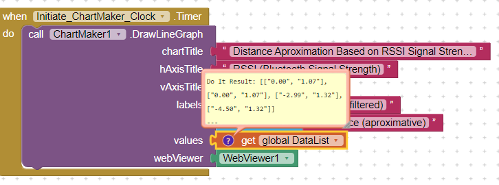
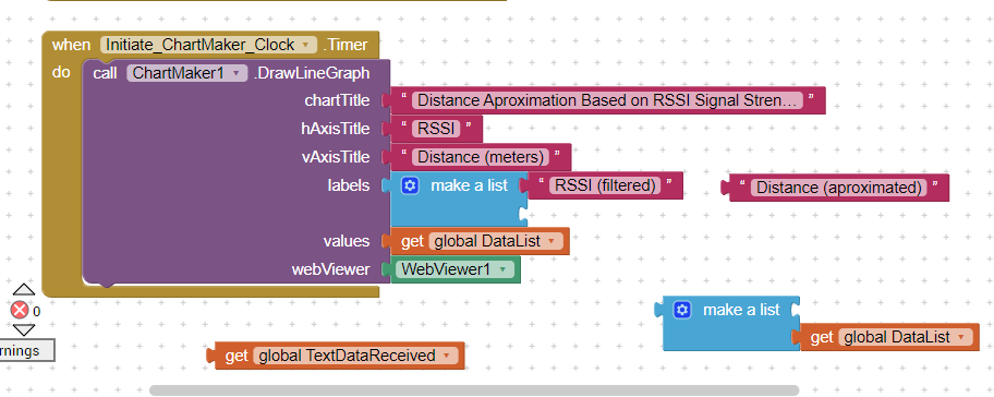
I think there is something not right with the way it gets the values, there are two values and it needs to add the first one to the first graph line and the second on to the second graph line, it also needs to work normally moving to the right not like in the screenshot above where it looks like it's glitching.
You are going to struggle to update a google chart 10 times a second given you have to send the data up to the internet and get the result back each time. This probably accounts for the flickering. Once a second may work, once every 5 seconds would be better. If you want faster/quicker, the you will need an on device chart builder - e.g. do it yourself on the canvas.
Thank you. I just mentioned I tried setting it up at various time settings because the graph is visibly glitched and I don't get why. I ain't that bothered by the flickering as I am by the fact that it doesn't work properly. As for the other example, I looked and I have it set up the same if you look in the screenshot but it won't work with two lines in my case for some reason.
Edit: The graph you suggested seems to be only working with positive values, I am working with negative ones as well.
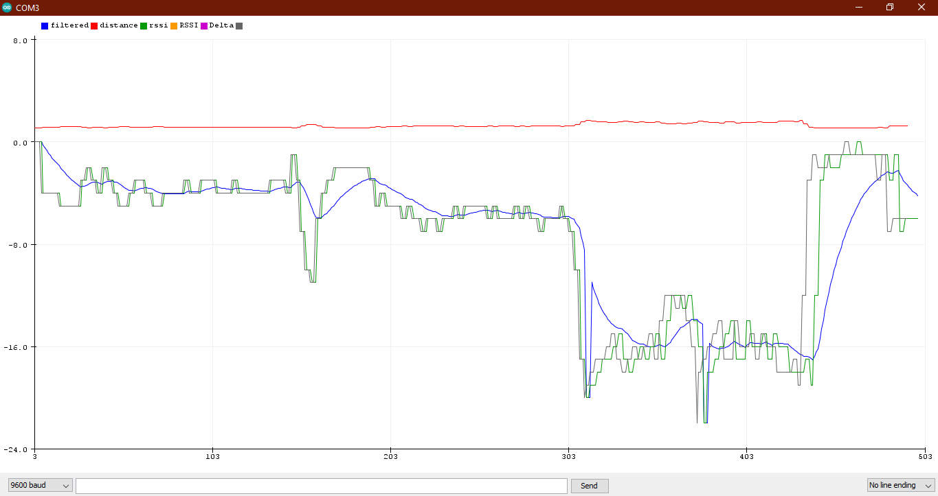
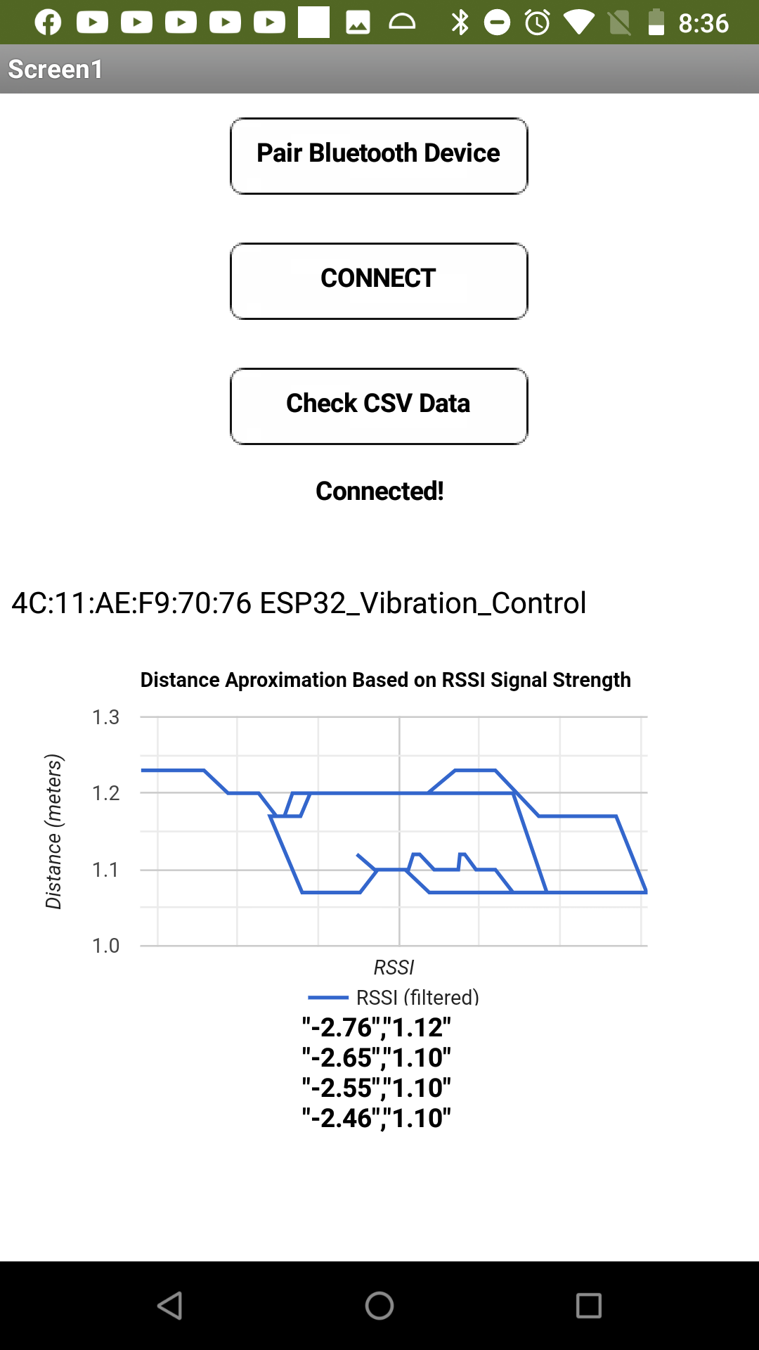
The plot seems to show what happens when successive point on the x axis are not increasing in value. ChartMaker requires points posted to the chart must successive (increasingly higher values) on the x axis, other wise you produce a chart that looks like spaghetti.
You can sort your data pairs prior to posting and probably eliminate this (at least with a single data set). If you use multiple data sets, each would have to be sorted.
I showed how to use a Clock with ChartMaker to eliminate flicker (at least with Clock times of 500 ms or more). You are not using that method. Why not try?
The plot seems to show what happens when successive point on the x axis are not increasing in value. ChartMaker requires points posted to the chart must successive (increasingly higher values) on the x axis, other wise you produce a chart that looks like spaghetti.
You can sort your data pairs prior to posting and probably eliminate this (at least with a single data set). If you use multiple data sets, each would have to be sorted.
I have no clue what you mean there. You guys said I needed a list of lists with two value pairs and that is what I've done, now you're telling me that I'm doing it wrong, after following your own advice with how to do that.
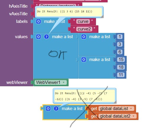
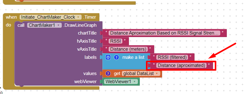
The ChartMaker shows how to use the tool. To provide two simultaneous graphs on a single chart requires two separate list of lists.
You probably do not have that as Abraham indicated. You only show . Where is your second list of pairs? You need two lists of pairs!
What is happening is the data you provide is not changing in value with additional data. The tool expects ordered distance data like 1 2 3 5 8 10, not 1 2 2 1 5 10 8 so you get a haywire graph. Data has to be ordered 1 1 2 2 5 8 10 might plot rationally, but 1 2 2 1 5 10 8 will not.
The only solution I am aware to eliminate the apparent chaos would be to sort your data list prior to drawing the chart.
Is because it is normal to come out as that, since it detects the distance as being smaller or larger, depending on what the signal strength is.
If I only have it to show ascending values it would be useless as a graph, since i want the graph to show when I move away (values rising) AND when I move closer (values dropping back).
Isn't this what meassuring distance should mean ? Closer values followed by Further away values then back to closer values, depending on how I move from the esp32?
About the thing that I need two lists of pairs, I understand that you mean it has to come in like this:
Providing two lists of pairs, does not work as shown by the x mark. Sorry for the advice w.r.t. a second graph on the chart. What would the second graph chart? the non filtered data or what?
-1 (rssi strength) , 1.40 (distance in meters)
0, 1.00
-2, 1.50
-1, 1.00
you can only have numerals, not the rssi strength, distance in meters annotation.
Exactly. You cannot use a Line Chart to show what you want to show. Your graph should show only points because if you use a line chart, the assumption is you move progressively away . The ChartMaker unfortunately cannot create a graph like that where you a close, then faraway, then nearer etc.
Yes, and you can measure distance; you just cannot plot distance on a graph the way you expect.
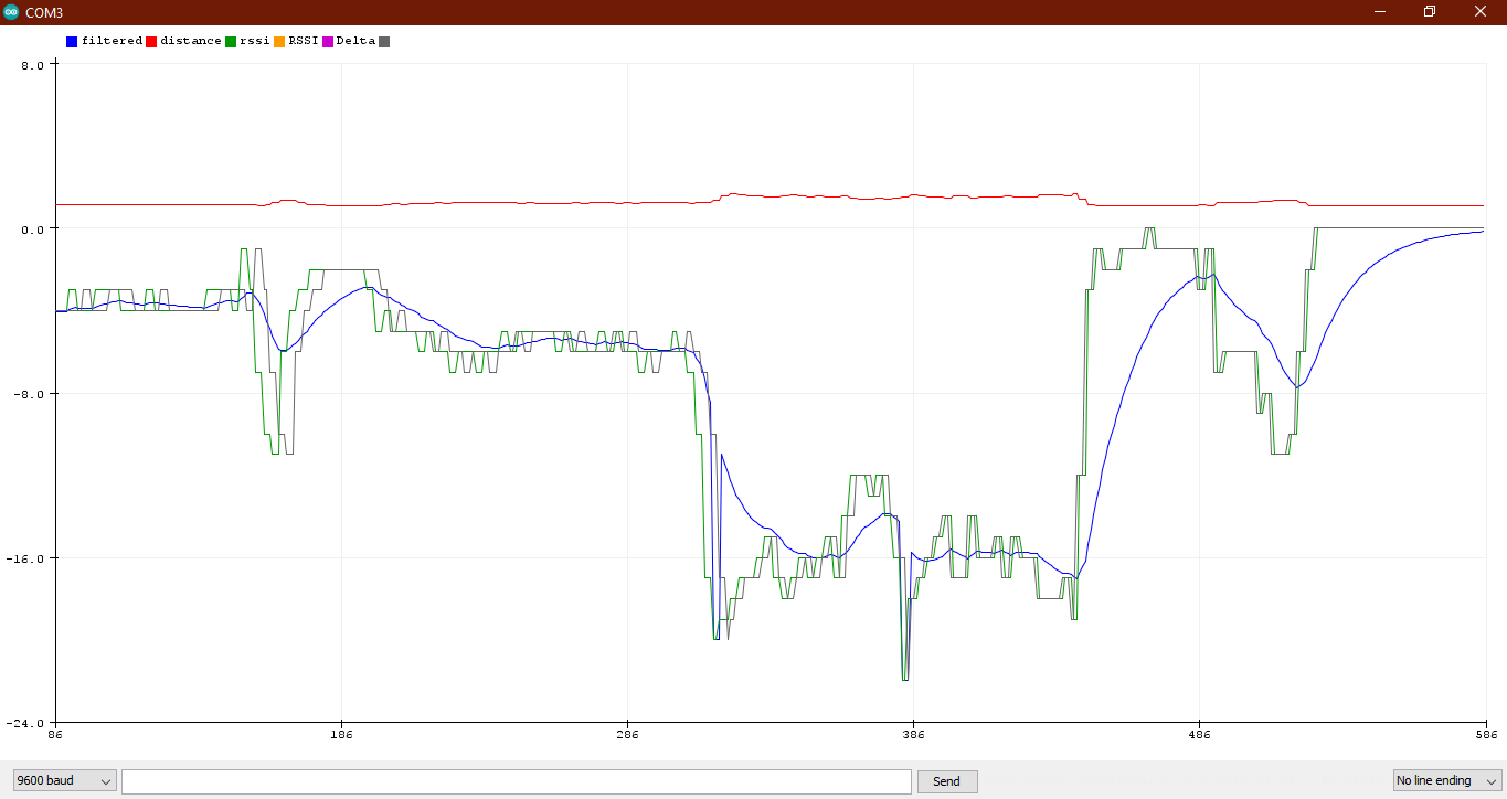
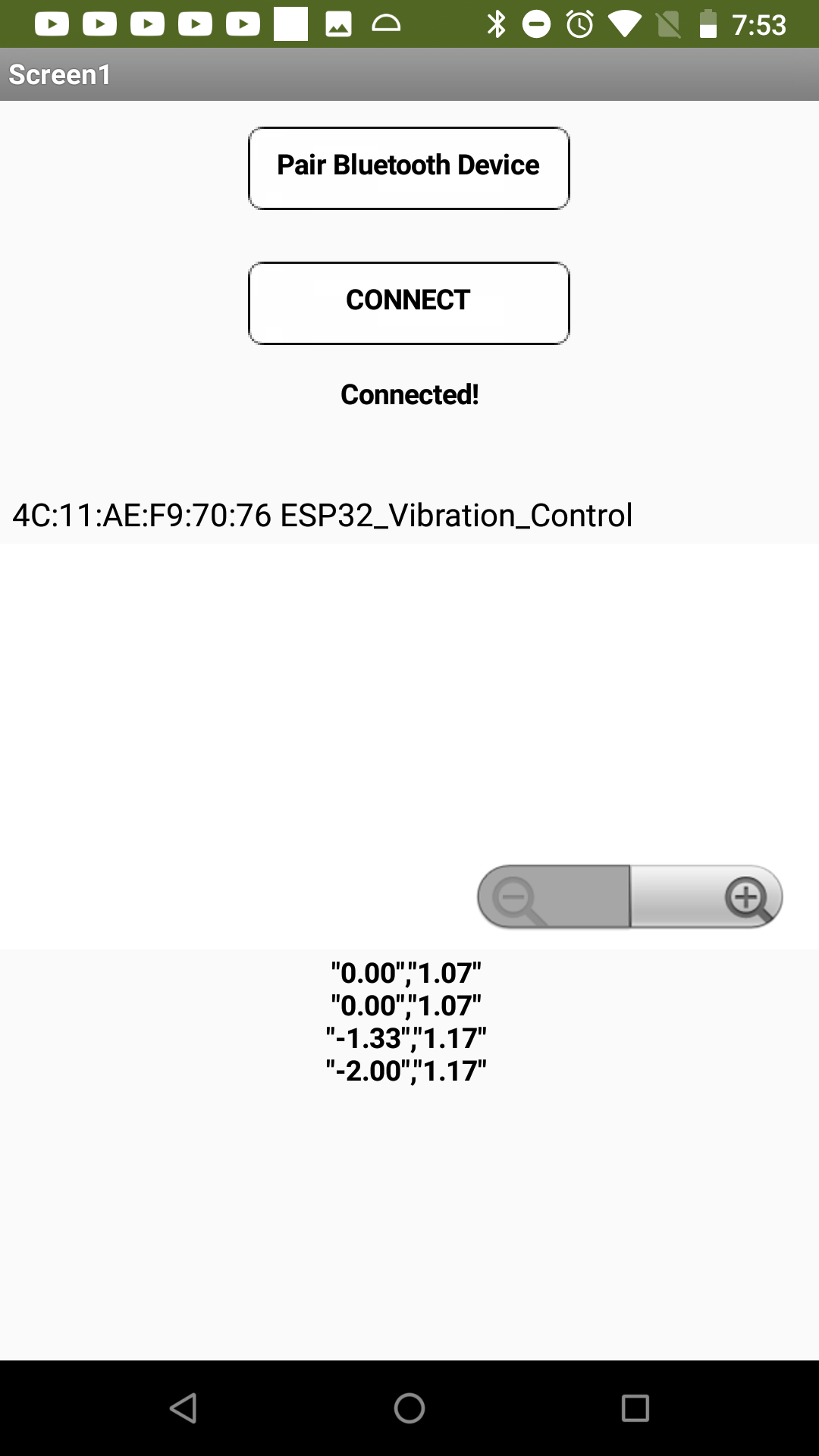
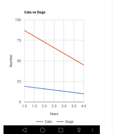
Guys, all I want is have ChartMaker render a graph just like the Serial Plotter in Arduino does, it works perfect and is exacly what I want and it's actually readable and useful and it's a Line Graph as you can see. I moved away, the lines show that change, I moved back closer, the lines show that:
You were expecting the block that draws a single dot to draw an entire scatter plot for you?
No way.
I could write one for you, if you apply your algebra skills to give me an algebraic inequality to
define the border of the sand corner at this thread ...
 . Where is your second list of pairs? You need two lists of pairs!