MIT App 2 ChartMaker Extension Issues

No need to write that for me my dear, I just want the ChartMaker to work like in the screenshots I posted above from my Serial Plotter monitor inside Arduino.

Once again, I share my Arduino code here and the Project as I have them right now so that you guys may see what I'm doing wrong with ChartMaker:

DFPS_APP_EN_ABG.aia (21.4 KB)

And the Arduino Code:

0bin - encrypted pastebin

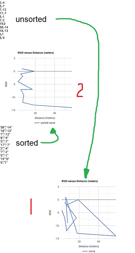
And I want the ChartMaker to bassically do and show exacly what my serial Plotter does and shows, both are Line Charts so is should be possible right?

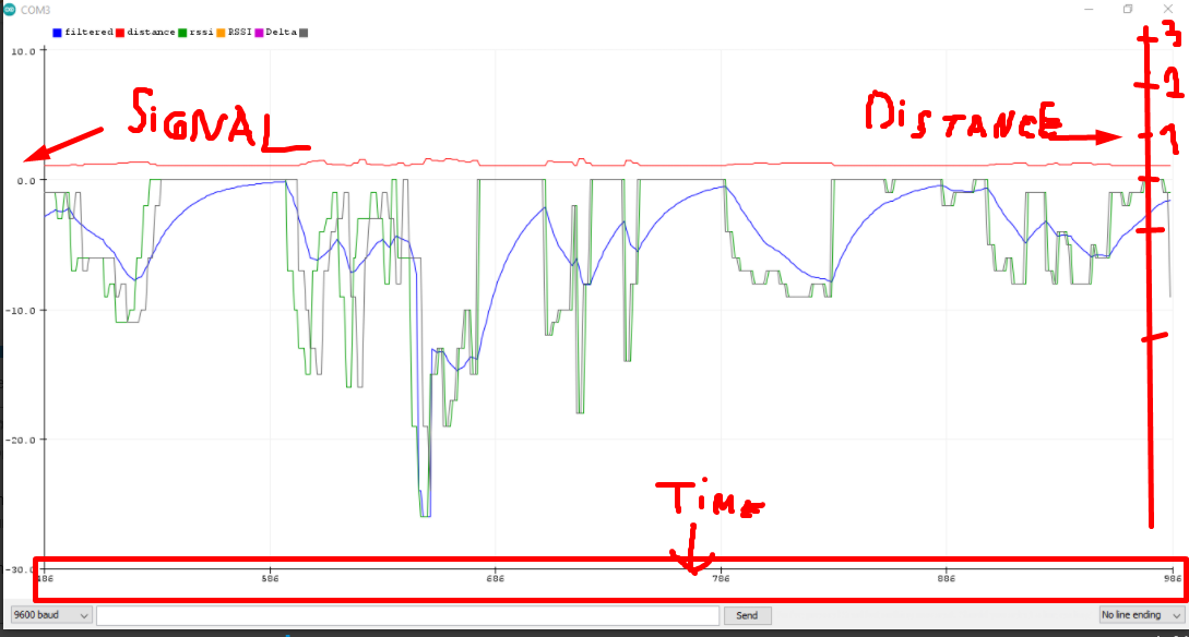
Again screenshots from the Serial Plotter Graph I just ran from Arduino here:

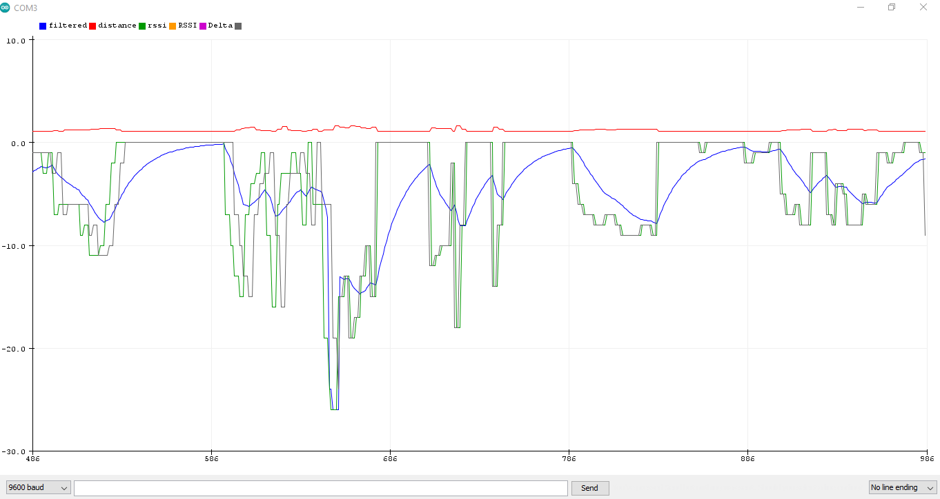
This is what I want ChartMaker to do (and without flickering).

That's all I need. I need and I want nothing more that's all for the graph. If I have this then the problem it's solved and I can move on to other things which I know how to do, such as the UI and sutff like that.

If anyone can modify the two codes to do that and send them back to here so I can test that would be perfect and the fastest way to solve out the issue, as it seems when I modify stuff myself I tend to mess things up even more. It's better if someone that knows what they're doing alter them a bit and solve the issue once and for all.

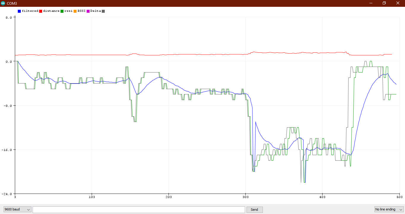
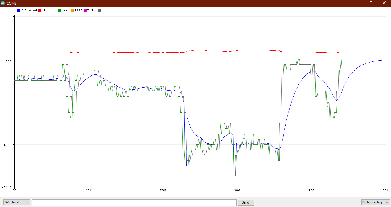
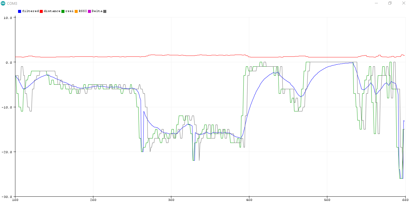
So there are 3 variables that need to be sent to Chartmaker:

-The RSSI
-The Kalman filtered RSSI result
-The Resulting Distance

These have to show as 3 different colored lines if possible so I can tell which is what and maybe for the numbers down at the bottom they'd be better off as time instead of distance.
It would be great if numbers at right could be added for the distance in meters just like the ones at the left that represent the signal values.

And I also tried this @SteveJG and it still won't render:

This is getting ridiculous, almost a week for a simple chart. I am starting to believe I'd be better off learning Java and coding the app in Android Studio together with the chart.

It took much less to write the Arduino code that is much more complex than this issue, it took much less to apply the formulas. Now I spent a week for a chart like it's some impossible thing to do, this should take 15 minutes to implement at most but it's starting to go into a week and so on beause no one seems to be having a clear solution to the issue.

Can't even make it to show a thing as simple as a graph with 3 variables that works, like it's some next gen technology or something we're working at.

Whatever. If you guys have time take a look into my code and blocks and maybe someone can make it work, I am sick of wasting all these days over this simple issue that no one seems to be able to help me with.

If no one can help me then so be it, thanks for all the advice.

Much love.

It doesn't have to be difficult. it is simply a matter of getting your data organised correctly.

For a two line chart, the Chartmaker extension expects to receive a list of data for each point.
For example:
The first point for each line would be a list like this: [[1,5,7]] where 1 is the point number, 5 is the first point for the Line1 data, and 7 is the first point for the Line2 data.
When we add the next point the list would look like this: [[1,5,7],[2,4,8]] where 2 is the point number, 4 is the second point for Line1 and 8 is the second point for Line2.

Most of us will not be receiving/providing data in that way, we will probably have two lists:
[5,4] and [7,8] therefore we have to combine these lists to create a new list that the Chartmaker extension will understand. This can be done with list blocks.

That said, the Google Chart Chartmaker extension is probably not the best method to display data like this if it is constantly updating, you do get a blink or flicker on each refresh, because the entire chart is redrawn, not just the data points. A different method, perhaps using the canvas, may work better.

I provide an example that builds the data values with point numbers every second using a clock at 1 second intervals) and a random number generator. It also removes the first item in the list of values after 15 items are displayed, in order that you get a "rolling" effect.

SCREEN

BLOCKS

AIA
TwoLineChart.aia (12.6 KB)

I hope this explanation helps....

2 Likes

If you use a Line Chart with ChartMaker, the following may be the best you can do with a single curve.

unsorted (1) is what you get now, but the data List can be sorted (2) and no more spaghetti.

Merry Christmas, Wesołych Świąt, Feliz Navidad, God Jul, Joyeux Noel, Καλά Χριστούγεννα, Happy Christmas, Veseloho Rizdva, Prettige Kerstdagen, Frohe Weihnachten!, 성탄 축하 , Buon Natale, 聖誕快樂 , 圣诞快乐, Sretan Božić, C рождеством!, عيد ميلاد مجيدWhat you really want is a scatter plot .

--Steve

1 Like