Introduction
An extension that provides additional tools to TextBoxes All blocks in this extension work with multi-line textboxes.
NOTE: I am aware that there are other extensions that does the same thing, but has more options. I just want to share this extension in the community. You can choose to download any one of them.
 BIG thanks to: @Ken, @Salman_Dev, @Android_Builder
 Current version: 11
 Release date: 2022-02-16T09:00:00Z
Last updated date: 2022-03-22T03:30:00Z
Documentation
Events
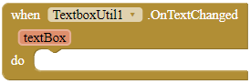
OnTextChanged
This event is invoked when the text fo a registered TextBox has changed.
Parameters: textBox = component
Methods
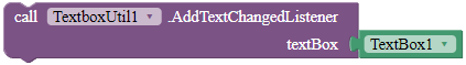
AddTextChangedListener
Registers the component so that when the text of this TextBox has changed, it fires the OnTextChanged event.
Parameters: textBox = component
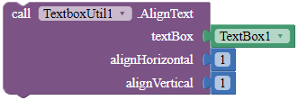
AlignText
Aligns the text of the TextBox. 1 is left/top, 2 is center and 3 is right/bottom.
Parameters: textBox = component, alignHorizontal = number (int), alignVertical = number (int)
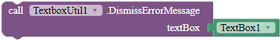
DismissErrorMessage
Clears the error message shown on the tip of the given TextBox.
Parameters: textBox = component
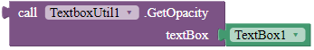
GetOpacityValue
Returns the opacity of the TextBox. 0 is less opaque and 255 is most opaque.
Returns: number (float)
Parameters: textBox = component
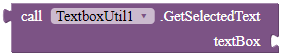
GetSelectedText
Returns the selected text from the given text box.
Returns: text
Parameters: textBox = component
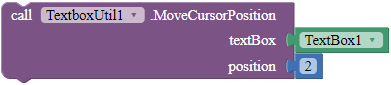
MoveCursorPosition
Moves the cursor to the specific position. Only works when the TextBox is focused.
Parameters: textBox = component, position = number (int)
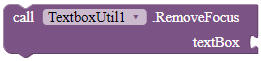
RemoveFocus
Removes focus for both the textbox frame and the cursor of the textbox. This does not hide the keyboard of the textbox.
Parameters: textBox = component
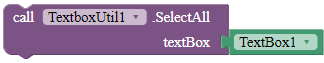
SelectAll
Selects all of the text in the given TextBox. This function only works when the TextBox is focused.
Parameters: textBox = component
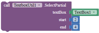
SelectPartial
Selects the text of the TextBox according to the start and the end position. Only works if the TextBox is focused.
Parameters: textBox = component, start = number (int), end = number (int)
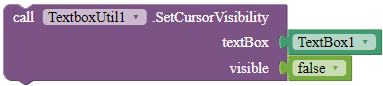
SetCursorVisibility
Sets the visibility of the cursor.
Parameters: textBox = component, visible = boolean
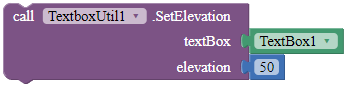
SetElevation
Sets the elevation for the given TextBox in pixels.
Parameters: textBox = component, elevation = number (float)
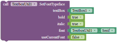
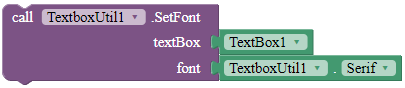
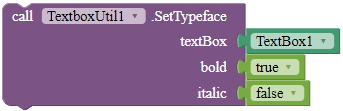
SetFontTypeface
Sets the font typeface of the TextBox, including whether to bold, italicize, and the font of the TextBox. Use the blocks in the properties of this extension for the font parameter. If useCurrentFont is true, the font parameter will be ignored.
Parameters: textBox = component, bold = boolean, italic = boolean, font = text, useCurrentFont = boolean
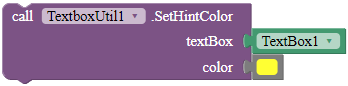
SetHintColor
Sets the hint color for the given TextBox.
Parameters: textBox = component, color = color
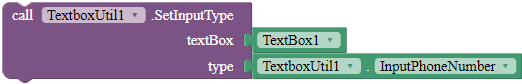
SetInputType
Sets the input type for the TextBox. Use the blocks in the Properties to set the type parameter.
Parameters: textBox = component, type = number (int)
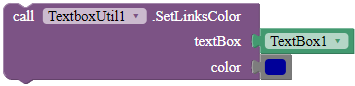
SetLinksColor
Sets the color of the links of your TextBox.
Parameters: textBox = component, color = color
- Show the context menu for your TextBoxes!
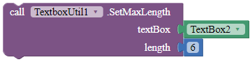
SetMaxLength
Sets the maximum length for the textbox. If you set the textbox's text longer than the length before you call this, the text will still be there undeleted.
Parameters: textBox = component, length = number (int)
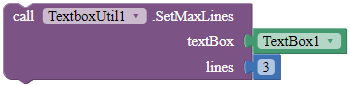
SetMaxLines
Sets the maximum lines the TextBox can contain. This block only works with TextBoxes with normal input type.
Parameters: textBox = component, lines = number (int)
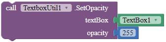
SetOpacityValue
Sets the opacity of the TextBox. 0 is less opaque and 255 is most opaque.
Parameters: textBox = component, opacity = number (float)
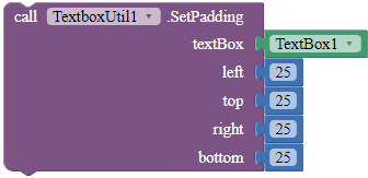
SetPadding
Sets the padding of the given TextBox.
Parameters: textbox = component, left = number (int), top = number (int), right = number (int), bottom = number (int)
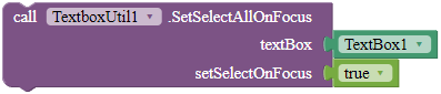
SetSelectAllOnFocus
Sets the TextBox so that when the user clicks any of the text in the TextBox, it automatically selects all of the text.
Parameters: textBox = component, setSelectOnFocus = boolean
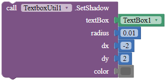
SetShadow
Sets the shadow for the text with the specified blur radius and color, and the specified distance from text position.
Parameters: textBox = component, radius = number (float), dx = number (float), dy = number (float), color = color
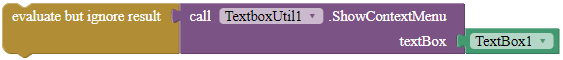
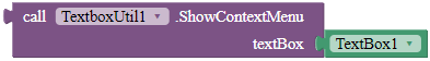
ShowContextMenu
Show the context menu for the given TextBox. Returns true if the context menu was shown, else false.
Returns: boolean
Parameters: textBox = component
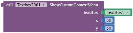
ShowCustomContextMenu
Show the context menu for this TextBox. If the context menu is shown, return true, else false.
Parameters: textBox = component, x = number (float), y = number (float)
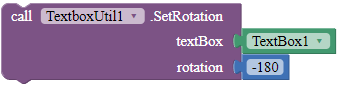
SetRotation
Rotates the TextBox according to the rotation angle.
Parameters: textBox = component, rotation = number (float)
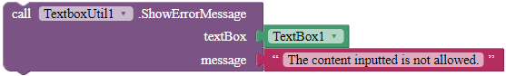
ShowErrorMessage
Shows an error message on the tip of the given TextBox.
Parameters: textBox = component, message = text
Properties
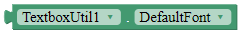
DefaultFont
A font block.
Returns: "DEFAULT"
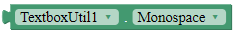
Monospace
A font block.
Returns: "MONOSPACE"
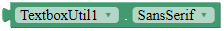
SansSerif
A font block.
Returns: "SANS SERIF"
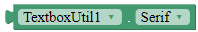
Serif
A font block.
Returns: "SERIF"
 Downloads
AIX:
com.gordonlu.textboxutil.aix (15.6 KB)
Rate my extension! 
- Good extension!
- Bad extension.
Made with Niotron IDE.
Kindly  PM me if you have any questions! Also, if you like my extension, please
  like it! It takes some effort for me to make it...
Votes and likes tell me the general user feedback of my extension. If you read this extension, please take 20 seconds to drop by and give a vote / like!
HAPPY 2022!
If you have any features that you want to add and you know the code, PM me.
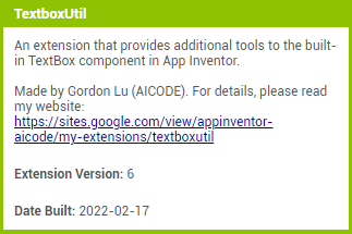
Added to my website on 2022-2-17.
Gordon Lu
 Message
 Website
 E-mail
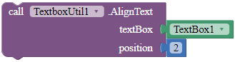

