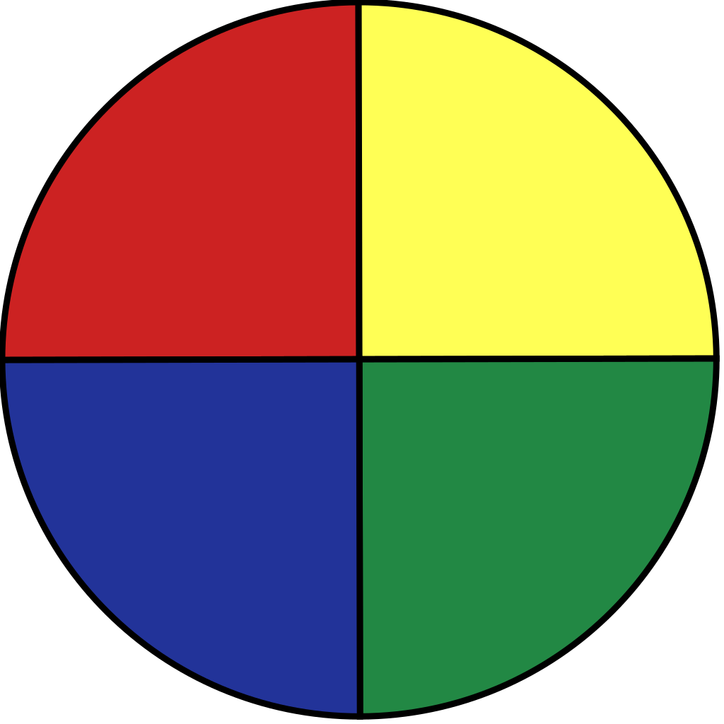
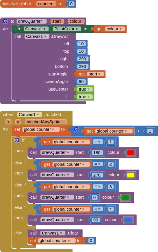
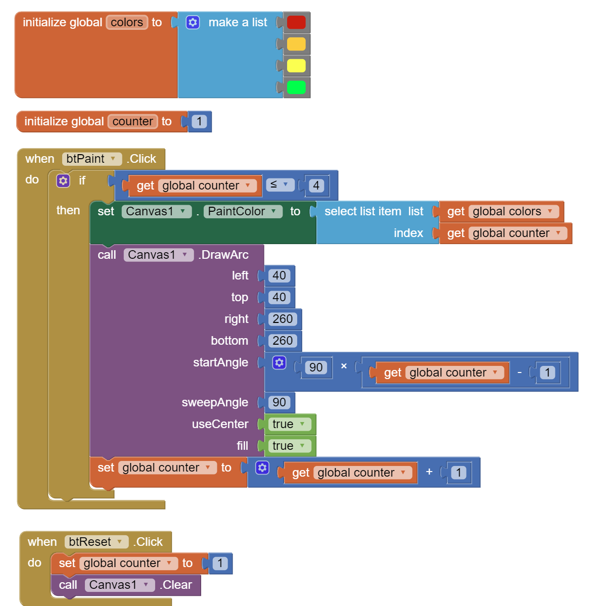
Hello, I want to click on a button, first click a quarter of the circle will appear, then second click the second quarter with a color, then the third quarter, and finally the fourth quarter using canvas and arc.thanks
Hello,
What have you tried to do? will you show us?
1 Like
Arcs4Colored.aia (2.7 KB)
Hi.thanks.very good. ![]()
Hi thanks very good. ![]()
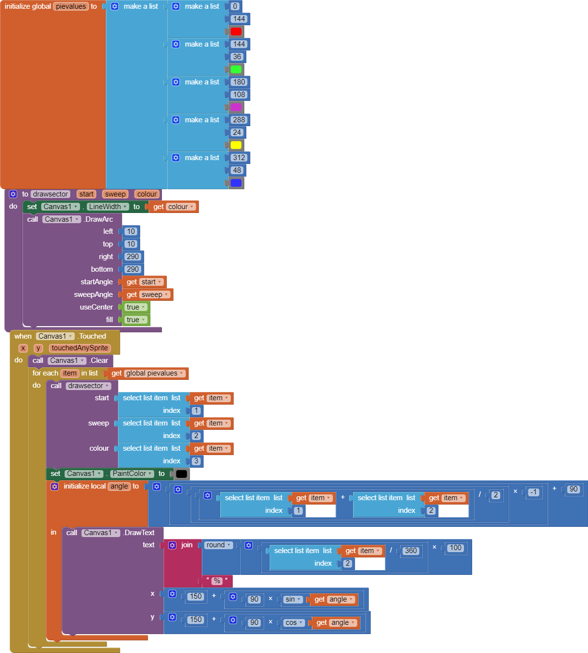
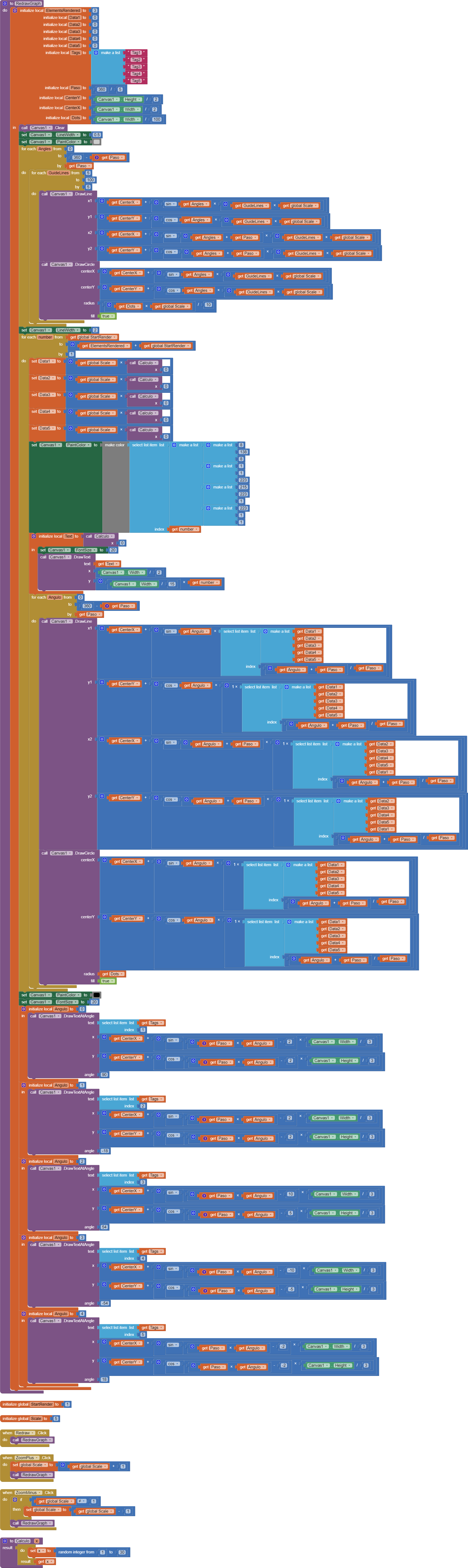
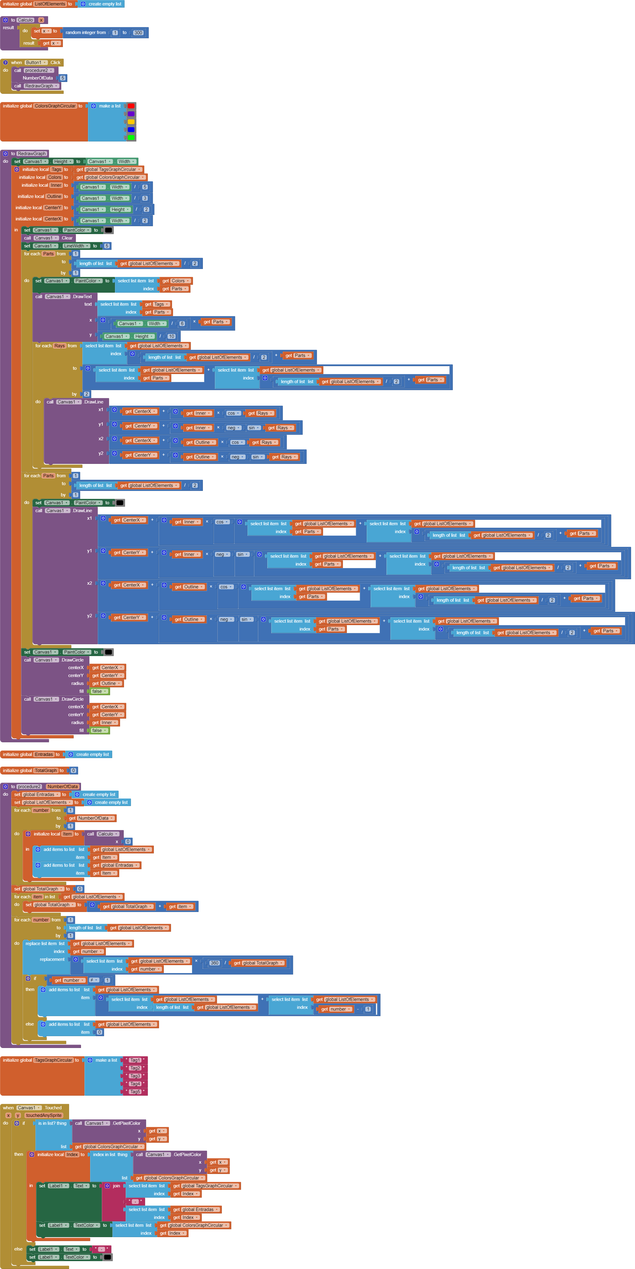
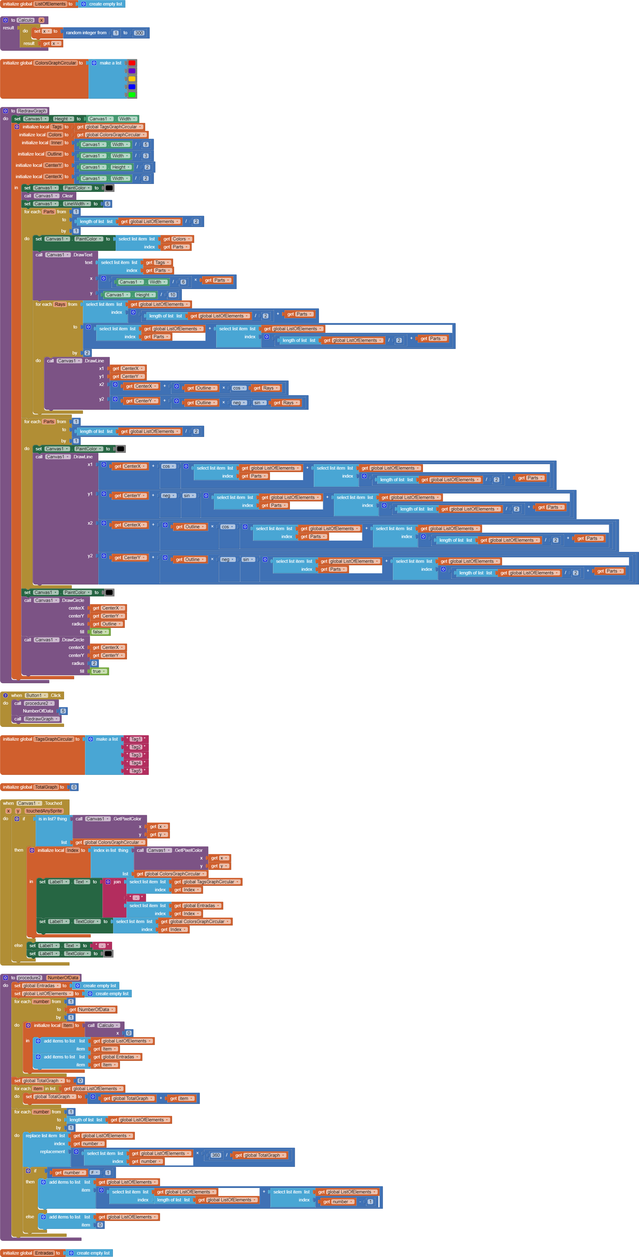
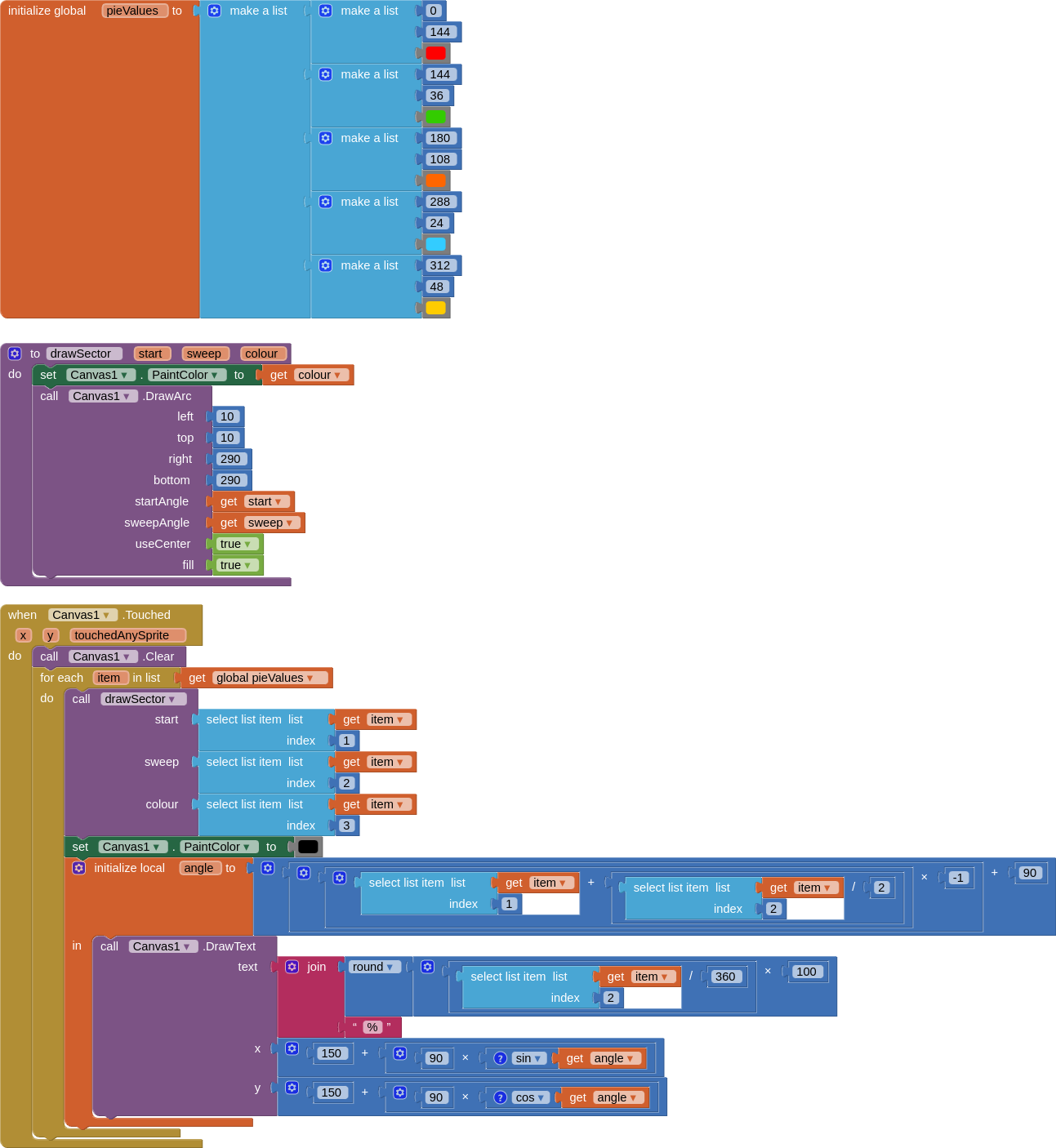
Hello again, I had another question. I have set of numbers (10, 15, 20, 5) that I want to draw a pie chart with canvas and arc. Divide each number (for example, 5) by the sum of numbers (50). I do (5/50=.1) and multiply by 360 (.1*360=36). The angle of each number (in degrees) is obtained(36 degree for 5). Now I want each part of the circle to be equal to its angle(36-72-108-144 are angles to degrees).thanks
Hi thanks.. I visited the address given by you, the image of the blocks was very vague. Please, if possible, give another address or explain it yourself. Thank you.
That was a really old post, from 2016.
Here is the .aia file I downloaded from that post, which can be used to generate clearer blocks images if you are still interested in an editorial refresh.
GraphsV2.aia (32.0 KB)
Here are blocks images of the 4 Screens, in order.
I am seeing them fresh, and it would be an investment of time to dive deep into them, compared to the newer AI2 Chart component.
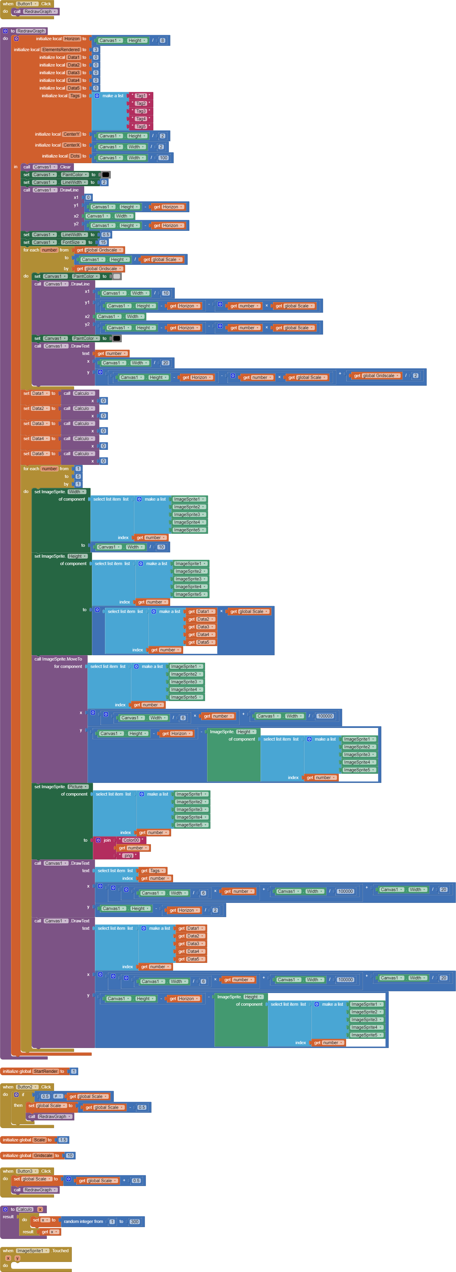
P.S. That post has the email address of the original poster, if you want to ask the author directly.
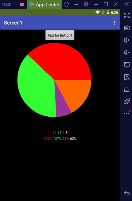
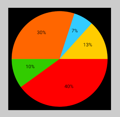
Hi ,thanks.but this project is about coloumnar graph no circle(pie)graph.
Just as well.
The next step in following up on that old post would have been Google Seance.
Is 'solve' a report of success, or a request for a solution?
I notice the second line of text lists degrees (°) as per cents (%).
Either change the % symbols to ° symbols, or divide each of those numbers by (360/100) to get per cents.
Hi,thanks.a report of success.thanks for your notice.
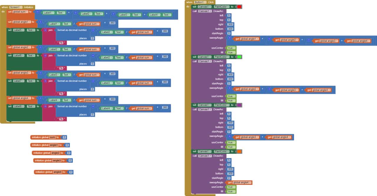
The lables1-4 are my data.
The lables 5-8 are shown degree of each data in pie chart.
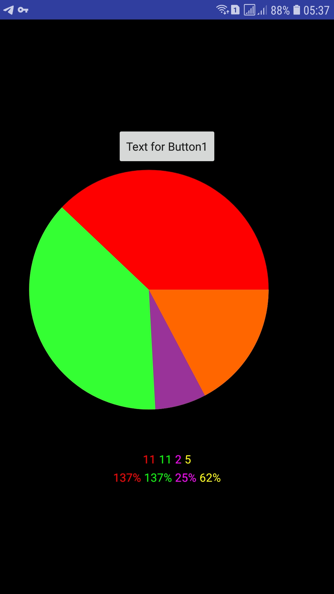
In the image, percentage is wrongly displayed instead of degree.
If you consider to develop this further, I suggest in streamlining your code, as a first step like this:
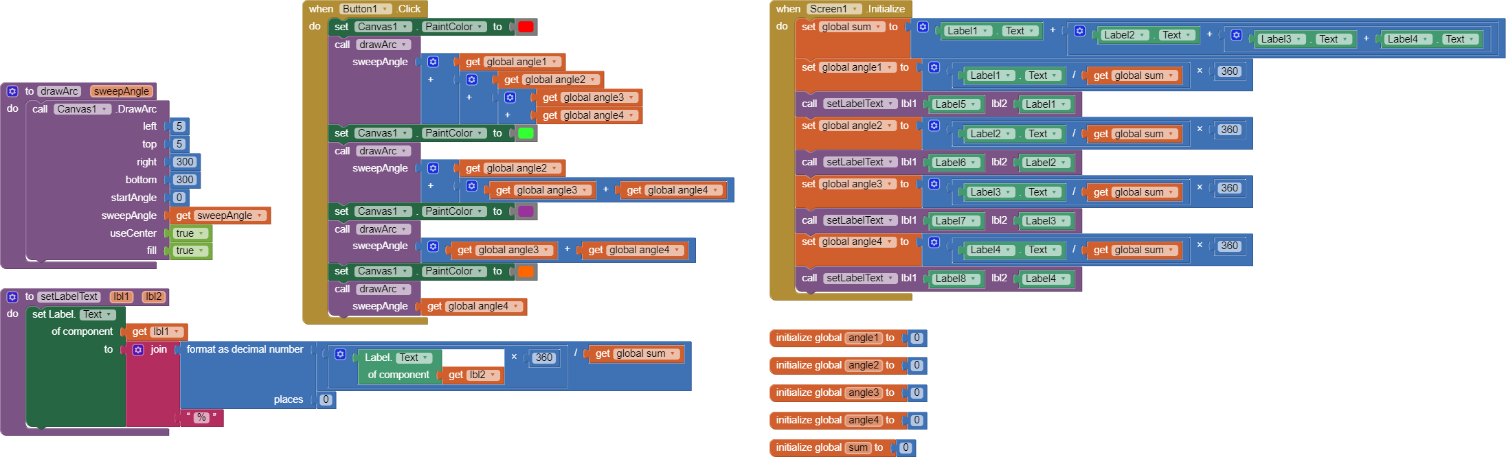
I added 2 procedures to cover common code.
As a second step, you could give your blocks and variables sensible names, as a third step you could start using lists. It will make your app much shorter and better understandable.
Hi,thanks.![]()
Hi,thanks.![]()
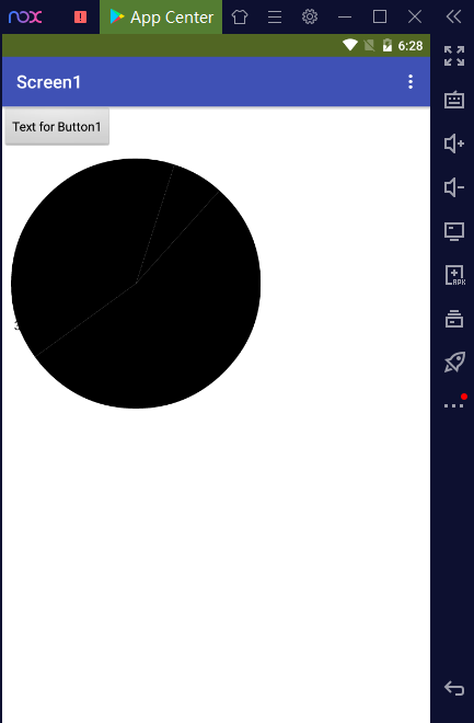
Hello and thanks. I followed your block image but the result is a black circle. Please advise
circle_percent.aia (3.9 KB)