As suggested elsewhere, I'm using a Canvas to put y-labels on a Chart. I put the Canvas next to the Chart in a Horizontal Arrangement, and then draw the labels onto the Canvas at specified x,y locations. So far, so good. But the numerical y-axis labels (that Chart contains) are still there. Is there a way to get the Canvas to overlap the left-hand edge of the Chart so that those are eliminated ?
Where ?
What is wrong with the chart y-axis labels ?
Where ? Just trying to search, maybe it was google AI.
Anyhow, the y-axis labels are just numbers, can't be text.
Best not to rely on AI for reliable answers to AppInventor issues.
There are extensions which will allow you to overlap components
https://puravidaapps.com/extensions.php
Search for overlap or overlay
I found and installed OverlapView, but it's devoid of any documentation and I can't figure out how to make it work.
Recall my goal is simply to replace the numerical y-axis labels on a Chart with my own text labels (the same as one can easily do for the x-axis). I've made a horizontal arrangement with a Canvas (containing my labels) on the left and the Chart on the right. It looks good, except I need to have the right-hand edge of the Canvas overlap the left-hand edge of the Chart so that the numerical y-axis labels go away. An alternative might be to have a 3rd element which I position to cover the numerical y-axis labels. This seems like a better bet, because as soon as I make the Canvas and OverlapView "layer", the textual labels get all spastic.
So I'd welcome any thoughts about how to proceed with this.
Why noy just draw your own chart on a Canvas?
That gives you complete control.
Can you say a little more about this ? So I have a Canvas, I put my y-axis labels on the left like I'm doing now, but put my Chart inside the Canvas ? But it doesn't appear possible to put a Chart inside a Canvas, so it would appear I'd need to somehow draw the chart by hand, which I can't fathom how to do.
See the Blocks Based on Canvas section of the FAQ
Fairly straight forward
- Set the arrangement you want to place the overlay on (you may need to put your chart inside an arrangement...)
- Set the position of the overlaying component
chartOverlap.aia (8.4 KB)
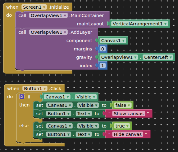
Thanks, that kinda works (not sure what the point of the Button is). I assume you meant the MainContainer to be a horizontal arrangement (of Canvas and my Chart named Graph).
This seems to work perfectly ...
... the negative margin making Canvas not quite so close to the y-axis, but enough to hide the numerical labels.
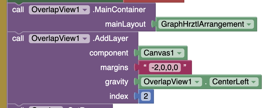
There's one problem though: when I rotate my phone to landscape orientation, Canvas doesn't cover the left-hand edge (numerical labels) of Graph at all. Probably because I have the width of Canvas and Graph set as 50 pixels and 80%, respectively. If Canvas width is %, the text gets stretched way out when I rotate to landscape.
I guess I need to have stuff in my blocks to change the overlap cirteria when the screen orientation changes. This kinda works for that ...
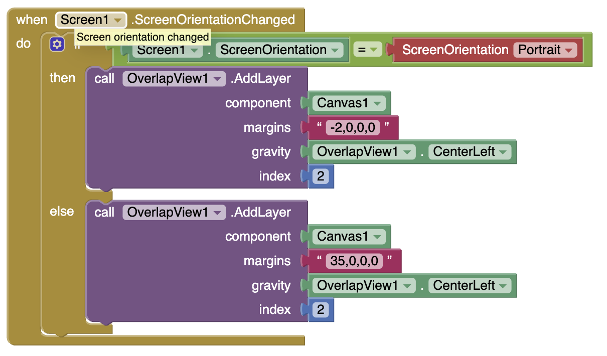
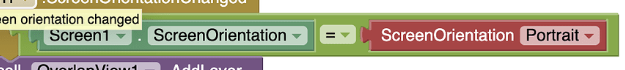
... except not really, because the IF block at the top never evaluates true (like when I rotate from landscape back to portrait).
This doesn't work (bug)
Test for screen width or height being bigger/smaller than...
If I use this block ...
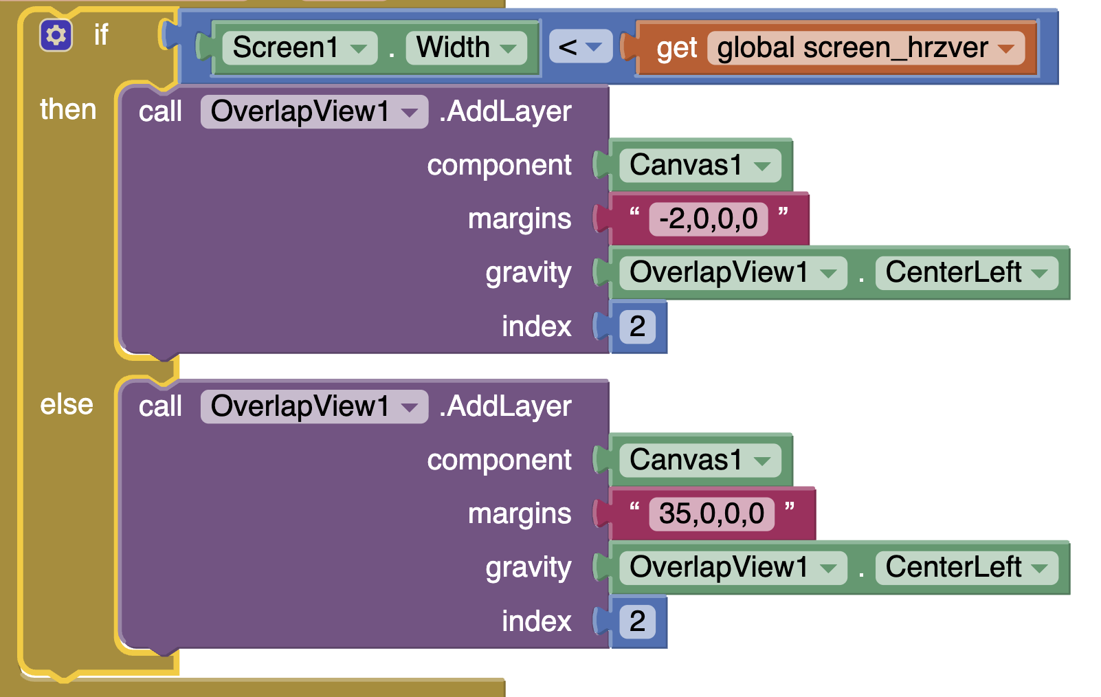
... and put it in an OtherScreenClosed event, or Initialize it works properly. (I made the number distinguishing between horizontal and vertical be a TextBox variable to I could experiment, and 600 seems to work, which seems odd given my Pixel7's resolution is supposedly 1080 x 2400).
But if I put it into a ScreenOrientationChanged event, it's gets all mxied up and each screen orientation has the "margins" set wrong.
See my post above!
To demonstrate to you that the component was overlaying the arrangement, given you did not understand how to use the extension.
I don't see what I'm missing that was in one of your previous posts, I assume you mean post #10. Sorry to be a dope. Appreciate your help.
Ah well, this seems to do it:
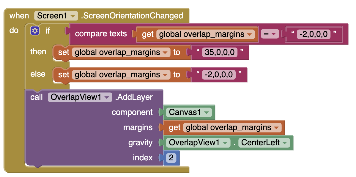
Something about the interaction of ScreenOrientationChanged and testing screen width/height that is not working the way it seems it ought to.
The chart component included in ai2 is simple to use, but have a few limitations.
You can always use a different "chart library", for example highcharts.
@TIMAI2 released an extension to use it.
You may also find a few demo I wrote using highcharts ( without extension ).
On the highcharts site there is a complete showcase of demos