This extension adds several features to the built-in ListView component.
Blocks v4:
Description:
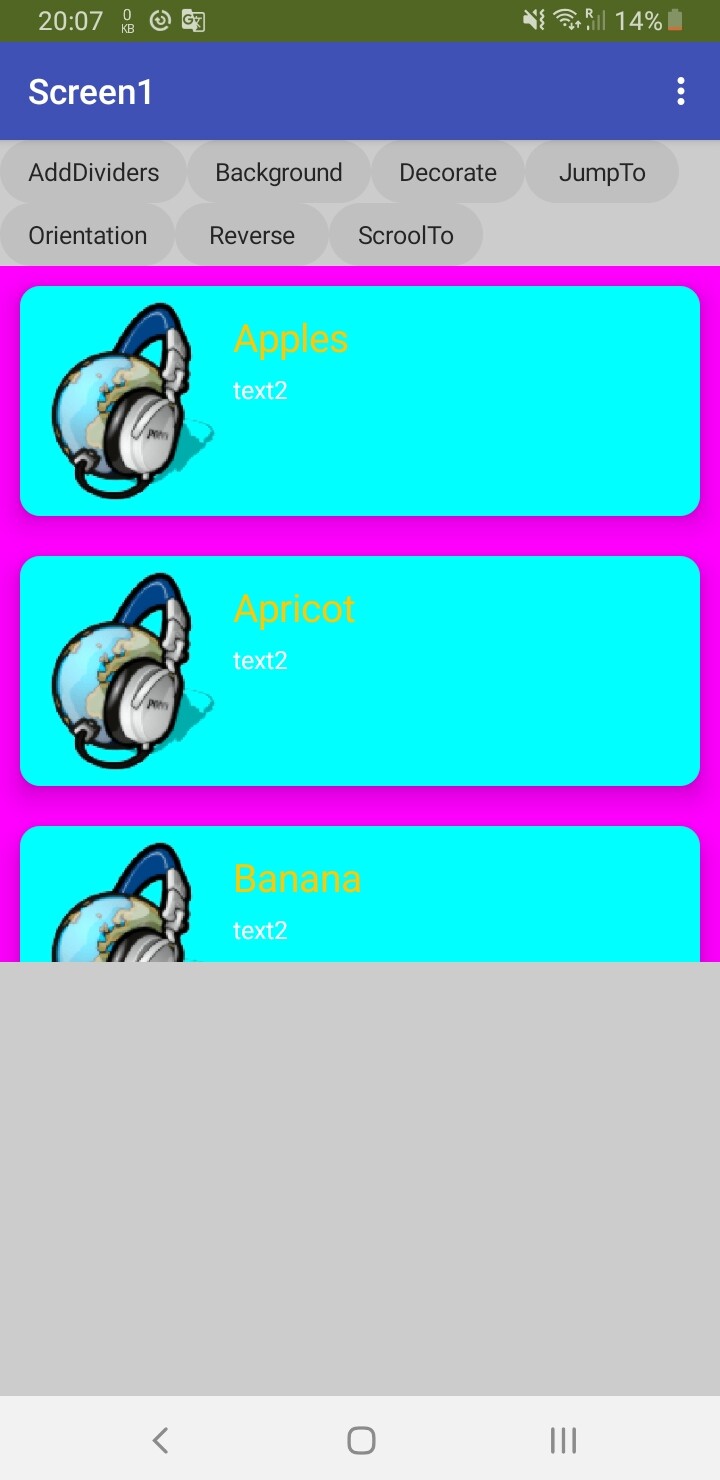
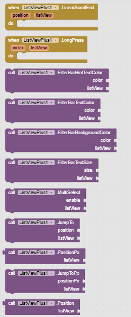
Reverse: Reverse the order of list items. The highest index will be at the top of the list.
ScrollTo: Scroll to a list item with animation. The item will be visible at the bottom of the list.
JumpTo: Scroll to a list item without animation. The item will be visible at the bottom of the list.
JumpToPx: Scroll to the height of the list expressed in px, without animation.
Position: Returns the list item to which the ListView is scrolled.
PositionPx: Returns the current height in px to which the ListView is scrolled.
DetectLongPress: Set ListView items to detect long press.
LongPress: An event triggered when we long press an item in the list.
FilterBarHintTextColor: Change the hint text color in the search box.
FilterBarTextColor: Change the text color in the search box.
FilterBarBackgroundColor: Change the background color in the search box.
FilterBarTextSize: Change the text size in the search box.
MultiSelect: Enables multiple item selection mode. Only visually.
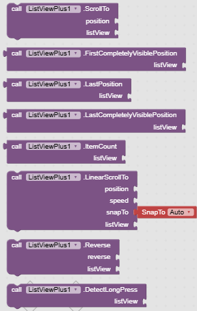
LinearScrollEnd: Event fired when linear scrolling ends.
ItemCount: Returns the number of items in the list.
LinearScrollTo: Scroll to a list item with animation. Once scrolling is complete, the LinearScrollEnd event will be fired.
- position - index of the position to which the ListView should be scrolled,
- speed - speed at which the ListView should be scrolled (px/s),
- snapTo - can take 3 values,
- Top - the element we are scrolling to is set as the first visible element of the list,
- Bottom - the element we are scrolling to is set as the last element of the list,
- Auto - the shortest way to show the element is selected, if the element is fully visible, scrolling will not occur.
Download extension:
Version 3: pl.listviewplus.aix (11.8 KB) deprecated
Version 4: pl.listviewplus.aix (14.2 KB)
Download demo project:
Uses V4 :
TestListViewPlus.aia (126.3 KB)
This demo shows multi selection with a long press and deletion of selected items. Uses detail text to highlight the selected item.
TestListViewPlus_new_multiselect.aia (126.4 KB)
This demo shows how to use the new MultiSelect method.
History:
V2:
- added long press detection of ListView item,
- added scrolling to height in pixels,
- added the ability to read the current position of the scrolled ListView,
- added option to modify hint text in list filtering bar,
- added the ability to set the margins of an item from the list, so that each margin can be different,
- adding dividers has been fixed to work in ListView horizontal view,
V3:
- added FilterBarHintTextColor, FilterBarTextColor, FilterBarBackgroundColor, FilterBarTextSize, MultiSelect
- AddClassicDividers, Orientation, DecorateItems, SearchHintText, BackgroundColorUnderItems are deprecated. Use the property in ListView.
- Works with AppInventor version nb199 or newer.
- Extension ported to the Fast build environment.
V4:
- added LinearScrollTo, LinearScrollEnd and ItemCount block.