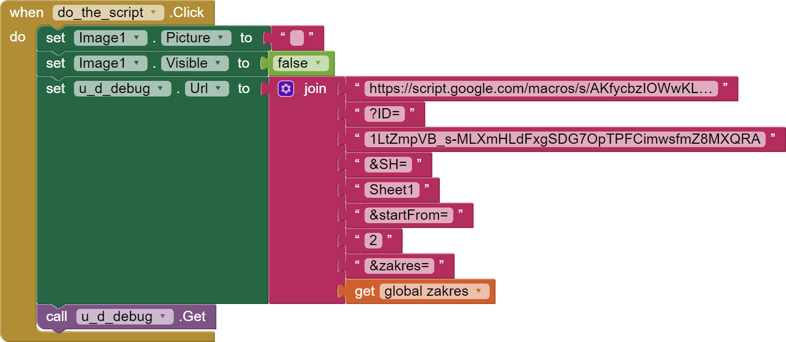
My simple test program consists of a textbox to enter a range, a set_range button to set the range, a button
do_the_script to execute the script and the show_chart button to display the chart.
The script works as follows.
Deletes existing records in google sheet (courses_month) (from the second row) and adds records to courses_month according to the given range from another sheet that contains all the courses. The script works very quickly and correctly. On the PC, I can see all the rows and the graph at once. My goal is to quickly display the same graph in the application that I see on the PC screen.
I don't want to create a new chart in the target application every time to get the Id of the chart because it takes a long time.
The idea in the test application is to display the published chart using the webviewer and the link below.
I got this link from a published chart.
The chart should be displayed after finishing the script or after pressing the show_chart button.
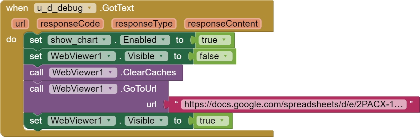
And here my problems start. Sometimes the chart for the given range appears immediately (even without pressing the show_chart button)
and corresponds to the graph I see on the PC screen and sometimes some previously made graph is displayed. Interestingly, although the address to webviewer is the same (!), I can see previously generated charts by pressing the show_chart button multiple times.I don't understand it at all !
How to clear (?) the list of published charts so that there is only one recently created and this one is displayed?
I tried it . As i said earlier I don't want to create a new chart in the target application every time to get the Id of the chart because it takes a long time.
What about the idea I described ? How t
clear a list of published charts ?
Dzięki TIMAI2. Z pierwszej podpowiedzi korzystam pobierając wykresy do aplikacji.
Nie chcę robić wykresów ( mam ich wiele ) od początku a jedynie poprawiać programowo te w których dane wychodzą poza zakres na osi pionowej. Skrypt działa poprawnie poprawiając ten zakres w takim przypadku. Nie mogę znaleźć własności która jest odpowiedzialna za pokazanie na wykresie osi pionowej i poziomej, które z nieznanego mi powodu znikają po wykonaniu skryptu. Podobnie jak we fragmencie skryptu
chart = chart.modify()
.setOption('vAxis.maxValue', newMax)
.setOption('vAxis.minValue', newMin)
.build();
sheet.updateChart(chart);
Moreover, the axis set manually on the chart, disappears after using a script that does nothing
chart = chart.modify()
.build();
sheet.updateChart(chart);
Why not just remove the current chart, and create a new one:
var charts = sheet.getCharts();

  for (var i in charts) {
    var chart = charts[i];
    sheet.removeChart(chart);
  }

var chart = sheet.newChart()
      .setChartType(Charts.ChartType.LINE)
...
or will this mess up the chart publishing...?
I have got this far, but still some configuration to do:
SCRIPT & DATA
function getData() {
  var ss = SpreadsheetApp.getActive();
  var sh = ss.getSheetByName('Sheet1');
  var lr = sh.getLastRow()+1;
  var charts = sh.getCharts();
  for (var i in charts) {
    var chart = charts[i];
    sh.removeChart(chart);
  }

  var chart = sh.newChart()
      .setChartType(Charts.ChartType.LINE)
      .setOption('backgroundColor','#dbffde')
      .setOption('pointShape','square')
      .setOption('pointSize',10)
      .setOption('width',1200)
      .setOption('height',600)
      .setOption('title', 'Kurs Euro')
      .setOption('hAxis.title', 'Data')
      .setOption('vAxis.title', 'Kurs Euro')
      .setOption('vAxis.minValue', 4.225)
      .setOption('vAxis.maxValue', 4.325)
      .setOption('hAxis.slantedText',true)
      .setOption('hAxis.slantedTextAngle',45)
      .setOption('hAxis.gridlines.count',lr)
      .setOption('series',{0:{dataLabel:'value'}})
      .addRange(sh.getRange("A2:B"+lr))
      .setPosition(2, 4, 0, 0)
      .build();


  sh.insertChart(chart);
}
[update] I have been playing around with options for building the chart, and also for outputting for user viewing. Still not quite caught up with you yet, but should be there soon...
and both of these will work in AI2 using the webviewer (directly if sheet and presentation are shared: "Anyone with the link", otherwise the user will need to sign in with their google account)
I have also not had any issues setting options with updateChart:
function updateChart() {
  var ss = SpreadsheetApp.getActive();
  var sh = ss.getSheetByName('Sheet1');
  var lr = sh.getLastRow()+1;
  var chart = sh.getCharts()[0];
  chart = chart.modify()
    .addRange(sh.getRange("A2:B"+lr))
    .setOption('vAxis.textStyle',{color:'black'})
    .setOption('hAxis.titleTextStyle',{color:'black'})
    .setOption('series',{0:{color:'royalblue'}})
    .setOption('series',{0:{annotations: {textStyle: {fontSize: 12, color: 'black' }}}})
    .setPosition(1,4,0,0)
    .build();
sh.updateChart(chart);
SpreadsheetApp.flush();
// Refresh the chart.
SlidesApp.openById("1nZiMh_2oD8EB_FppEl6r8j93wlYVp1YOKv7OG1vE").getSlides()[0].getSheetsCharts()[0].refresh();

}
Note: the Slides command at the bottom is to refresh the chart on the presentation. (Users would need to reload if viewing in a browser)