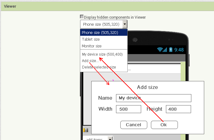
Ability to create custom sizes for the preview area
I suggest expanding the functionality of the preview area and adding the ability to create custom sizes as shown in the image below
Ability to create custom sizes for the preview area
I suggest expanding the functionality of the preview area and adding the ability to create custom sizes as shown in the image below
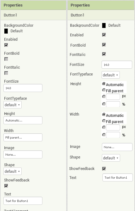
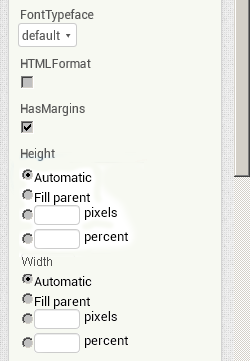
Height and Width property controls
Move the Height and Width property controls to the main panel and make the px and % input fields only for entering numbers. You can now enter characters in these fields that are not numbers.
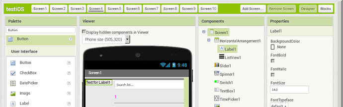
The names of the screens in a row
As far as I remember, there is a limit on the number of screens and it is impossible to change their names in a regular way. In this case, you can easily place them in a row, which will be more convenient for switching between them. In an extreme case, you can make the right-most tab with the screen name in the form of a list, where the names of screens that do not fit in the line will be located. The name of the active screen (Screen 4) is underlined, for example.
Hello actech
I see no value in being able to specify the size of your own device - most developers are defining Apps that will be used on more than one device. It’s good practice therefore to design a flexible GUI that will happily fit a range of device sizes well.
Your Apps are only for you? OK, what are you going to do when you buy a new phone? Rewrite all your Apps?
Sorry but your Screen Buttons idea is not, in my view, as good as we have now. Currently, just a glance tells you what screen you are working on - having a row of buttons makes it less obvious. In any case, that’s a waste of real estate that can be put to better purpose in the future for other features (such as Screen renaming).
Hello,
I’m talking about increasing the convenience of working. The preview area is not used for debugging applications for different devices, but for more convenient layout development. Unlike other solutions, App Inventor does not allow you to test apps on different devices at the same time, which is why it would be more convenient for users to have the preview area more closely match what they see on their particular device.
If it is possible to make working with the IDE more convenient with a little effort, then tell me the reason why you do not need to do this?
As for the names of screens in a row, there are no problems with determining which screen users are on if the tab with the active screen is highlighted in a noticeable way. For example, you can do this using the background, underscores only, and other methods. I’m sorry, I thought this point was obvious, but I will make a correction in my proposal to make it look more obvious.
Hotkeys for switching between the view editor and the block editor.
This may seem superfluous to some people, but experienced users and even more so programmers know that it is easier to use hot keys than the mouse pointer
Ability to delete components in the viewport by pressing the Del key
We can select components in the preview area and it is logical to delete the selected component without being asked to delete it. By holding down the Ctrl key, you can select several components in the preview area, and it was a good idea to be able to quickly delete them.
Controls in the properties panel in a row
This sentence may seem very strange, but I suggest that you remember Delphi and its Object Inspector, which was very simple and easy to work with, because it was designed for convenient operation.
Now the property names are located above the controls for entering a value, but if you place them on the left, you will win not only in terms of space occupied, but also in terms of usability, if you highlight the selection of the active element when it is selected with the mouse cursor or Tab key.
Some might say that App Inventor users who are not programmers do not need such improvements. Well, if you follow this logic, it is not necessary to improve computers, phones, cars, and everything else. We used to ride horses and didn’t know what a car was. There was Android 2, and now it would work on it, why improve something? It used to be DOS, but Windows was invented for some reason. And now the question is, do you choose to work in the DOS operating system or in Windows, Android 2 or Android 8?
Ability to create custom sizes for the preview area
It could lead to students trying to make pixel perfect layouts in the Designer - let's not forget the huge difference in resolution between computer monitors and small devices.
As I said, most developers are defining Apps that will be used on more than one device. It’s good practice to design a flexible GUI that will happily fit a range of device sizes well.
So, I see specifying the size of your own device (unless you have a giant hi-res monitor to work on) as detrimental rather than convenient.
names of screens in a row
You can and of course MIT will look at your suggestions - what about the real estate used? I'd rather the Backpack was on the toolbar......... as a rule of thumb, there has to be an an advantage over what we have now and no new disadvantages.
How things can be deleted is safeguarded because young and old have reported the inadvertent deletion of everything from a component to finished projects.
Hi Actech,
I like all your ideas. I also want the capability to do a multi-select in the designer and code windows.
When you spend 10 hours a day in AI2 development the milliseconds and seconds wasted in additional keystrokes add up a lot.
You’re right, students can try to make pixel perfect if they haven’t mastered the basics of computer science well enough, but I’m talking about something else.
First, mobile apps don’t have to be public, and in my case, I make them for myself. Why? Because if I need to make a public app, I will use Android Studio with all due respect to the App Inventor developers.
Secondly, tell me, are you satisfied with the situation when 5 buttons are displayed horizontally in the viewing area, and 7 buttons are displayed on the screen of the device used for the test? Personally, I prefer the situation when the viewport displays what I see on the device being tested with the highest possible accuracy, rather than what the viewport is able to display.
Third, the developers have placed a drop-down list with dimensions above the viewport. Why did they do this if the size of the preview area is unimportant? This means that they did it for something, and all I need is other sizes of these settings, which is exactly what I managed to do with the style script.
the developers have placed a drop-down list with dimensions above the viewport. Why did they do this
Given the way an App GUI is defined, why isn't this adequate? You are polishing the design of your GUI via the real device view of the Companion.
Anyway, keep your ideas flowing, your Topic is assigned to MIT.
The ability to cancel actions and the history of operations are the most important functions without which, as you correctly noticed, you can accidentally delete the entire screen. And there should be a warning when performing non-cancellable operations, but this does not mean that you need to do double or even triple protection against this, figuratively speaking. I know cases when from-for a carelessness of the user by means of the same operation removed operating systems on their computers without even reading the dialogue with a warning.
I understand that it is extremely difficult to create a browser-based IDE that is as easy to use as a text - based programming IDE, but it is possible to make it more convenient.
Simple example. On the right side of the panel, there are Designer and Blocks buttons for switching between the view editor and the block editor. If the browser window is made smaller than a certain size, then these buttons will be hidden outside the window and I will have to open the window to switch. But you can add a hotkey and then at any size of the window you can switch between editors. Will it be more convenient to work this way? Yes. To implement this function, you need to spend a lot of effort? No.
Improving the block editor
The block editor is a Blockly interface, so not everything can be fixed, but with the help of Stylish, I removed the controls I didn’t need and reduced the size of the backpack
Hi all,
Lots of good stuff here, but in order to keep the discussion somewhat linear I've grouped my responses into a single post.
The change that added monitor sizing also generalized the code internally for arbitrarily sized interfaces, and is the reason we have a dropdown now instead of a checkbox (previous UI). We just don't have an interface for adding custom entries yet.
As a counterpoint, I use the Web Developer extensions in Firefox and Chrome to code specific screen sizes so I can test what App Inventor looks like on different resolutions. Such a feature can be helpful if used wisely.
I agree that something can be done here. I'm not sure we want to have the controls shown all the time as it can clutter the UI, but I can imagine that we can attach the controls to the HTML and then allow their visibility to be controlled through CSS.
I think that it would be an interesting UX experiment to try this. Since we want to encourage people to "Don't Repeat Yourself," visually having more screens take up more space in the UI might encourage people to see an alternative approach (e.g., what do people think/feel as they fill up the space... "am I going to run out of screens to use?" vs infinite number hidden behind a dropdown). This also aligns with how many IDEs handle multiple windows/tabs. On the other hand, we also have a number of both production and experimental versions of App Inventor that use that space for other things, so I'm also weary of repurposing it.
Totally agree with this one. The trick is picking values that will work across platforms and UI changes. We're also planning an experimental version where both designer and blocks are visible to make use of larger screen real estate, in which case this might be moot.
This appears to be a regression. If you click on the component in the structure tree and hit delete it will prompt you to see if you want to delete it (at least on macOS). However, if I click on the component directly in the designer it does not work. I've filed an issue.
I'm not convinced that this is a net win. There are plenty of screens that are also horizontally challenged and I find the scrolling up/down to be preferable to scrolling left/right, mostly because every touch pad and mouse supports up/down scrolling but not necessarily left/right scrolling. I think this one will come down more to a personal preference. It would also make for another nice UI/UX experience. I imagine with the right CSS classes we could make it so that you could customize this.
Note that there's "Hide Workspace Controls" that will hide all of the workspace controls if you don't actually need them.
We did add this a few months ago for the designer. There are some issues with it that we're working to address. Since this is not something supported by Blockly, I'm not sure it's something we'd want to necessarily tack on to the blocks editor. It seems like a lot of work to develop and maintain that feature for a small set of users. Generally if you find yourself changing a lot of properties in code, it might be a place to consider introducing an abstraction.
Thank you, Evan, for the detailed response to the suggestions. I understood the situation.
Height and Width property controls and Controls in the properties panel in a row
I decided to make a small example to compare the options. What do you think about this?
You are right, some interface settings can be made in the form of options, and the ability to change the interface using styles would be quite good. As an example, I will give an article on changing the Thunkable X interface http://droidscript.ru/main/statyi/thunkablex_stylish.php.
In my opinion it will just take up more space, the usual design is better
Do you think that a more user-friendly interface is one that takes up less space on the screen and for this reason the proposed interface is worse? That is, you are quite satisfied that you need to do extra mouse clicks to set the Height and Width properties, for example?