Yes, in my opinion it would be unnecessary and exhausting to ask each time what size of each component you add, most times I do not even set the size for components like a layout button label and more …
Let’s clarify the situation. In the example to the right, there are no requests. All elements of this panel are simply visible and set to auto by default. If you follow your logic, then almost all the controls for the screen should be hidden, because I don’t use them, but you understand that this will be inconvenient for everyone else. The solution? To make the interface customizable. Those who don’t want to change the dimensions will turn them off, and those who want to turn them on.
If we talk about the occupied area, the example on the right takes up less space compared to the example on the left. But then I don’t understand why you say the example on the left takes up less space?
I saw information that around April, developers will look at making the interface more user-friendly. This is the right decision. Now I look at the App Inventor interface and see some things that can confuse users, especially beginners.
-
The menu for selecting the interface language is more logical to move to the Settings menu, because this is a setting, and not a separate super important function
-
The My Projects Option appears on the control panel as many as 3 times and the question arises, how do they differ from each other? Maybe for popular commands, make a separate panel under the main panel, as they do in desktop development, so as not to duplicate commands.
-
On the My Projects page, I can select one project and publish it in the gallery, but why are the options in the Build menu not available and you need to open the project to use them?
-
Export selected project. Can we add the ability to save several selected projects?
-
Add a panel for quick access commands. Now the View Trash command is duplicated separately, but from my experience I can say that for me it would be much more important to use the AI Companion command, because there is a constant loss of communication. For this reason, I am currently using an emulator or a USB connection. But someone else can say, and for me, the Save apk command is more important. For this reason, toolbars are made customizable in desktop IDE.
This is more of a historical artifact mainly because the Settings menu is a much more recent addition. The language switcher has been around for years. I do think that it's useful to have the language be its own thing for younger folks who might not know the English word Settings and its implications, but might recognize the word "English" and know that it likely implies a place to switch the language. Over the past 30 days, about 77.6% of our users used App Inventor in English.
One of the philosophies of App Inventor as a visual programming tool is that functionality should be more visible, which sort of clashes with the menu driven UIs that a lot of people are used to. This is the result. I think we'll revisit this in the UI refresh, but what exactly we'll do remains to be seen until we can also do some user acceptance testing.
The technical reason is that the code generation is done in the browser and we don't load the files for a project until it's opened. It would be possible to make this a feature, but it will require a nontrivial amount of work to make it happen as there is some tight coupling between the language model and UI that needs to be untangled first.
This seems like it would be a good project for someone to work on. I've filed an issue on GitHub.
We'll need to think about this one. I'm hesitant to add more UI that can be individually customized without a good generic model for it throughout the App Inventor code base. On the other hand, maybe this could be addressed by adding the ability to have hotkeys, e.g., ctrl+shift+B for build?
4 Likes
Thank you, Evan, for your comments.
As for hotkeys, we have already said that it is a good solution if they are assigned to frequently used operations, because this does not require changing the interface, unlike the new panel, as you correctly noticed.
I understand that App Inventor is used by a lot of people and any editing of the interface, as in chess, should not worsen the current position.
1 Like
Hi Evan,
I like to have hot keys assigned to the [Design] and [Blocks] buttons and I suggest that the these two buttons should be moved to the left side of the same bar after the project name and before the [Screen1] buttons.
Thanks
Hi, thanks to Evan I was able to expand the functionality of the App Inventor IDE
Hot keys assigned to the [Design] and [Blocks] buttons
For different browsers, there are various extensions (Greasemonkey, etc.) that you can use to create your own scripts and styles that will be automatically loaded for the pages of the domain specified in the scripts. This allows you to change the appearance and functionality of pages uploaded to the browser. In our case, this allows users to extend the functionality of the App Inventor IDE, for example, by adding the ability to use hotkeys to switch to the block and view editor, as well as execute other commands.
Below is a script for Greasemonkey, with which can do this by pressing the combination Alt+1 or Atl+2 (meta+1 or meta+2).
// ==UserScript==
// @name     App Inventor
// @version  1
// @grant    none
// ==/UserScript==
//@include http://ai2.appinventor.mit.edu/

let eventList = [];
eventList["AltDigit1"] = 'openDesignEditor';
eventList["AltDigit2"] = 'openBlockEditor';

function openBlockEditor(){

  let _targetList = document.querySelectorAll('.ode-TextButton.ode-TextButton-up');

  for (let _i of _targetList){

    if (_i.textContent == "Blocks"){

      ['mouseover', 'mousedown', 'mouseup'].forEach(action => _i.dispatchEvent(new MouseEvent(action)));
      break;
    }
  }
}

function openDesignEditor(){

  let _targetList = document.querySelectorAll('.ode-TextButton.ode-TextButton-up');

  for (let _i of _targetList){

    if (_i.textContent == "Designer"){

      ['mouseover', 'mousedown', 'mouseup'].forEach(action => _i.dispatchEvent(new MouseEvent(action)));
      break;
    }
  }
}

document.addEventListener('keydown', function(event) {

  let _key = "";

  if (event.altKey || event.metaKey){
    _key += "Alt";
  }

  _key += event.code;

  eval(eventList[_key])();
});Using the Stylish plugin and Greasemonkey I managed to solve the following problems:
-
Move the Designer and Block buttons in front of the screen selection button and make hotkeys for them
-
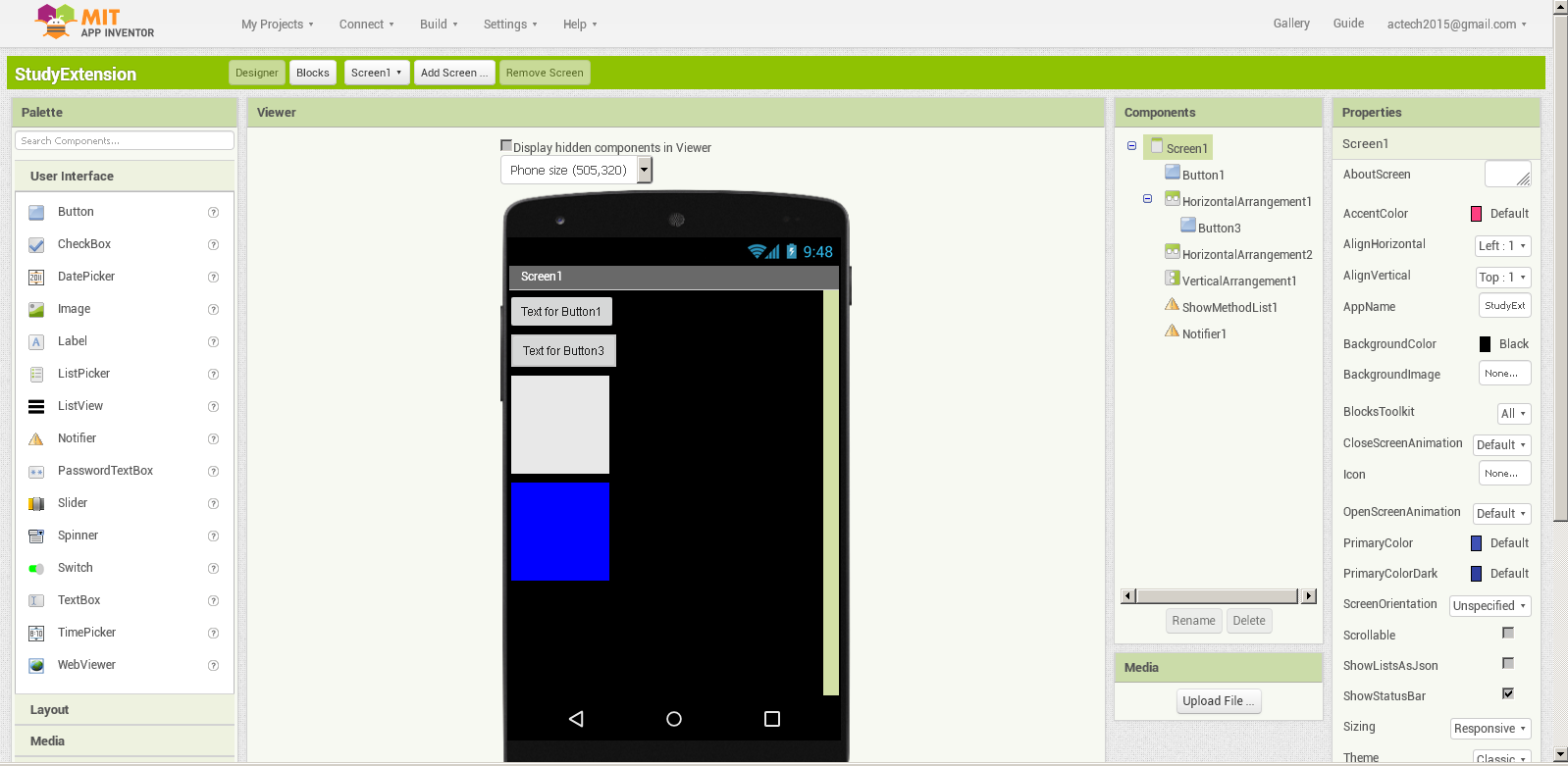
Change the properties panel for more convenient operation. Evan, if you plan to change the layout of the properties panel, please leave this layout as a pair of “property name - control” as it exists now. This excellent markup makes it easy to arrange them in a row. This is a great advantage and convenience in operation, which is not available in other browser development environments.
-
Quickly delete project components without prompting by pressing the Del key in the view editor
-
Control the visibility of the block palette in the block editor to hide it and expand the block editing area to the full width of the browser window.


2 Likes
This design will be less suitable for small screens, especially if viewed in tablet mode.
Chris, i think the actech is trying to say that when you design full page for your or other device you have keep waiting for the emulator or the device to refresh (and crash in the meantime) before you realize that you have move a button 2% up. We all experience the problem where you layout full page and only 1/4 is on the app inventor webpage, you then have to start shifting the visibility etc and blindly work.
don`t forget that this is a kiddy platform, all starters comes here to get the feeling. Pros use stuff like Android studio etc where the layout preview is always full page.
1 Like
I actually reduced the browser size in order to reduce the weight of the image file. In my original image, it was important to pay attention to the design of the properties panel. To eliminate misunderstandings, I give a full interface. As you can see, nothing has changed, and there is plenty of space for viewing.