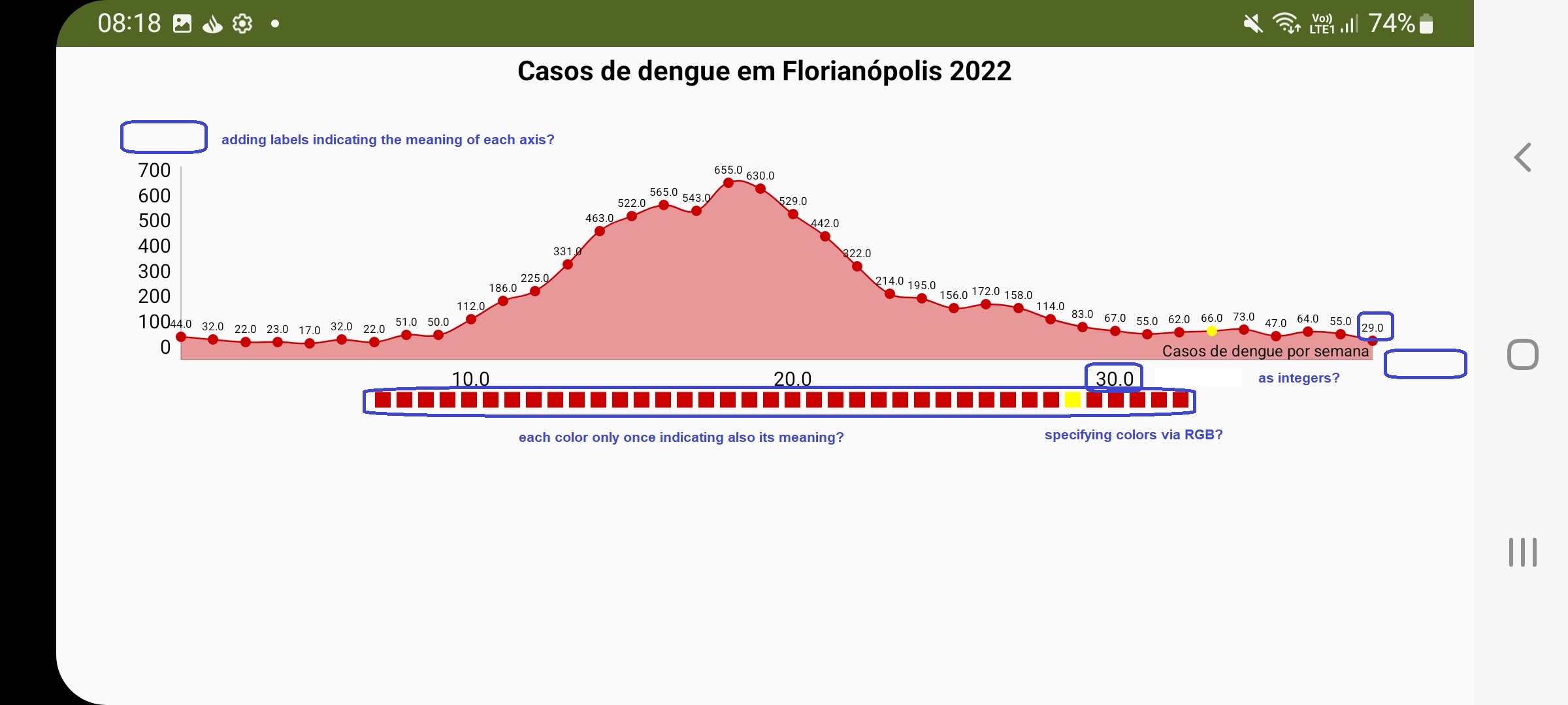
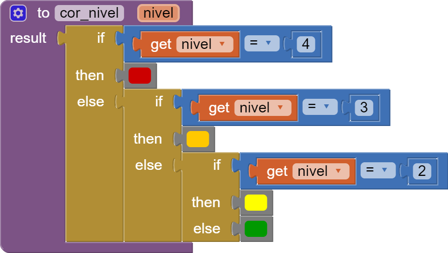
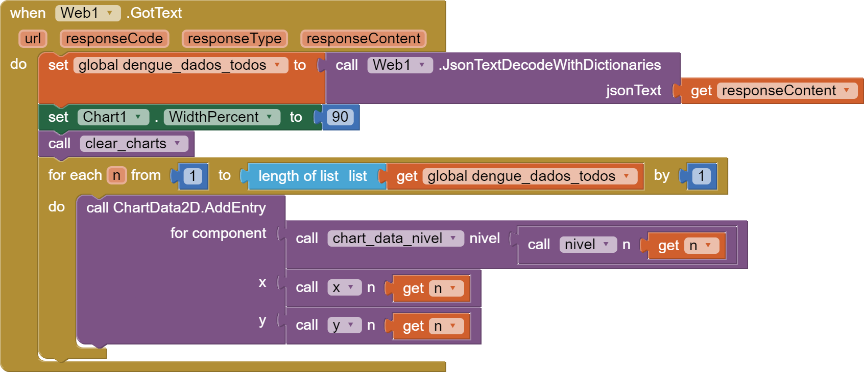
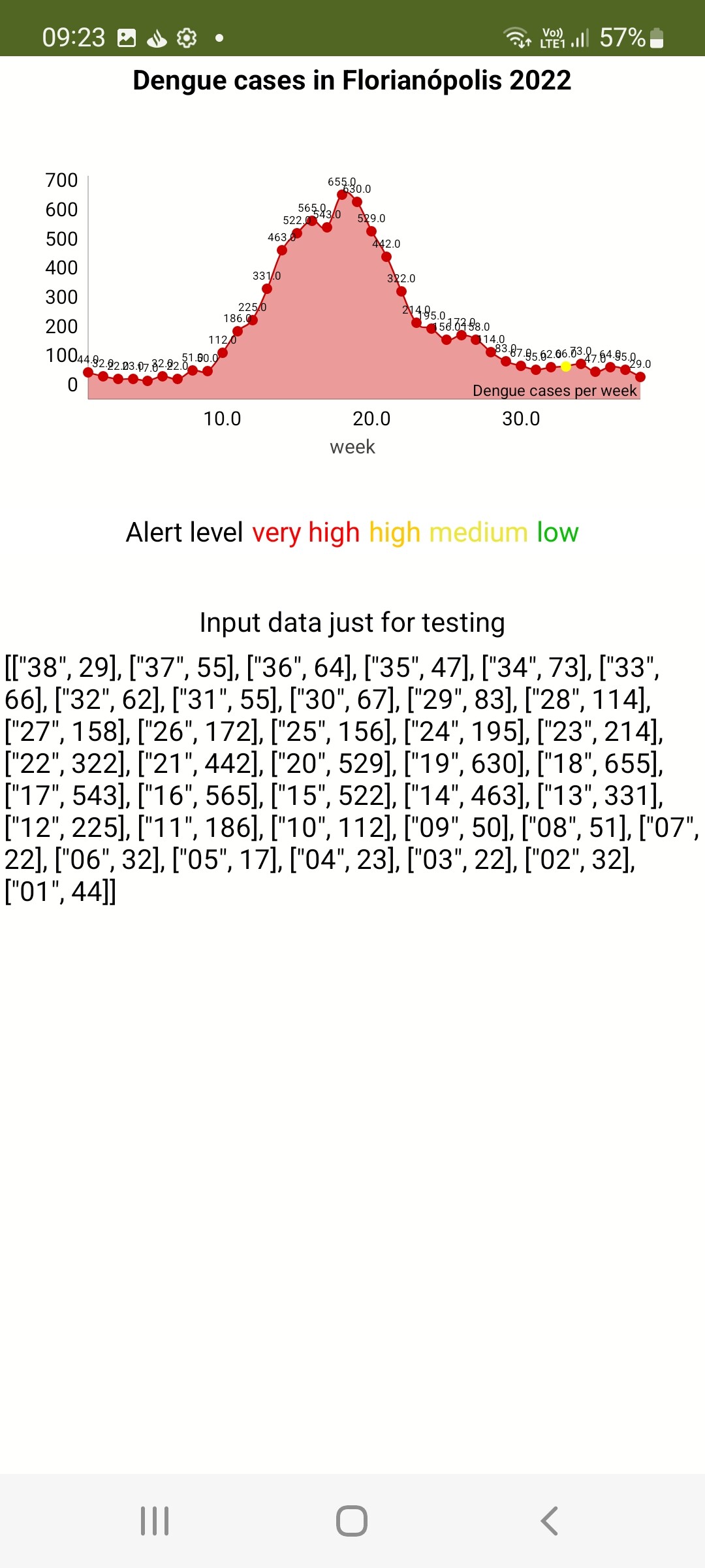
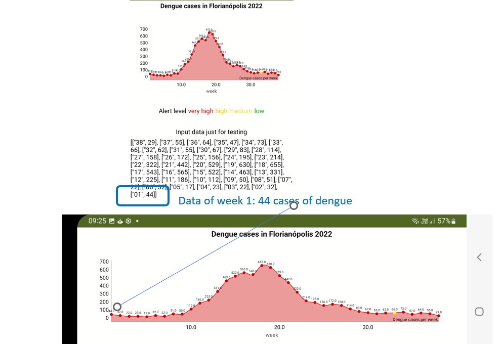
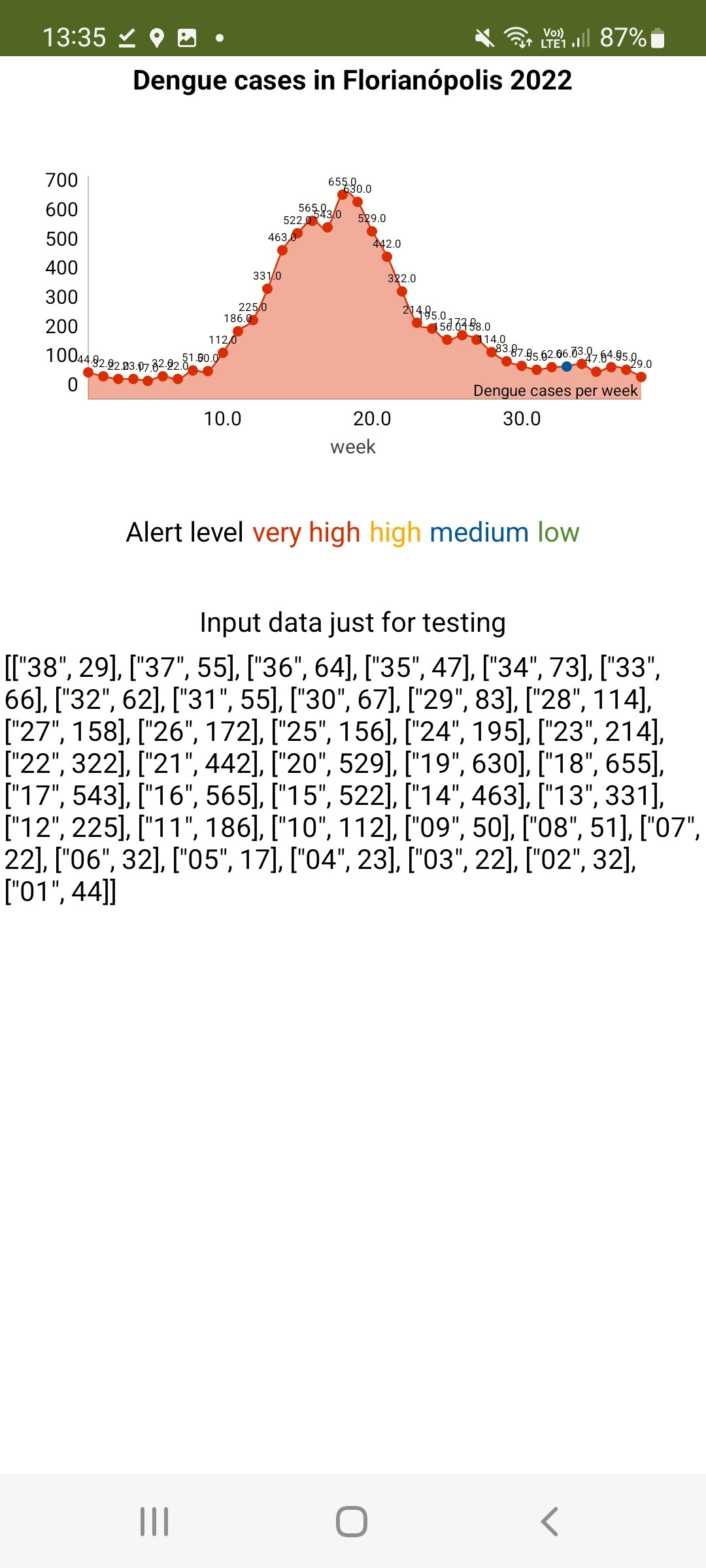
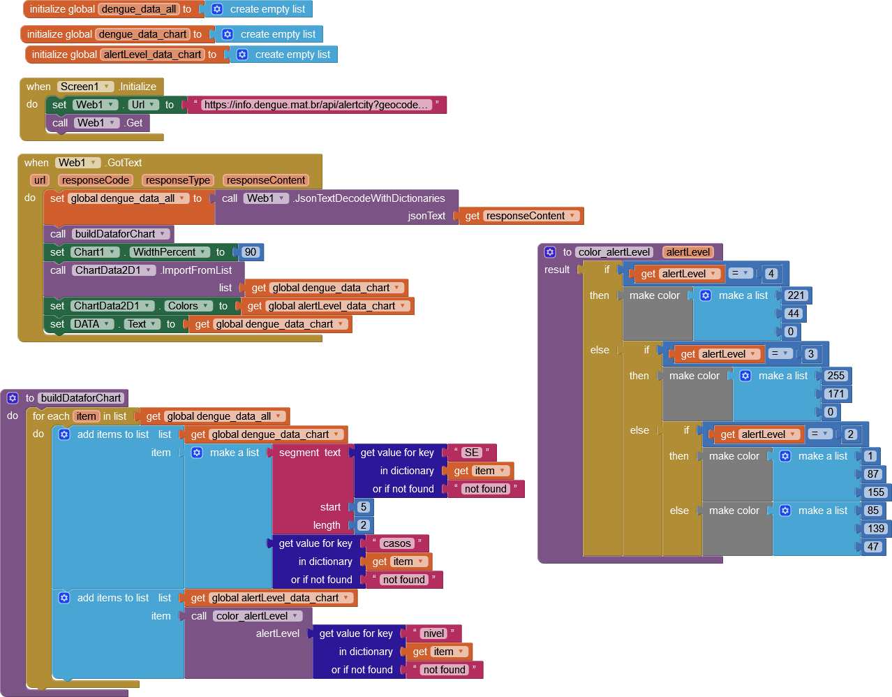
I am checking out the new charts components plotting the number of dengue cases per week, using as colors for the circles the alert level (level 1 – green, level 2 – yellow, level 3 – orange, level 4 – red).
Is it possible to indicate labels for the x and y axis?
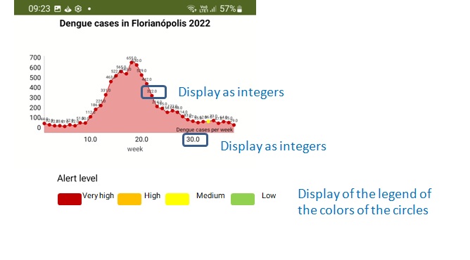
My input are integer numbers, yet they are displayed as decimals?
Trying to add a legend indicating the meaning of the colors, the colors are repeated for each datapoint. Is it possible to limit this to a specific set of items? How to add their meaning to be displayed?
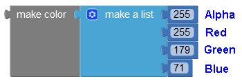
Trying to use customized colors (not the ones of the preset color blocks) by specifying them via RGB (using the RGB color block) the app crashes (when testing with the companion).
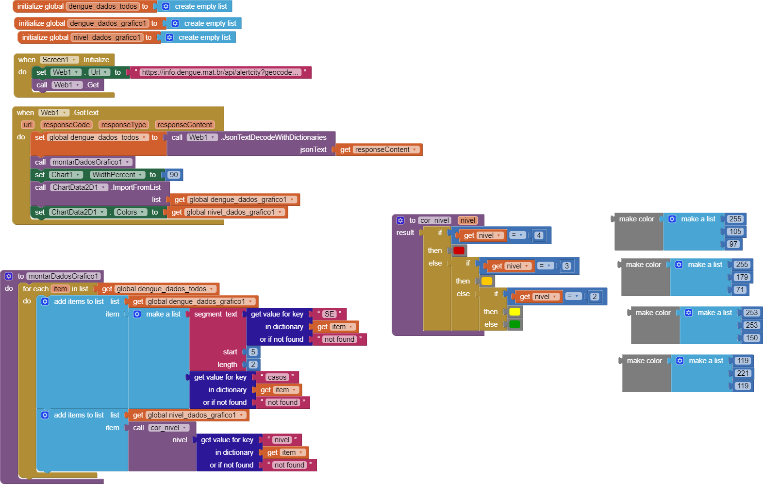
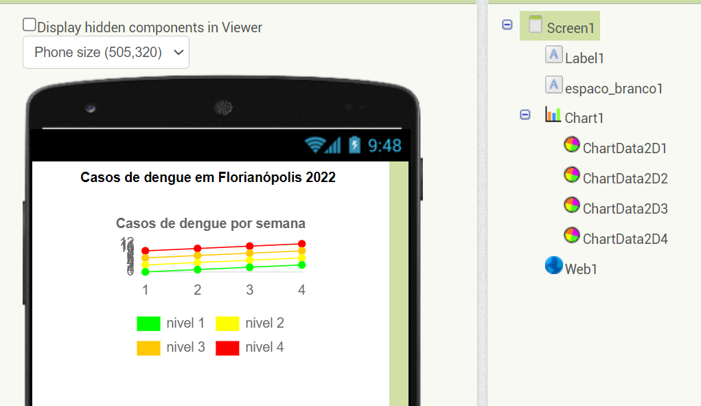
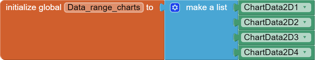
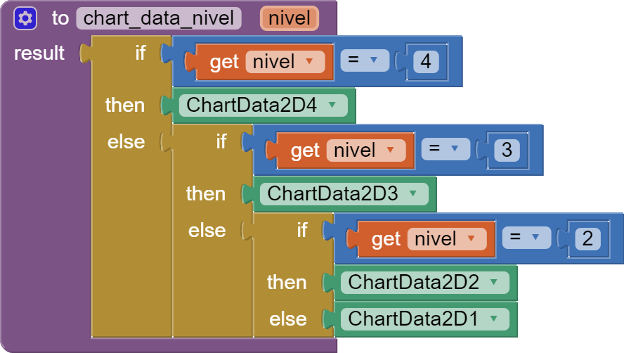
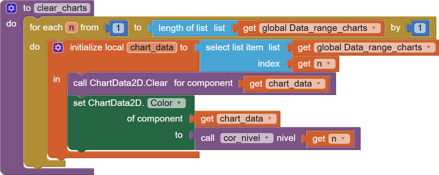
You might be able to do this by using 4 ChartData components, one per danger level, and sending the different data points (week number, case count) into the ChartData component for that range (0-200, 201-400, 401-600, 601+).
Assign a different color to each ChartData, and Label it by its range.
Plot all 4 ChartDatas in the same Chart.
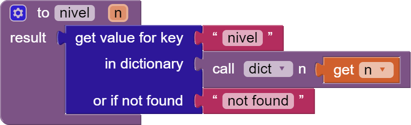
I studied your code, and I see that you are coloring each point by nivel, (whatever that is.)
Most of your nivel values are in the red (4).
Here my take on your graph, based on nivel 1-4: chart2_dengue.aia (8.5 KB)
@ewpatton This definitely needs more work to allow/disallow decimal points (as with the bottom axis numbers)
The chart will not accept the colour numbers generated by the make colour block. I could work around it by setting the colour to a label, then getting the label colour. This needs fixing.
Putting the chart inside an arrangement, then adding labels can provide for this. This needs fixing.
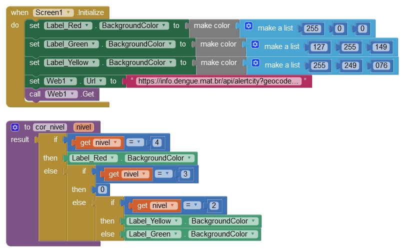
I built one manually using labels to show the colours and the definitions. Would be nice to divorce the "line" from the "points".
Thanks a lot for your suggestions! I will try them to adjust the chart as much as possible. Most probably the only remaining issue will be the display of decimal numbers only.
However, although it does not crash, it does not display the colour either
EDIT: The list has to consist of more than one colour entry. A single colour can be defined as an integer. However, most of the Universe uses RGBA integers. For example -16776961 is an RGBA red. If I swap the last value (Alpha) and put it in the front: -61167769 the result is a green, so obviously the integer formula is different (or the Chart is at fault). I will see what I can find.
TimAI2 has already discovered that you can set the background colour of a label (RGB or RGBA) and then set the chart colour to the label Background colour:
That is an oversight in the design of the Chart Module unfortunately.
I notice also that, your data values are plotted right-to-left, starting with 29, ending with 44, in accordance with your data - but should that be left-to-right?
Hi, I wasn't thinking of something so fancy - rather just adjusting the issue of decimals and maybe an aesthetic more beautiful way of displaying the legend of the meaning of the colors of the circles of the line chart as for example like this:
I do not think this is possible in this release, but it would be a good thing for us to add in a future release.
Currently, for most chart types the X value is automatically coerced to a double value internally, which is why you end up with the decimal point. We probably would want a few different formatting options here given that the X values could be integers, doubles, or timestamps.
It's interesting that the legend is doing that with a single data series. The legend feature here was more intended for when there is more than one data series and you need to differentiate between them. I'm not sure how we can best handle this right now.
I investigated this and the issue is that the make a color block is returning a positive long value to be stored in the list rather than a negative int value. I've come up with a patch in the Colors property to work around, but you could also just subtract power(2, 32) from each of the colors to get the right integer value. The color blocks output the "correct" values but since the property wants something in [-231, 231 - 1], it rejects all values and this causes an index out of bounds error during rendering.