🧩 SlideUnlock
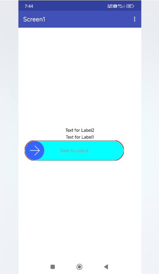
An extension for MIT App Inventor 2.This component allows users to implement a slide-to-unlock feature in their App Inventor projects. It provides a customizable interface for users to unlock their app or access a specific feature by sliding a button from one end to the other. The component includes various properties to personalize the appearance and behavior of the slide-to-unlock mechanism, such as background color, stroke color, slide background color, button color, and more. Additionally, it offers options to enable or disable features like vibration, sound, and button auto-rotation. This component is designed to enhance the user experience and provide an intuitive way to interact with the app.
Telegram | GitHub
BuyMeaCoffee | YouTube
Find More Extension
Terms & Conditions
 Specifications
 Package: io.th.slideunlock
 Size: 22.08 KB
 Version: 1.0
 Minimum API Level: 21
 Updated On: 2025-06-04T18:30:00Z
 Built & documented using: FAST v2.8.4
 Library UsedOn SlideUnlockView Thanks zjun615 for this awesome Library.
 Buy Aix Price: 2
 here
here
UPI 170Rs.
 Find More Extensions On:BuyMeaCoffeePages
Get Free Version here
Find more info On GitHub
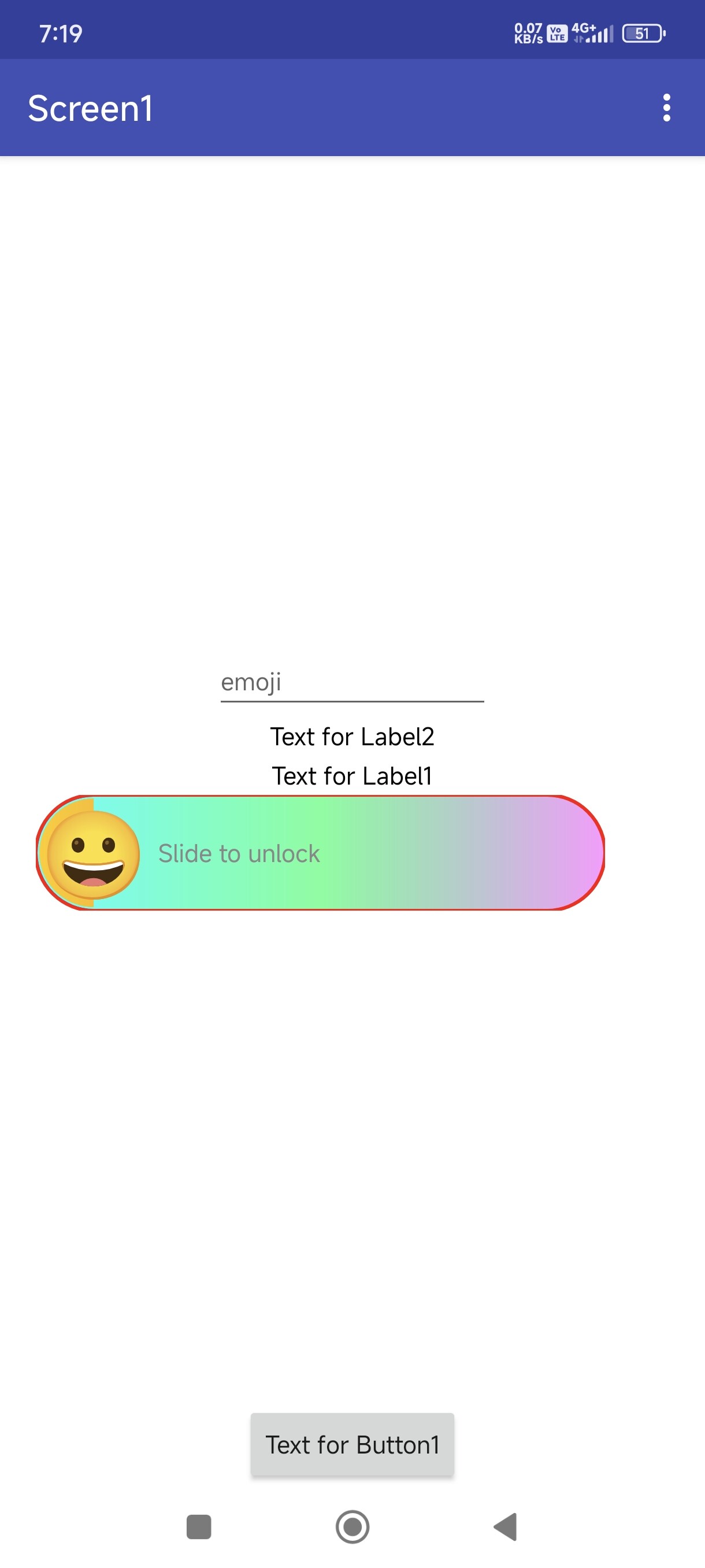
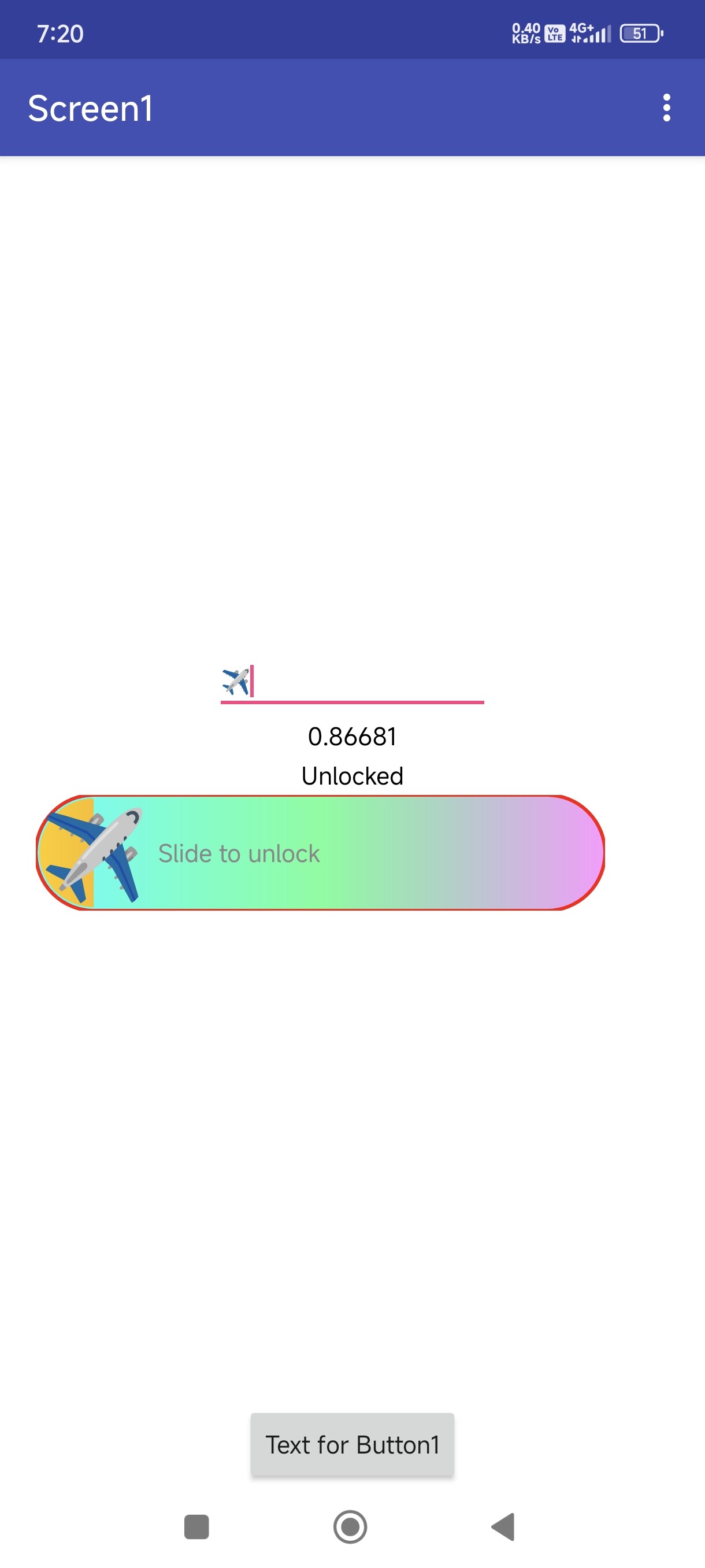
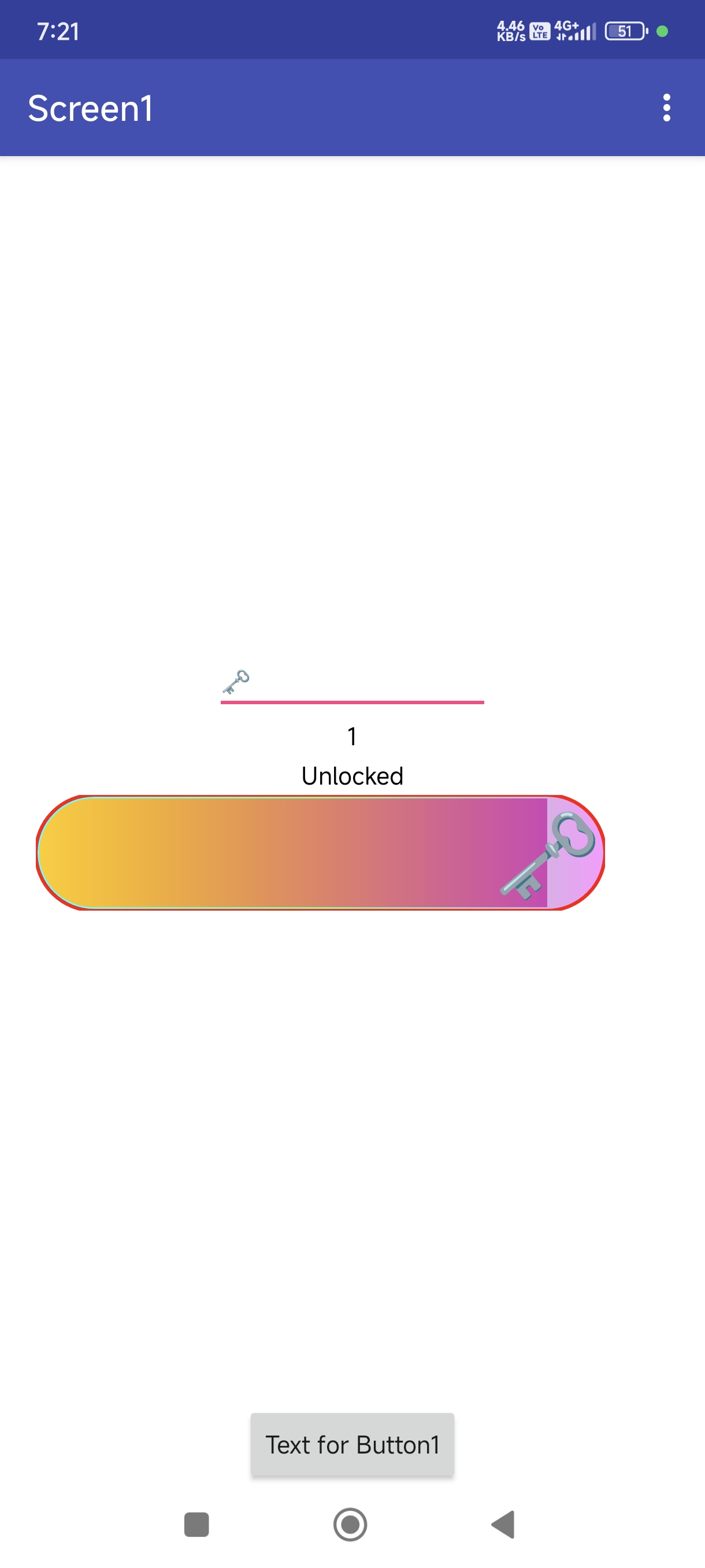
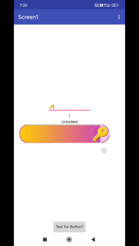
Demo
Blocks
Events:
SlideUnlock has total 4 events.
Unlocked
Event raised when the user successfully slides to unlock
SlideProgress
Event raised when the slide progress changes
| Parameter | Type |
|---|---|
| progress | number |
SlideStart
Event raised when the user starts sliding
SlideEnd
Event raised when the user ends sliding
Methods:
SlideUnlock has total 11 methods.
Create
Initialize the slide unlock view inside an arrangement
| Parameter | Type |
|---|---|
| arrangement | component |
GradientBackground2
Set gradient background with two colors
| Parameter | Type |
|---|---|
| color1 | number |
| color2 | number |
GradientBackground3
Set gradient background with three colors
| Parameter | Type |
|---|---|
| color1 | number |
| color2 | number |
| color3 | number |
GradientBackground4
Set gradient background with four colors
| Parameter | Type |
|---|---|
| color1 | number |
| color2 | number |
| color3 | number |
| color4 | number |
SlideGradientBackground2
Set slide area gradient with two colors
| Parameter | Type |
|---|---|
| color1 | number |
| color2 | number |
SlideGradientBackground3
Set slide area gradient with three colors
| Parameter | Type |
|---|---|
| color1 | number |
| color2 | number |
| color3 | number |
SlideGradientBackground4
Set slide area gradient with four colors
| Parameter | Type |
|---|---|
| color1 | number |
| color2 | number |
| color3 | number |
| color4 | number |
ClearGradientBackground
Clear gradient background
ClearSlideGradientBackground
Clear slide area gradient background
ShowEmoji
Shows an emoji at the specified position
| Parameter | Type |
|---|---|
| emoji | text |
| x | number |
| y | number |
ShowDefaultButton
Shows the default button shape
Designer:
SlideUnlock has total 4 designer properties.
EmojiText
- Input type:
string - Default value:
😀
EmojiTextSize
- Input type:
float - Default value:
100.0
EmojiHasBackground
- Input type:
boolean - Default value:
true
EmojiBackgroundColor
- Input type:
color - Default value:
&HFFFFFFFF
Setters:
SlideUnlock has total 22 setter properties.
FixedWidth
Set the fixed width in pixels
- Input type:
number
FixedHeight
Set the fixed height in pixels
- Input type:
number
WidthPercent
Set the width as percentage of parent (0-100)
- Input type:
number
HeightPercent
Set the height as percentage of parent (0-100)
- Input type:
number
Tips
Set the text to display on the slide unlock view
- Input type:
text
BackgroundColor
Set the background color
- Input type:
number
StrokeColor
Set the stroke color
- Input type:
number
SlideBackgroundColor
Set the slide background color
- Input type:
number
ButtonColor
Set the button color
- Input type:
number
TipsColor
Set the tips text color
- Input type:
number
BackAnimationEnabled
Enable or disable the back animation
- Input type:
boolean
BackAnimationDuration
Set the back animation duration in milliseconds
- Input type:
number
ButtonAutoRotate
Enable or disable button auto-rotation on slide
- Input type:
boolean
ButtonSize
Set the button size multiplier (0.5 to 2.0)
- Input type:
number
ArrowSize
Set the arrow size multiplier (0.5 to 2.0)
- Input type:
number
ButtonShape
Set the button shape (0: Circle, 1: Square, 2: Rounded Square)
- Input type:
number
VibrationEnabled
Enable or disable vibration feedback
- Input type:
boolean
SoundEnabled
Enable or disable sound feedback
- Input type:
boolean
EmojiText
Sets the emoji character to display
- Input type:
text
EmojiTextSize
Sets the emoji text size
- Input type:
number
EmojiHasBackground
Sets whether the emoji has a background
- Input type:
boolean
EmojiBackgroundColor
Sets the emoji background color
- Input type:
number
Getters:
SlideUnlock has total 22 getter properties.
FixedWidth
Set the fixed width in pixels
- Return type:
number
FixedHeight
Set the fixed height in pixels
- Return type:
number
WidthPercent
Set the width as percentage of parent (0-100)
- Return type:
number
HeightPercent
Set the height as percentage of parent (0-100)
- Return type:
number
Tips
Set the text to display on the slide unlock view
- Return type:
text
BackgroundColor
Set the background color
- Return type:
number
StrokeColor
Set the stroke color
- Return type:
number
SlideBackgroundColor
Set the slide background color
- Return type:
number
ButtonColor
Set the button color
- Return type:
number
TipsColor
Set the tips text color
- Return type:
number
BackAnimationEnabled
Enable or disable the back animation
- Return type:
boolean
BackAnimationDuration
Set the back animation duration in milliseconds
- Return type:
number
ButtonAutoRotate
Enable or disable button auto-rotation on slide
- Return type:
boolean
ButtonSize
Set the button size multiplier (0.5 to 2.0)
- Return type:
number
ArrowSize
Set the arrow size multiplier (0.5 to 2.0)
- Return type:
number
ButtonShape
Set the button shape (0: Circle, 1: Square, 2: Rounded Square)
- Return type:
number
VibrationEnabled
Enable or disable vibration feedback
- Return type:
boolean
SoundEnabled
Enable or disable sound feedback
- Return type:
boolean
EmojiText
Sets the emoji character to display
- Return type:
text
EmojiTextSize
Sets the emoji text size
- Return type:
number
EmojiHasBackground
Sets whether the emoji has a background
- Return type:
boolean
EmojiBackgroundColor
Sets the emoji background color
- Return type:
number
Thank
Feel free to contact us any quarry or suggestions.