🧩 SlideToAct
An extension for MIT App Inventor 2.This component is developed by TechHamara using Fast, a powerful tool for creating Ai2 extensions. It provides a user-friendly interface for sliding actions, allowing users to easily interact with your app.
Telegram | GitHub
BuyMeaCoffee | YouTube
Find More Extension
Terms & Conditions
 Specifications
 Package: io.th.slidetoact
 Size: 21.85 KB
 Version: 1.0
 Minimum API Level: 7
 Updated On: 2025-06-09T18:30:00Z
 Built & documented using: FAST v2.8.4
 Library Used On slidetoact Thanks Applib-HarmonyOS for this awesome library.
 Get aix/aia/apk here
 Find more info On GitHub
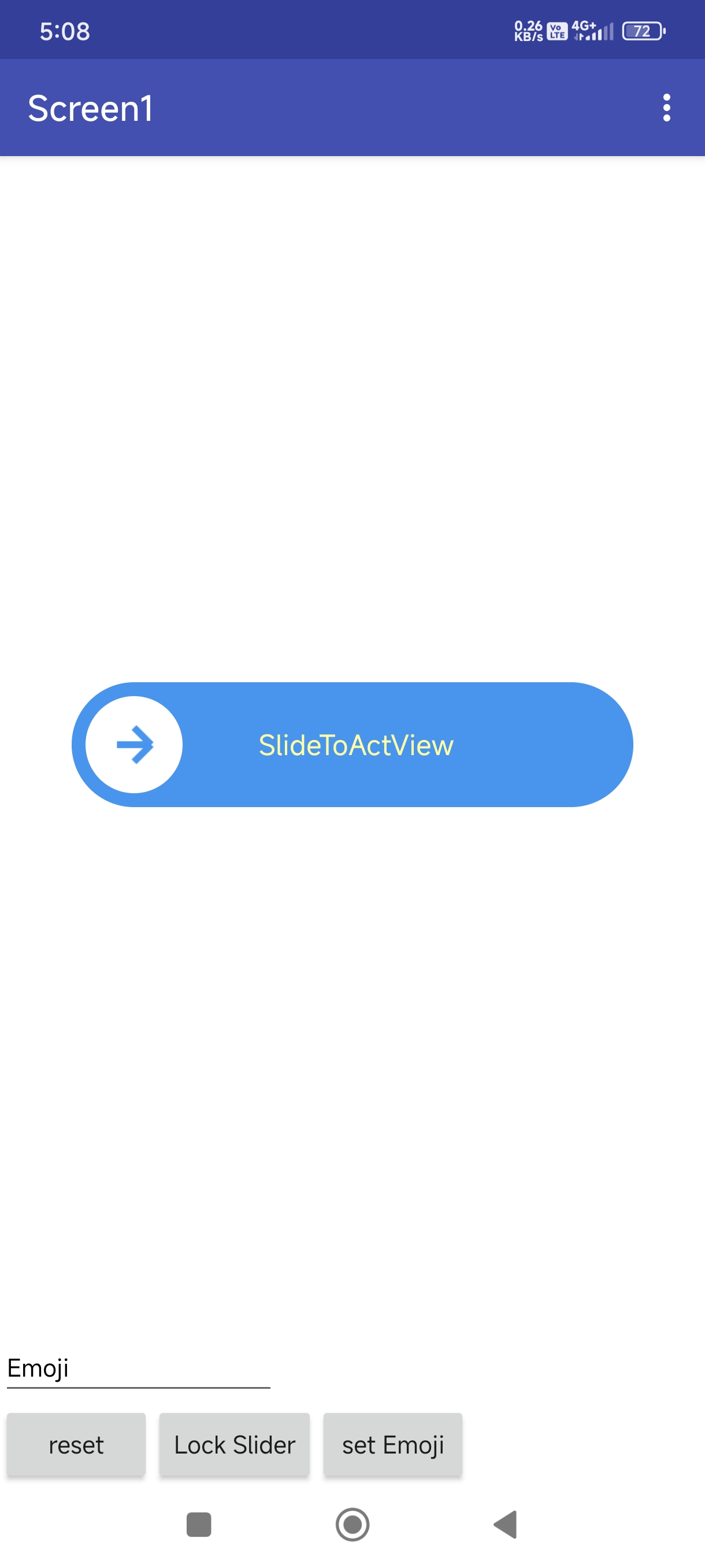
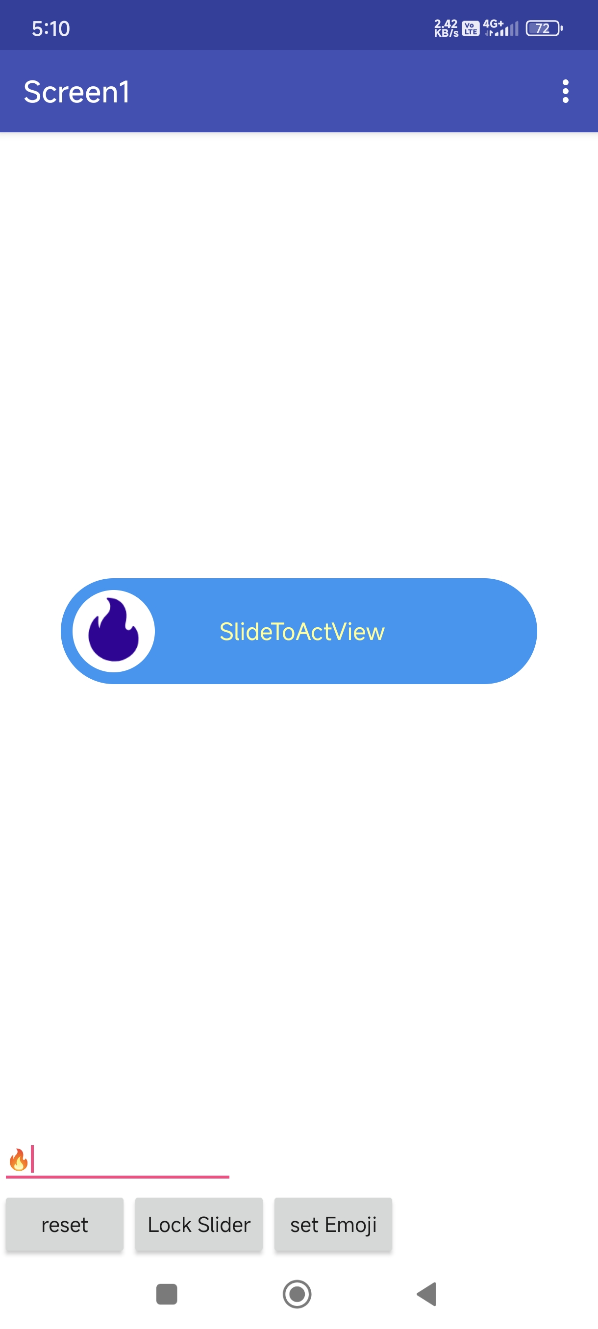
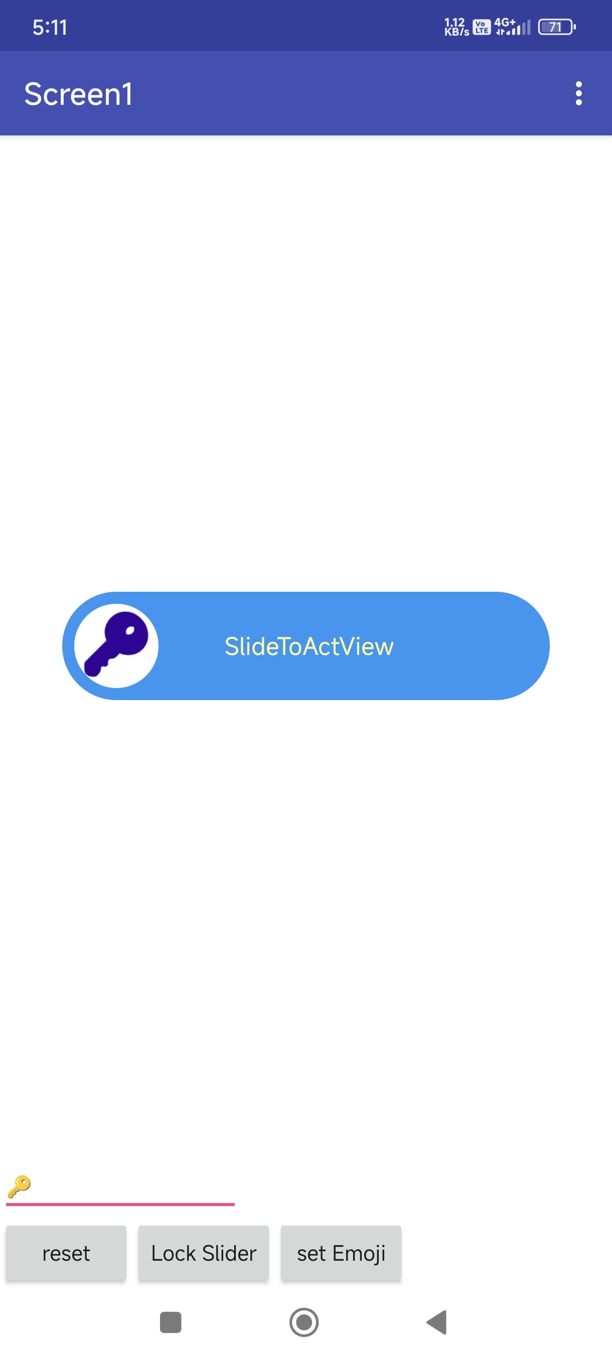
Demo
Blocks
Documentation
Events:
SlideToAct has total 7 events.
SlideCompleted
Event raised when the slider is completed
SlideReset
Event raised when the slider is reset
SlideFailed
Event raised when the user fails to slide properly
| Parameter | Type |
|---|---|
| isOutside | boolean |
SlideAnimationStarted
Event raised when the slide animation starts
| Parameter | Type |
|---|---|
| threshold | number |
SlideAnimationEnded
Event raised when the slide animation ends
ResetAnimationStarted
Event raised when the reset animation starts
ResetAnimationEnded
Event raised when the reset animation ends
Methods:
SlideToAct has total 5 methods.
Initialize
Initialize inside an arrangement.
| Parameter | Type |
|---|---|
| arrangement | component |
EmojiIcon
Set an emoji as the slider icon
| Parameter | Type |
|---|---|
| emoji | text |
ArrowIcon
Set the default arrow icon
Reset
Reset the slider to its initial position
IsCompleted
Check if the slider is completed
- Return type:
boolean
Setters:
SlideToAct has total 13 setter properties.
TextSize
Set the text size
- Input type:
number
AreaMargin
Set the area margin
- Input type:
number
IconMargin
Set the icon margin
- Input type:
number
Text
Set the text to display on the slider
- Input type:
text
TextColor
Set the text color
- Input type:
number
OuterColor
Set the outer color
- Input type:
number
InnerColor
Set the inner color
- Input type:
number
IconColor
Set the icon color
- Input type:
number
Locked
Set whether the slider is locked
- Input type:
boolean
Reversed
Set whether the slider is reversed
- Input type:
boolean
RotateIcon
Set whether to rotate the icon
- Input type:
boolean
AnimateCompletion
Set whether to animate completion
- Input type:
boolean
AnimationDuration
Set the animation duration in milliseconds
- Input type:
number
Getters:
SlideToAct has total 9 getter properties.
TextSize
Set the text size
- Return type:
number
AreaMargin
Set the area margin
- Return type:
number
IconMargin
Set the icon margin
- Return type:
number
Text
Set the text to display on the slider
- Return type:
text
Locked
Set whether the slider is locked
- Return type:
boolean
Reversed
Set whether the slider is reversed
- Return type:
boolean
RotateIcon
Set whether to rotate the icon
- Return type:
boolean
AnimateCompletion
Set whether to animate completion
- Return type:
boolean
AnimationDuration
Set the animation duration in milliseconds
- Return type:
number
Thank
Feel free to contact us any quarry or suggestions.