![]() Introuduction
Introuduction
![]() DIFFICULTY:
DIFFICULTY: ![]()
![]()
![]()
![]()
![]()
![]() (6/10)
(6/10)
![]() Releast date: 2022-03-13T02:00:00Z
Releast date: 2022-03-13T02:00:00Z
This guide took me 3 entire days to make. I hope it saved some of your time!
In this guide, we will create bar or line charts without any extensions, with the QuickChart API. QuickChart API is a web API provider that helps people generate charts. Since this is an API, this will, along with a lot of chart extensions, require active internet connection. The app will be able to generate both bar or line charts.
Before you start this guide, take 5 minutes to look at their documentation and website so that you have some understanding about what we are going to do next.
This is a free API that does not require API keys. Have fun!
I am still finding ways to enhance this tutorial.
-
adding titles, descriptions for x-axis and y-axis (for bars and lines).
-
customizing the colors of the bars/lines.
-
adding pie chart features (note: this should be similar to this.)
![]() DISCLAIMER: Please beware, this application requires internet connection, so this is not a total replacement for extensions that work offline.
DISCLAIMER: Please beware, this application requires internet connection, so this is not a total replacement for extensions that work offline.
![]() Step 1. Going Over The Concepts.
Step 1. Going Over The Concepts.
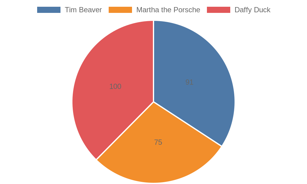
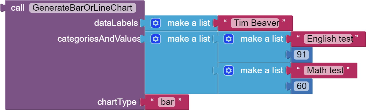
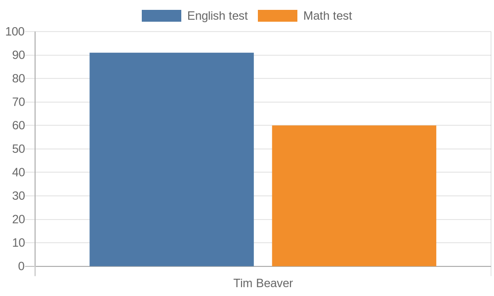
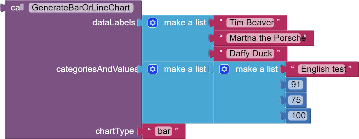
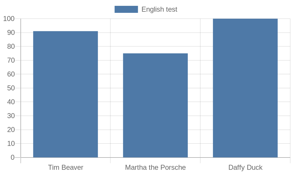
By the end of this part, you will be able to do something like this.
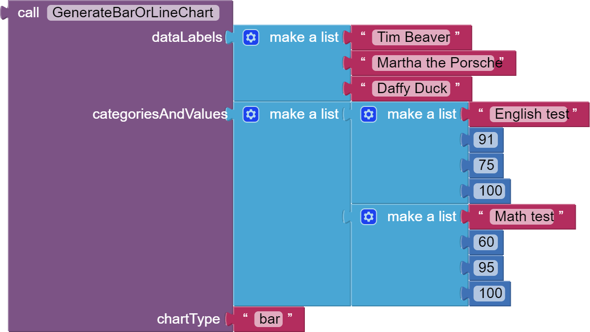
Then, with QuickChart API, the result would be this.
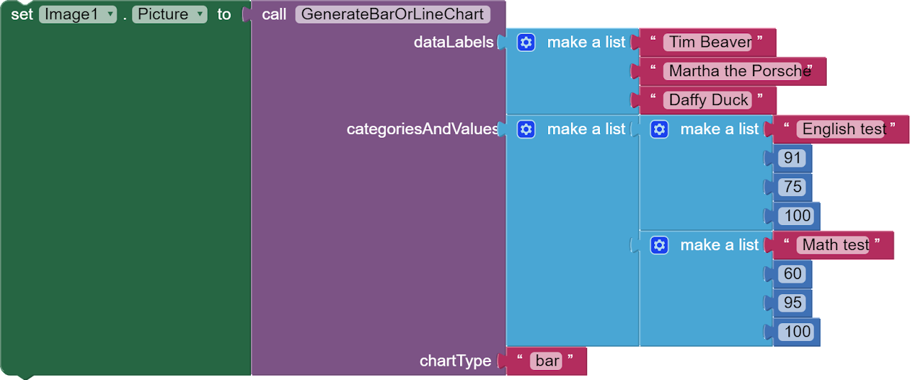
In the chart, English test and Math test are the categories, while Tim Beaver, Martha the Porsche and Daffy Duck are data labels, and that the values for each bar in a bar chart or point on a line graph represent a number value. For example, the blue bar of Tim Beaver represents 91, while the orange one represents 75.
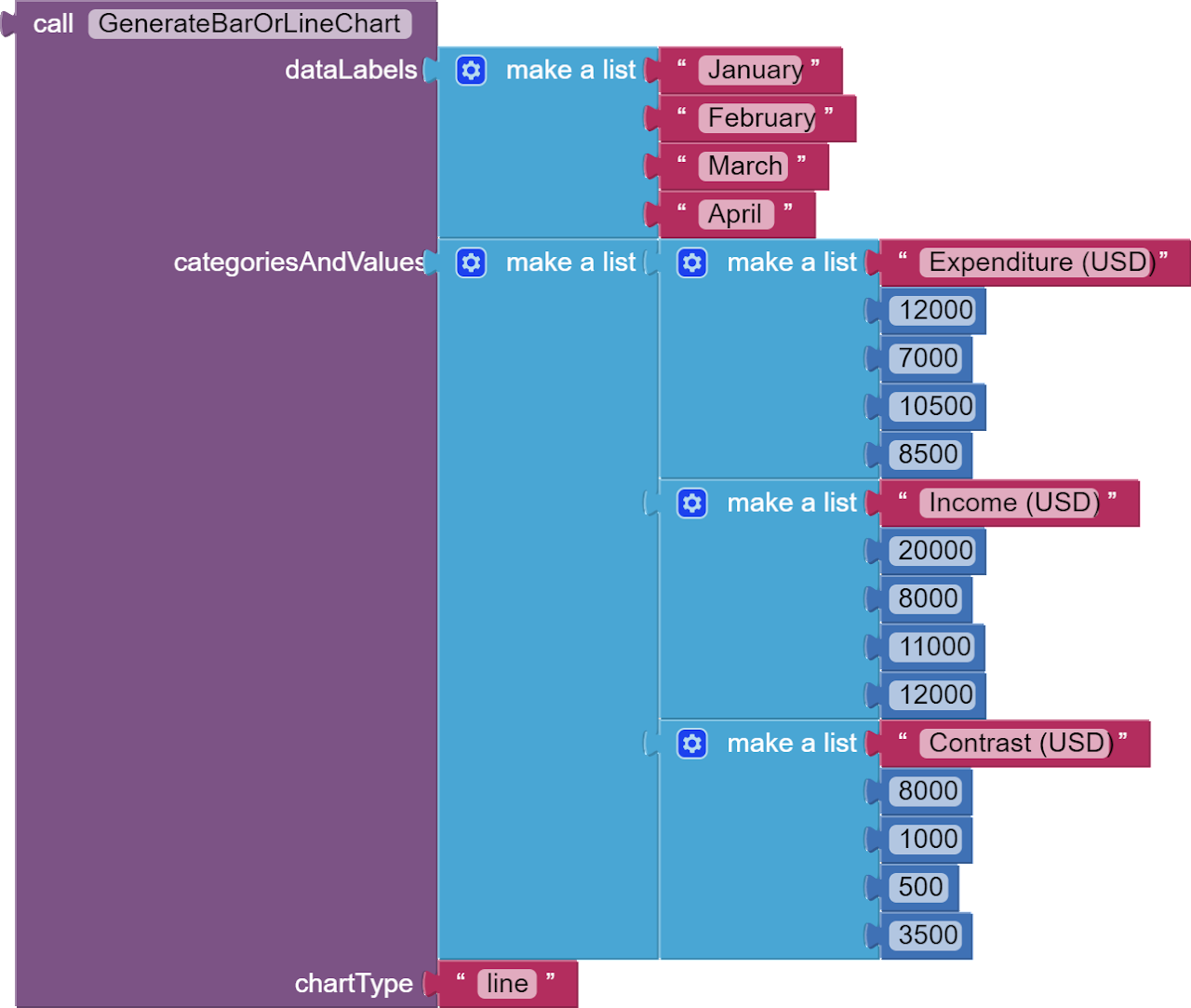
Now, go back to the procedure blocks and compare them with this chart. As you can see, dataLabels is a list of all data labels, and chartType can be either bar or line. categoriesAndValues is a list with two sublists, because there are two categories. Each sublist starts with a category name, while the next three items are values of the character scoring the respecting test. In the first sublist, each character joined the English test. Tim scored 91 points, Martha scored 75, and Daffy scored 100. Note that if you have 4 characters, but you only provided the test results for 3 characters, your app might crash.
With that, let's see the procedure (right click the procedure, open it in a new tab, and zoom in the procedure).
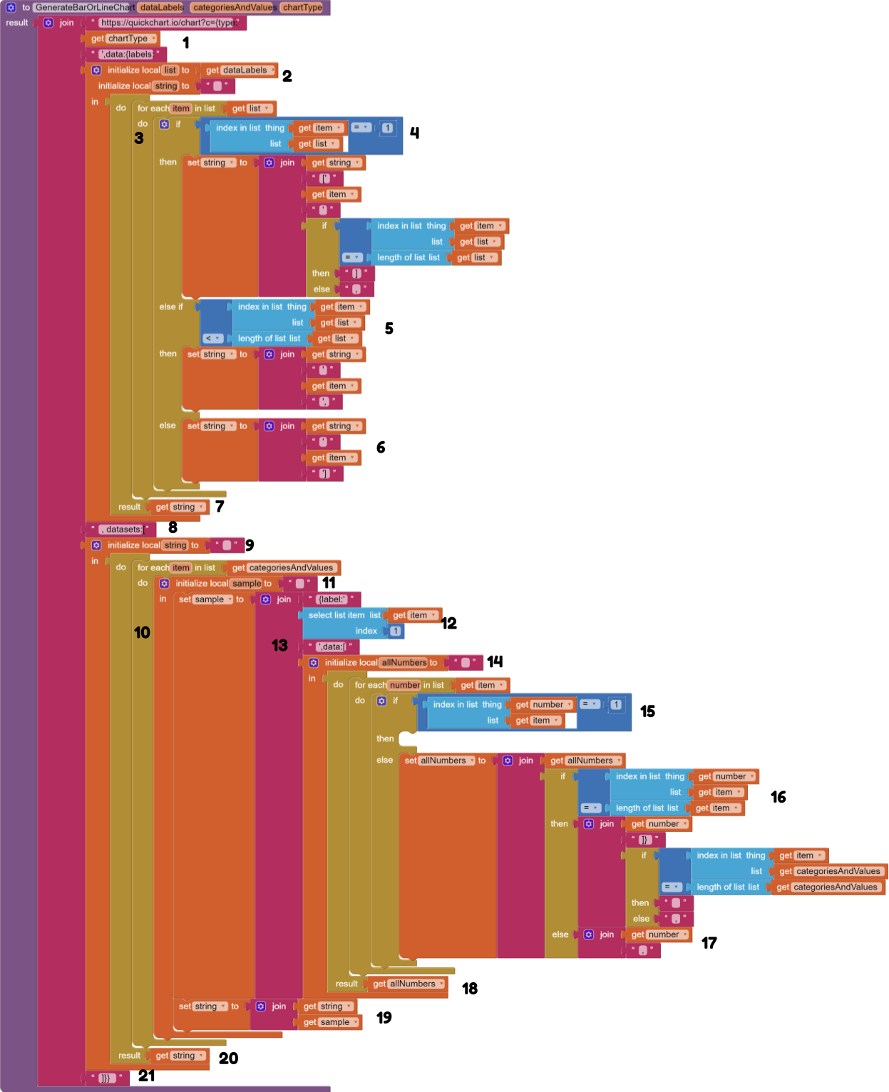
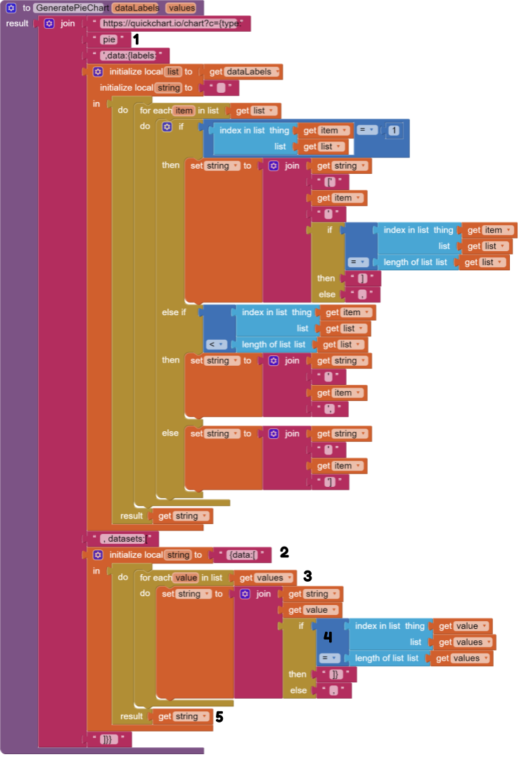
This large structure, with 100 blocks, is the procedure we are mainly highlighting in this guide. I have added annotaion numbers, from 1 to 21, to help you better understand it.
[1] We first start by defining the chart type, so that if chartType is bar, the prefix of the URL should be https://quickchart.io/chart?c={type:'bar',data:{labels:.
[2] We then create two local variables - list that is a copy of dataLabels, and string that is the converted version of the list. Note that we do not directly use the list separator block, because the documentation stated that its ', not ".
[3] We add the for each item block to run blocks for every data label in the data label list.
[4] If the data label is the first data label in the list, we start by joining [' and the data label and ' together. So if the first data label is Apples, the string should start with ['Apples'. If the first data label is also the last data label, we add a closing bracket ]. Else, we continue with a comma.
[5] If the data label is not the first and the last item in the list, we continue by joining the string variable with ' and the data label and '. So if the first data label is Apples and the second data label is Oranges and that there are 3 data labels, we should set it to ['Apples','Oranges', and continue to the third item.
[6] If the data label is the last item in the list, we end by joining ' and the data label and ']. If the first data label is Apples and the second data label is Oranges, and that there are only 2 data labels, we should set it to ['Apples','Oranges'] and data labels are done.
[7] To finish up data labels, we should return the finished string.
[8] Before we start with categories and values, we need to tell the system that we are going to do datasets. So join the text with , datasets:[.
[9] We create a local variable - string, to turn the list of categories and values to the pattern that the documentation states.
[10] We add a for each item in list block to run blocks for every sublist of category and data values.
[11] We create another local variable sample within the for each item in list loop. We start of setting the sample by using {label:'.
[12] We add the category name to the sample variable.
[13] We then continue with ',data:[.
[14] We create another local variable called allNumbers. Then, we add a for each item in list block to run blocks for every value in each sublist.
[15] If the item is the first item in the list, we skip the checking process for this item, because we are targeting the value, and the first item is the category name.
[16] If the tested number is the last item in the sublist, we append the number and closing symbols ]} to the allNumbers local variable. If the sublist is not the last item in the whole categoriesAndValues list, we add a comma to continue, else a blank string to stop.
[17] If the number is not the last item in the sublist, we continue by appending the number and a comma to allNumbers.
[18] We return allNumbers to the set sample block.
[19] To make parts 10 to 18 effective, we need to append sample to string.
[20] We return string to the main join block.
[21] Finally, we close everything with ]}}. Phew!
If you do not want to manually code the procedure, go to the ![]() Downloads section and download the AIA file that has the procedure in it.
Downloads section and download the AIA file that has the procedure in it.
![]() Step 2. Testing What We Have
Step 2. Testing What We Have
You can test this out via Do It in the companion now.
This whole thing returns a generated image URL. According to the App Inventor Image documentation, you can set the image Picture to an image URL in the blocks, so you can try something like:
You can try these!

![]() Step 3. Going Through The Concepts
Step 3. Going Through The Concepts
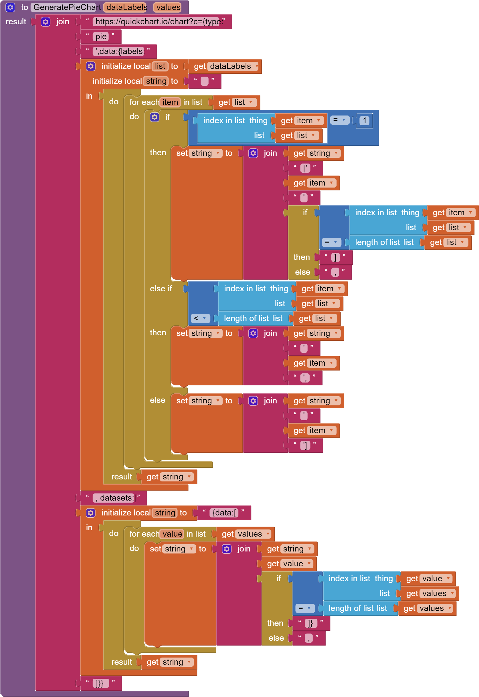
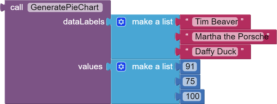
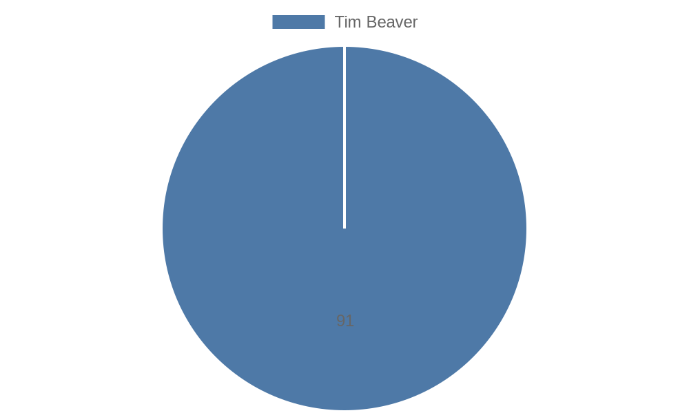
By the end of this part, you will also be able to make pie charts like this.
The output is this:

Note that the procedure structure and the parameters are different from the last part.
In the chart, unlike bar or line charts, there are no categories - pie charts can only have one category. Tim Beaver, Martha the Porsche and Daffy Duck are data labels, and that the values for each slice in a pie chartrepresent a number value. For example, the blue bar of Tim Beaver represents 91, while the orange one for Martha the Porsche represents 75. Also, note that the values parameter do not have sublists, they are in one main list.
The procedure is 50% similar to the last part, so I am only going to talk about the ones that are different.
[1] Since this can only be a pie chart, the chart type is set to pie.
[2] We create a local variable called string and set its initial value to {data:[. This variable is used to convert values to a list.
[3] We add a for each item block to run blocks for every value in the values list. For each item, we will append the value to the string variable.
[4] If the value is not the last value in the list, we also add add a comma at the end to continue, else we will close everything with ]} to end it .
[5] We return the string to the main join block.
![]() Step 4. Testing What We Have.
Step 4. Testing What We Have.
You can try out these!
![]() One Step Further
One Step Further
![]() Downloads
Downloads
AIA:
Charts.aia (5.8 KB)
, the AIA that only has the bar and line procedures.
AIA:
PieCharts.aia (3.7 KB)
, the AIA that only has the pie procedure.
![]() Tests
Tests
Tested successfully on the AI Companion on Xiaomi 5G 11 NE Lite.
![]() Rate my tutorial!
Rate my tutorial! ![]()
- Good guide!
- Bad guide.
Kindly ![]() PM me if you have any questions! Also, if you like my guide, please
PM me if you have any questions! Also, if you like my guide, please ![]() like it! It takes some effort for me to make it...
like it! It takes some effort for me to make it...
Votes and likes tell me the general user feedback of my guide. If you read this guide, please take 20 seconds to drop by and give a vote / like!
If you have any feature requests or bug reports, reply below.
This guide is also available at my website. Click here to learn more!
Gordon Lu