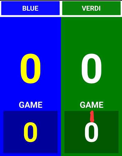
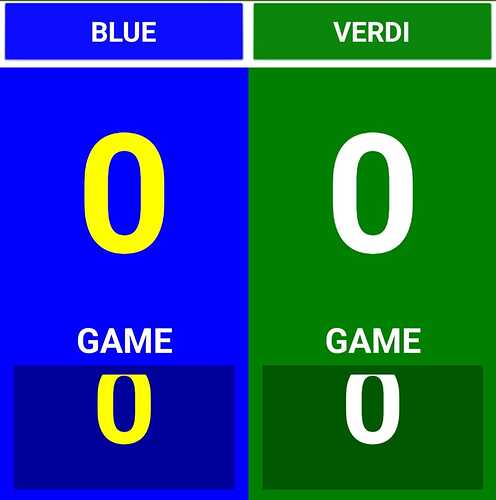
As you can see from the image I would like to reduce the space above and below the text. By reducing the size of the box, the text is partially cut off and there is still space above and below.
How can I fix?
Dear @Nax72,
maybe is not the solution, but I faced (almost) the same problem with labels.
By using an extension and following the hints given by @Anke I solved the problem of the text padding above and below the text in a label. Probably you can do the same in your text boxes.
The link below, is related to the topic.
Spero che ti aiuti a risolvere, ciao, Ugo.
If labels, untick "hasMargins" in the designer

