Hello again, I really want help because I am tired of many failed attempts. I simply finished the design of my application, but I have been standing for a long time at this point. I want the font size of my application to match the sizes of different screens. What I specifically want is that the font size on different screens represent the same percentage that It is represented on my mobile screen. I want this to be done through an equation and with the same font sizes that i have specified on my mobile screen. Please, I need help. I have been sitting for a long time with this dilemma.
I think the solution is located here in DisplayMetrics extension but i do not know how to apply it ?
I tried to determine the percentage of each font size that I have on my mobile screen and then represent that percentage on the rest of the different screens, but it did not work
Hello
Did you find a solution? I am having the same problem looks good on a tablet but on a phone the fint is huge.
Would like to be able to automatically size depending on the screen size.
Hi mate, replying after long time but anyways. I was dealing with the same problem and i found a method which works for almost all android device using built in mit app inventor fuction, yeah also no need of using get matrix.aix extension.
Now in most android device i found that its font size changes with two variable:
1.Device Font size
2.Deivce Display size
So, to scale font size to fit according to different display size and device font sizes we have to implement the new font size which changes accordingly. So,
- we need new font size to be directly proportional to default button font size,
- we need new font size to be directly proportional to ∝ screen height ( because we want our font size to get bigger as display size increases)
- we need new font size to be indirectly proportinal (1/ ∝) to reference label width ( because as the device font size gets bigger we want new font size to get smaller to make it look constant)
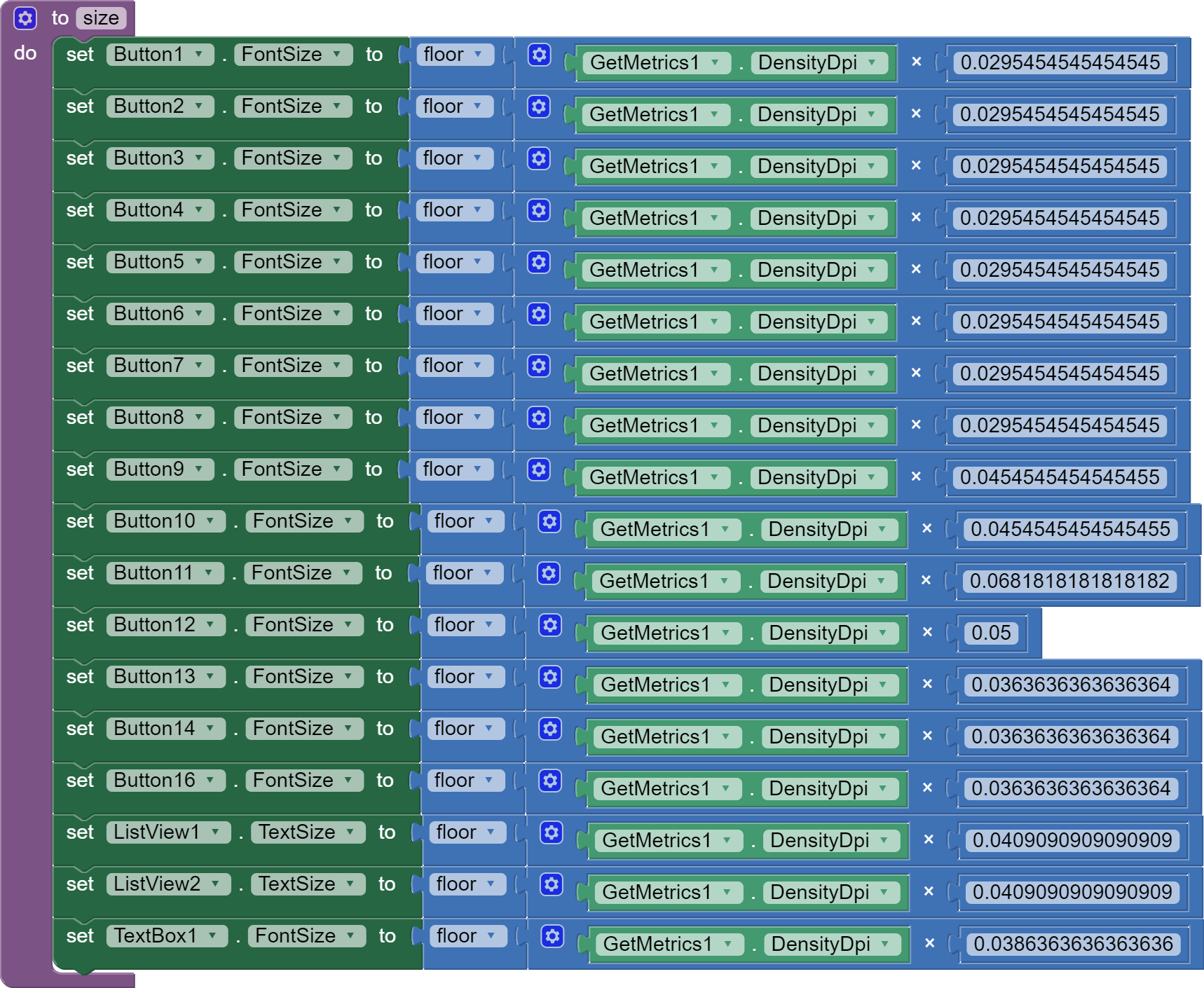
We get this Formula:
- New font size = Default font size of button suppose (14) x ( screen Height / Default screen Height ) x (default reference label width / reference width)
in my case,
Default screen height is 822 in portrait mode and 411 in landscape mode
Default reference label width is 61
So in my case formula becomes:
In portrait mode :
New font size for button = 14 x (screen Height / 822) x ( 61/ reference label width )
In landscape mode :
New font size for button = 14 x (screen Height / 411) x ( 61/ reference label width )
we can combine these two formula using if condition.
Here is the palette view of 1st pic :
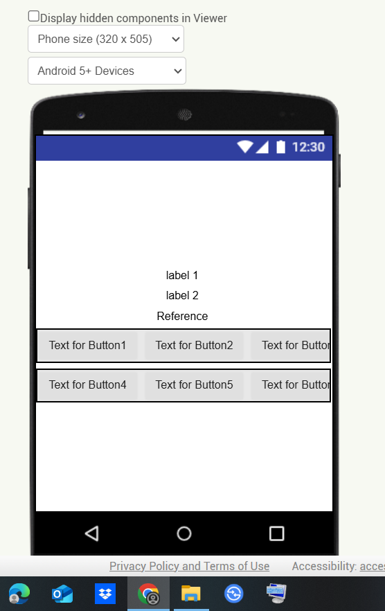
In the above picture i have added 6 buttons and label named as reference which will give us reference label width, to hide it you can keep its height as 1 pixel and width automatic.
( you can know your default screen height by using block)

you have to get it for both portrait and landscape mode you will get two different numbers.
(you can know your default reference label width [which is in 3rd row] by using block)

Here is all the block that i have used for it to work,

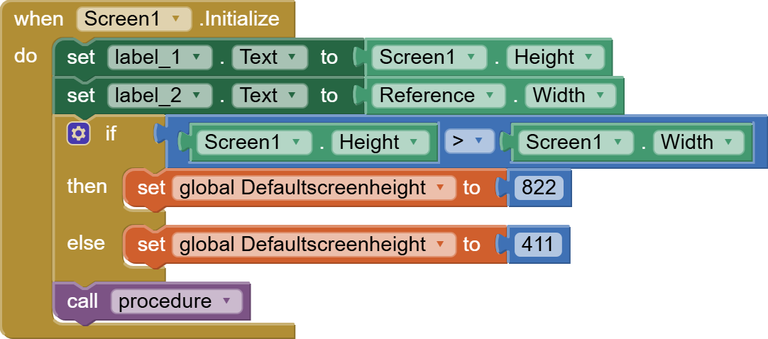
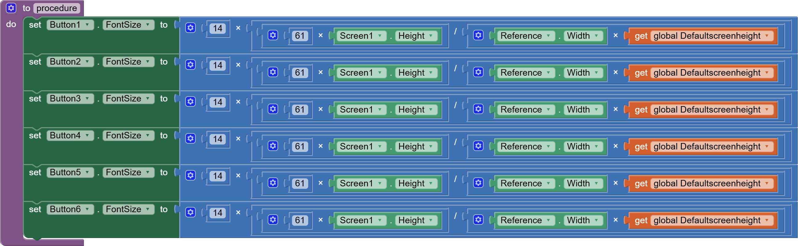
First,
- I have created a global variable by name defaultscreenheight
- when screen initalize label_1 text provide us screen height and label_2 provide us Refrence
label width which is in third row in 1st pic - I have used if condition to know the screen orientation
If the screen height is greater than screen width, we know device is in portrait mode
-Then [golbal_Default_screen_height] is set to 822
and if the screen width is greater than screen height, we know device is in landscape mode
-Then [golbal_Default_screen_height] is set to 411
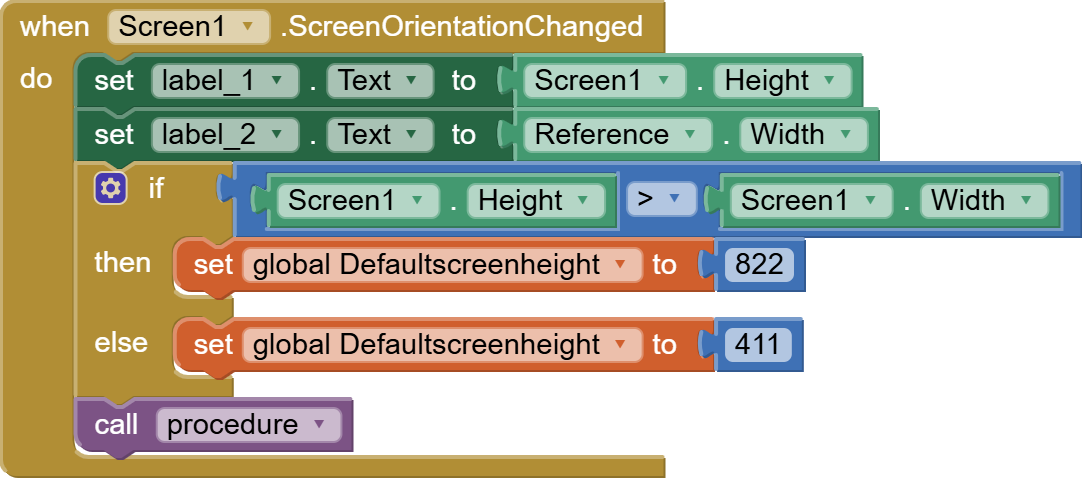
After, that i use call procedure to implement formula to decide new fontsize. - I have used all the same fuction as in the (when screen1. Initalize) block to adapt font size when screen orientation is changed.
- Finally under procedure i have used formula where,
All the button font size are changed proportionally
Here,
14 is the default font size of the button it can be any number.
61 is the default reference label width which is in third row in 1st pic
lastly, [get global Defaultscreenheight] automatically gets either 822 or 411 value based on device orientation.
I have also provided aia file of this app,
you can have a look and let me know whether it work in different devices and font sizes.
Scale_font_size.aia (4.1 KB)
Can you explain where you get this value from ? I presume this is label width ?
What happens when you are viewing app in Landscape ?
1 Like
yes mate, it is label width. I have also applied if condition in the blocks which makes it work in landscape mode
But where does 44 come from? What is in the label?
If I want to use my own device as the reference device, I will have a different screen height and I guess a different label width. Is it the word "Reference" ? If so, why ?
The formulas in your blocks do not match what you have written above them ?