A ListPicker?
Or a Spinner?
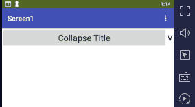
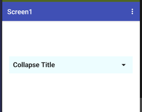
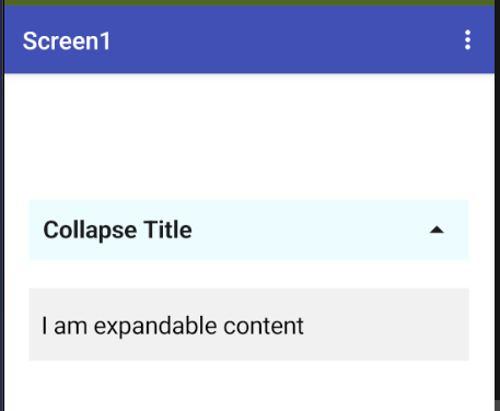
Just a button that show description of an image and collapse when reclicked
You can do that with a Button, by testing its Bold setting in the Click event.
If it's bold, it's currently showing the title text, so switch the text to the detail text and turn off the bold flag. Otherwise, it's showing the detail text currently, so you would want to show the title text and turn on the bold flag.
You could also change the fontsize.
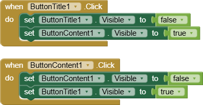
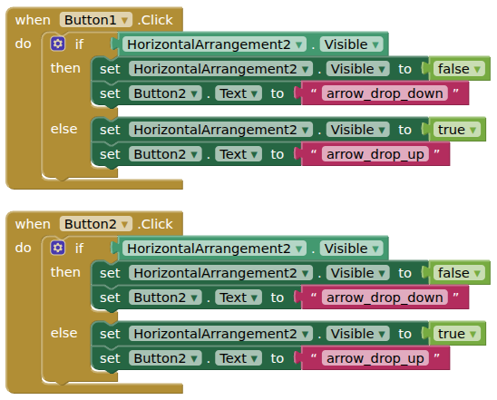
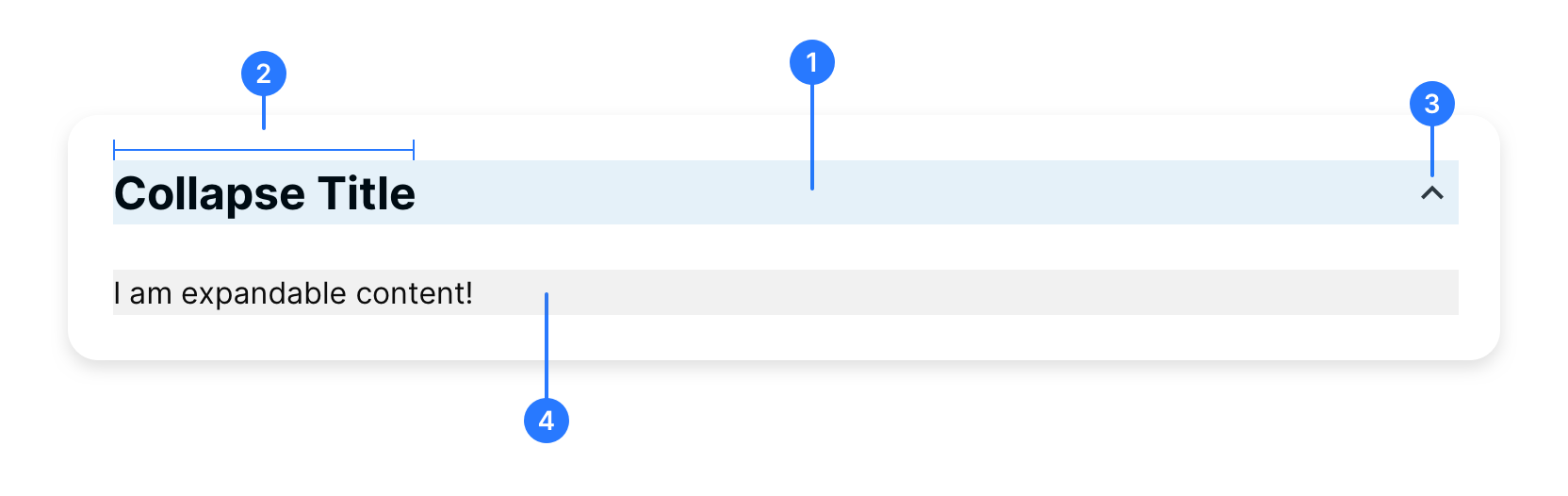
In a Vertical arrangement, add one Horizontal arrangement (set clickable). In this Horizontal add one label (for 2) and one more any arrangement (for 1) , again add one label with symbol with image down arrow . Add another final labe (for 4) with visibility false
Now if the horizontal is clicked, change the arrow from down to up and set the id 4 visible to true. else change all the items in reverse
If you want to make same like in multiple then use compcreator or dynamic component extension
I don't see clickable checkbox for arrangement
Using the above compcreator you can set