I took a whack at this, and I am convinced the HighlightDataPoints function doesn't work for more than one point.
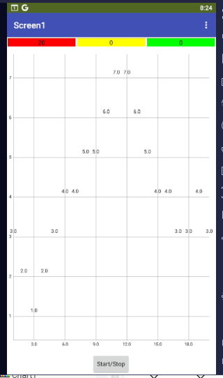
The color assigned to the data range keeps overwriting the highlights.
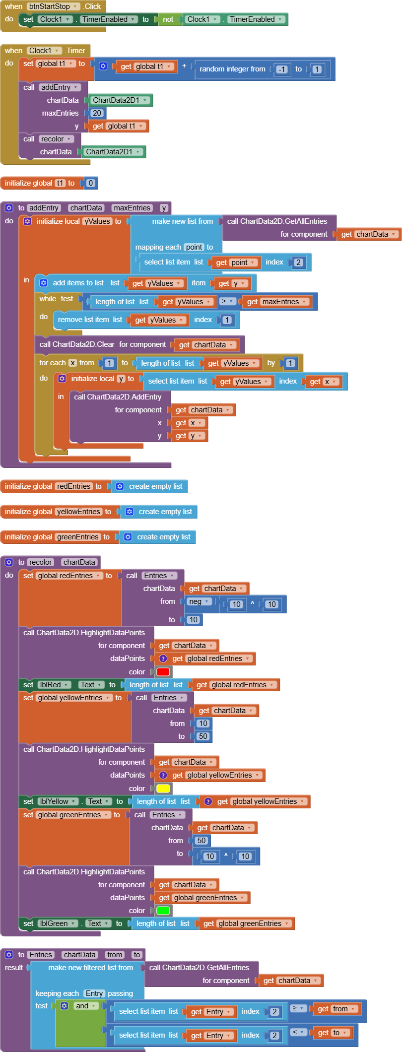
charts_drunkard_walk_range_colored.aia (5.5 KB)
I am thinking of redoing this by partitioning the data series into three parts, by y range, and assigning them different colored ChartData components on the same graph.
The partitioned data can be kept for statistical analysis, as I have done in this sample in the three colored Labels at the top.
Here's my Cherts and Graphs FAQ.
Every one and his brother has done charts and graphs.