ImageListViewer
An extension for MIT App Inventor 2.An extension to create a fully customisable list view with image, title and subtitle. Developed by The K Studio.
Download:
v8.3 com.thekstudio.imagelistviewer.aix (31.9 KB)
 Specifications
 Size: 28 KB
 Minimum API Level: 7
 Updated On: 2025-03-22T18:30:00Z
 Built & documented using: FAST-CLI
Events:
ImageListViewer has total 6 events.
OnCheckboxChanged
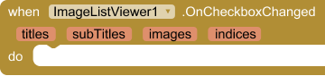
Event triggered when a checkbox is checked or unchecked.
| Parameter | Type |
|---|---|
| currentItem | number |
| checkedItems | list |
ReachBottom

Event raised when the list view reaches the bottom.
ReachTop

Event raised when the list view reaches the top.
AfterPicking
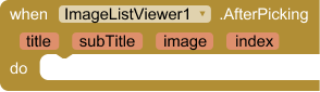
Event raised after an item is picked from the list
| Parameter | Type |
|---|---|
| title | text |
| subTitle | text |
| image | text |
| index | number |
LongClick
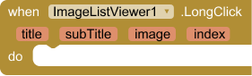
Event raised when a list item is long-clicked
| Parameter | Type |
|---|---|
| title | text |
| subTitle | text |
| image | text |
| index | number |
OnError
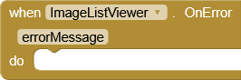
Event raised when an error occurs
| Parameter | Type |
|---|---|
| errorMessage | text |
Methods:
ImageListViewer has total 17 methods.
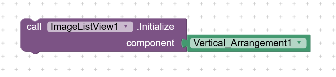
Initialize

Initialize the ListView in the given Android view component for eg. Vertical Arrangement.
| Parameter | Type |
|---|---|
| component | component |
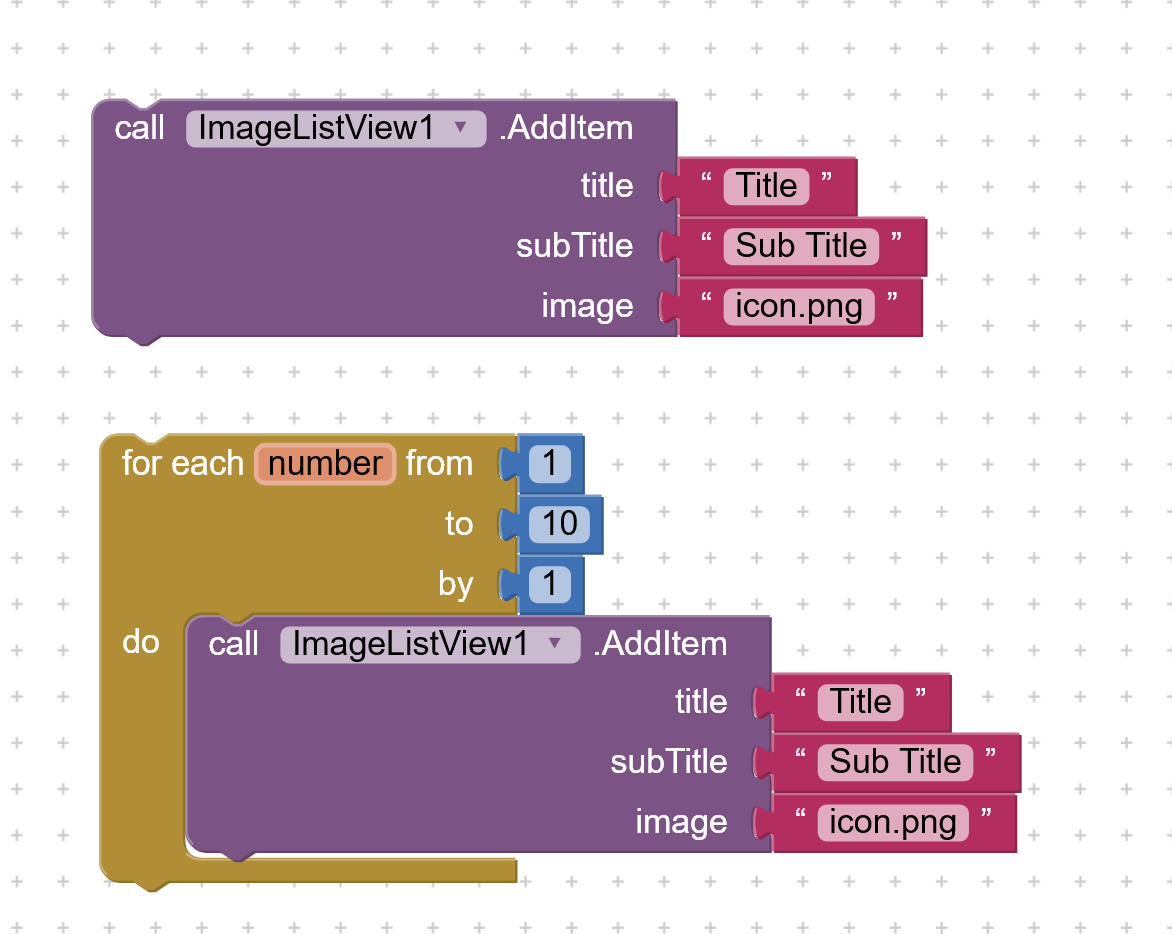
AddItem
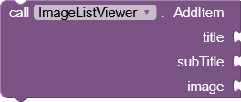
Add an item with its associated image and subitem to the List
| Parameter | Type |
|---|---|
| title | text |
| subTitle | text |
| image | text |
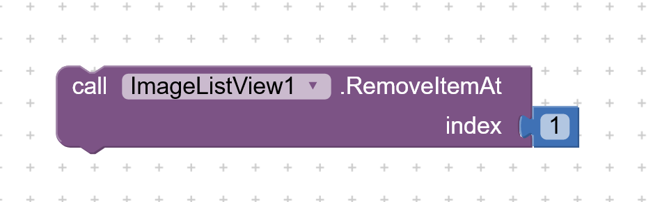
RemoveAt

Remove an item from the List at the given index
| Parameter | Type |
|---|---|
| index | number |
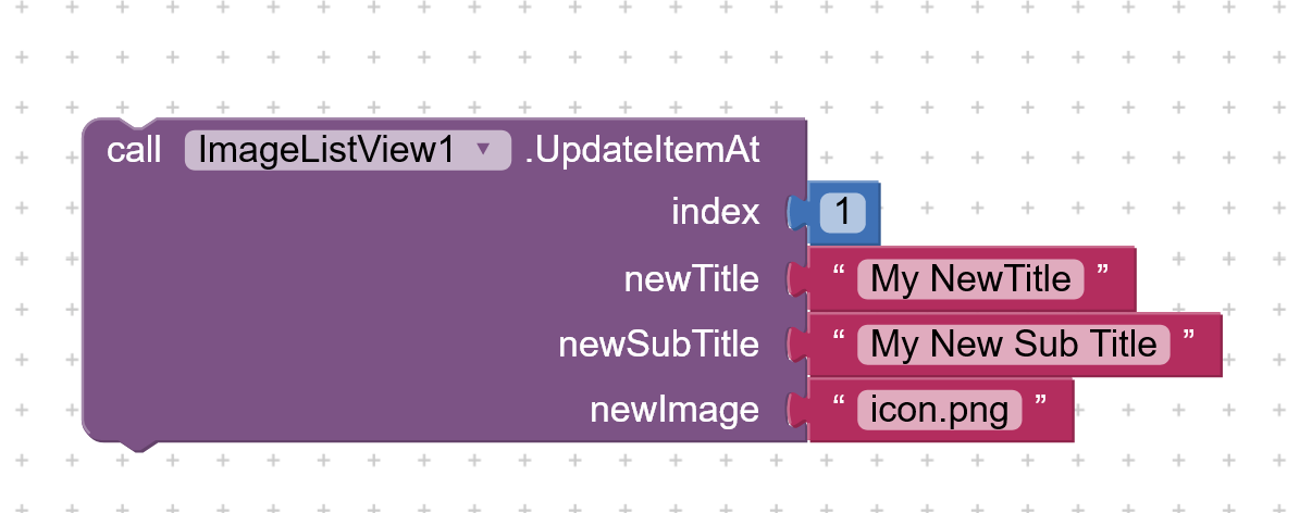
UpdateAt
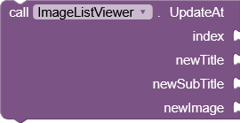
Update an item at the given index in the List
| Parameter | Type |
|---|---|
| index | number |
| newTitle | text |
| newSubTitle | text |
| newImage | text |
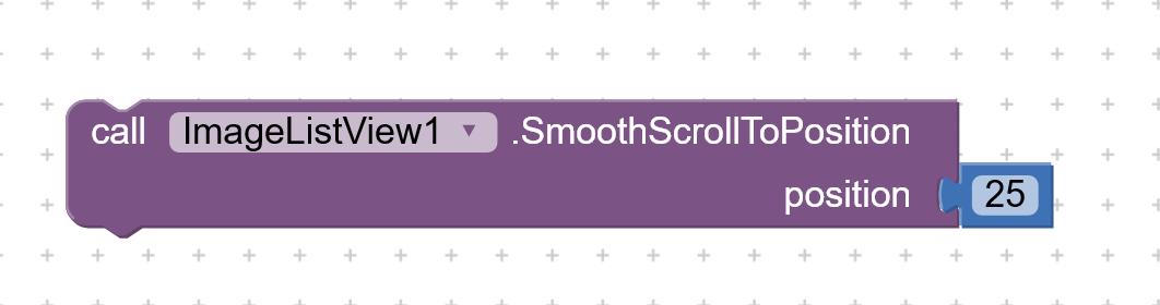
SmoothScrollTo

Smoothly scroll the ListView to the specified position
| Parameter | Type |
|---|---|
| position | number |
ClearList
Clear all items from the List
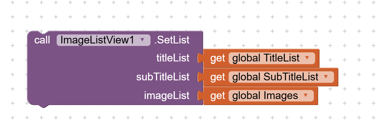
SetList
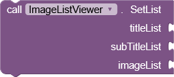
Set the list items with titles, subtitles, and images. Set empty list if not required.
| Parameter | Type |
|---|---|
| titleList | list |
| subTitleList | list |
| imageList | list |
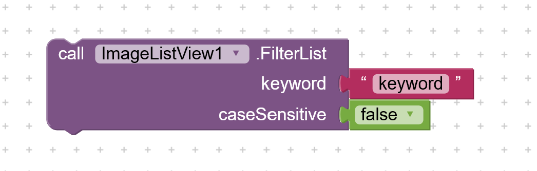
FilterList
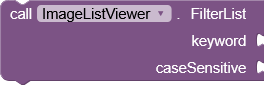
Filter list items based on the provided search text
| Parameter | Type |
|---|---|
| keyword | text |
| caseSensitive | boolean |
Enable
Enable the ListView, allowing item and checkbox selection.
Disable
Disable the ListView, preventing item and checkbox selection.
IsEnabled
Check if the ListView is enabled.
CheckAll
Check all checkboxes
UncheckAll
Uncheck all checkboxes
CheckAt

Check checkbox at the specified position (1-based index)
| Parameter | Type |
|---|---|
| position | number |
UncheckAt

Uncheck checkbox at the specified position (1-based index)
| Parameter | Type |
|---|---|
| position | number |
IsChecked

Check if the item at the given index is checked.
| Parameter | Type |
|---|---|
| index | number |
Setter Properties:
ImageListViewer has total 31 designer properties.
CheckboxColor
- Input type:
color - Default value:
&HFF000000
CheckboxVisible
- Input type:
boolean - Default value:
False
ImageSize
- Input type:
integer - Default value:
120
TitleFontSize
- Input type:
integer - Default value:
16
SubtitleFontSize
- Input type:
integer - Default value:
14
TitleColor
- Input type:
color - Default value:
&HFF000000
SubtitleColor
- Input type:
color - Default value:
&HFF808080
TitleBold
- Input type:
boolean - Default value:
false
SubtitleBold
- Input type:
boolean - Default value:
false
TitleHTML
- Input type:
boolean - Default value:
false
TextAlignment
- Input type:
choices - Default value:
left - Arguments:
left,center,right
SubtitleHTML
- Input type:
boolean - Default value:
false
DividerColor
- Input type:
color - Default value:
&HFFFFFFFFF
DividerHeight
- Input type:
integer - Default value:
1
Scrollbar
- Input type:
boolean - Default value:
false
ScrollbarColor
- Input type:
color - Default value:
&HFF808080
FontTypeface
- Input type:
asset
ListPaddings
- Input type:
string - Default value:
10,10,10,10
ImagePaddings
- Input type:
string - Default value:
20,20,20,20
TitlePaddings
- Input type:
string - Default value:
10,10,10,5
SubtitlePaddings
- Input type:
string - Default value:
10,5,10,10
ImageSide
- Input type:
choices - Default value:
left - Arguments:
left,right
CornerRadius
- Input type:
integer - Default value:
0
Elevation
- Input type:
integer - Default value:
0
BackgroundColor
- Input type:
color - Default value:
&HFFFFFFFF
TouchFeedbackColor
- Input type:
color - Default value:
&HFF808080
TouchFeedback
- Input type:
boolean - Default value:
true
TitleMaxLines
- Input type:
integer - Default value:
1
SubtitleMaxLines
- Input type:
integer - Default value:
3
SubTitleVisible
- Input type:
boolean - Default value:
true
ReverseList
- Input type:
boolean - Default value:
false
Getters:
ImageListViewer has total 7 getter properties.
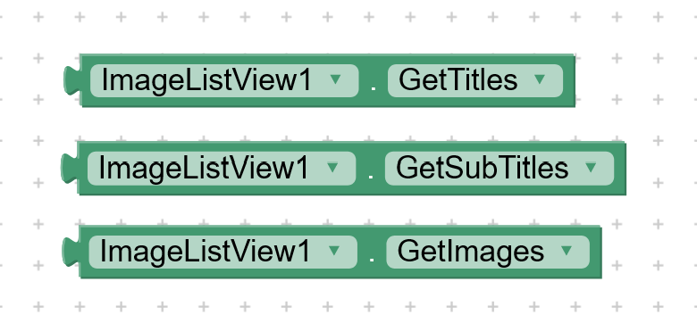
GetTitles
Get the items in the ListView.
- Return type:
any
GetSubTitles
Get the items in the ListView.
- Return type:
any
GetImages
Get the image file paths in the ListView.
- Return type:
any
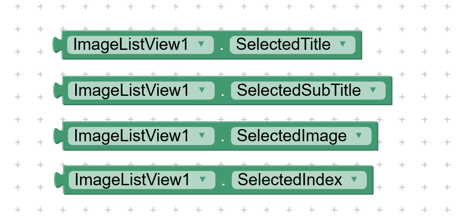
SelectedTitle
Get the selected title after picking a list item
- Return type:
text
SelectedSubTitle
Get the selected subtitle after picking a list item
- Return type:
text
SelectedImage
Get the selected image after picking a list item
- Return type:
text
SelectedIndex
Get the selected index after picking a list item
- Return type:
number
Explanation and Usage:
Initializes the list view in an arrangement like vertical arrangement. First initialize the list view before creating list view.
Add a single list item with title, sub title and image. You can also use loop the add multiple items to the list.
Set the list items at a time from the list of titles, subtitles and images.
Removes the list items at specified index.
Update the list item at specified index.
Smooth scroll to the specified position, here position is index.
Clears the list view

Filters the list with keyword and case sensitivity control.
Returns the currently set list of titles, subtitles and images.
Returns the selected title, subtitle, image and index.Note: Index starts from 1
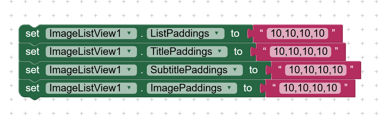
Set the padding of list view item, title, subtitle and image.
Set the padding as string of comma separated integers which represent padding as LEFT, TOP, RIGHT, BOTTOM
Other setter properties are self explanatory.
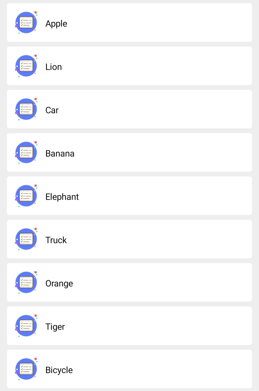
Preview:
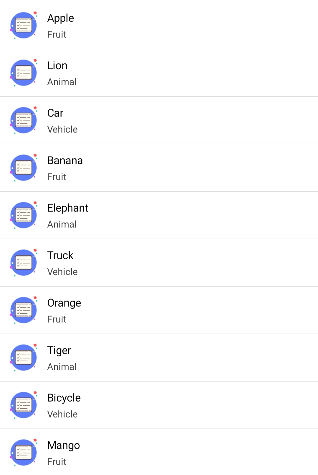
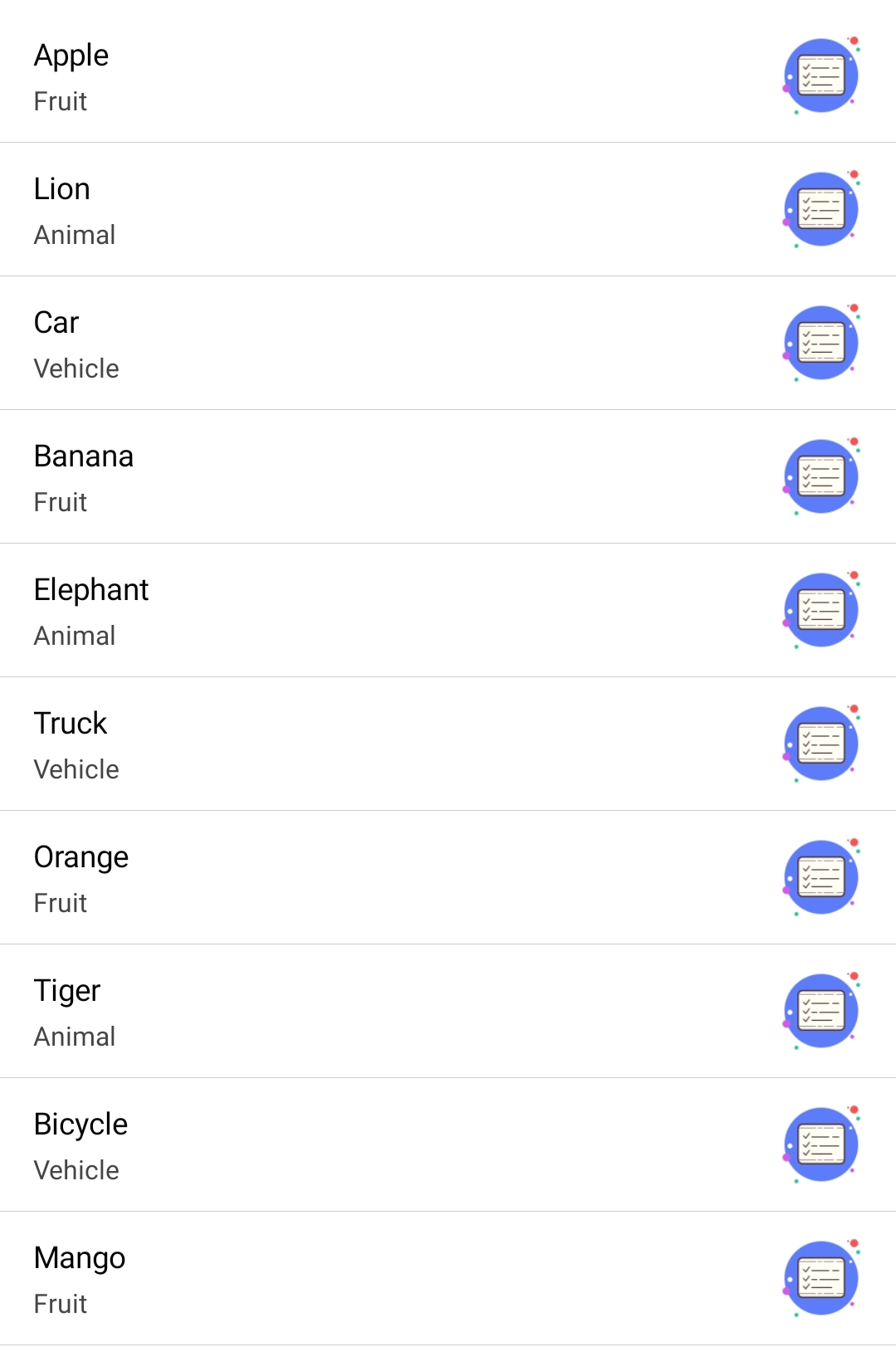
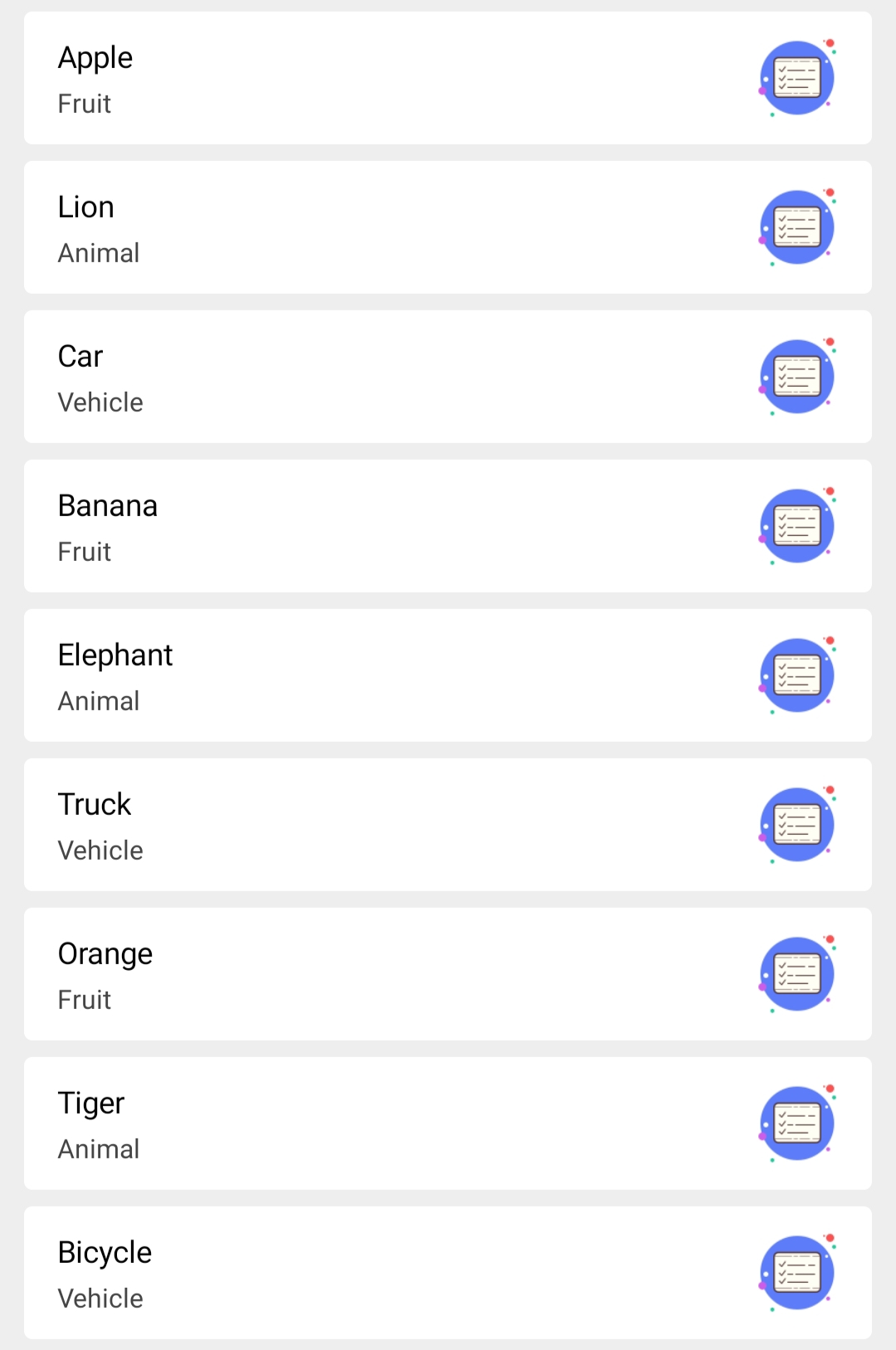
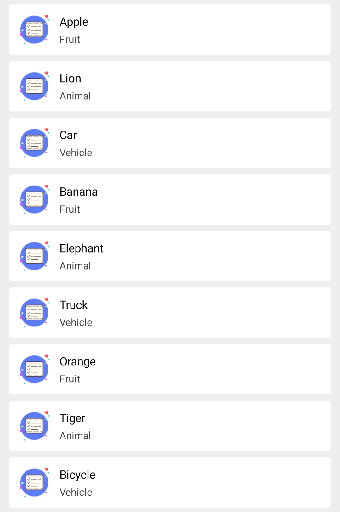
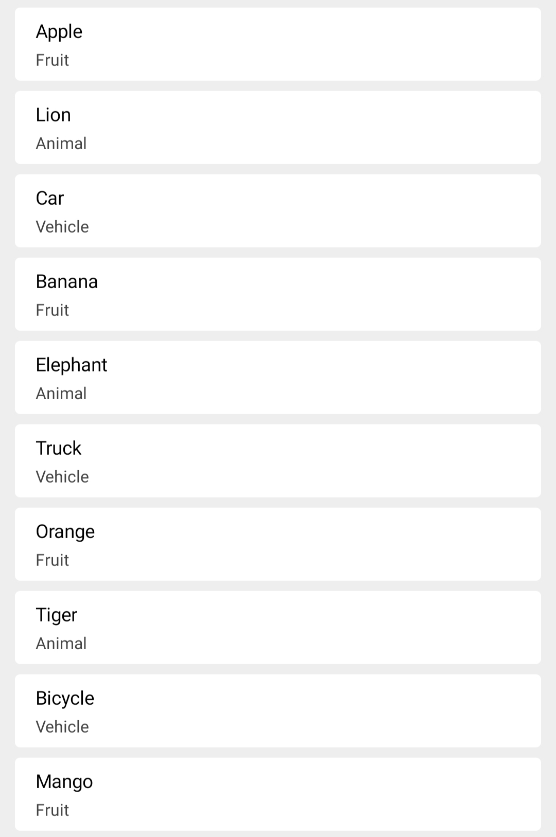