Hello, How can i put some values in the center of pie chart if pie chart have piehole.
1 Like
This was previously asked in this topic:
I do not know of a direct solution with google charts for this
1 Like
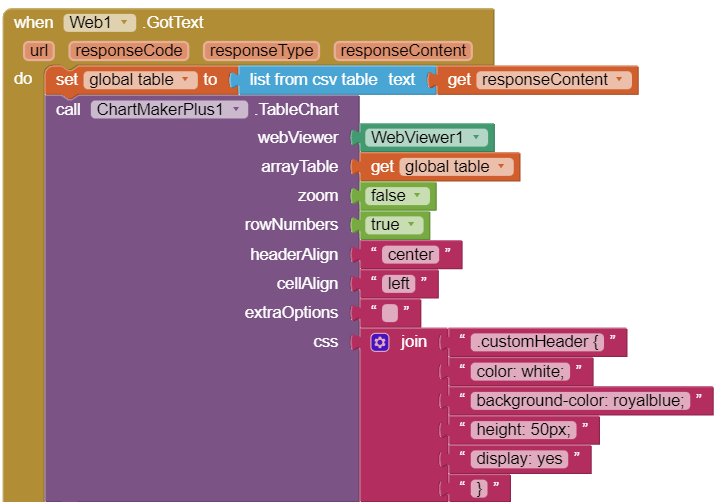
Can someone help me with how to use the CSS socket in the Table Chart? Sometimes my table has only one row and I need to fix the height of the row. I really don't want that height automatic expansion.
Thank you all.
1 Like
Not had a chance to test, but you can try adding something like:
.cssClassNames: { tableCell: {height:15px} }
or just
.tableCell: {height:15px}
Make sure you add a semi-colon after the previous last entry
1 Like
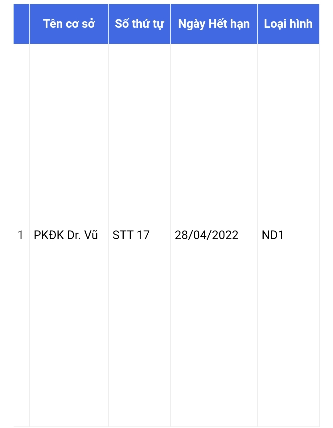
Thank TIMAI2 for your answer. I tried but it's not working. I made a simple example attached here (.aia file). Can you take a look and find a way to fix it? Thank you.
AskTIMAI2_ChartMakerPlus1_TableChart.aia (13.6 KB)
1 Like
I will take a look 
1 Like
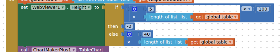
Can't figure out a css/options solution for this, but you could try this workaround; setting the height of the webviewer depending on the number of rows:
The webviewer is not scrolling for me, not sure why that is?
1 Like
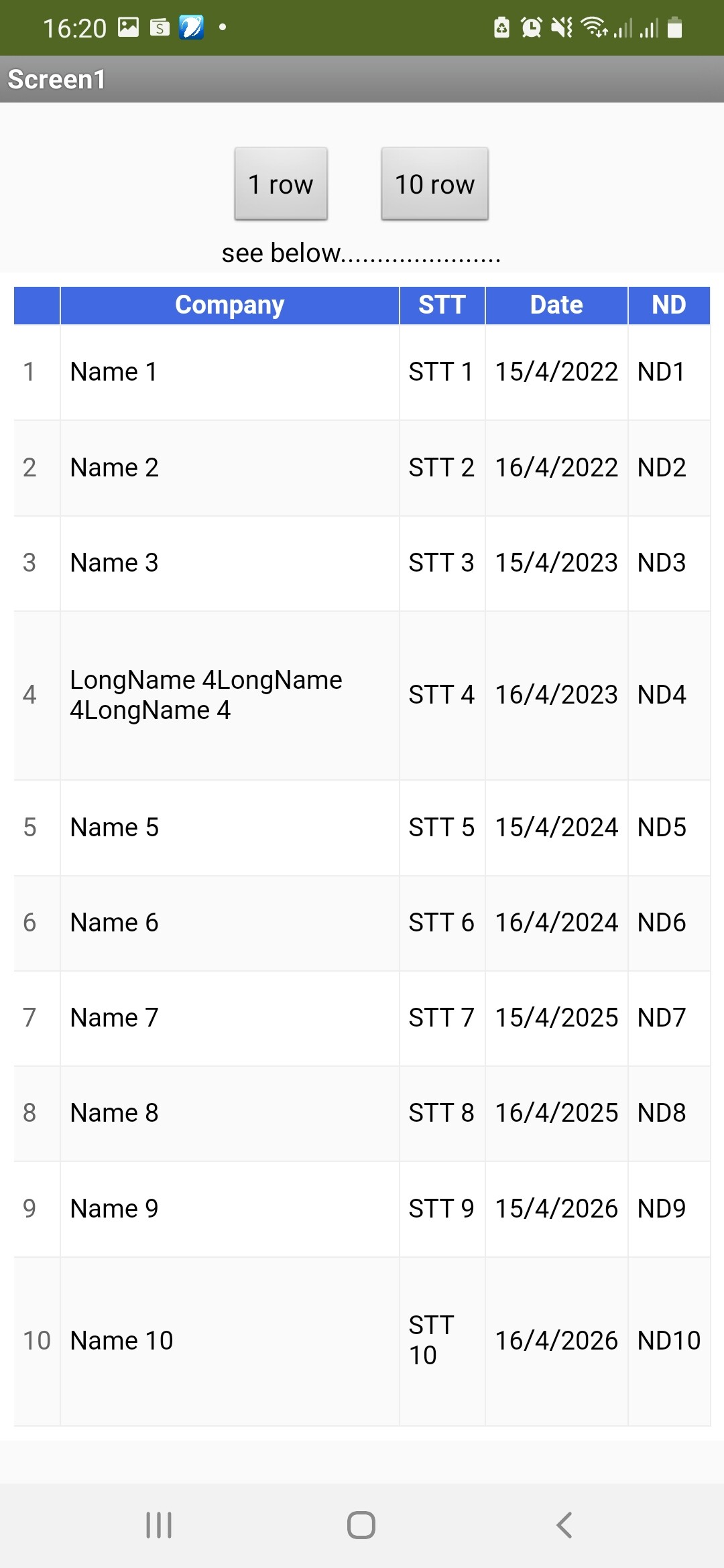
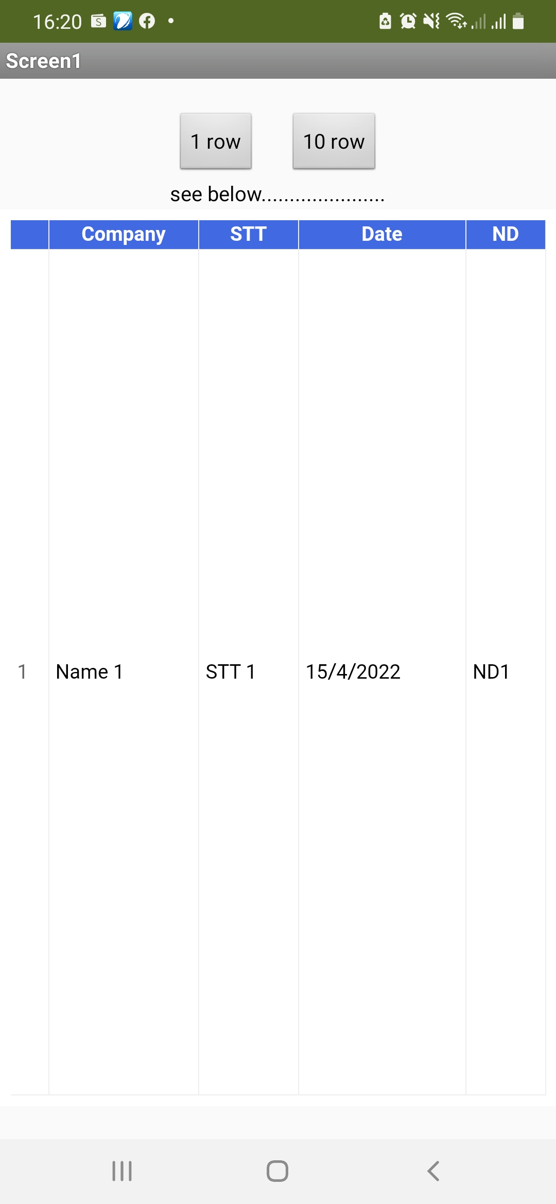
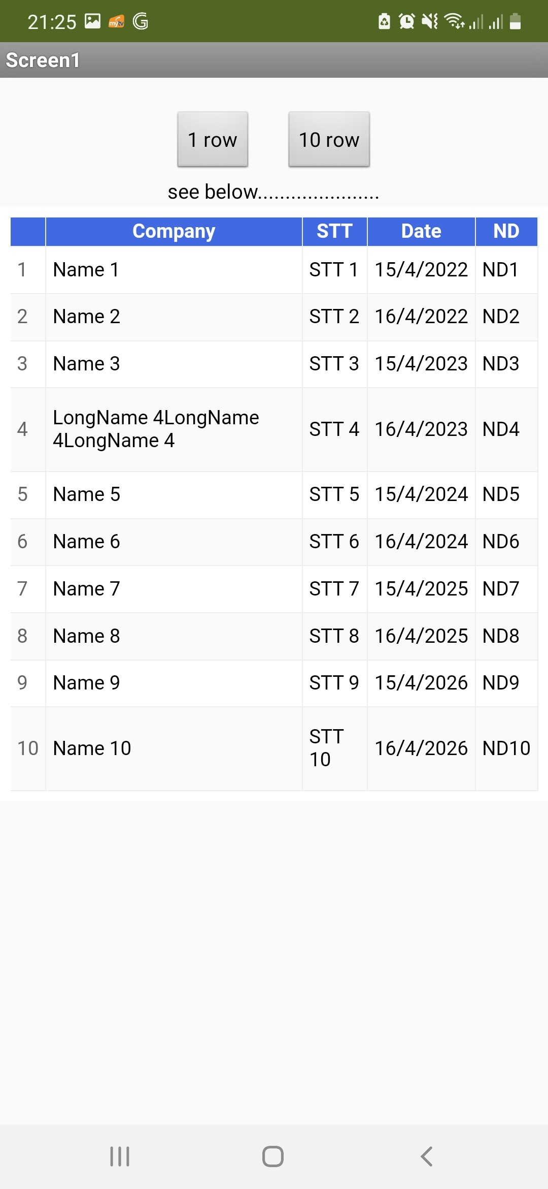
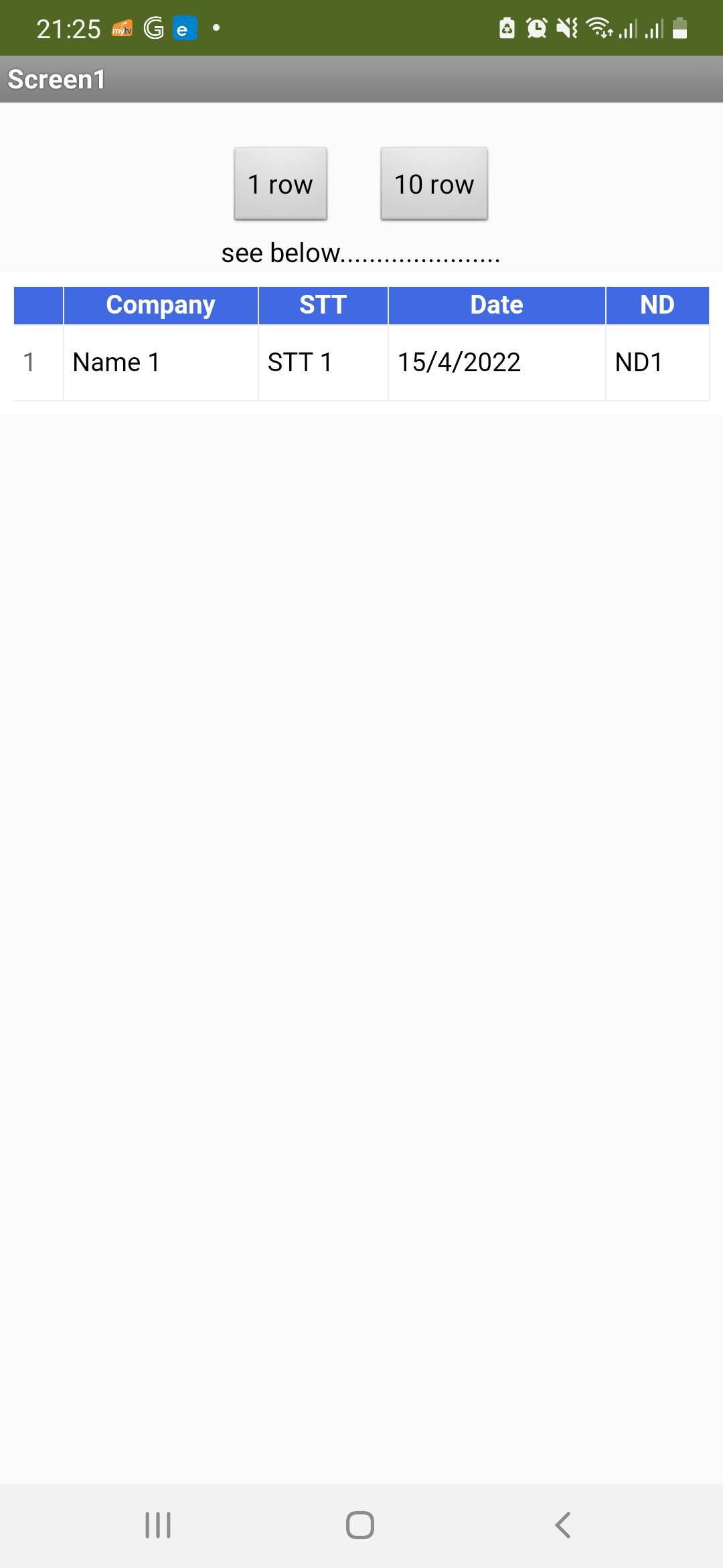
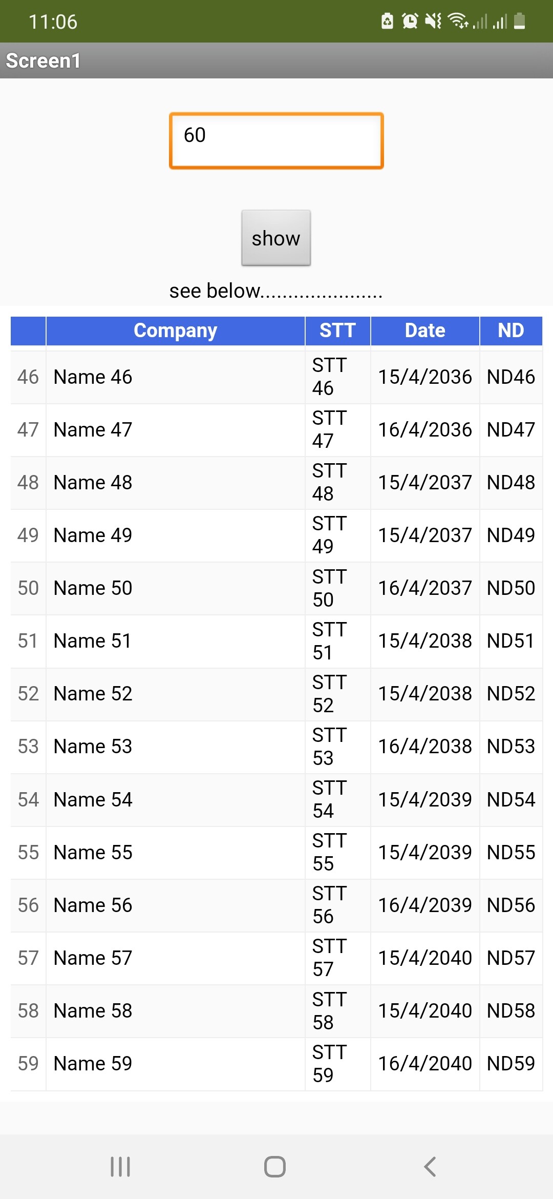
Thank TIMAI2. I think this is a very good workaround. I post some images of results for someone may need?
1 Like
It's also not scrolling for me. With my phone, I can't see more than 21 rows. So, we need to upgrade the extension in the future to fix the CSS problem.
1 Like
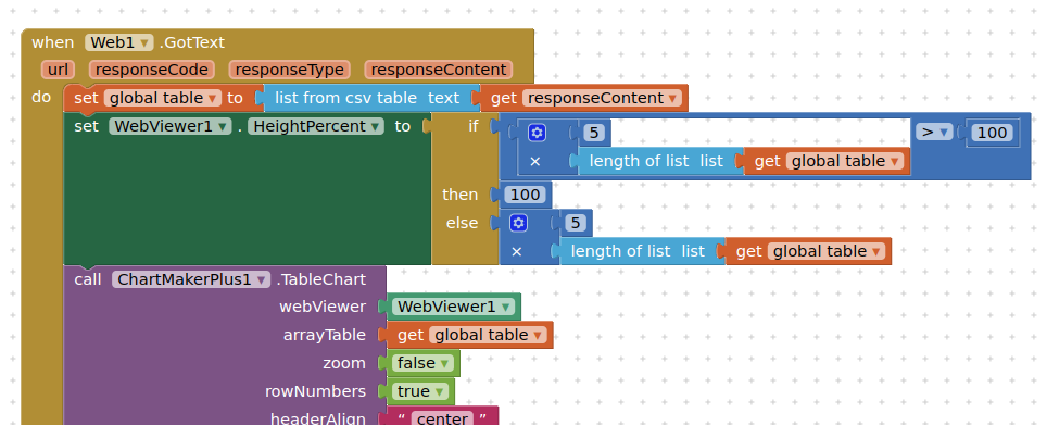
The webviewer will scroll
I switched to using Height instead of HeightPercent, and set the default Height to 300 pixels.
The webviewer will scroll, if number of rows exceeds 20
You may need to play around with the "40" pixels setting....
1 Like
Thanks for this nice extension !
I need to make a scatter plot but this is not possible right now. Will be possible to add this in a future version?
Possible, but no plans for it...you could make one directly with google charts, and the built-in Chart component in AI2 will be coming soon....
Thanks for the fantastic extension!
Now, I’m trying to plot real-time data from a sensor. While this does work in principle, repeatedly calling ChartMakerPlus.LineChart will cause the chart to “flicker” as an artifact of re-rendering the chart in WebViewer.
Is there maybe a way to avoid this? Any help would be appreciated!
This is (in principle) what I am trying to achieve: https://webdeasy.de/wp-content/uploads/2020/06/javascript-live-chart.mp4
Minimal (coarse) example:
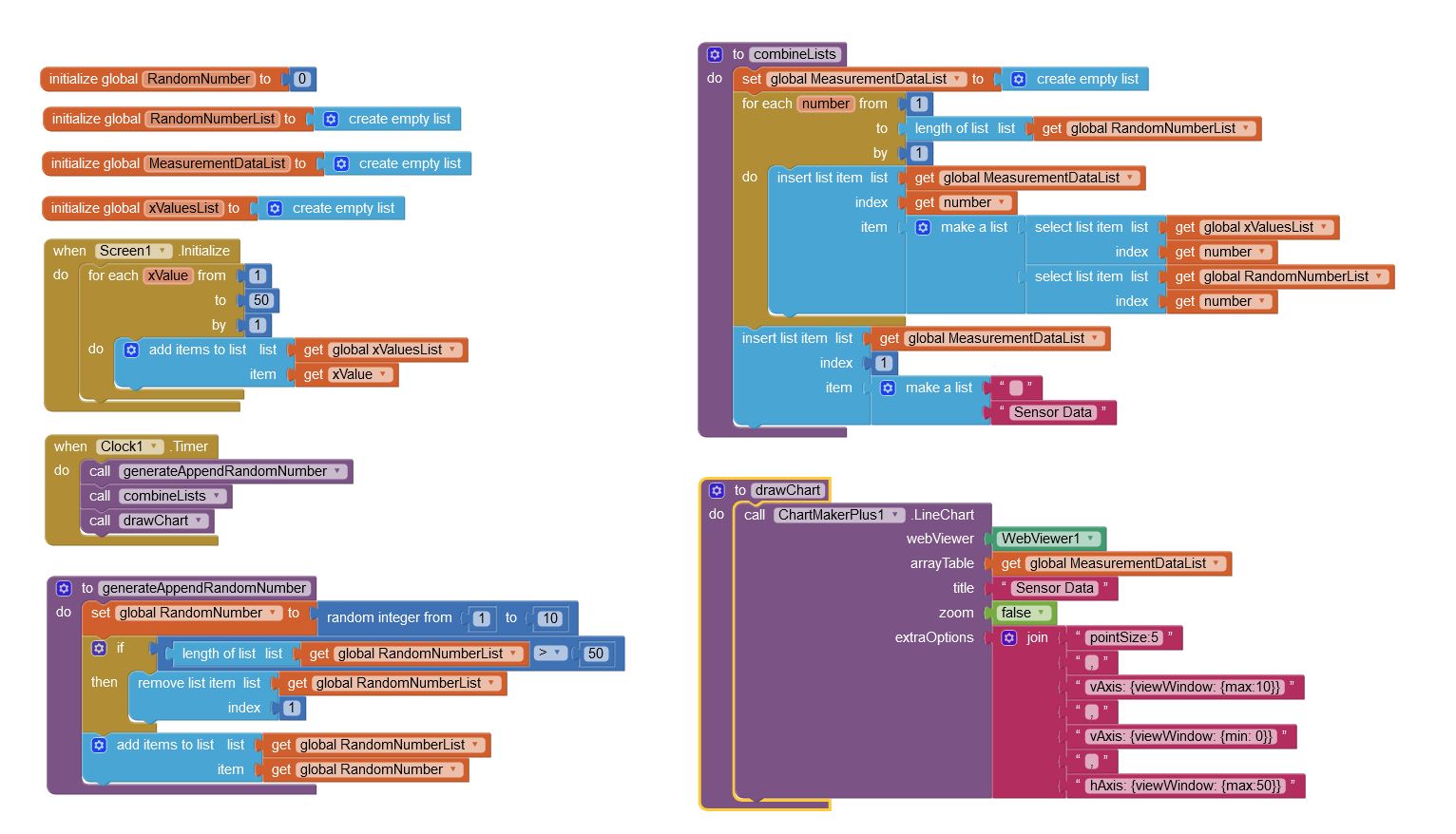
I have made several attempts to handle real time data. Whilst an in html javascript update of data seems to work well, providing a feed of realtime data is less than successful.
You may have more luck with (google) searches on the subject, but there will always be a short delay while the chart is turned around at the server.
You could try using High Charts, where you can bring down all the javascript libraries to the app.
Unfortunately, the new Chart component didn't make it into the latest nb189 release 
Thanks for your instantaneous reply! I’ll look into that.
Great job @TIMAI2 !
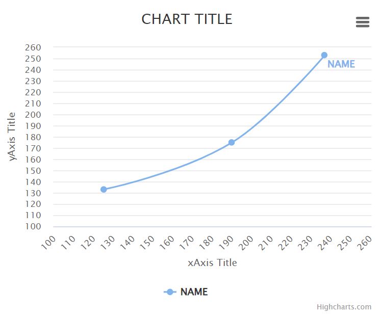
Before I knew about this extension, I made a (Sp)Line chart with HighCharts.
But now I would like to convert it to your extension.
I went through the google docs but I'm totally lost.
Could somebody please help me with the blocks for the arrayTable (Line Data) and which options to plug in to extraOptions?
Here is the html code and a screen shot of what I have made in HighCharts, so that you can see what I want to get to:
<!DOCTYPE html>
<html>
<head>
	<script src="https://code.highcharts.com/highcharts.js"></script>
	<script src="https://code.highcharts.com/modules/series-label.js"></script>
	<script src="https://code.highcharts.com/modules/exporting.js"></script>
	<script src="https://code.highcharts.com/modules/export-data.js"></script>
	<script src="https://code.highcharts.com/modules/accessibility.js"></script>
</head>
<body>

	<div id="container1" style="width:50%"></div>

	<script>
		Highcharts.chart('container1', {
			chart: {
				type: 'spline',
				height: 80  + '%'
			},
			title: {
				text: 'CHART TITLE'
			},
			xAxis: {
				title: {
					text: 'xAxis Title'
				},
				type: 'category',
				min: 100,
				max: 260,
				tickInterval: 10
			},
			yAxis: {
				title: {
					text: 'yAxis Title'
				},
				labels: {
					formatter: function () {
						return this.value;
					}
				},
				min: 100,
				max: 260,
				tickInterval: 10
			},

			series: [{
				name: 'NAME',
				data: [[125, 133],[190, 175],[237, 253]]
			}],
		});
	</script>

</body>
</html>
Many thanks in advance!
Walter
I will do you examples using the native Charts component, and ChartMakerPlus.
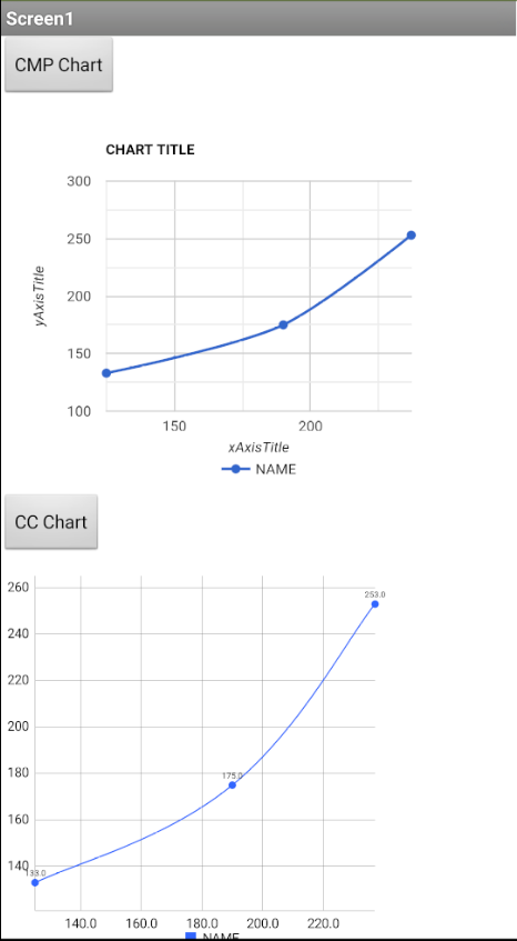
chartExamples.aia (13.0 KB)
You can play around with the settings of both charts to improve your output
That's great TIMAI2! Thank you so much for your swift reply!