Of course you can 
Thanks! Was wondering if you have any blocks that I can refer to? I just started working on MIT app for a school project and saw your extension and thought it'll be cool to combine both TinyDB and the bar chart!
All you have to do is extract the data from your tinydb tag/s and place it in a list format that works for a bar chart. You have everything you need. Have a go.
1 Like
Hi, @TIMAI2
I am currently using the doughnut Chart with the link you have added. Everything working great, maybe you can help me with putting the title in the center of the doughnut.
I dont have a picture but dont need picture to explain what I wanna do, it basically easy to understand.
I just wanna know do i add the extras by the title area or by the extras area, and what is the best html to type in to make it happen.
many thanks
See if there is anything here that works for you:
1 Like
Alternatively you could try this method:
then place the image on a button and set the title to the button text.....
Good extension! Thanks.
I'm trying to change the local/language setting using Javascript, but it only works when loading.
https://developers.google.com/chart/interactive/docs/basic_load_libs#loadwithlocale
Any other way to do it without having to change the source code?
@Edmilson_Torres. This is a good suggestion, I will add it when I get around to the next update.
As you have found, a change to the locale will need to be in the source code, you cannot add it after the page has loaded.
1 Like
WOW @TIMAI2
Your extension rocks, even in the outside. And more, it's free!
Thank You 
#One of the best extension!
HI,
How can i make the pie chart a doughnut Chart.? I used the piehole:'1' string and it is not working.
pieHole has a capital "H". A value of 1 is ignored.
var options = {
          title: 'My Pie Chart',
          pieHole: 0.5,
        };
https://developers.google.com/chart/interactive/docs/gallery/piechart#donut
1 Like
Thank you. It worked. 
Also, how can i set the width of line chart. On default there is a lot of margin both left and right of the chart?
Width and Height are set to the size of the webviewer. Try playing around with positions and visiblity titles and legends to get a "fuller" chart. Look in the configuration options for pie charts....
Ok. Thank you. will try that..
hi,
Can i make an input entry through my app and display it on tableview?
How can i make the entry goes the csv sheet?
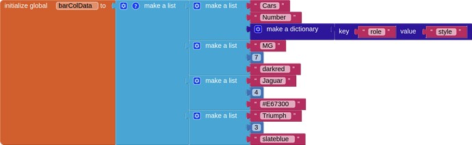
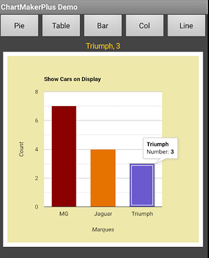
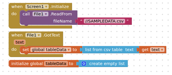
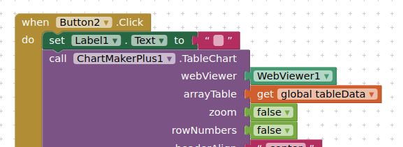
Not sure I understand what you mean? If you look at the demo aia project provided, I read a standard csv file using the file component and convert this to a list. This is then applied to the tablechart block:
extract from SAMPLEDATA.csv:
id,first_name,last_name,city,company,car_make,country
1,Flori,Baudi,Tangguhang,Tagopia,Volvo,Italy
2,Nonie,Hovey,Millerovo,Mynte,Toyota,Russia
3,Royall,Wyrall,Cancas,Edgepulse,Lincoln,Peru
4,Terrel,Worgan,Siemianowice Śląskie,Meejo,Chrysler,Poland
5,Tyson,Wernham,Ibiporã,Brainbox,Dodge,Brazil
6,Anabal,Duigenan,Chaltyr,Blogspan,Chevrolet,Russia
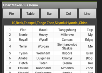
You can generate your tablechart data and refresh the tablechart using either a csv or a list, as you wish....
Perhaps show what you want to do if this doesn't answer your question...
1 Like
I got that. I can generate table chart data directly from list, right?
Yes, you can just use a correctly structured AI2 list
1 Like
Hello,
How can i customize the colors of both bars in a column chart with two bars?. I used `colors:[#004411'] and it seems to be setting color of only one bar.