 Introduction
A non-visible extension that provides additional tools to visible components, such as Label.
Hope it saved some of your time! It took me  3 days to complete this.
 Version: 5
Release date: 2022-04-03T09:00:00Z
 Built with: Niotron IDE
 Package name: com.gordonlu.componenutil
 Blocks overview
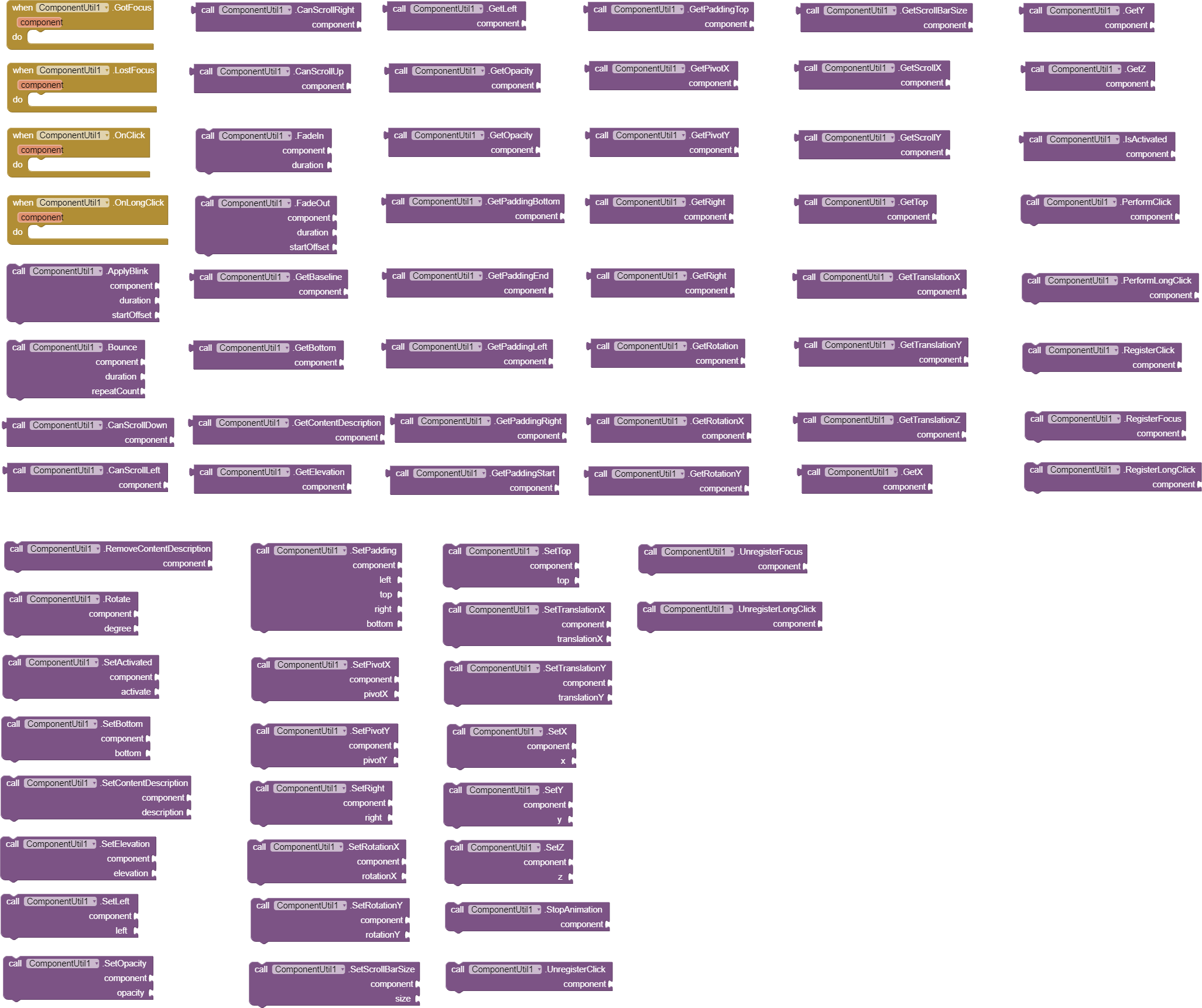
There are 96 blocks, 9 events and 88 methods.
V2 additions:
V3 additions:
V4 additions:
 Documentation
Event blocks
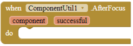
AfterFocus
This event is fired after the extension has attempted to give focus to a component.
Parameters: component = component, successful = boolean
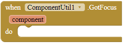
GotFocus
This event is fired when a registered component is focused.
Parameters: component = component
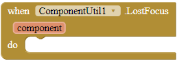
LostFocus
This event is fired when a registered component has focus removed.
Parameters: component = component
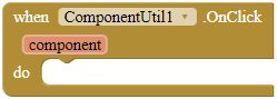
OnClick
This event is fired when a registered component is clicked.
Parameters: component = component
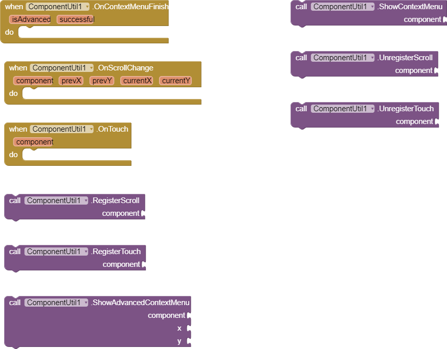
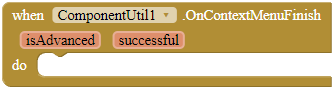
OnContextMenuFinish
This event is fired when the action is completed. The isAdvanced parameter identifies whether the action is showing an advanced context menu, and the successful parameter is whether the action is successfully completed.
Parameters: isAdvanced = boolean, successful = boolean
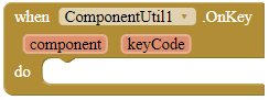
OnKey
This event is fired when the user has pressed a hardware key while playing around with this component. To check out what keyCode means, please read the keys in KeyEvent | Android Developers, starting with
KEYCODE_.Parameters: component = component, keyCode = number (int)
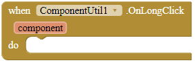
OnLongClick
This event is fired when a registered component is long clicked.
Parameters: component = component
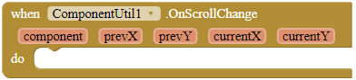
OnScrollChange
This event is fired when the user has scrolled the component. This probably only works with scrollable arrangements.
Parameters: component = component, prevX = number (int), prevY = number (int), currentX = number (int), currentY = number (int)
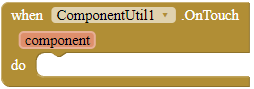
OnTouch
This event is fired when the user has touched a registered component.
Parameters: component = component
Method blocks
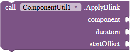
ApplyBlink
Applies blink animation to a component, given a specific duration and a component.
Parameters: component = component, duration = number (int), startOffset = number (int)
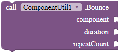
Bounce
Bounces the given component with the given duration and repeat counts.
Parameters: component = component, duration = number (int), repeatCount = number (int)
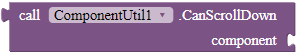
CanScrollDown
Checks whether the component can be scrolled vertically in a down direction.
Returns: boolean
Parameters: component = component
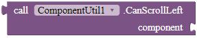
CanScrollLeft
Checks whether the component can be scrolled horizontally in a left direction.
Returns: boolean
Parameters: component = component
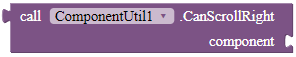
CanScrollRight
Checks whether the component can be scrolled horizontally in a right direction.
Returns: boolean
Parameters: component = component
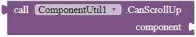
CanScrollUp
Checks whether the component can be scrolled vertically in a up direction.
Returns: boolean
Parameters: component = component
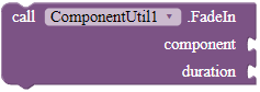
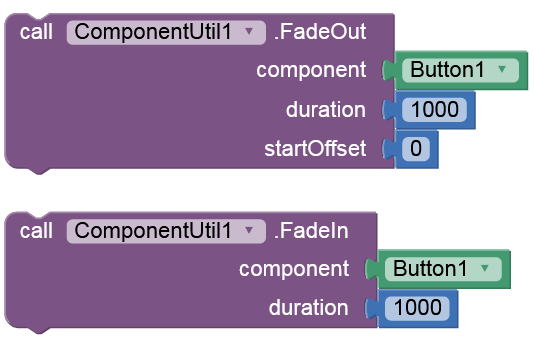
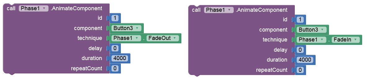
FadeIn
Applies fade-in animation for the given component.
Parameters: component = component
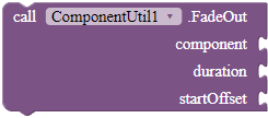
FadeOut
Applies fade-out animation for the given component.
Parameters: component = component, duration = number (int), startOffset = number (int)
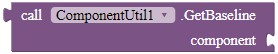
GetBaseline
Return the offset of the component's text baseline from the widget's top boundary. If this component does not support baseline alignment, this method returns -1.
Returns: number (int)
Parameters: component = component
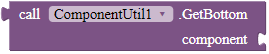
GetBottom
Returns the bottom of this component, in pixels.
Returns: number (int)
Parameters: component = component
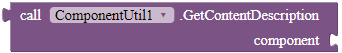
GetContentDescription
Returns the component's content description.
Returns: text
Parameters: component = component
GetElevation
Returns the base depth position, or elevation, of the component, in pixels.
Returns: number (float)
Parameters: component = component

GetLeft
Returns the left edge of this component, in pixels.
Returns: number (int)
Parameters: component = component
GetOpacity
Returns the opacity of the component. 0 is less opaque and 1 is most opaque.
Returns: number (float)
Parameters: component = component
GetPaddingBottom
Returns the bottom padding of this component in pixels. If there are inset and enabled scrollbars, this value may include the space required to display the scrollbars as well.
Returns: number (int)
Parameters: component = component
GetPaddingEnd
Returns the end padding of this component in pixels. If there are inset and enabled scrollbars, this value may include the space required to display the scrollbars as well.
Returns: number (int)
Parameters: component = component
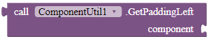
GetPaddingLeft
Returns the left padding of this component in pixels. If there are inset and enabled scrollbars, this value may include the space required to display the scrollbars as well.
Returns: number (int)
Parameters: component = component
GetPaddingRight
Returns the left padding of this component in pixels. If there are inset and enabled scrollbars, this value may include the space required to display the scrollbars as well.
Returns: number (int)
Parameters: component = component
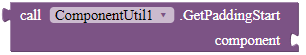
GetPaddingStart
Returns the start padding of this component in pixels. If there are inset and enabled scrollbars, this value may include the space required to display the scrollbars as well.
Returns: number (int)
Parameters: component = component
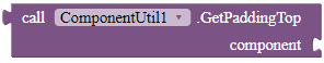
GetPaddingTop
Returns the top padding of this component in pixels. If there are inset and enabled scrollbars, this value may include the space required to display the scrollbars as well.
Returns: number (int)
Parameters: component = component
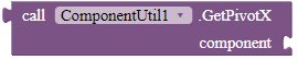
GetPivotX
Returns the x location of the point around which the component is rotated and scaled.
Returns: number (float)
Parameters: component = component
GetPivotY
Returns the y location of the point around which the component is rotated and scaled.
Returns: number (float)
Parameters: component = component
GetRight
Returns the right edge of this component, in pixels.
Returns: number (int)
Parameters: component = component
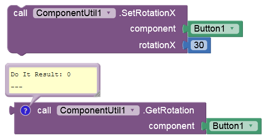
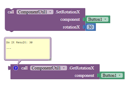
GetRotation
Returns the degrees that the component is rotated around the pivot point.
Returns: number (float)
Parameters: component = component
GetRotationX
Returns the degrees that the component is rotated around the horizontal axis through the pivot point.
Returns: number (float)
Parameters: component = component
GetRotationY
Returns the degrees that the component is rotated around the vertical axis through the pivot point.
Returns: number (float)
Parameters: component = component
GetScaleX
Returns the amount that the component is scaled in x around the pivot point, as a proportion of the view's unscaled width.
Returns: number (float)
Parameters: component = component
GetScaleY
Returns the amount that the component is scaled in y around the pivot point, as a proportion of the view's unscaled width.
Returns: number (float)
Parameters: component = component
GetScrollBarSize
Returns the scrollbar size for this component.
Returns: number (int)
Parameters: component = component
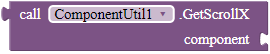
GetScrollX
Return the scrolled left position of this component. This is the left edge of the displayed part of your component. You do not need to draw any pixels farther left, since those are outside of the frame of your component on screen.
Returns: number (int)
Parameters: component = component
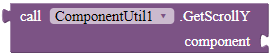
GetScrollY
Return the scrolled top position of this component. This is the top edge of the displayed part of your component. You do not need to draw any pixels farther top, since those are outside of the frame of your component on screen.
Returns: number (int)
Parameters: component = component
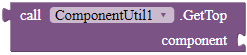
GetTop
Returns the top edge of this component, in pixels.
Returns: number (int)
Parameters: component = component
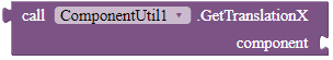
GetTranslationX
Returns the horizontal location of this component relative to its left position. This position is post-layout, in addition to wherever the object's layout placed it.
Returns: number (float)
Parameters: component = component
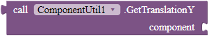
GetTranslationY
Returns the vertical location of this component relative to its top position. This position is post-layout, in addition to wherever the object's layout placed it.
Returns: number (float)
Parameters: component = component
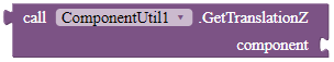
GetTranslationZ
Returns the depth location of this component relative to its elevation.
Returns: number (float)
Parameters: component = component
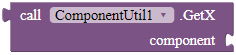
GetX
Returns the visual x position of this component, in pixels. This is equivalent to the TranslationX property plus the current left property.
Returns: number (float)
Parameters: component = component
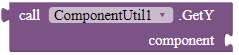
GetY
Returns the visual y position of this component, in pixels. This is equivalent to the TranslationX property plus the current top property.
Returns: number (float)
Parameters: component = component
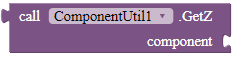
GetZ
Returns the visual z position of this component, in pixels. This is equivalent to the TranslationZ property plus the current elevation property.
Returns: number (float)
Parameters: component = component
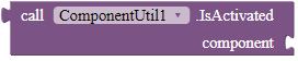
IsActivated
Indicates the activation state of this component. Activation state is not equivalent to enabling state.
Returns: boolean
Parameters: component = component
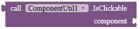
IsClickable
Checks whether this component is clickable or not.
Returns: boolean
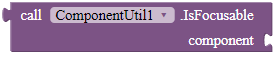
IsFocusable
Checks whether this component is currently able to take focus.
Returns: boolean
Parameters: component = component
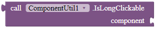
IsLongClickable
Checks whether this component is long clickable or not.
Returns: boolean
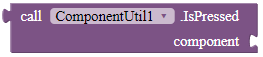
IsPressed
Checks whether this component is currently pressed by the user.
Returns: boolean
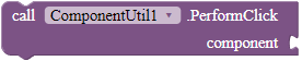
PerformClick
Performs a click for the given component.
Parameters: component = component
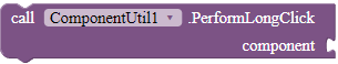
PerformLongClick
Performs a long click for the given component.
Parameters: component = component
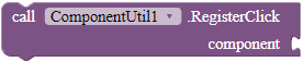
RegisterClick
Registers the component so that when the user clicks the component, it will fire the OnClick event.
Parameters: component = component
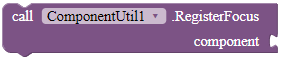
RegisterFocus
Registers the component so that when the user focuses or removes focus for the component, it will fire the respective event.
Parameters: component = component
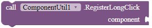
RegisterLongClick
Registers the component so that when the user clicks the component, it will fire the OnLongClick event.
Parameters: component = component
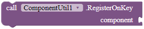
RegisterOnKey
Registers the component so that when the user presses hardware keys while playing around with this component, the extension will fire the OnKey event.
Parameters: component = component
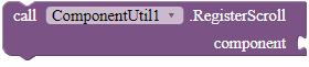
RegisterScroll
Registers the component so that when the user scrolls the component, it will fire the OnScroll event.
Parameters: component = component
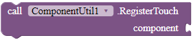
RegisterTouch
Registers the component so that when the user touches the component, it will fire the OnTouch event.
Parameters: component = component
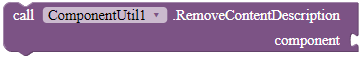
RemoveContentDescription
Removes the component's content description.
Parameters: component = component
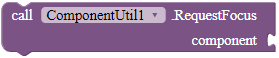
RequestFocus
Call this to try to give focus to a specific component or to one of its descendants.
Parameters: component = component
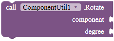
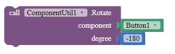
Rotate
Rotates the given component.
Parameters: component = component, degree = number (float)
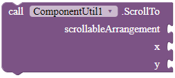
ScrollTo
Scrolls the scrollable arrangement to the given position.
Parameters: scrollableArrangement = component, x = number (int), y = number (int)
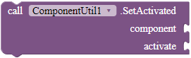
SetActivated
Changes the activated state of this component.
Parameters: component = component, activate = boolean
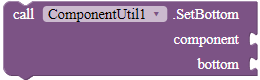
SetBottom
Sets the bottom position of this component relative to its parent, in pixels.
Parameters: component = component, bottom = number (int)
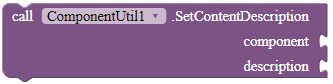
SetContentDescription
Sets the component's content description. A content description briefly describes the component and is primarily used for accessibility support to determine how a component should be presented to the user.
Parameters: component = component, description = text
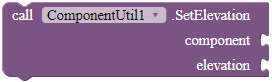
SetElevation
Sets the elevation for the given component.
Parameters: component = component, elevation = number (float)
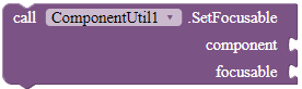
SetFocusable
Set whether this component can receive the focus.
Parameters: component = component, focusable = boolean
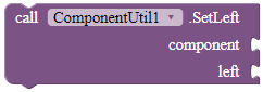
SetLeft
Sets the left position of this component relative to its parent, in pixels.
Parameters: component = component, left = number (int)
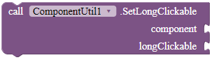
SetLongClickable
Sets whether this component can be long clickable.
Parameters: component = component, longClickable = boolean
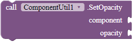
SetOpacity
Sets the opacity of this component. 0 is less opaque and 1 is most opaque.
Parameters: component = component, opacity = number (float)
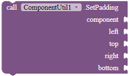
SetPadding
Sets the padding of the given component.
Parameters: component = component, left = number (int), top = number (int), right = number (int), bottom = number (int)
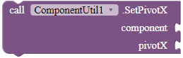
SetPivotX
Sets the x location of the point around which the component is rotated and scaled. By default, the pivot point is centered on the object.
Parameters: component = component, pivotX = number (float)
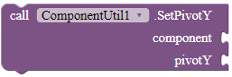
SetPivotY
Sets the y location of the point around which the component is rotated and scaled. By default, the pivot point is centered on the object.
Parameters: component = component, pivotX = number (float)
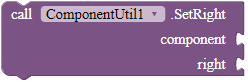
SetRight
Sets the right position of this component relative to its parent, in pixels.
Parameters: component = component, right = number (int)
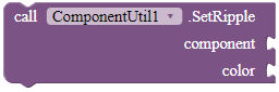
SetRipple
Applies ripple effect for the given component.
Parameters: component = component, color = color
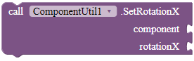
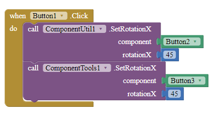
SetRotationX
Sets the degrees that the component is rotated around the horizontal axis through the pivot point.
Parameters: component = component, rotationX = number (float)
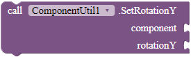
SetRotationY
Sets the degrees that the component is rotated around the vertical axis through the pivot point.
Parameters: component = component, rotationY = number (float)
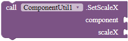
SetScaleX
Sets the amount that the component is scaled in x around the pivot point, as a proportion of the component's unscaled width. A value of 1 means that no scaling is applied.
Parameters: component = component, scaleX = number (float)
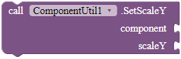
SetScaleY
Sets the amount that the component is scaled in y around the pivot point, as a proportion of the component's unscaled height. A value of 1 means that no scaling is applied.
Parameters: component = component, scaleY = number (float)
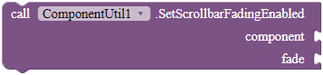
SetScrollbarFadingEnabled
Define whether scrollbars will fade when the component is not scrolling.
Parameters: component = component, fade = boolean
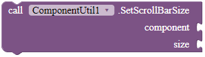
SetScrollBarSize
Sets the size of the scrollbar.
Parameters: component = component, size = number (int)
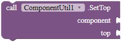
SetTop
Sets the top position of this component relative to its parent, in pixels.
Parameters: component = component, top = number (int)
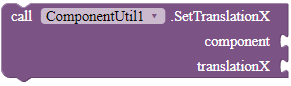
SetTranslationX
Sets the horizontal location of this component relative to its left position.
Parameters: component = component, translationX = number (float)
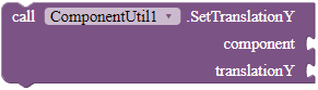
SetTranslationY
Sets the vertical location of this component relative to its top position.
Parameters: component = component, translationY = number (float)
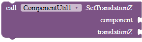
SetTranslationZ
Sets the depth location of this component relative to its elevation.
Parameters: component = component, translationZ = number (float)
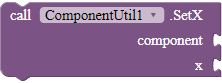
SetX
Sets the visual x position of this component, in pixels. This is equivalent to setting the TranslationX property to be the difference between the x value passed in and the current left property.
Parameters: component = component, x = number (float)
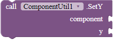
SetY
Sets the visual y position of this component, in pixels. This is equivalent to setting the TranslationY property to be the difference between the y value passed in and the current top property.
Parameters: component = component, y = number (float)
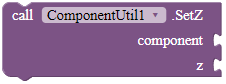
SetZ
Sets the visual z position of this component, in pixels. This is equivalent to setting the TranslationZ property to be the difference between the z value passed in and the current elevation property.
Parameters: component = component, y = number (float)
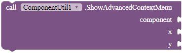
ShowAdvancedContextMenu
Shows the advanced context menu for this component and fires the OnContextMenuFinish event for whether it is successful. What's different from ShowContextMenu is that you can specify the x and y position of the context menu. This function will require devices with Android versions larger or 7.0.
NOTE: I cannot guarantee that this block works properly. That's why there is a successfull parameter in the corresponding event.
Parameters: component = component, x = number (float), y = number (float)
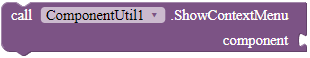
ShowContextMenu
Shows the context menu for this component and fires the OnContextMenuFinish event for whether it is successful.
Parameters: component = component
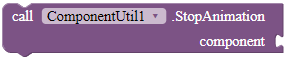
StopAnimation
Stops all animations that you applied for the given component.
Parameters: component = component
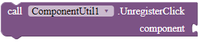
UnregisterClick
Unregisters the component so that when it is clicked, the extension will not fire the OnClick event.
Parameters: component = component
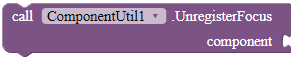
UnregisterFocus
Unregisters the component so that when the user has focused or removed focus this component, it will not fire the respective event.
Parameters: component = component
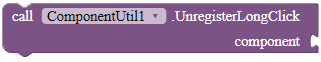
UnregisterLongClick
Unregisters the component so that when it is clicked, the extension will not fire the OnLongClick event.
Parameters: component = component
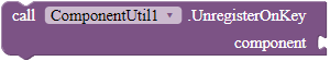
UnregisterOnKey
Unegisters the component so that when a hardware key is pressed in this component, the extension will not fire the OnKey event.
Parameters: component = component
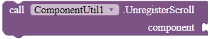
UnregisterScroll
Unregisters the component so that when the user has scrolled this component, it will not fire the OnScrollChange event.
Parameters: component = component
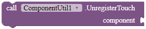
UnregisterTouch
Unregisters the component so that when the user has touched this component, it will not fire the OnTouch event.
Parameters: component = component
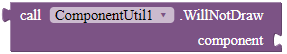
WillNotDraw
Checks whether the component can draw on its own.
Returns: boolean
Parameters: component = component
 Downloads
AIX:
com.gordonlu.componentutil.aix (31.1 KB)
 History
Version 5, April 16 2022
AIX: com.gordonlu.componentutil.aix (28.6 KB)
Version 4, April 6 2022
AIX: com.gordonlu.componentutil.aix (27.3 KB)
Version 3, April 5 2022
AIX:
com.gordonlu.componentutil.aix (26.6 KB)
JAVA:
ComponentUtilV3.txt (32.5 KB)
Version 2, April 4 2022
AIX: com.gordonlu.componentutil.aix (24.1 KB)
JAVA:
ComponentUtilV2.txt (28.9 KB)
Version 1, April 3 2022
AIX: com.gordonlu.componentutil.aix (20.5 KB)
JAVA:
ComponentUtil.txt (25.1 KB)
 Credits
Thank you @Kumaraswamy and @Salman_Dev for your help (I read your posts in the OS Development category, helps me a lot) and @MohamedTamer for his ComponentTools extension. Go check it out!
Also, for extensions that were mine and migrated into here, I would like to thank @Aquib_Khan for ClickZ.
Special thanks for YOU for reading this.
Other contributors:
-
@SRIKAR_B.S.S for Animation Maker.
-
@Ct_tricks and other Niotron staff for Niotron IDE.
-
@nishyanthkumar for motivation.
Made with Niotron IDE.
Kindly  PM me if you have any questions! Also, if you like my extension, please
  like it! It takes some effort for me to make it...
Likes tell me the general user feedback of my extension. If you read this extension, please take 20 seconds to drop by and give a like!
If you have any features that you want to add and you know the code, PM me or directly reply below using the  button.
By downloading my extension, you agree the terms and conditions in my website.
Gordon Lu
 Message
 Website
 E-mail
 Version 2!
 Ok. That is exactly what the Stack Overflow answer is. I'll check it.


 the repo!