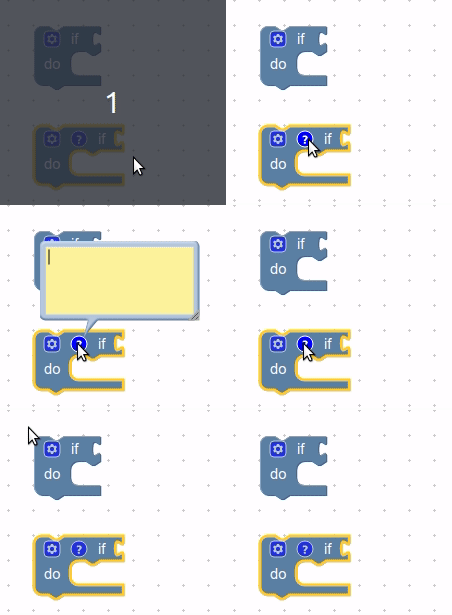
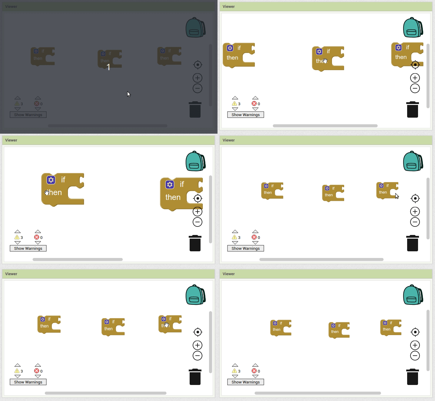
Since the workspace drag operation updates the scrollbar position, we might be able to override the scrollbar set method to handle repositioning the comment bubbles without having to modify core at all. As for blocks, we could be a bit cheaty and register event handlers in response to mouse/touch events that just check whether a block is being dragged and update accordingly, although it would be nice if core had hooks to add behavior during these types of actions.
Thank you very much for such a lot of work, thinking on the best position of the comments bubble in every circumstance and position of the block in the workspace.
In my opinion, the simplest solution is almost always the best.
Please consider that, in a real project, the block to be commented would have some more blocks nested inside, and would be preceded and followed by more blocks, in a column like shape (most of the times higher than the vertical dimension of what can be seen in the screen. So it would be nearly impossible to avoid the comment bubble overlapping other blocks.
It doesn’t matter if the bubble is over other blocks, as far as it is not over the current block (and the ones nested inside).
What would I do?
As far as the question mark for bringing up the bubble, is always on top of the block; By default I would set the original bubble a little bit higher (just enough for not hiding its own block).
Then, once the user sets a different position (if desired), It’s really great if this position is memorized and kept every time the user hides or brings up the bubble again.
This would make up a much more consistent user experience, than the bubble jumping to an unexpected position in the workspace.
I would double the size of the font.
As soon as a project grows over half a dozen blocks, most of the time you have to use the zoom tool, for the screen to show an acceptable number of the related blocks.
Then the size of the text in the comments bubble is so small that it becomes a real pain to increase the zoom every time you work on a comment, and then reduce it back again to keep working on blocks.
Sorry I don't think I was very clear before! You are correct that would be pretty annoying if comments tried to avoid /all/ blocks. Their current behavior actually matches what you're suggesting, they just try to avoid the block they are attached to. Here's a gif demonstrating this:

Thank you for your input! I think that makes sense. But I would encourage you to try out the intelligent positioning once it is released (as I believe that's what we're going to try first). In my experience it's pretty good! So it's rare that you actually move your comment.
Makes sense. I think you have a valid point about how annoying zooming can be. My question is: Do you think the size of all text should increase? Or just the comment text?
I wanted to mention, there's a handy trick you can use for zooming: which is to zoom with your mouse wheel. Just do "ctrl/cmd + wheel" and the workspace will zoom towards your mouse pointer. (Note that it's actually a lot smoother, gif recording just makes it choppy)

I know that doesn't help if you don't have a mouse wheel ![]() But it can be pretty nice if you do!
But it can be pretty nice if you do!
Thank you for your thoughts @Martin_Herraiz. We really appreciate the feedback!
On hardware that supports it (e.g., Macbooks), these get mapped to two-finger pinch gestures. This is how I typically navigate an App Inventor workspace (also panning gestures with 2 fingers).
I think we should enforce a minimum font size in the comment bubble, but I don't know that straight out doubling the size makes the most sense (currently 11pt would become 22pt). This way, when zooming out the font would remain 11pt relative to the screen rather than scaled as a function of the workspace (zoom out 50% and today the font will be 6.5pt). Right now the whole thing just scales with the workspace scale, which might be fine when zooming in, but makes it harder to read when zooming out.
I'd have to think more about whether this should apply to all bubbles (e.g., mutators), or just comments. In the case of the block text, I think it makes sense that text scales with the workspace since that content is all in the same plane.
Thanks for your early answer to my suggestions, and for the tricks you mention.
I would only increase the text size on the comments bubble (which now is hard to read, at the most common zoom level).
I believe that increasing all text would only make the blocks bigger in size, escalating but not solving the problem.
May be we could also save some room (and thus gain readability) by reducing a little bit the space between lines.
Also, some fonts are more readable than others (especially for elderly people like me).
My favourite one is Verdana.
Looking forward to try the next release.
My suggestion:
As a rule of thumb, don’t try to make the application more intelligent than the user.
An application is something programmed by someone who is trying to put in the user’s shoes. But there is no guarantee that both programmer and user are thinking the same, or that different users have the same needs, or point of view.
From my understanding, a simple (but steady and reliable) functioning, than everybody understands and learns easily, is preferable than a fancy (but some times unexpected) one.
“Do It” comments moving has been fixed by #2181. I believe it should go out in the next release of App Inventor. 

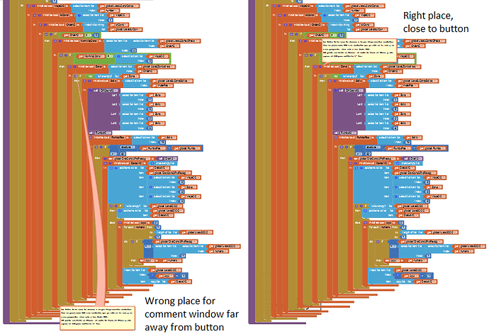
Please, let the comment window stay close to the button you click to open it.
It's a nightmare to need to scroll to a place far away (below all your blocks), to be able to read a comment.
And then back to top to close the comment window and follow your work.
Similar to the mutators. Better let them appear just abobe the block (instead of bellow)
I would agree and like to see this implemented. Having the comments "intelligently" position themselves is not necessarily what every user wants and having the option to manually control where comments are on the screen would save time and allow user to maintain focus on work at hand when screen reloads and repositions all the comments.
as a user, I prefer to have control over where the comment is placed.
this is the top Google search result for a bunch of queries regarding comment text size atm so I'm gonna risk necroing this one. I also find comment text size ridiculously small, I have to zoom to almost maximum (just 2 clicks shy of it using workstation controls, have maybe 2-3 small string blocks onscreen at that level) in order to read them at all and if I zoom back out just a couple clicks the text just about disappears. I don't usually use them to store data or notes though, they're my signposts to various functions/variables/objects and that's exactly what I want them for. My project is already up to 1500 blocks with no real end in sight (feature creep is bugger but it's also a much bigger piece than I intended to bite off and chew) and finding anything in all that mess is a serious, grinding, tedious chore. I'd LOVE if we could get up to like 40-50pt text in them, then they'd REALLY be useful. Just make comment text size dynamic, not hard coded, it may be hard and a bit of a tedious grind to get them all and get it working right but it's not impossible. imo this is almost the textbook definition of an accessibility issue and isn't getting the attention such deserves. My eyes are pretty bad, I pretty much wear coke bottles. I HAVE TO turn up text size in every app I use but this one won't let me. That's not very fair, I REALLY want to make an Android app just like everyone else can.
As luck would have it, I'm ALSO having issues with comments going all over the place and/or resizing when I load/reload, did the changes y'all were talkin about from 2021 not get approved or something? That "dual-mode" @BeksOmega was talking about sounds perfect for me, but I strongly doubt that I'm seeing it atm. Every single time I reload I have to reset all my comments, as they're all right in the centre of my screen again. Some of them have giant ASCII words in them as a workaround to the hard coded comment text size issue (START, Important functions, ect) and they resize to default almost every time I reload.
Have you tried the browser extensions in
?
