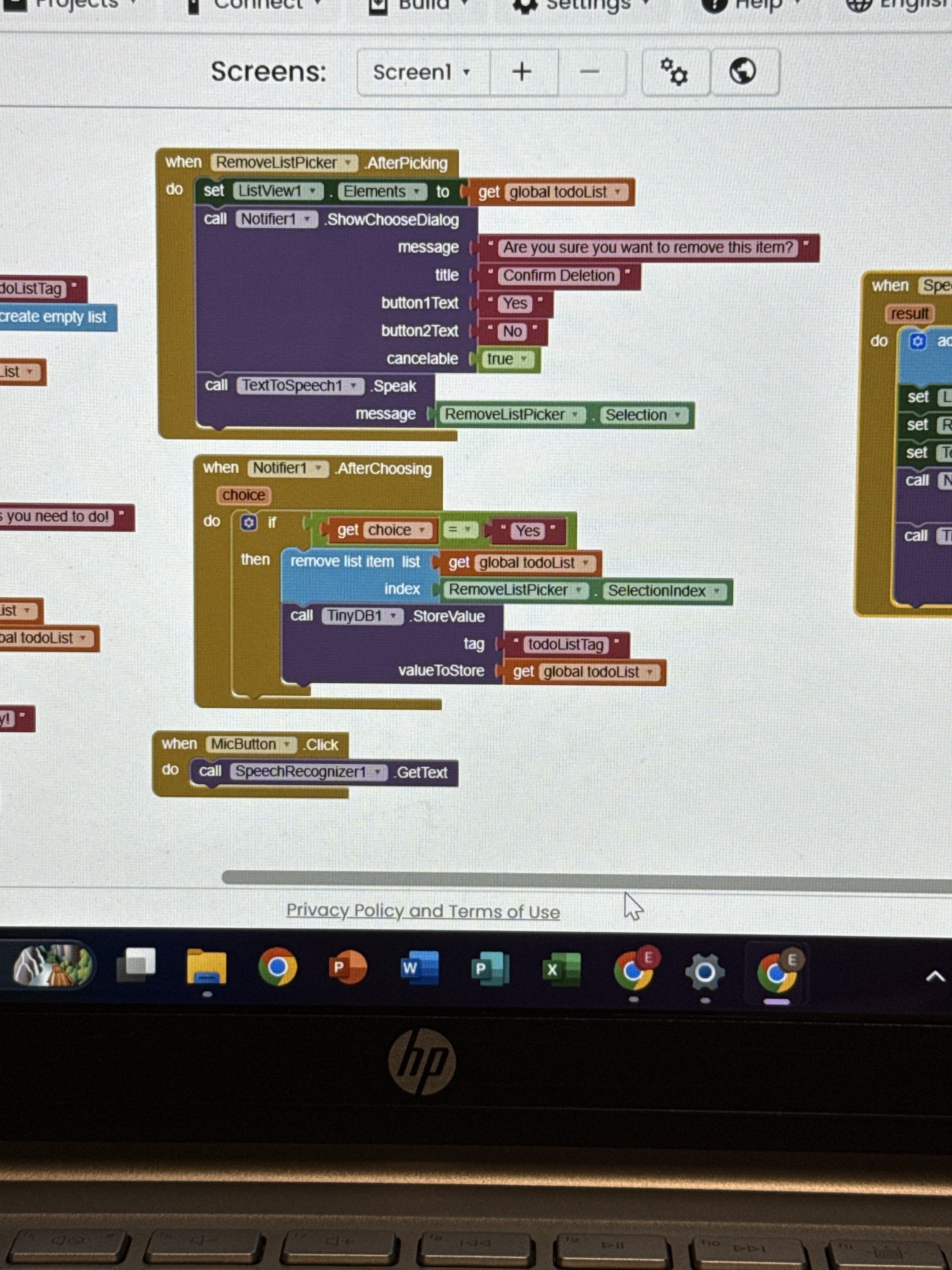
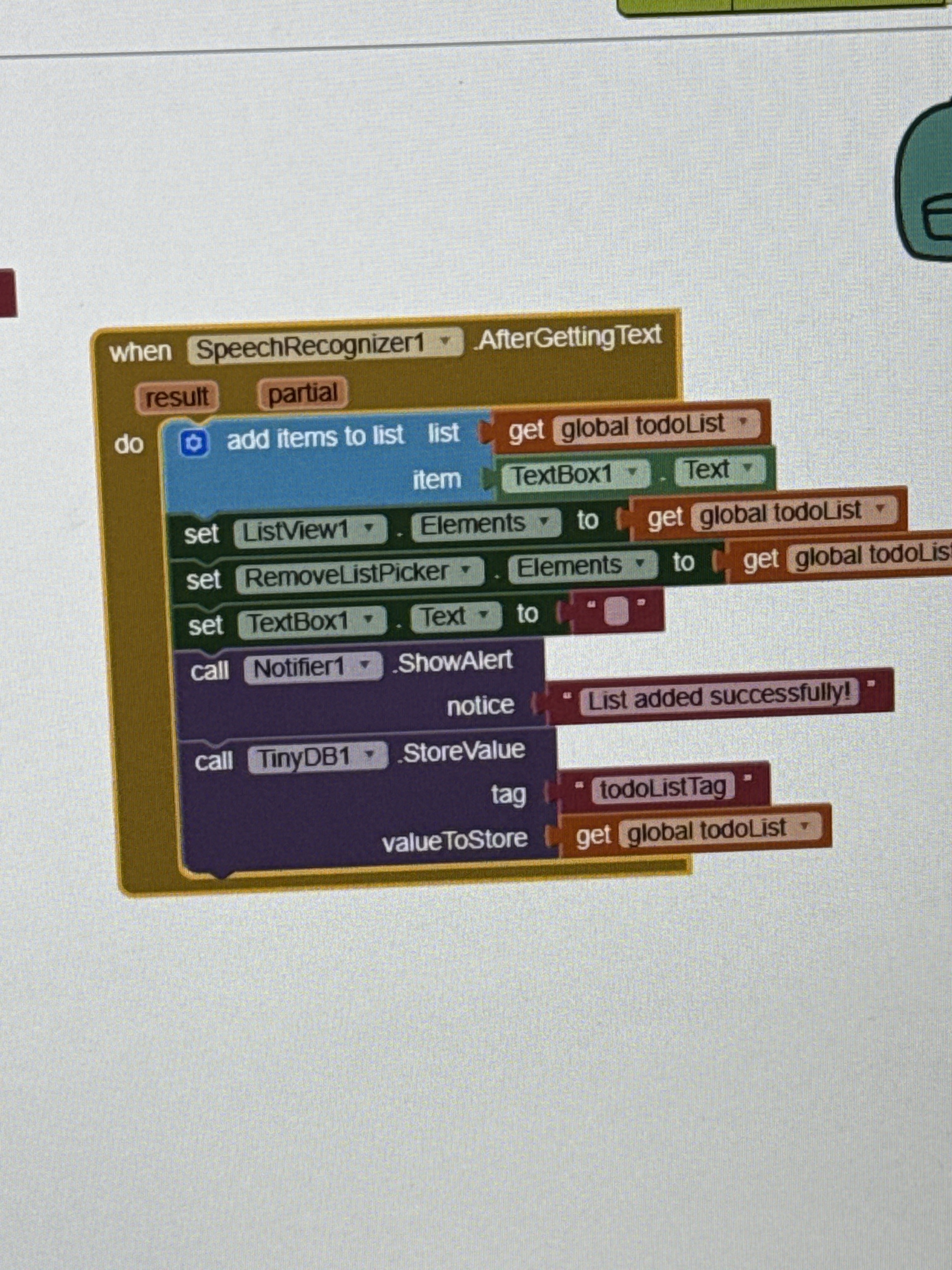
I can't comment on iOS, but either platform, this code is wrong:
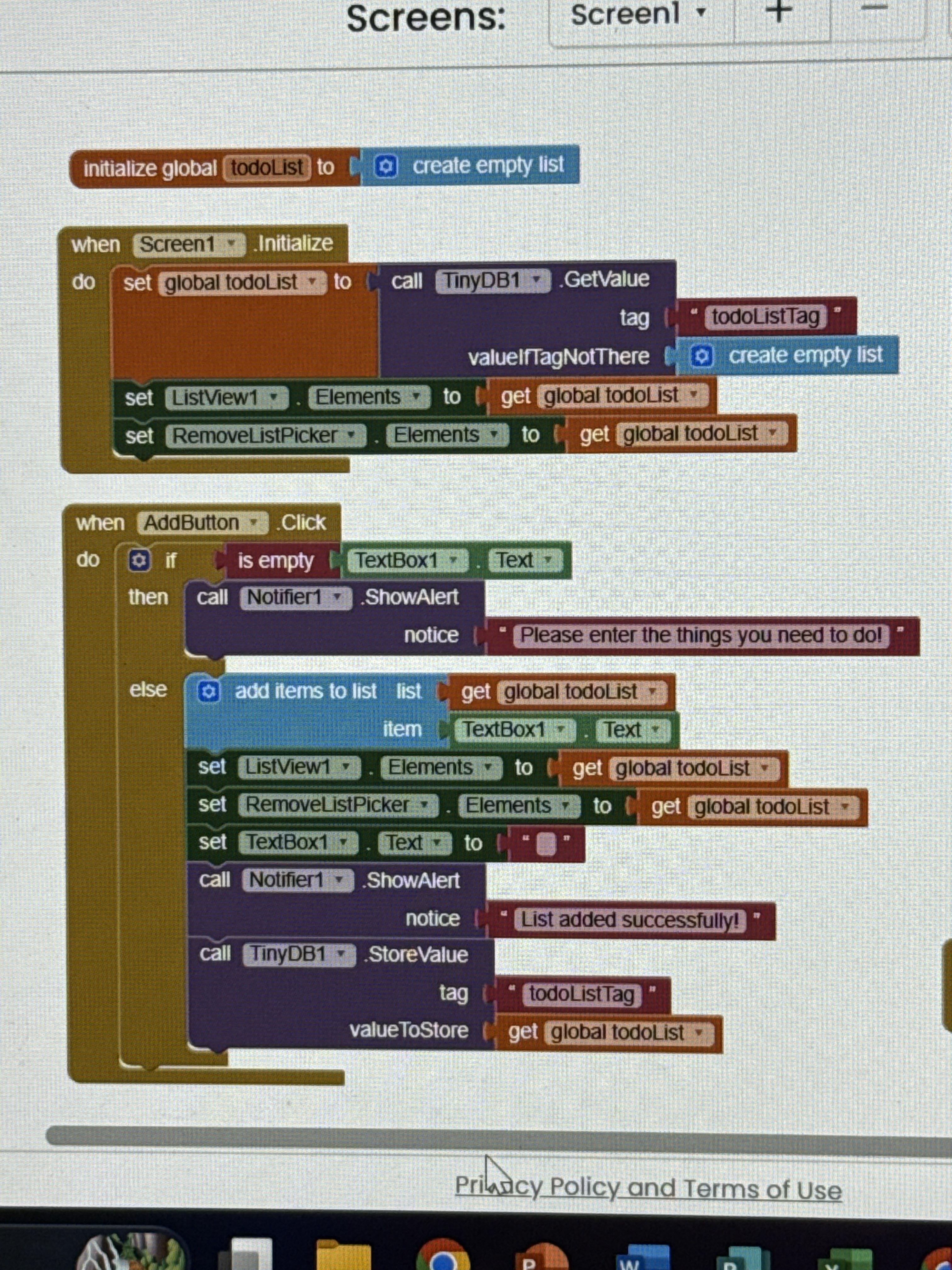
Speech Recognizer text comes in the result variable, which you totally ignore.
The iOS platform has resctrictions on the screen design (for labels, texts, layouts, etc). You must test the showed items and solve them to the best way would be posible for you with the current Ai2 features for iOS. Normaly the best way is to have easy-designs.
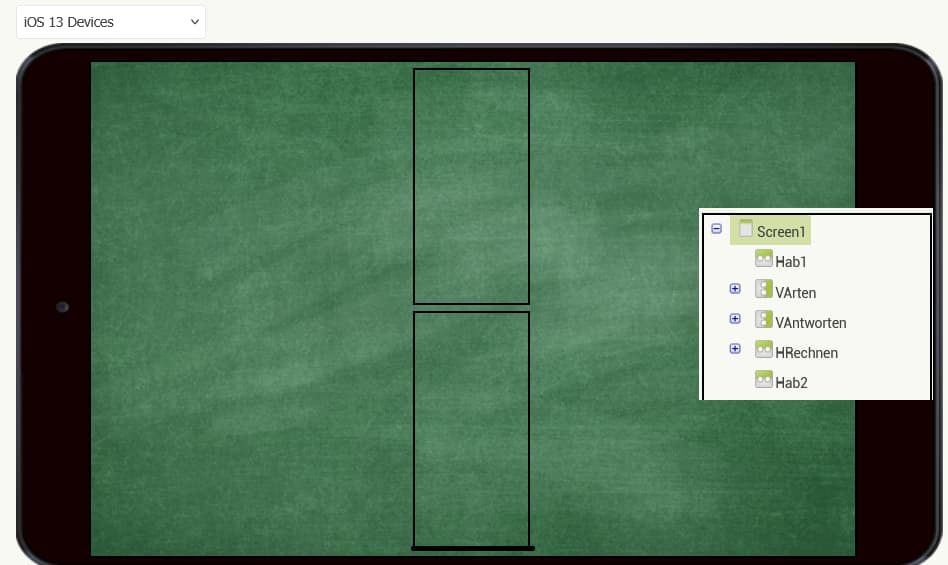
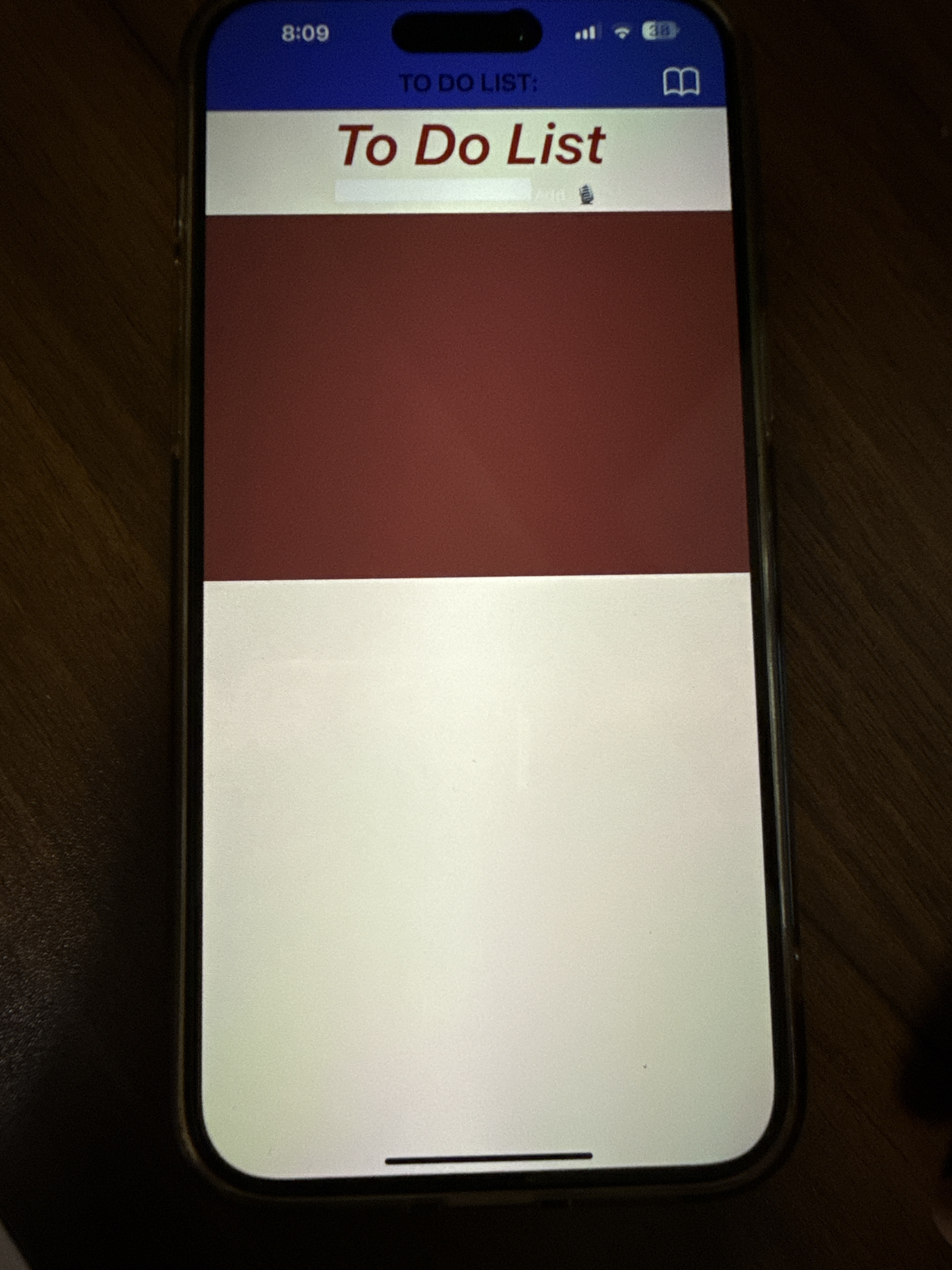
Actually, I wouldn’t say there are real restrictions for iOS — it’s more about being careful when the app launches or when switching between virtual screens.
My recommendations:
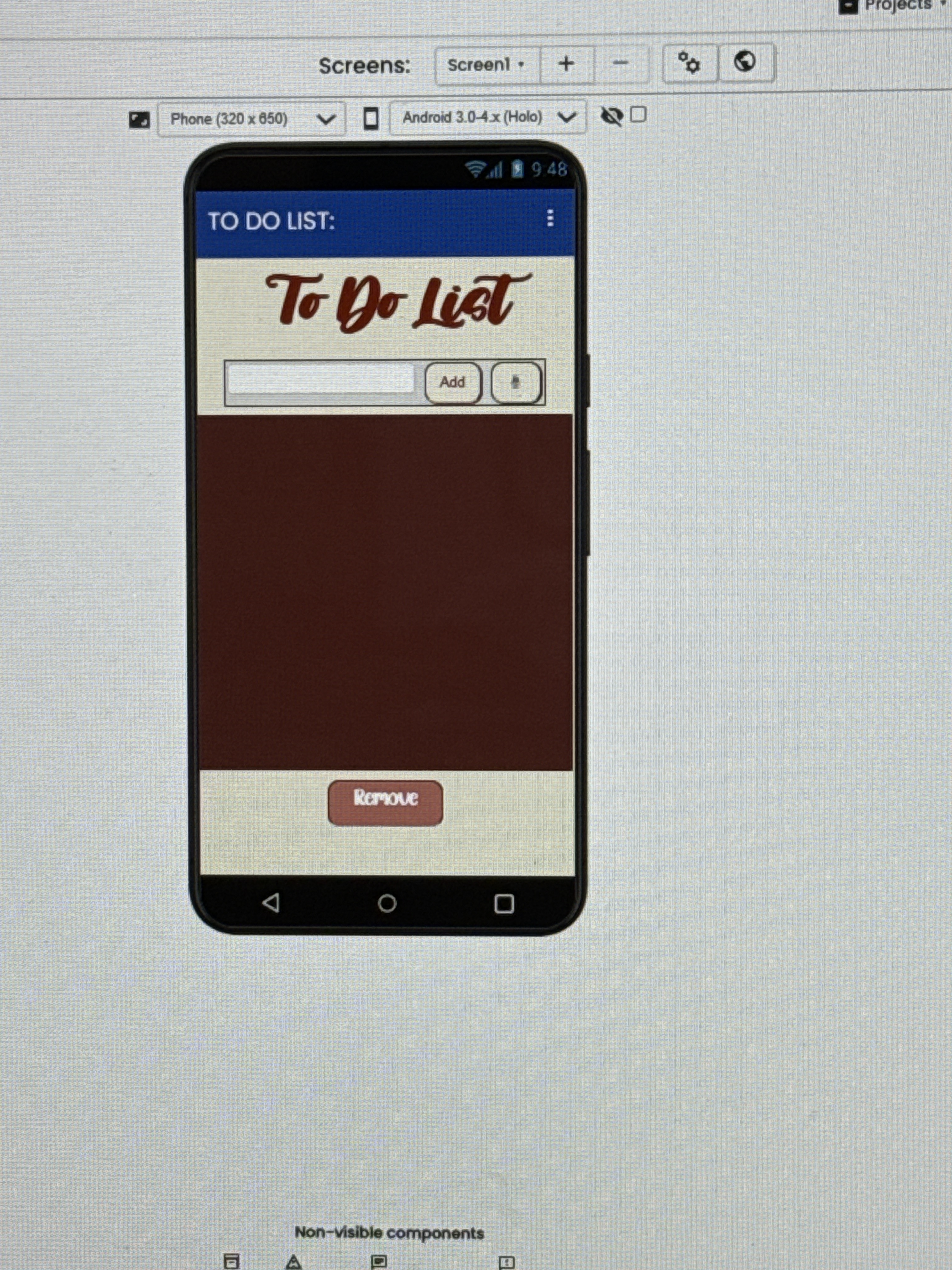
- Add visual elements at the top and bottom of your virtual screens (as shown in the picture) to keep them centered. This will help the device focus the content on the screen’s center.
- Specify the height and width of all visible components. If your app doesn’t contain too many elements, you can do this inside the Screen.Initialize block. Avoid adding any Clock component in the Screen.Initialize block, even for animation purposes. (In one of my tests, an app caused unusual overheating on iOS, which I believe was due to the Clock sensor forcing iOS to read variables in tight loops.)
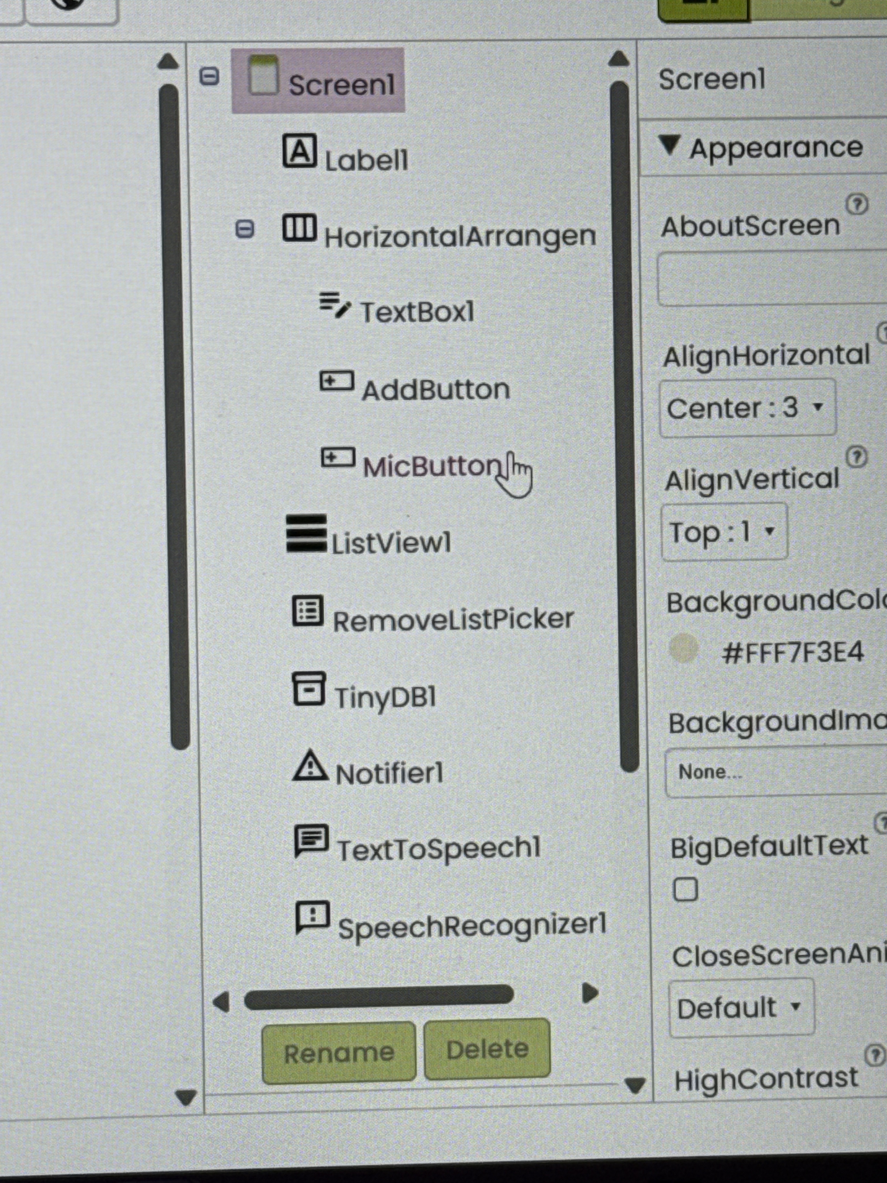
- Instead of storing component lists in variables, store them in procedures.
- Although it’s often said not to use nested layouts, I don’t fully agree. The Table Arrangement can be used like a virtual screen — but keep in mind that it has many design limitations.
- I don’t have a single app with two screens. I always use one screen, and if possible, only a few virtual screens within it.
1 Like