Which Line Graph?

Hello, i made an App to configure my ESP32 via BLE.

everything works as expected with the help of the community.

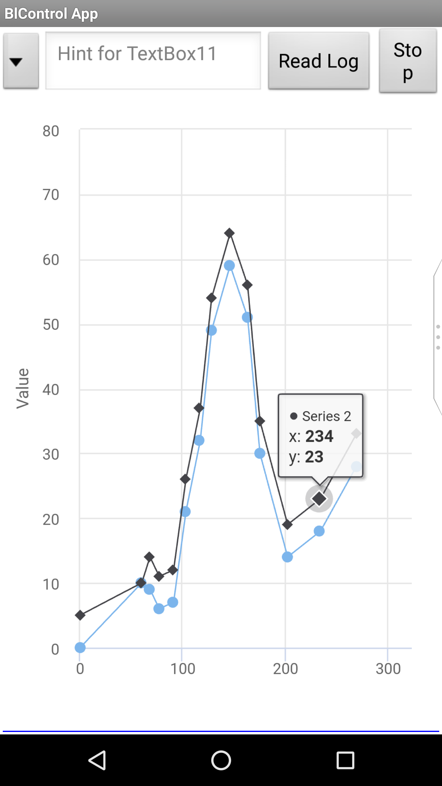
Now i want to make a Graph / Line Chart for Display some Sensor Data from the ESP32 (Voltage/Temp/...)

The Sensor Data is stored on the SD Card of the ESP32 and i want to read the Logfile and display it on the Phone. (Maybe with saving the data to a file....but that's another Topic)

The Graph should be scaled to 200 Datapoints (for example) when i start to read the Sensor Data.
After 200 displayed Points, the X-Axis should increase to 201 datapoints, 202 and so on...
Maybe up to 5000 Datapoints.
After read out all Sensor Data i want to Zoom (X-Axis) in the Graph to look at some details.

I know its no Problem in other App's programmed with Flutter or Android Studio.

But is it possible in App Inventor?
Which Chart should i use?
I think canvas cant handle my features?
Google Charts need connection to the Internet (Not preferred)
Maybe Chart.js?
ChartMaker?
HighCharts?

I dont want to test all available Chart's to see that it's not working. And maybe some had done something similar?

Greetings
John

Hi John,

Did you search the forum?

hello Peter,

yes i have read all these Examples. And i think i can get them working.

But the Examples are very simple. And i'am not sure if they can handle my features. (or which)

I think Highcharts is the optimal solution for me...

so i played a little bit with the Example
https://www.highcharts.com/demo/line-boost

I Downloaded the Highcharts Package and put it to SD Card. (Example folder is to big for uploading with app)

i added a Webview with URL to SDCard and the Example Index.html

And the Graph was Displayed and is zoomable.
Now i have to learn How to get the Sensor Data from App to HTML to HighChart

Let us know how and when you get it working, so we can add it to the FAQ!

first i have to get it working :sweat_smile:

what i have done so far:

  • upload necessary files to app
  • display the graph with dummy values

But i dont really understand how to get the data from App Inventor to the HTML file.
I know i have to use WebViewString set text.

But how do i use this in HTML? How to bring that to the Chart?

I attached the HTML file. The graph is made by click (touch) to a free position in the Graph:
events: {
click: function (e) {
// find the clicked values and the series
var x = Math.round(e.xAxis[0].value),
y = Math.round(e.yAxis[0].value),
series = this.series[0];
series1 = this.series[1];
// Add it
series.addPoint([x, y]);
series1.addPoint([x, y+5]);
}

index.txt (3.5 KB)

Here a graph with Google chart and JavaScript, maybe you can get some ideas to enter the data.

https://groups.google.com/forum/#!category-topic/mitappinventortest/apps-tips--tricks/_K59AYPlUQk

http://kio4.com/appinventor/169D_javascript_graficos.htm

thank you Juan,

i already saw these examples. But they are all drawn once. And with new data they are drawn new.

i want to add new points to the highchart.
And, i have no idea how to use HTML and javascript. how often do the scripts run?

my idea:

init graph (script)
and with every "WebViewString set text" there is called another script in html which add's the new point expressed in "text"

but that's not working in my example

as often as you set them to run. There is a setInterval function for repeating functions in javascript.

just realized that i don't need to update the graph

reading the Values with BLE and updating the Graph (live) would mean to set a update Timer of 1ms

So i will read the BLE Data (read from SD on BLE Device) to a Textfile on SD Card in Phone. So it would be great to have both files the same.

Log file will look this way: (Format for Logview and Dataexplorer)

$N$;Logging01
$C$;U_Gate[V];U_Lipo[V];Current[A];Temp1[°C,T];Temp2[°C,T];Temp3[°C,T];U_BEC[V,U];Temp6[°C,T];Temp4[°C,T];TempEXT[°C,T];Temp5[°C,T];Throttle[Dec];Rotations[RPM]
$I$;100
$12.00;11.63;0.00;25.49;27.55;26.00;0.00;-67.84;-67.84;-67.84;-67.84;0;0
$12.00;11.63;0.00;24.97;27.55;26.00;4.85;26.00;26.52;5.38;26.00;0;0
$11.98;11.63;0.00;25.49;28.07;25.49;4.87;26.00;27.03;-7.00;26.52;0;0
$11.98;11.63;0.00;25.49;28.58;25.49;4.85;26.00;27.03;118.30;26.52;0;0
$11.98;11.63;0.00;25.49;28.58;25.49;4.85;26.52;27.55;18.78;26.00;0;0
$11.98;11.63;0.00;25.49;28.58;25.49;4.85;26.52;26.52;10.02;26.52;0;0
$11.98;11.63;0.00;26.00;28.07;26.00;4.85;26.00;26.52;9.50;26.52;0;0
$11.98;11.63;0.00;25.49;28.07;26.00;4.85;26.00;27.03;10.02;26.52;0;0

How to format this for the Chart Format

series: [{
name: 'U_Gate',
data: [43934, 52503, 57177, 69658, 97031, 119931, 137133, 154175]
}, {
name: 'U_Lipo',
data: [24916, 24064, 29742, 29851, 32490, 30282, 38121, 40434]
}, {
name: 'Current',
data: [11744, 17722, 16005, 19771, 20185, 24377, 32147, 39387]
}, {
name: 'Temperature',
data: [null, null, 7988, 12169, 15112, 22452, 34400, 34227]
}, {
name: 'Rotation',
data: [12908, 5948, 8105, 11248, 8989, 11816, 18274, 18111]
}],

I think there is a big limitation in App Inventor...

i will have around 15.000 Datapoints with 10 different values.

Solution 1: Canvas
Doesn't work because i cant get Canvas bigger than 2000 Datapionts

Solution 2: Highcharts (or another Chart with Webview)
i think making a WebViewstring with 150.000 Points wont work?

Solution 3: Open App in App
2nd App could handle a correct Chart and open the written file for viewing

Solution 4: Code the App directly with Flutter or something else

Solution 5: Figure out how to scale your data representation to fit ranges of points into human and device visual capabilities.

At 15,000 data points, a statistical display is more appropriate.

P.S. Here's a well respected tool for data visualization: https://r4ds.had.co.nz/data-visualisation.html

Hi ABG,

you are Right, this is a good solution. But i'am not sure how to "filter" my data.

Of course i have to get all Datapoint's. For Example 10.000 Point's.
So i have to sum up 5 values to 1

But how i should do this? Average would be the wrong way.
Is there an example code for APP Inventor?

Edit: Maybe just a moving average over all Datapionts (Stream) and plot every 5th Value?

Learning data visualization is best done outside this forum.
Here is a start ...

Regarding AI2 summarization techniques, here is a value procedure (draggable into the Blocks Editor) to do a SUM GROUP BY operation similar to an Sql SELECT GROUP BY on an AI2 table (lists of lists);