


DialogProperties
Sets dialog properties for single or multiple sliders. Initial values, dialog colors, bar colors, progress colors, and thumb colors are passed as lists.
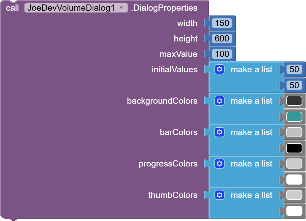
The number of items in the list will be the number of controls that will be created.
ShowVolumeDialog
Displays the dialog with the configured properties.

CloseDialog
Closes the dialog if it is showing.

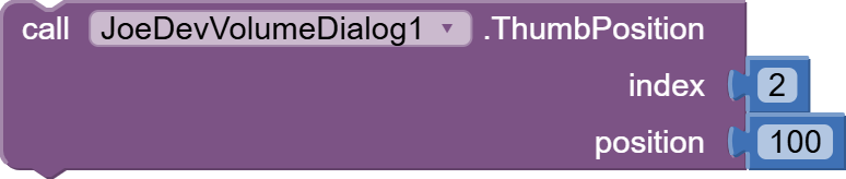
ThumbPosition
Sets the thumb position of a specific SeekBar by index.
SetIcon
Sets the icon for a specific slider by index.

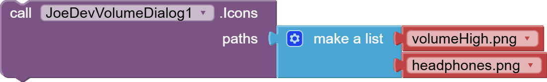
Icons
Sets the icon for all sliders using a list of paths.
SliderValue
Gets the current progress value of a specific slider by index.

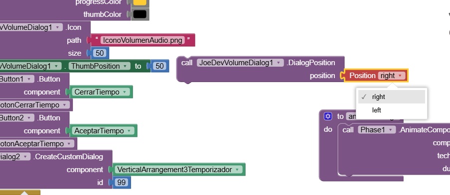
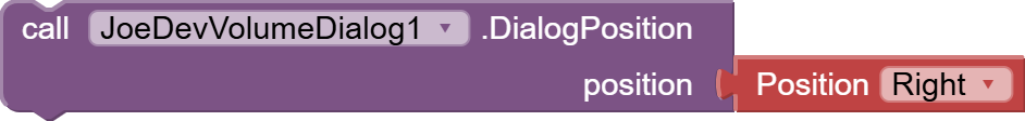
DialogPosition
Change the position of the dialog. Accepted values: 'Left', 'Right' or 'Center'.
TopTextValues
Set text values above each slider.
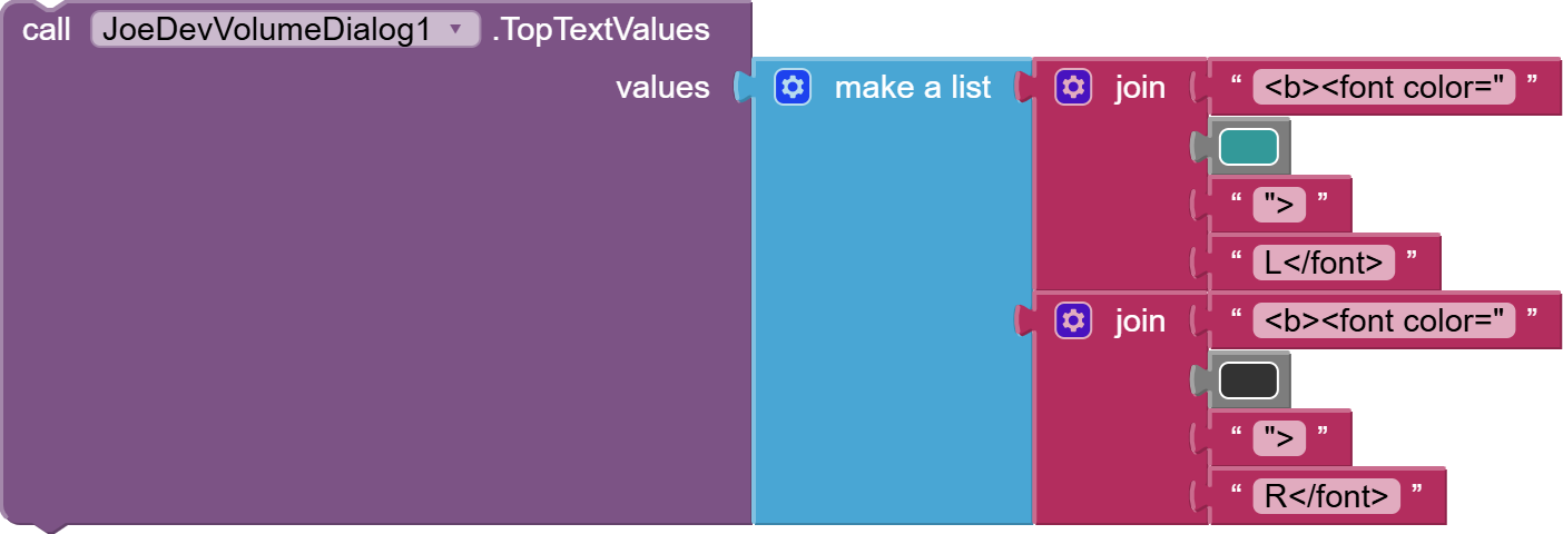
Supports HTML formatting
BottomTextValues
Set text values below each slider.
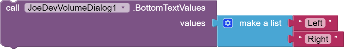
Supports HTML formatting.
TextSize
Sets the size for all texts.

TextColor
Sets the color for all texts.

CornerRadius
Sets the corner radius.
InactivityTimeout
Sets the inactivity timeout in milliseconds. The dialog will close after this duration of inactivity.
HorizontalSpacing
Sets the horizontal spacing between multiple sliders in pixels.
IconSize
Sets the size for all icons in pixels.

IconClicked
Triggered when any icon is clicked. Returns the index of the icon that was clicked.

VolumeValueChanged
Triggered when any slider value changes. Returns the index of the slider and its new value.

Update:
-
The IconBottomMargin property has been removed.
-
Some functions now accept lists to display more than one control with their own values.
-
If you are using the previous version, some blocks will be collapsed due to new features or name changes.
-
Added texts at the top and bottom.
v1.1 Oct 07, 2025.
VolumeDialog.aia (2.2 MB)
joejsanz.joedevvolumedialog.aix (17.7 KB)
JDK: 11
Minimum API Level: 21
Updated On: 2025-10-07T07:00:00Z
Built using: FAST-CLI v5.2.0-premium
Thanks.