Tooltips
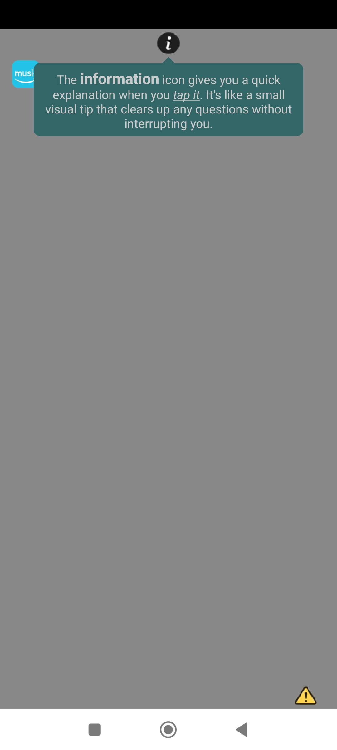
Custom tooltips with text on any component,
automatically positioned up or down with an indicator arrow, and close when tapped.
Custom tooltips with text on any component,
automatically positioned up or down with an indicator arrow, and close when tapped.

With other extensions like Spotlight and ScreenTouch it might look like this:
Ideal for a user guide.
Alignment
Set the text alignment.
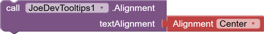
- Horizontal alignment for now.
Options: Left, Center, and Right.
ShowTooltip
Displays a persistent tooltip that closes when tapped.
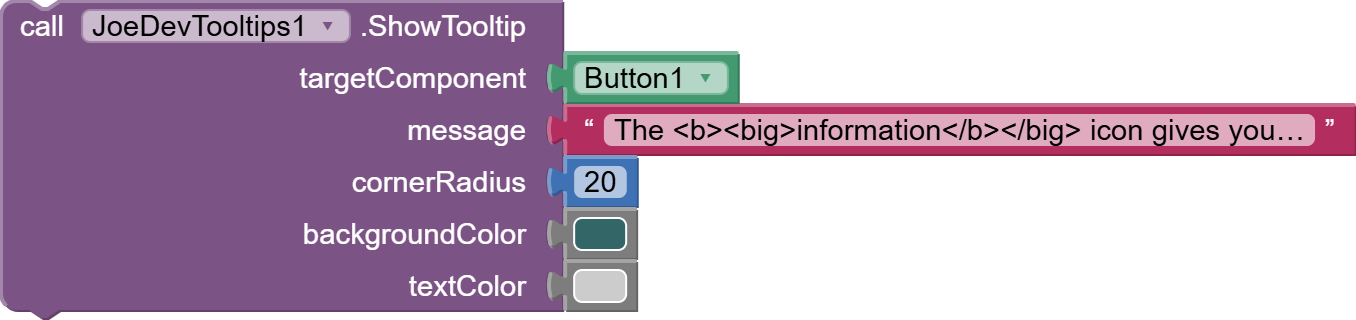
- The tooltip will appear anchored to a button, and the arrow will always be centered on the button.
- The tooltip is automatically positioned and will currently only appear in the top or bottom positions.
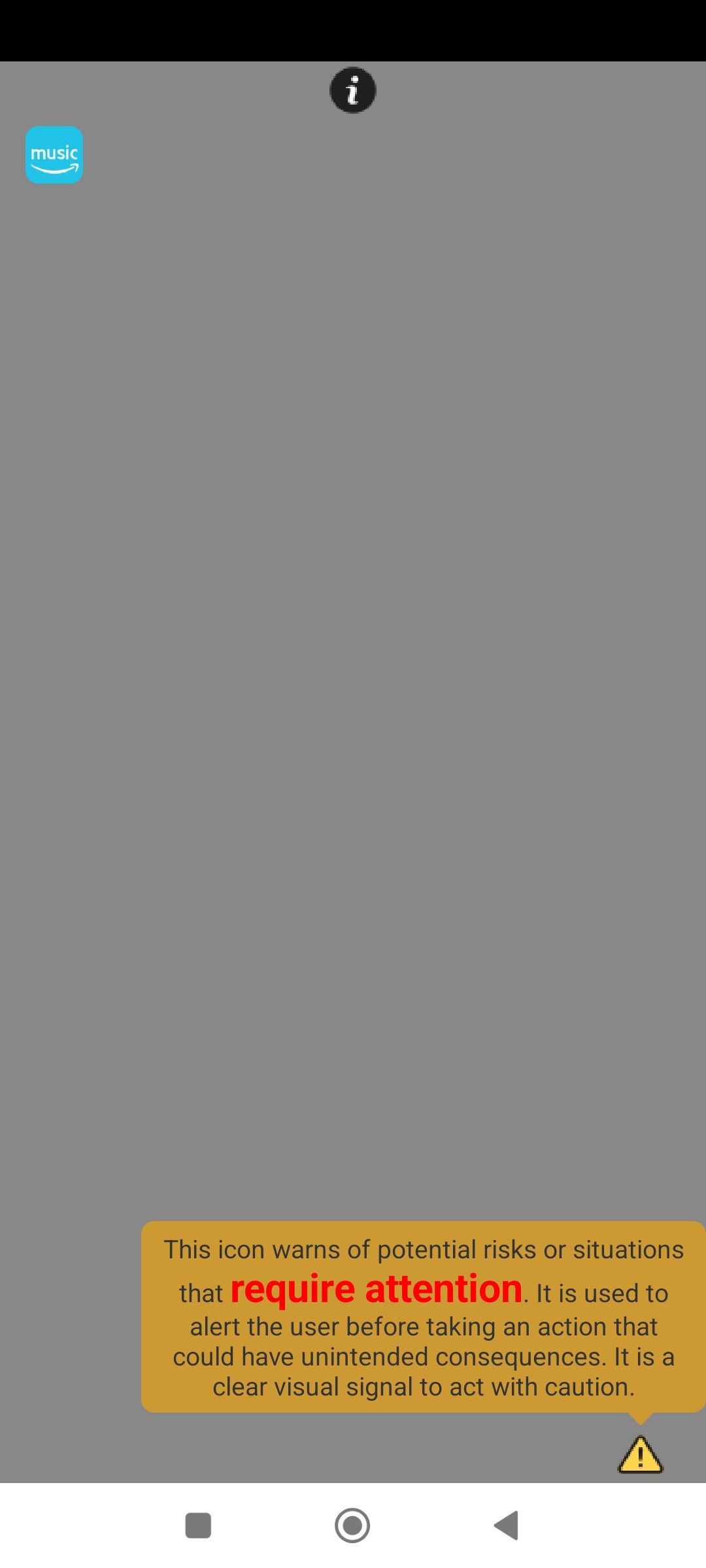
CloseTooltip
Closes the current tooltip if it is visible.

- Use this feature to close the current tooltip or tap the tooltip to close it, as it cannot be closed by tapping outside the message.
IsTooltipVisible
Indicates whether a tooltip is currently visible.

Note:
The functions must be put in this order:
AlignmentShowTooltip
v1.0 Ago 19, 2025.
Tooltips.aia (23.7 KB)
joejsanz.joedevtooltips.aix (13.0 KB)
JDK: 11
Minimum API Level: 21
Updated On: 2025-08-19T07:00:00Z
Built using: FAST-CLI v4.2.0-premium
Thanks.