Styles Extension for MIT App Inventor: A Deep Dive into UI Customization
The Styles extension empowers App Inventor developers with fine-grained control over their user interface elements, going beyond the basic styling options provided by the platform. This document explains each function within the Styles extension, enabling developers to leverage its full potential.
1. Visual Enhancements:
-
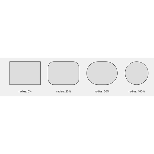
ApplyBorderRadiusToImage(component, cornerRadius, strokeWidth, strokeColor)-
Purpose: Adds rounded corners and a stroke (border) to an
ImageViewcomponent. -
Parameters:
component (AndroidViewComponent):The targetImageViewcomponent.cornerRadius (int):The radius of the corners in pixels (0-100, where 100 is a full circle).
-
Example:
Result:
-
-
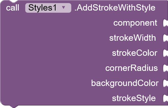
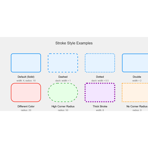
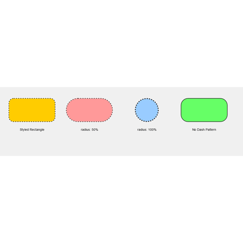
AddStrokeWithStyle(component, strokeWidth, strokeColor, cornerRadius, backgroundColor, strokeStyle)- Purpose: Applies a border with customizable style (dashed, dotted, double) and rounded corners to any View.
- Parameters:
component (AndroidViewComponent):The target View component.strokeWidth (int):Border width in pixels.strokeColor (int):Border color (use color blocks).cornerRadius (float):Corner radius in pixels.backgroundColor (int):Background color of the View (use color blocks).strokeStyle (String):The style of the stroke ("dashed", "dotted", "double", or any other string for a solid stroke).
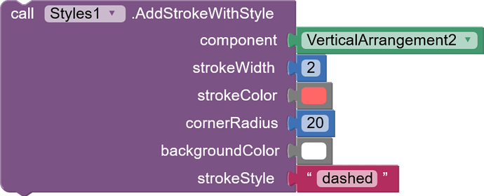
- Example:
blocks:
Results:
-
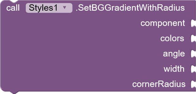
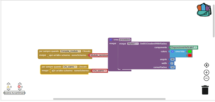
SetBGGradientWithRadius(component, colors, angle, width, cornerRadius)-
Purpose: Applies a linear gradient border with rounded corners to a View.
-
Parameters:
component (AndroidViewComponent):The target View.colors (YailList):A list of color values (as strings) for the gradient.angle (int):The angle of the gradient in degrees.width (int):The width of the gradient border in pixels.cornerRadius (int):Corner radius in pixels.
-
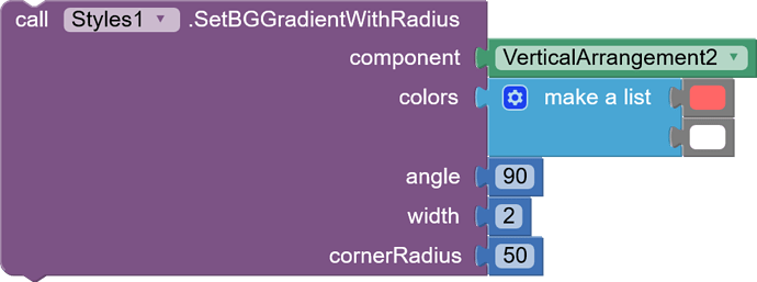
Example:
blocks:
-
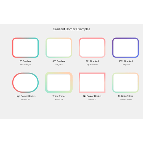
Results:
-
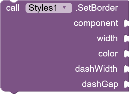
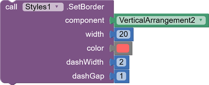
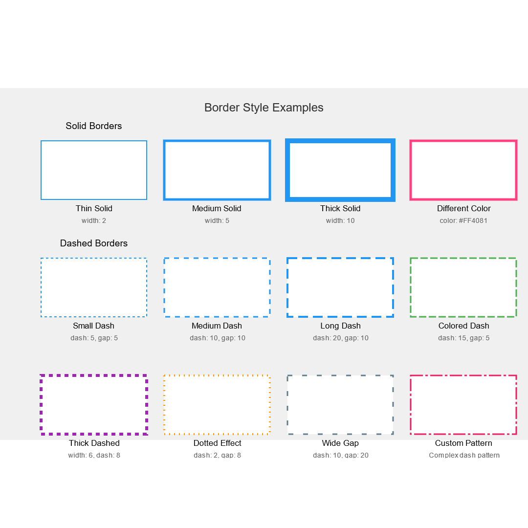
SetBorder(component, width, color, dashWidth, dashGap)- Purpose: Adds a simple border to a component, with options for solid or dashed styles.
- Parameters:
component (AndroidViewComponent):The component to receive the border.width (int):Border width in pixels.color (int):Border color (use color blocks).dashWidth (float):Length of a dash in the dashed border (0 for solid).dashGap (float):Space between dashes in the dashed border (0 for solid).
- Example:
blocks:
Result:
-
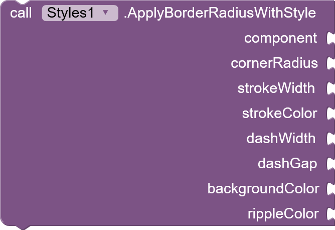
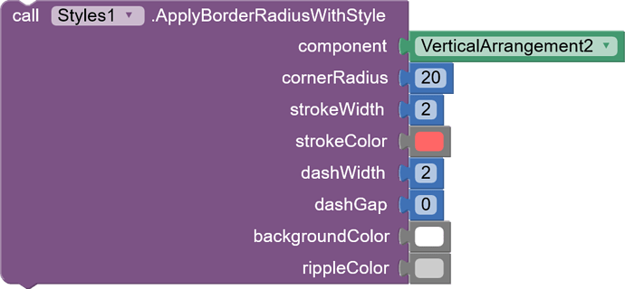
ApplyBorderRadiusWithStyle(component, cornerRadius, strokeWidth, strokeColor, dashWidth, dashGap, backgroundColor, rippleColor)- Purpose: A comprehensive function to apply rounded corners, border, background color, and optional ripple effect to a View.
- Parameters:
component (AndroidViewComponent):The target View.cornerRadius (float):Corner radius in pixels.strokeWidth (int):Border width in pixels.strokeColor (int):Border color (use color blocks).dashWidth (float):Dash length for dashed borders (0 for solid).dashGap (float):Space between dashes (0 for solid).backgroundColor (int):Background color (use color blocks).rippleColor (int):Color of the ripple effect (use color blocks). Set to 0 for no ripple.
- Example:
blocks:
result:
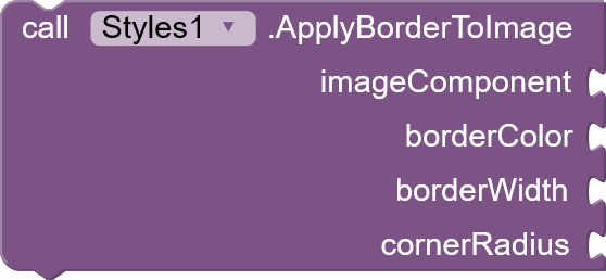
ApplyBorderToImage(imageComponent, borderColor, borderWidth, cornerRadius)- Purpose: Adds a border to an ImageView by using padding and a background drawable.
- Parameters:
imageComponent (AndroidViewComponent):The ImageView component to apply the border to.borderColor (int):The color of the border.borderWidth (int):The width of the border.cornerRadius (int):The radius of the corners.
- Example:
blocks:
2. Layout and Positioning:
-
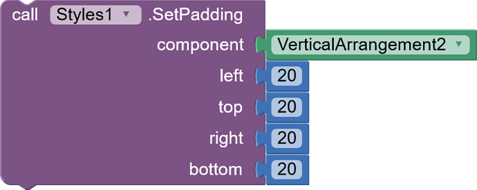
SetPadding(component, left, top, right, bottom)- Purpose: Modifies the internal padding of a View component.
- Parameters:
component (AndroidViewComponent):The target View component.left (int):Left padding in pixels.top (int):Top padding in pixels.right (int):Right padding in pixels.bottom (int):Bottom padding in pixels.
- Example:
blocks
result:
-
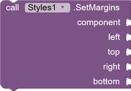
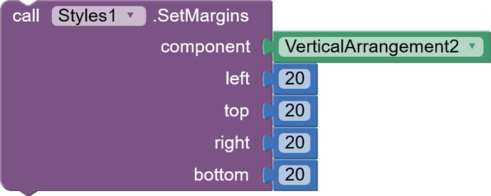
SetMargins(component, left, top, right, bottom)- Purpose: Adjusts the external margins of a View component.
- Parameters:
component (AndroidViewComponent):The target View component.left (int):Left margin in pixels.top (int):Top margin in pixels.right (int):Right margin in pixels.bottom (int):Bottom margin in pixels.
- Example:
blocks :
Result:
3. Color and Appearance:
-
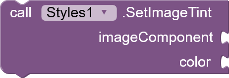
SetImageTint(imageComponent, color)- Purpose: Applies a color tint to an
ImageView, useful for creating visual effects or theming. - Parameters:
imageComponent (AndroidViewComponent):The targetImageView.color (int):The tint color (use color blocks).
- Example:
blocks:
- Purpose: Applies a color tint to an
result:
-
SetImageOpacity(viewComponent, opacity)- Purpose: Controls the opacity of an image or any View component.
- Parameters:
viewComponent (AndroidViewComponent):The target component (can be anImageViewor other Views).opacity (float):The opacity value (0.0 for fully transparent, 1.0 for fully opaque, or use values between 0-100 to represent percentages).
- Example:
blocks:
Result:
-
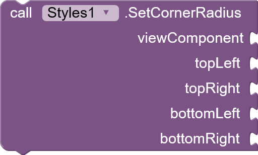
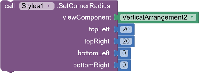
SetCornerRadius(viewComponent, topLeft, topRight, bottomLeft, bottomRight)- Purpose: Allows individual corner radius settings for any View, enabling more versatile rounded corner designs.
- Parameters:
viewComponent (AndroidViewComponent):The target View.topLeft (float):Top-left corner radius in pixels.topRight (float):Top-right corner radius in pixels.bottomLeft (float):Bottom-left corner radius in pixels.bottomRight (float):Bottom-right corner radius in pixels.
- API Compatibility: Requires Android API level 21 (Android 5.0) or higher.
- Example:
blocks:
result :
-
SetMultiColorLinearGradient(viewComponent, colors, angle)- Purpose: Creates and applies a linear gradient with multiple color transitions.
- Parameters:
viewComponent (AndroidViewComponent):The component to receive the gradient.colors (YailList):A list of color values (as strings) defining the gradient steps.angle (int):The angle of the gradient in degrees.
- Example:
blocks:
Result:
SetMultiColorRadialGradient(viewComponent, colors, radius)- Purpose: Applies a radial gradient (circular gradient) to a view.
- Parameters:
viewComponent (AndroidViewComponent):The View component.colors (YailList):A YailList of color values (as strings).radius (float):The radius of the gradient.
- Example:
blocks:
Result:
4. Style Copying and Extraction:
ExtractComponentStylesPx(component)- Purpose: Returns a JSON string representing various style properties of a given component.
- Parameters:
component (AndroidViewComponent):The component to extract styles from.
- Returns:
(String):A JSON string containing the extracted styles.
- Example:
blocks:
Result:
-
CopyComponentStylesToList(sourceComponent, targetComponents)- Purpose: Copies a wide range of style properties from a source component to a list of target components.
- Parameters:
sourceComponent (AndroidViewComponent):The component to copy styles from.targetComponents (List<Object>):A list of AndroidViewComponent objects to apply the copied styles to.
- Example:
Result:
-
CopyComponentStylesToListExcluding(sourceComponent, targetComponents, excludedStyles)- Purpose: Similar to
CopyComponentStylesToList, but with the ability to exclude specific style properties from being copied. - Parameters:
sourceComponent (AndroidViewComponent):The source component.targetComponents (List<Object>):The list of target components.excludedStyles (List<String>):A list of style property names (as strings) to exclude from copying.
- Example:
blocks:
Reults:
- Purpose: Similar to
-
ExtractAllComponentProperties(component)- Purpose: Retrieves all accessible properties (fields and parameterless methods) of a given component and returns them in JSON format.
- Parameters:
component (AndroidViewComponent):The target component.
- Returns:
(String):A JSON string containing the extracted properties.
- Example:
blocks:
Result:
-
ApplyStylesFromJSON(targetComponent, jsonStyles)- Purpose: Applies styling properties to a component based on a JSON string input.
- Parameters:
targetComponent (AndroidViewComponent):The component to apply styles to.jsonStyles (String):A JSON formatted string containing style properties and their values.
- Example:
blocks:
5. Shadow Manipulation:
-
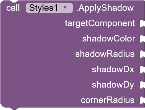
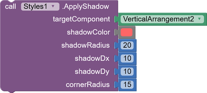
ApplyShadow(targetComponent, shadowColor, shadowRadius, shadowDx, shadowDy, cornerRadius)- Purpose: Adds a shadow effect to a component.
- Parameters:
targetComponent (AndroidViewComponent):The component to apply the shadow to.shadowColor (String):The color of the shadow (in hex format, e.g., "#000000").shadowRadius (float):The blur radius of the shadow.shadowDx (float):The horizontal offset of the shadow.shadowDy (float):The vertical offset of the shadow.cornerRadius (int):The corner radius of the component (for shadow consistency with rounded corners).
- API Compatibility: Requires Android API level 21 (Android 5.0) or higher.
- Example:
blocks:
Results:
6. Frosted Glass Effect:
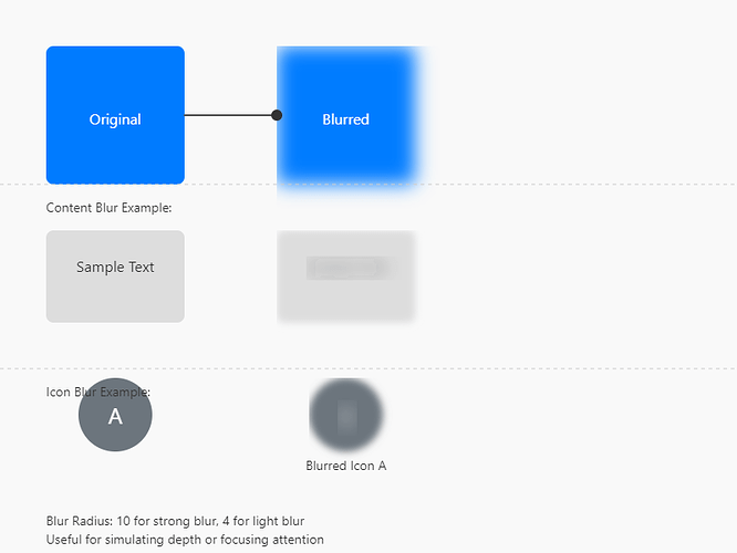
ApplyFrostedGlassEffect(androidViewComponent, blurRadius)
-
Purpose: Applies a frosted glass or blur effect to a view and its components' content.
-
Parameters:
androidViewComponent (AndroidViewComponent):The component to apply the blur effect to.blurRadius (float):The radius of the blur effect.
-
API Compatibility: Requires Android API level 31 (Android 12) or higher as the RenderEffect API is available from this version onward..
-
Example: blocks:
-
Results:
This comprehensive documentation details the capabilities of the Styles extension. By understanding these functions, App Inventor developers can create visually appealing and highly customized user interfaces.
Aix file :
![]() styles.aix-V1 (76.7 KB)
styles.aix-V1 (76.7 KB)
![]() styles.aix-V2 (77.2 KB) ( with frosted glass effect )
styles.aix-V2 (77.2 KB) ( with frosted glass effect )
![]() styles.aix-V3 (71.5 KB)( shadow effect fixed and Neumorphism effect added )
styles.aix-V3 (71.5 KB)( shadow effect fixed and Neumorphism effect added )


