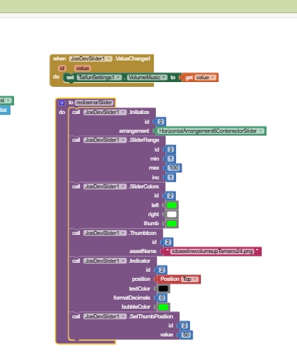

Initialize
Initializes the slider with its default values.

SliderRange
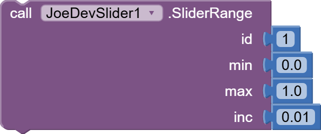
Sets the range and increment of the Slider.
- Values can be with decimal or integer.
- Default values: 0 to 100 in increments of 1.
CurrentSliderValue

GetMinValue

GetMaxValue

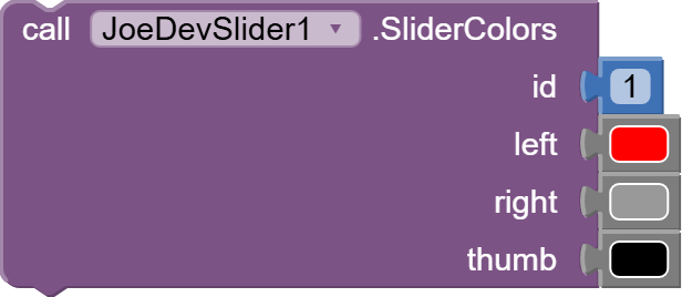
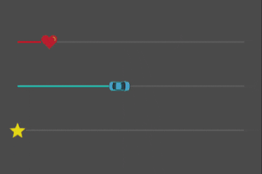
SliderColors
Sets the colors of the bar and thumb.
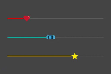
ThumbIcon
Change the thumb of a slider by an icon from assets.
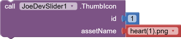
You can set any size, but the recommended size is 24px x 24px.
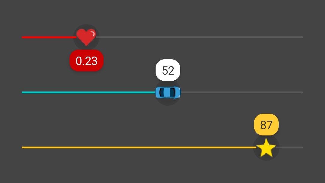
Indicator
Adds an indicator to show the slider's progress in the thumb position.
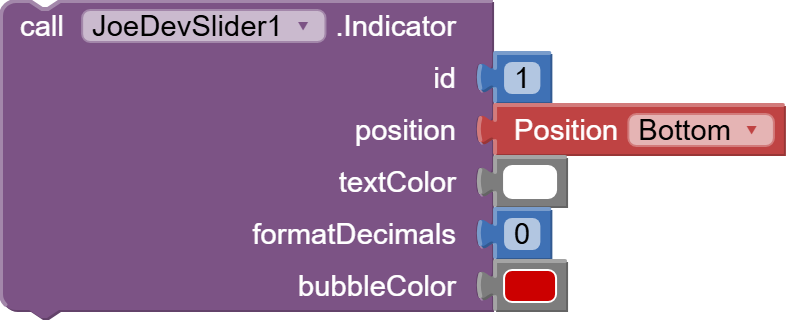
Pressing or sliding the thumb will cause the indicator bubble to appear, and releasing your thumb will cause the bubble to disappear.
- Use formatDecimals to define the number of decimal places (e.g., 0 = no decimal places, 1 = one decimal place, etc).
IndicatorMargin
Sets a margin between the bubble and the thumb.
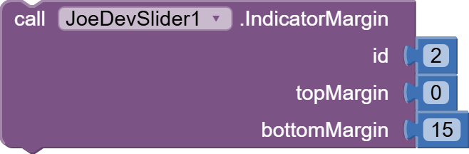
In Android 11 and Android 14 the bubble was set at different distances, with this you can set the distance of the bubble.
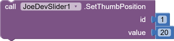
SetThumbPosition
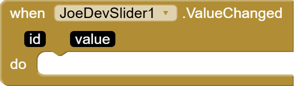
ValueChanged
StartTracking
Event triggered when the slider starts being tracked.

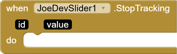
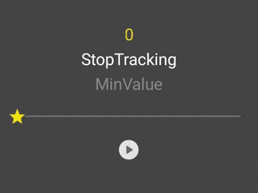
StopTracking
Event triggered when the slider stops being tracked.
MaxValueSet
Event triggered when the maximum value of the slider is set.

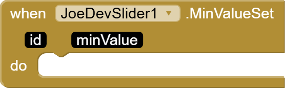
MinValueSet
Event triggered when the minimum value of the slider is set.
Update v1.1 April 14, 2025.
Note!
If you're already using this extension, save your project before updating so you don't lose anything. I've modified the text in all blocks for clarity and added new blocks.
New blocks:
- ThumbIcon
- Indicator
- IndicatorMargin
Update v1.2 April 16, 2025.
The following events were not firing:
- MaxValueSet
- MinValueSet
This has been fixed.
Update v1.3 June 14, 2025.
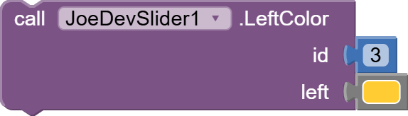
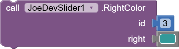
- Slider colors can now be added separately.
Useful for doing this:
LeftColor
RightColor
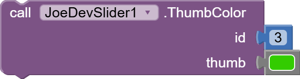
ThumbColor
v1.3 June 14, 2025.
Slider.aia (27.4 KB)
Event Testing:
SliderEventTest.aia (980.9 KB)
I have used TaifunSettings VolumeMusic extension from Taifun to test the ValueChanged event.
joejsanz.joedevslider.aix (19.1 KB)
JDK: 11
Minimum API Level: 21
Updated On: 2025-06-14T07:00:00Z
Built using: FAST-CLI v3.6.1
Thanks.
 ) featuring the diagnostic protocol KWP2000 and an OBD to BT converter (really a very few Euro on Amazon or similar). If you don't have one, my hint is anyway to avoid to buy the cheapest one, because sometimes some of them do not have the "real" ELM327 but a clone, that in some cases isn't 100% compatible. Therefore the mean reasonable price can be around 10-14 Euro.