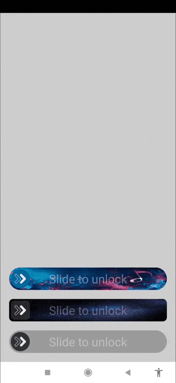
Create an "Unlock" slider button.
You can fully customize colors, background images, thumb color and icon, and corner radius. It also includes the option to add text that fades out as the thumb is passed over it.
ㅤFunctionsㅤ
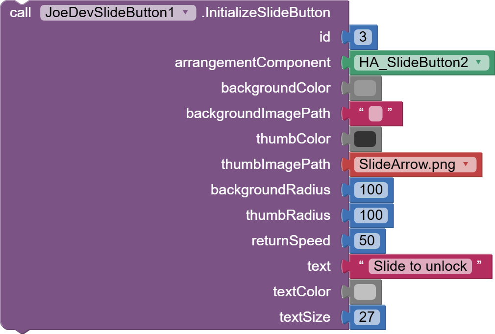
InitializeSlideButton
Initializes the slider button with the look you need.
id: Unique identifier.arrangementComponent: Arrangement in which the slider button will be displayed.backgroundColor: Background color of the slider button.backgroundImagePath: Background image path from Assets.thumbColor: Color of the thumb.thumbImagePath: Path of the thumb image from Assets.backgroundRadius: Background corner radius.thumbRadius: Radius of the corners of the thumb.returnSpeed: Speed of return of the thumb when released.text: Optional text to display in the background.textColor: Color of the text.textSize: Size of the text.
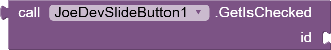
GetIsChecked
Get the current state of the slider button (whether it is in the activated position or not).
id: Identifier of the slider button.
Returns:trueif the button is activated,falseotherwise.
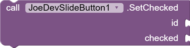
SetChecked
Sets the state of the slider button, activated or deactivated.
id: Identifier of the slider button.checked:trueto activate the button,falseto deactivate it.
ㅤEventsㅤ
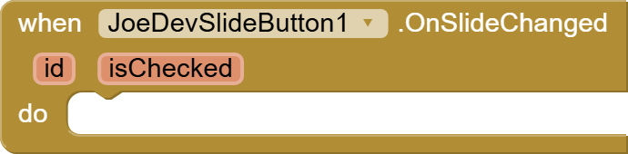
OnSlideChanged
Fired when the slider button changes its state (on or off).
id: Identifier of the slider button.isChecked:trueif the button is on,falseif it is off.
ㅤExtension:ㅤ
joejsanz.joedevslidebutton.aix (14.0 KB)
Thanks.