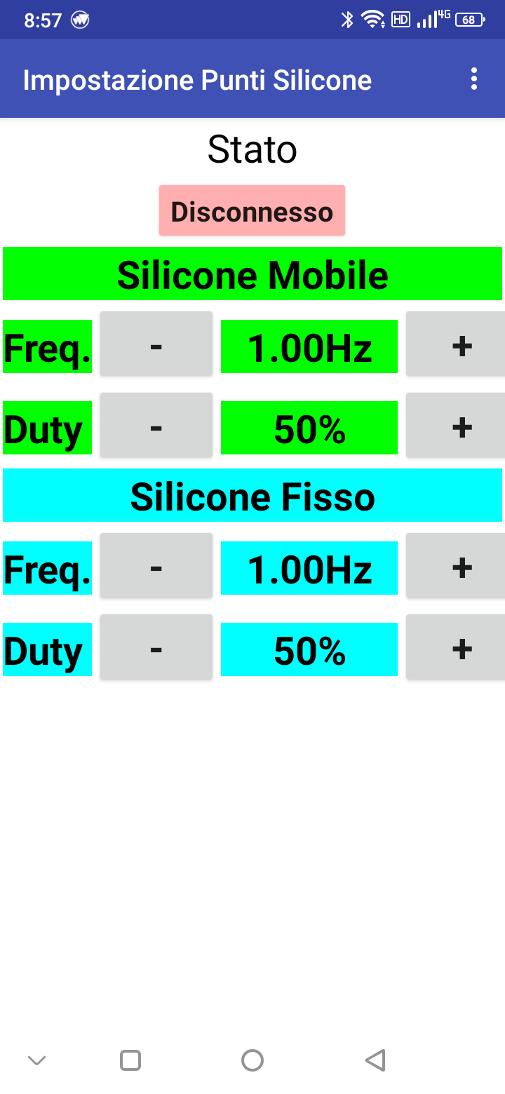
I have a super simple user interface, it is used to set 4 parameters on a connected machine.
After an initial setup phase of the machine, these parameters should not be changed any more ( set-and-forget ), so the look of this interface is not that important.
Only wondering how to improve it ( I mean make it less obscene ; - ).
You could highlight the difference between what you sent and what arrived by setting Label.BoldItalic true for what you change before sending it, and setting all Label.BoldItalic false when new data arrives.
In practice the app only sends data to the machine ( there is only an initial retrieval of parameters stored in the machine after connection ).
I'm referring to the overall look ( quite hobbyistic ), for example text and buttons of different heights ( even if set to auto ), "flat" look...