I'm Suyash, one of the GSoC participants. I'll be working on adding the Tab Bar Arrangement component to the App inventor under the guidance of my mentor @ellelili2025.
The Tab Bar arrangement is a better way for the users to organise their data and to give access to the content in a single screen rather than multiple screens. However, the tab bar arrangement can be currently implemented using buttons and a Horizontal Arrangement, I'll be implementing it natively as a layout using the platform-specific implementation of this technique.
I'm attaching the design document for my project here. I request all of you to kindly go through the doc and drop your valuable comments here or in the doc. Any suggestions/improvements are most welcome.
Yes, swiping from tab to tab is the part of the plan for this project. Though my initial target is to setup a tab layout where users can click on respective tab to switch between the tabs. Once I achieve this, I’ll surely try to add the swipe functionality between the tabs.
Hi everyone, here's the first update on the project.
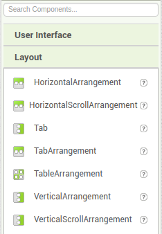
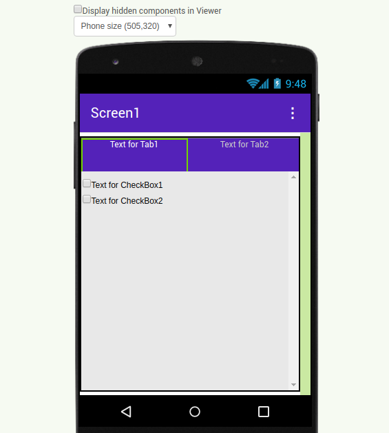
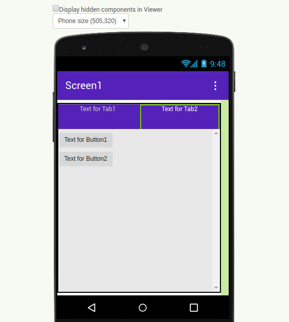
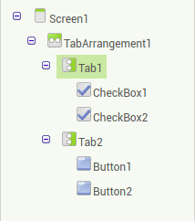
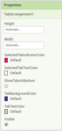
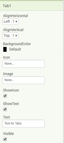
We've decided to make some changes in the design of the component based on suggestions received in the design doc attached in the main post. Currently, we have developed 2 components: TabArrangement and Tab. Users can drag a tab arrangement and then a tab into the tab arrangement component to use this arrangement. The properties implemented for both the components are listed below:
Thanks @Peter. Currently, the swiping is enabled to switch between the tabs. I'll also add the functionality wherein users can make the tab bar invisible.
Rather than having ShowTabsAtBottom as binary option, I think something like a dropdown called Position that had three options: 1. Default, 2. Top, 3. Bottom, would be better. My reasoning here is that Android apps typically have the tabs at the top whereas iOS pretty much always shows tabs at the bottom. This would allow better cross-platform compatibility of the component since Default would put it at the top for Android and bottom for iOS. Of course, this also means that eventually it will have to be aware of @Himani's work to preview on different platforms (but this can be resolved after GSOC).