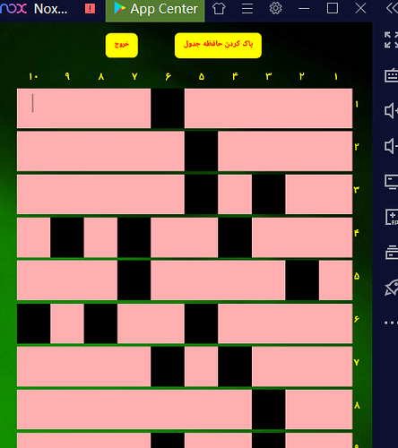
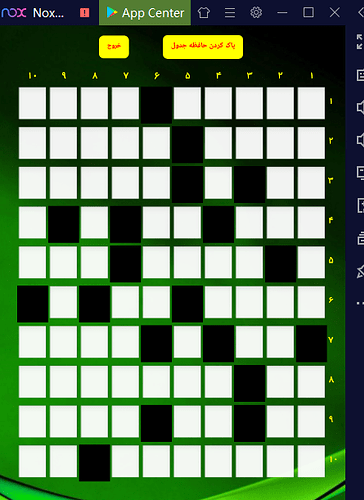
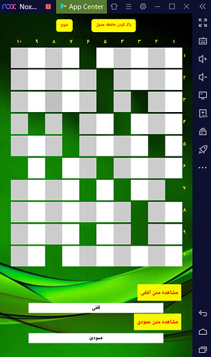
Hi ,I have many buttons on screen in horizontal or table arrangement ,but there are space between them. I want remove any space between them and any button be connect with adjacent buttons. thanks
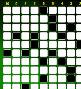
I find below informations but no work for me.
http://www.appinventor.org/content/howDoYou/UIModules/Arrangements
in my phone :
This looks more like a case for a Canvas, where you use modulo arithmetic to calculate the row and column touched.
Here is a sample ...
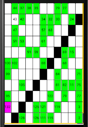
HidatoV286.aia (103.0 KB)
in button properties, set shape from default to rectangular (do it for all buttons)
hi do not work.
 فارسی
فارسی 
.را نگاه کنید هنوز فاصله ها وجود دارند ولی اگر برنامه را بسازید یا پیش نمایش آن را در موبایل نگاه کنید، فاصله ندارند viewer اگر همان
.هستند rectangular ها، به صورتbutton این را هم مطمئن باشید که همه ی
.کنید، می توانید از این آموزش استفاده کنید rectangular ها را یکجاbutton برای اینکه همه ی
 English
in the viewer part in app inventor, they still have the spaces. but if you build the app or see the preview in the companion, they don't have spaces.
also make sure all of them are rectangular.
to make all of them rectangular together, you can use this tutorial.
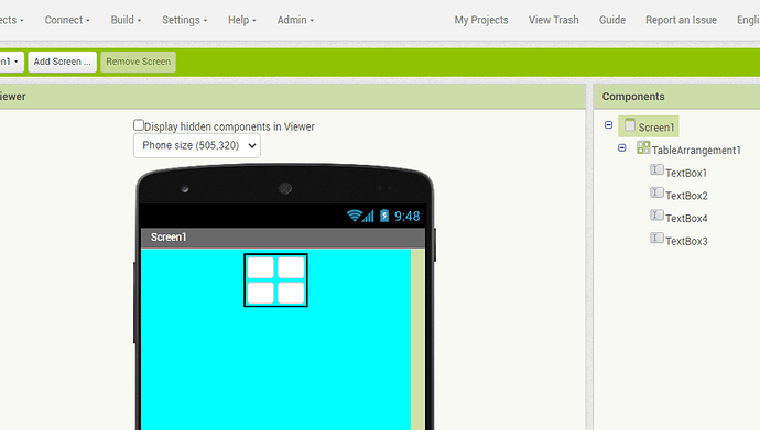
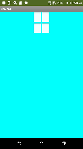
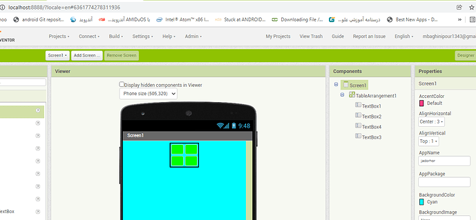
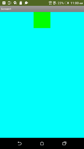
Hi,thanks .i want 4 TextBox in a table arrangement (2x2) and background colour are default.in this state spaces are between textBoxes but if background colour is not default ,spaces remove between Text boxes.
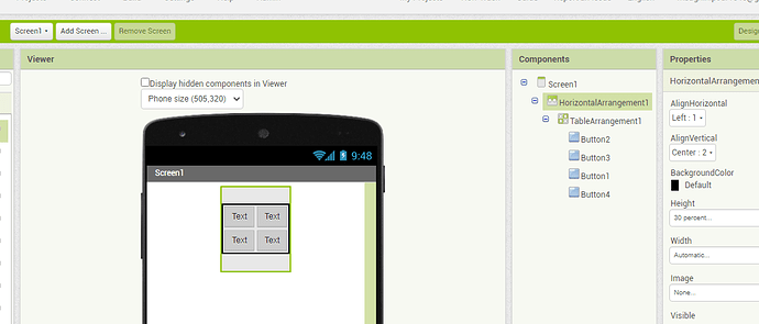
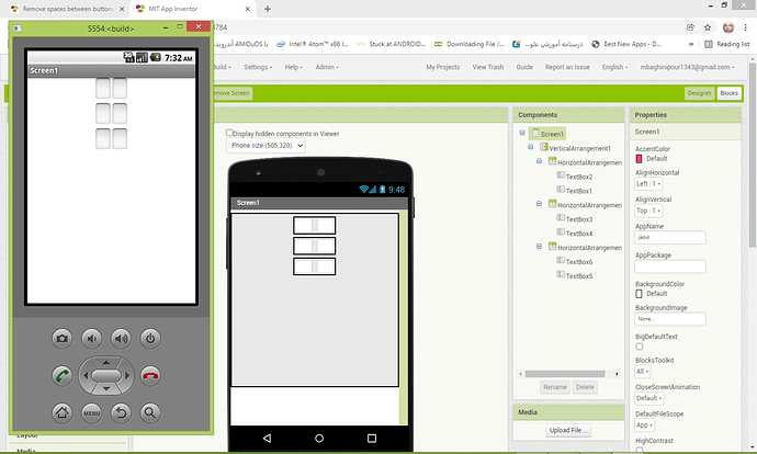
in app inventor and default background colour
in my phone and default background colour
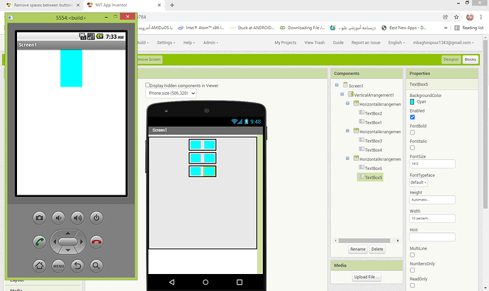
in app inventor and if backgrund colour is not default
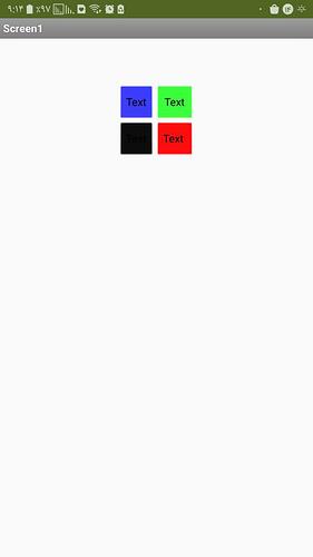
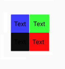
in my phone and background colour is not default
result:if you want remove spaces beween TextBoxes ,background colour are not default.
a question:i want change border colour of TextBoxes.
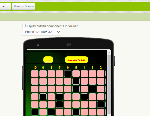
in app inventor no default backgroiund colour
in my phone no default backgroiund colour
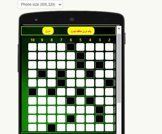
default background colour in app inventor
default background colour in my phone
Also see here
Don't use Table Arrangements.
They are buggy and hard to control.
Use nested Horizontal Arrangements within a Vertical Arrangement.
Those are easy to populate in the Designer using Copy/Paste.
- Pull in a Vertical Arrangement and set its sizes (Fill Parent?)
- Pull your first Horizontal Arrangement into the Vertical Arrangement and set its sizes
- Pull your first Button (or Textbox or Label) into the first Horizontal Arrangement and set all its attributes (size, font, text, etc.)
- Copy (Ctrl-C) the first Button
- Select the first Horizontal Arrangement
- Paste into the first Horizontal Arrangement as many times as needed to fill it with Buttons
- Select the first Horizontal Arrangement and hit Ctrl-C
- Select the Vertical Arrangement and hit Ctrl-V as many times as needed to fill it with rows of Buttons.
Sample project:
I'm not sure that the issue here is with the table arrangement. I think that the issue is that the default drawable for text boxes includes a padding outside of the border. When we replace the default drawable with the solid background color, this perceived spacing is lost because the invisible area is now replaced by a solid opaque color.
There's probably a way to solve this at the code level but it will take some time to think about and code a solution.
Hi thanks,i use vertical and horizontal arrangement instead of table arrangement .
 default background colour
 no default background colour
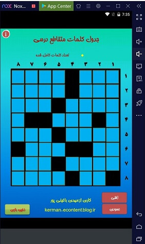
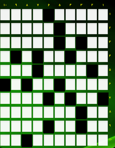
 i made with articulate storyline(cross word)The best for me(Text boxes have thin black border).
https://kerman-econtent.blog.ir/
 i made with app inventor and all textboxes have no default background(cross word).i want all TextBoxes same background colour but in app imventor if textboxes have default background colour them completely saperate with betweens spaces(margin ) and if have no default background colour them complete stick to each others.
Hi thanks.I am very beginner.app inventor simmplify programming and create more rows and coloumns text boxes with code for me difficulty.The best way is to create a crossword puzzle(UI section) with a number of rows and columns without code.The construction of the crossword puzzle (Ui section)should be in the design section, not in the code(block) section.
There is a trade off to consider if you want to create crossword designs in the AI2 Designer.
- You lose the ability to load puzzle designs from files or a data base
- You become the sole author of those puzzles, losing the ability to sit back and let other users create and share puzzles for your app.
Here are a couple of (working) puzzle projects that load their puzzles from files and adapt their boards to fit the loaded puzzles ...
Hi thanks.excellent. 
This topic was automatically closed 7 days after the last reply. New replies are no longer allowed.
