me again ... (the more I think of my project, the more I see the barriers
my problem is now font size : 14 is fine on the phone, but on my tablet it looks very tiny ... almost ridiculous.
I found this post, but I am not sure how to use the reference proposed by @Taifun
I know about responsive sizing of components so that an app responds to the sceen size, but when you have text on buttons and labels, how can you sense the size of the screen of the device on which the app is installed, so that you can then also size the font used on a component according to the size of the component on the display screen?
How can I do so that the relative space occupied by text in labels or buttons remains the same whatever the screen ?
thx
1 Like
ABG
May 28, 2021, 10:35pm
2
@Taifun 's reference is to an extension at puravidaapps.com
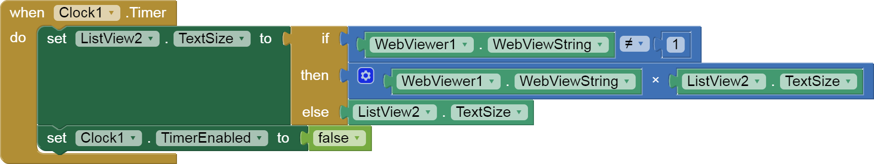
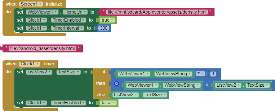
The same thread has a JavaScript solution by @Boban , which i will reproduce here for easier reference. (It needs refreshing to use a WebViewer event instead of the Clock Timer, and I can't vouch for file paths either.)
ListView2.aia (3.2 KB)
density.html:
<!doctype html>
<head>
 <title>Mobile-Web-App: Test Javascript</title>
 <meta charset="utf-8">

<script>
function myOnLoad(){

 var devicePixelRatio = window.devicePixelRatio;
 eleRatio = document.getElementById("ratio");
 eleRatio.innerHTML = devicePixelRatio;

}

window.onload = myOnLoad;
window.AppInventor.setWebViewString("" + devicePixelRatio + "")
</script>

</head>
<body>
<h1>Mobile-Web-App: detect device pixel ratio</h1>

devicePixelRatio: <b id="ratio"></b>

</body>
</html>
Apparently, you can use Javascript to get a ratio specific to the device, and apply the ratio to the font size to fit the device.
Thank you ! I'll look at it
You can also try the "Sizing" property in the Screen1 property. You can set "Responsive" and "Fixed". See if you can see any difference.
TonyR
May 29, 2021, 8:49am
5
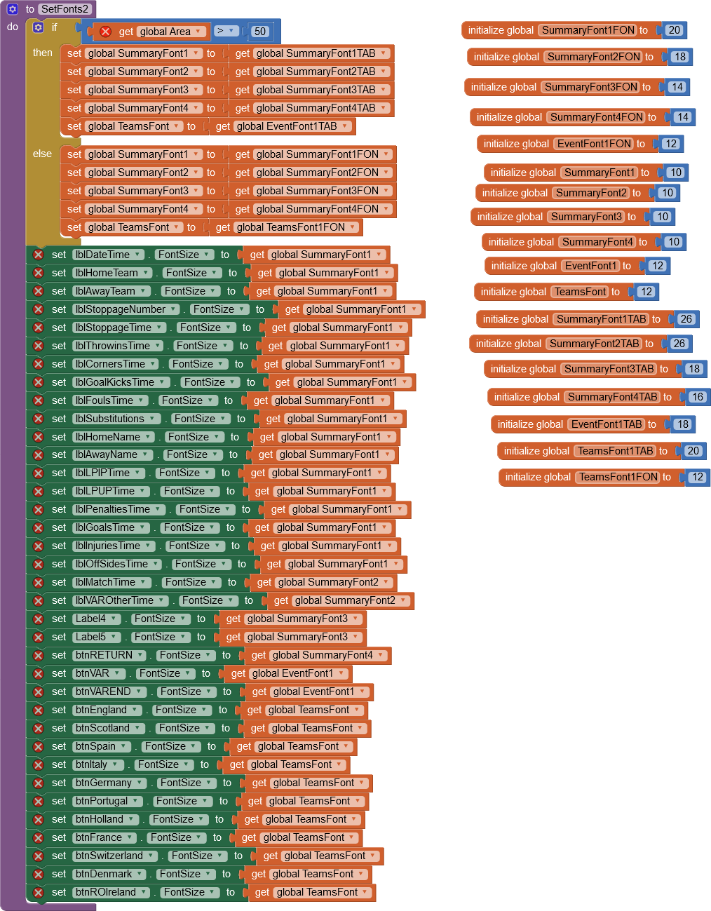
In order to allow some adaptation of fonts between Phone and tablet, I looked at finding some way to
distinguish when the app is running on an Android phone or tablet, ignoring Apple Iphones and tablets
Examining screen sizes via height and widths, a crude measure was multiplying the screen width and
screen height and dividing by 10000, to come up with a global AREA figure.
I found that an area > 50 was the region of tablets and an area <50 was the region of phones.
So I decided on the best set of font sizes for the components in my tablet version of my app and similar for
my phone version, and just added code to set the fonts I need to set ffor the most sensitive components
according to the display size. Obviously, if you have to change the fonts of a lot of components, its more work,
but thats the way it goes!
Sorry I cant seem to get this image the size I want!
Hope this helps!
Thank you ! I ignored that option and it's much more readable now (with option "fixed" selected, which is counter-intuitive for me).
TonyR:
In order to allow some adaptation of fonts between Phone and tablet, I looked at finding some way to
distinguish when the app is running on an Android phone or tablet, ignoring Apple Iphones and tablets
Examining screen sizes via height and widths, a crude measure was multiplying the screen width and
screen height and dividing by 10000, to come up with a global AREA figure.
I found that an area > 50 was the region of tablets and an area <50 was the region of phones.
So I decided on the best set of font sizes for the components in my tablet version of my app and similar for
my phone version, and just added code to set the fonts I need to set ffor the most sensitive components
according to the display size.
very smart and pragmatic way of doing, thank you !
system
June 5, 2021, 10:04am
7
This topic was automatically closed 7 days after the last reply. New replies are no longer allowed.
 )
)