Pick a design theme for your app. Themes change the appearance of an app, such as how buttons and text look. The most common themes are:
Classic: This theme stays consistent whether you are looking at an Android, iOS, or the screen layout in App Inventor’s designer. Choose Classic if you want detailed control of the appearance of your app.
thanks for your reply but all the things are known and do not work at least in my case.
Please note again, that no parameters have been changed system-wise. This was just happening after updating the Companion App from 2.75 to 2.76
I could restore my basic layout now after some trial and error but don't see any logic behind.
Initially:
I had 3 horizontal arrangements with height seized as follow:
a = 10%
b = 75%
c = 15%
With companion app version 2.75 everything worked fine.
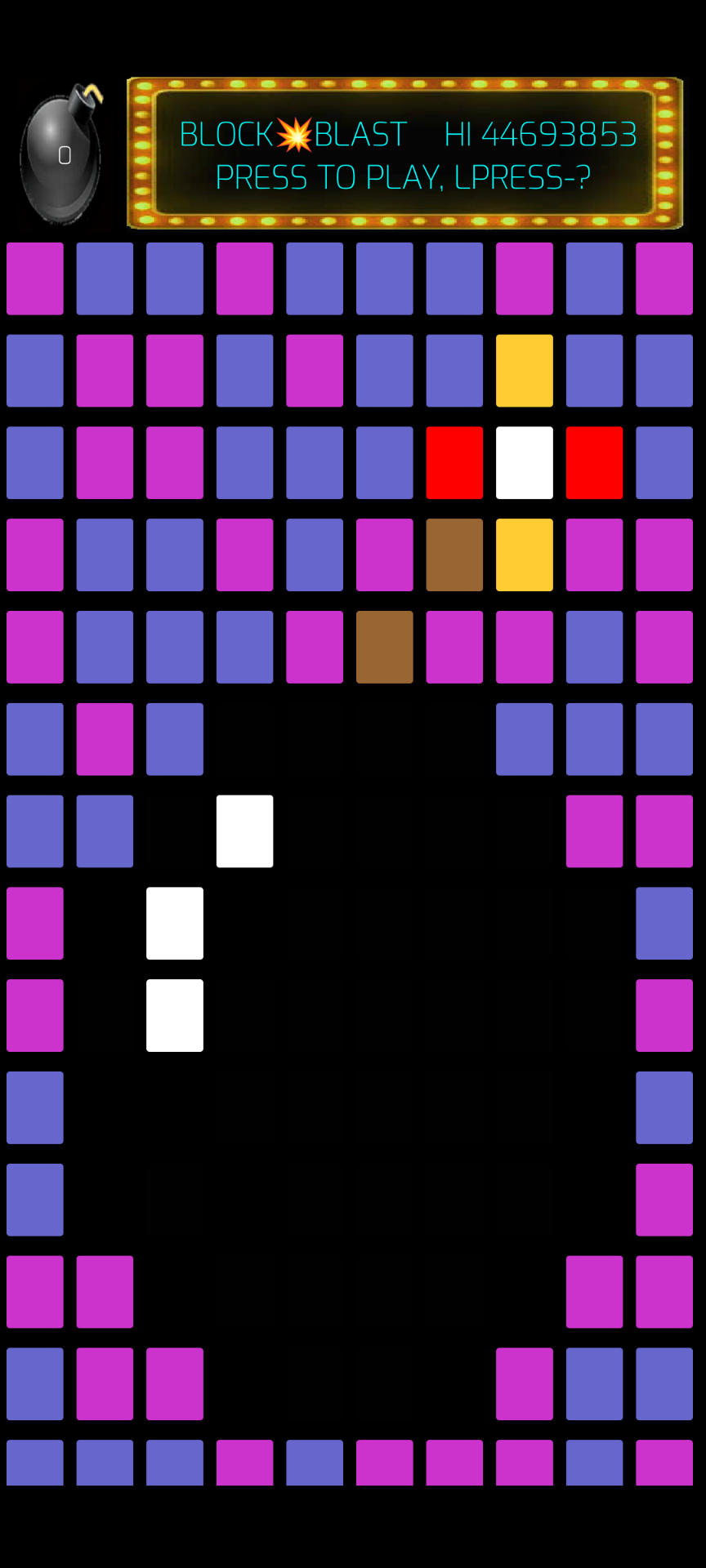
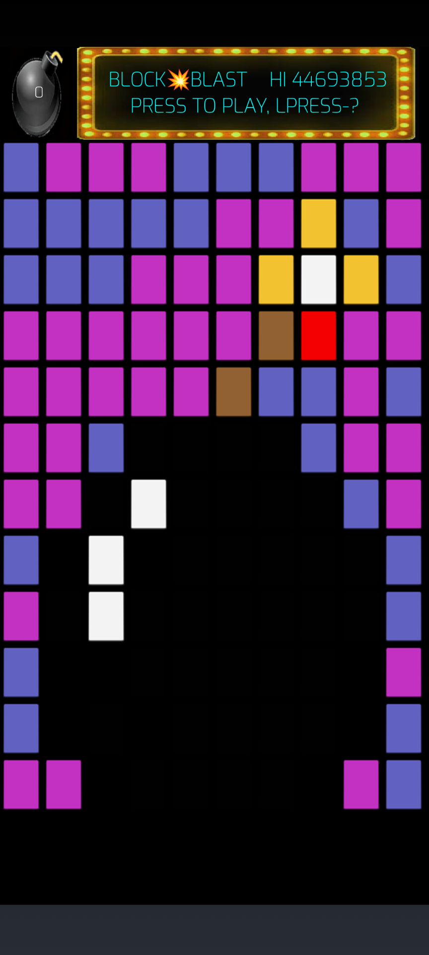
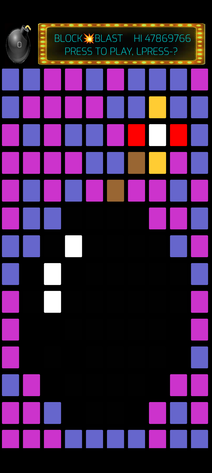
After updating to 2.76 I got the mentioned issue. (please se screenshots)
No i was changing my arrangements heights as follow:
a = automatic
b= fill parent
c = automatic
With this I could receive the initial proper layout.
As soon I change any of the arrangements heights to a percentage the issues with the navigation bar occurs.
Maybe this helps a bit in trouble shooting.
Please note again: It happened after updating the app from 2.75 to 2.76
Well I tried making the arrangement which contains everything 90%, it didn't work! In fact the Navigation grew bigger! WTH screenshot doesn't show the increased navigation bar
@Ray_Cortopassi : How many arrangements do you have?
Instead of working with percentage you may try to work with "fill parent" and "automatic" height. This at least worked in my case. ( so removing all percentages from height settings)
Lots of arrangements. Each row is an arrangement so 15 Vertical arrangements in a main vertical arrangement. I tried setting the main vertical arrangement to 80%, didn't work, next I'll try setting the individual vertical arrangements to a smaller percentage.
Screen1.Height and Width are not always available at Screen1.Initialize time.
It takes time for AI2 run time to lay out the Screen, and maybe fight with Android for space?
Sometimes you have to add a Clock Timer delay at app start time before grabbing those two values and using those values to lay out your Screen and component sizes.
What may could help is, (as it was successfully for me):
Put your "bomb" and your button next to it in a horizontal arrangement and set the height to automatic.
Then take another horizontal arrangement below. Set the height to "fill parent" and put all your 15 arrangements inside.
So on your Screen1 there would be in total 2 "main arrangements" one with the bomb + button (height automatic) and one with all your 15 smaller arrangements (with height fill parent). This at least helped in my case.
I was removing all percentages in the height setting from arrangements on the Screen.
I'll try that. Thanks for the tip. Not sure it'll help in my case since changing main arrangement to percentage and setting it to 80% made no difference. I have the 15 arrangements in a list and it would be very easy to just adjust them at initialization without messing with the designer.
Instead of guessing, I have done some calculations, based upon the screen height of my device (Pixel 8a, running Android 16)
Screen Item
Pixels
%
Rounded %
Screen Height
914px
100%
100%
StatusBar
45px
5.0%
5%
TitleBar
56px
6.1%
6%
NavBar
48px
5.3%
5%
Visible
764px
83.6%
84%
The visible area is your workspace, this can be larger if you hide the status or title bars.
Would be interested to know how the percentages line up on other devices ? Are the heights of the bars fixed or variable, etc. We should probably have a look at width as well, given the new edgetoedge stuff going on.
I find on an Android 13 device, the NavBar is not included in the Screen Height, so this throws everything out
I have the same problem of changes to the screen display sizing. The upper and right side of app screen are now lovely, but unwanted, blue bars. My app screens are all landscape and now certain parts of the text are not readable as they are cut off. This afternoon, no problem. This eve after 2.76 auto installed, the problem.
Other apps on phone have not been affected so I guess it's a 2.76 issue.
Unfortunately, we don't have a choice about targeting SDK 35, which means we have to deal with the new edge-to-edge screen design. We're not thrilled about it either.
It looks like you got your user interface to stop stretching and clipping, @Ray_Cortopassi. Were you able to do that without an extension? If not, can you give me an idea of what you did?
Right. This is the change Google made -- screen height now includes the nav bars, and I'm using Android methods that are supposed to return the height of the existing nav bars so that I can subtract them back out of the usable screen area.
To take a moment to rant, it's really unclear why Google decided to make this the default. The percent of apps that WANT to be placing design elements behind the nav bars seems like it would be very small. It seems much more logical to include a new method to give the option of adding the nav bars to the usable area rather than forcing the rest of us to subtract them. Anyway.
The Android method that I'm using to subtract the nav bars from the usable screen area SHOULD, if I understand Google correctly, be returning the height of the nav bars that are currently being displayed. Therefore, if you hide a nav bar, I shouldn't be subtracting the height, and if there are differences in nav bar sizes, it should account for that.
I'm trying to figure out if this is actually happening, and if not why not.