So, today I was bored so, spent some time playing with Ai2
Results
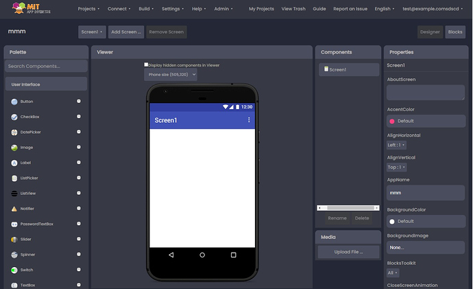
Main interface
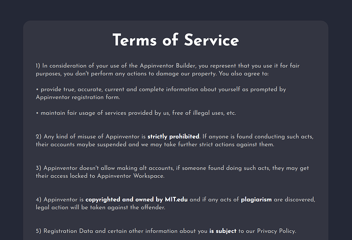
TOS
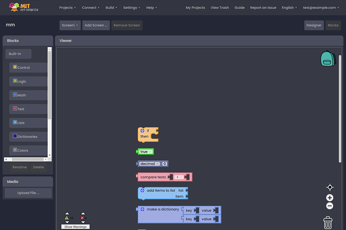
Blocks
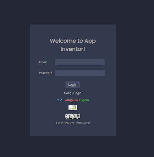
Login
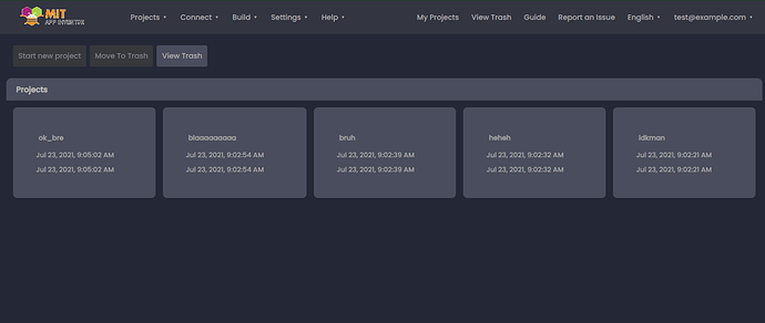
Project List
Rate it and comment below

Credits
@Hrichik_Mazumder For deployment
@themaayur For his awesome idea for blocks design and some UI Tips
15 Likes
The dark theme looks pretty nice. Is it mainly CSS changes? Have you tested for potential contrast issues of the text versus the background color?
12 Likes
Looks Nice ! I like this theme 

2 Likes
The designer looks good. Show side of blocks.
3 Likes
Thanks for your appreciation
Yes, mainly Css but some little Gwt ones too
I am working to make everything look minimal, including Docs, etc
Thank you so much
 Thanks
 Just running server and sending you a pic
2 Likes
5/5 but u could update de icons
2 Likes

I tried to keep ai2 authenticity, anyways, will update and show how it looks
2 Likes
Try To make Light Theme Of this
2 Likes
He did make it he has a pr on github regarding this linking it -
3 Likes
The light theme of this can be found on the Github PR By @Know_About_IT
Here
1 Like
I am now implementing material text boxes to give UI an awesome punch
4 Likes
I know This. But this did not have the translucent look like this
1 Like
Yes, I will make Light version too, within 2-3 days
2 Likes
I will add theme switch options
1 Like
Good luck on your journey!
Can I have the link or the files for using this UI?
PS: I don't have any GitHub account and I even don't know how to use GitHub...
1 Like
