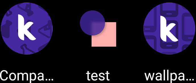
And I'm not sure what exactly your statement means.
Hello all
Can you please test if the artefacts persist with this APK?
Thanks
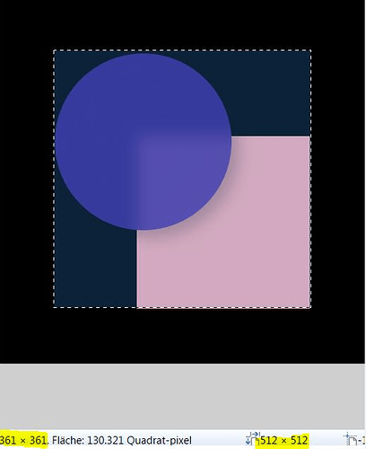
Ok, the launcher icon is 512x512px and has a black background. The actual picture is only 360x360px and is exactly in the middle.
Awesome!
Based on my experiments with the system, I see three plausible solutions to the problem
-
Use the solution I've shared above. The user's app icon is set as the adaptive icon's background layer.
Pros: No white patches along the edges
Cons: The wiggle/parallax/spring motion that comes with adaptive icons is lost; the icon is stationary. -
Set the background layer of the icon from #FFFFFF (white) to #00FFFFFF (transparent). This will get rid of the artefacts while retaining the parallax motion.
Pros: Motion is retained
Cons: Motion is applied to the entire icon (this is not an issue introduced by this solution, rather a limitation of the system currently implemented in App Inventor). It is not possible to have, say in the other two icons @Anke shared above , the "k" ligature maintain motion while the background art stay stationary. -
Add a new property called
AppIconBackground. This will let the user set a special background for their app's icon that will remain stationary. TheAppIconproperty will retain its parallax. If theAppIconBackgroundimage property is not set, the system can default to a solid background colour (either white, transparent, or the app's primary colour property; I'm unsure which one is best suited here)
Pros: Provides granular control over what part of the icon should move and what shouldn't.
Cons: The user will have to take care to make theAppIconimage transparent. For example, theAppIconandAppIconBackgroundproperties will have to be
Note that they are of the same dimensions.
It's a single image of size 512x512
Lots of effort for a few tiny artifacts. 
I personally like this solution the most as it's the closest we'll get to the implementation Android requires us to have. It'd be great to have some insight from the team
Yes! Option 3 you have given is exactly what I've been looking for in AI and closest to the proper Android spec for icons moving forward! I would love to have another property for the background and foreground icon images or be able to set to a solid background so the foreground icon could be transparent.
What does this all mean to/for mere mortals who just want to upload an image for their app icon?
Now that I think about this, it might be better to have the new property be called AppIconForeground. AppIcon, the currently provided property, will serve as the background layer of the icon. This layer will be stationary, as most users would expect it to be.
If the user sets the optional AppIconForeground property, the system can render it as the sliding/parallax foreground layer of the adaptive icon.
This way, only those users who wish to leverage the full feature-set of adaptive icons will have to deal with the AppIconForeground property and ensuring transparency in the foreground layer.
@TIMAI2 to answer your question, if we are to go with updated solution #3, nothing will change for you as an AI user. The issue with the white areas will be fixed and your icon will be sans motion, as one would expect. If you wish to add a foreground layer to your icon that has parallax animations, you will be able to set the AppIconForeground property to an image of your choosing.
I've created an issue here:
Thanks @Anke for the images. I hope you don't mind that I used them in the issue.
@ewpatton what are your thoughts on the ideal way to fix the bug (I've attached three possible fixes in the issue). I'll see if I can find some time to work on this during the weekend.
What was the outcome? Once the adaptive icon set is produced, can the 512 x 512 (or 1024 x 1024 or 576 x 576) icon be deleted by the Build Server to avoid bloating of the APK/AAB?
Unless someone is embedding the icon as a Bitmap, the icon actually adds very little extra size to the app. Uncompressed, a 1024x1024 icon (which is needed for the Apple App Store, btw) is 4 MB. The 1024x1024 icon we use for the iOS companion app, stored as a PNG, is only 87 KB. Unfortunately, for older versions of Android we still need to leave the non-adaptive icons in so that they can be used. The AAB format for publishing in the Play Store mitigates this since Google can build variations of the APK for newer Android that drop the unnecessary resources (however, the AAB still needs to contain every possible version).
... does the Build now avoid the artefacts (discussed here) automatically or is there a specific icon size that should be defined for best results?
Unfortunately, I don't think we ever came up with a solution for the edge artifacts...
Indeed - and there are truly more important problems to solve.
How do I add this new property?


