My problem is . I designed an application that is a link to a website.
When i am viewing this application in the emulator, the screen of the emulator is the same size as the website, that mean there is no problem, but when send the application to the mobile phone, the whole site does not fit the mobile screen it is appear bigger it is need to resize by hand to fit the mobile screen . How to solve this problem


Hello Aymen
Is the website yours? I ask because if it is, you can make it "mobile friendly", such that it works well and looks good on most smartphones. I think the page fits the Emulator better because of the computer's screen resolution. Smartphones tend to be high resolution and screen ratios are many and varied, even from the same phone manufacturer.
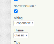
Setting 'Responsive' may not be a total cure for this problem (I think you will find it is selected by default now in App Inventor). Another possibility might be to make an HTML file and display each website page in an Iframe. This might lend more scale control. A very good site for help on this subject:
https://www.w3schools.com/default.asp