🏃♂️ JewelRecyclerView
An advanced recycler view extension for App Inventor.

 Specifications
 Package: com.jewel.jewelrecyclerview
 Size: 242.08 KB
 Version: 1.1.0
 Price: $10 USD
 Minimum API Level: 21
 Updated On: 2025-08-30T18:00:00Z
 Built using: FAST v4.4.0-premium
 Supported builders: App Inventor, Kodular, Niotron, AndroidBuilder & others.
 Payment methods: Download | Wise | Xoom | PayPal | Binance (Crypto) | UPI (
 ) | JazzCash (
 ) | Bkash (
 )
)
 Demo apk: RecyclerView.apk

Multi-Components
 JewelRecyclerView
Events:
JewelRecyclerView has total 13 events.
1. CreateView
Event raised to create UI. Don't bind any data to the UI.

| Parameter | Type |
|---|---|
| rootView | component |
2. BindView
Event raised to bind data to UI.
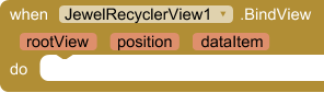
| Parameter | Type |
|---|---|
| rootView | component |
| position | number |
| dataItem | list or nested list |
3. ViewAttachedToWindow
Called when a view created by adapter has been attached to a window.
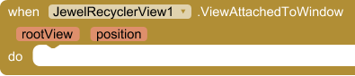
| Parameter | Type |
|---|---|
| rootView | component |
| position | number |
4. ViewDetachedFromWindow
Called when a view created by adapter has been detached from its window.
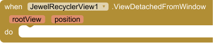
| Parameter | Type |
|---|---|
| rootView | component |
| position | number |
5. ScrollStateChanged
Event raised when scroll state changes.
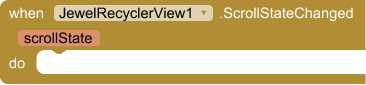
| Parameter | Type |
|---|---|
| scrollState | JewelRecyclerScrollState (helper blocks) |
- Enums for JewelRecyclerScrollState:
Idle,Dragging,Settling
6. Scrolled
Event raised when scroll event occurs.
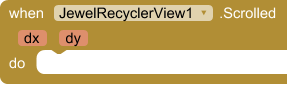
| Parameter | Type |
|---|---|
| dx | number |
| dy | number |
7. LeftSwiped
Event raised when an item swiped to left.
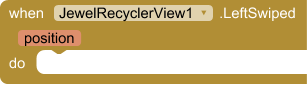
| Parameter | Type |
|---|---|
| position | number |
8. RightSwiped
Event raised when an item swiped to right.
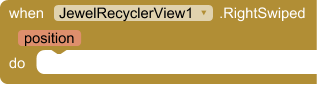
| Parameter | Type |
|---|---|
| position | number |
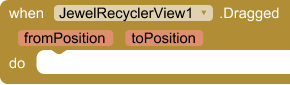
9. Dragged
Event raised when an item dragged.
| Parameter | Type |
|---|---|
| fromPosition | number |
| toPosition | number |
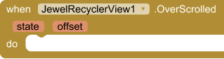
10. OverScrolled
Event raised when recycler view over scrolled.
| Parameter | Type |
|---|---|
| state | number |
| offset | number |
11. ItemSelected
Event raised when an item selected.
This event is only associated with CarouselLayoutManager and BannerLayoutManager.

| Parameter | Type |
|---|---|
| position | number |
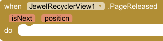
12. PageReleased
Event raised when page released. This event is only associated with ViewPagerLayoutManager.
| Parameter | Type |
|---|---|
| isNext | boolean |
| position | number |
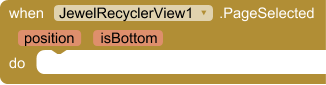
13. PageSelected
Event raised when page selected. This event is only associated with ViewPagerLayoutManager.
| Parameter | Type |
|---|---|
| position | number |
| isBottom | boolean |
Methods:
JewelRecyclerView has total 28 methods.
1. Initialize
Initialize recycler view inside an arrangement.
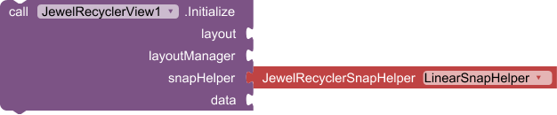
| Parameter | Type |
|---|---|
| layout | component |
| layoutManager | LayoutManager |
| snapHelper | JewelRecyclerSnapHelper (helper blocks) |
| data | list or nested list |
- Enums for JewelRecyclerSnapHelper:
LinearSnapHelper,PagerSnapHelper
2. GroupSnapHelper
Build custom group snap helper.

- Return type:
JewelRecyclerSnapHelper
| Parameter | Type |
|---|---|
| groupCount | number |
3. GravitySnapHelper
Build custom gravity snap helper.

- Return type:
JewelRecyclerSnapHelper
| Parameter | Type |
|---|---|
| gravity | JewelRecyclerGravity (helper blocks) |
- Enums for JewelRecyclerGravity:
Start,End,Bottom,Top,Center
4. LinearLayoutManager
Create linear layout manager.
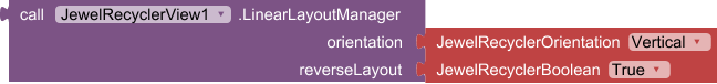
- Return type:
LayoutManager
| Parameter | Type |
|---|---|
| orientation | JewelRecyclerOrientation (helper blocks) |
| reverseLayout | JewelRecyclerBoolean (helper blocks) |
- Enums for JewelRecyclerOrientation:
Vertical,Horizontal - Enums for JewelRecyclerBoolean:
True,False
5. GridLayoutManager
Create grid layout manager.
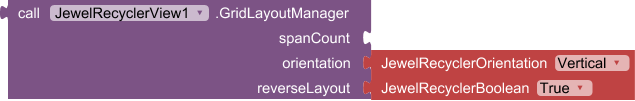
- Return type:
LayoutManager
| Parameter | Type |
|---|---|
| spanCount | number |
| orientation | JewelRecyclerOrientation (helper blocks) |
| reverseLayout | JewelRecyclerBoolean (helper blocks) |
- Enums for JewelRecyclerOrientation:
Vertical,Horizontal - Enums for JewelRecyclerBoolean:
True,False
6. StaggeredGridLayoutManager
Create staggered grid layout manager.
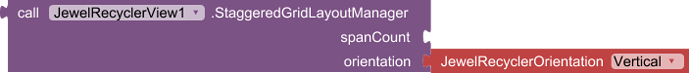
- Return type:
LayoutManager
| Parameter | Type |
|---|---|
| spanCount | number |
| orientation | JewelRecyclerOrientation (helper blocks) |
- Enums for JewelRecyclerOrientation:
Vertical,Horizontal
7. CarouselLayoutManager
Create CarouselLayoutManager.
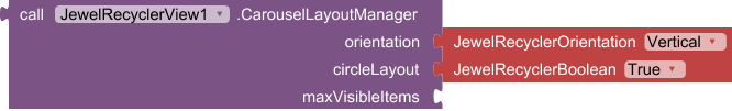
- Return type:
LayoutManager
| Parameter | Type |
|---|---|
| orientation | JewelRecyclerOrientation (helper blocks) |
| circleLayout | JewelRecyclerBoolean (helper blocks) |
| maxVisibleItems | number |
- Enums for JewelRecyclerOrientation:
Vertical,Horizontal - Enums for JewelRecyclerBoolean:
True,False
8. VegaLayoutManager
Create vega layout manager.
- Return type:
LayoutManager
9. ShikderLayoutManager
Create shikder layout manager.
- Return type:
LayoutManager
10. EchelonLayoutManager
Create echelon layout manager.
- Return type:
LayoutManager
11. HiveLayoutManager
Create hive layout manager.

- Return type:
LayoutManager
| Parameter | Type |
|---|---|
| orientation | JewelRecyclerOrientation (helper blocks) |
- Enums for JewelRecyclerOrientation:
Vertical,Horizontal
12. BannerLayoutManager
Create banner layout manager.
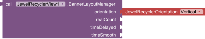
- Return type:
LayoutManager
| Parameter | Type |
|---|---|
| orientation | JewelRecyclerOrientation (helper blocks) |
| realCount | number |
| timeDelayed | number |
| timeSmooth | number |
- Enums for JewelRecyclerOrientation:
Vertical,Horizontal
13. ViewPagerLayoutManager
Create view pager layout manager.
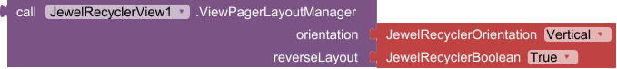
- Return type:
LayoutManager
| Parameter | Type |
|---|---|
| orientation | JewelRecyclerOrientation (helper blocks) |
| reverseLayout | JewelRecyclerBoolean (helper blocks) |
- Enums for JewelRecyclerOrientation:
Vertical,Horizontal - Enums for JewelRecyclerBoolean:
True,False
14. ZoomLayoutManager
Create zoom layout manager.
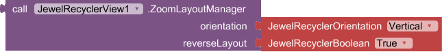
- Return type:
LayoutManager
| Parameter | Type |
|---|---|
| orientation | JewelRecyclerOrientation (helper blocks) |
| reverseLayout | JewelRecyclerBoolean (helper blocks) |
- Enums for JewelRecyclerOrientation:
Vertical,Horizontal - Enums for JewelRecyclerBoolean:
True,False
15. FocusLayoutManager
Create focus layout manager.
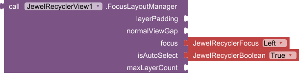
- Return type:
LayoutManager
| Parameter | Type |
|---|---|
| layerPadding | number |
| normalViewGap | number |
| focus | JewelRecyclerFocus (helper blocks) |
| isAutoSelect | JewelRecyclerBoolean (helper blocks) |
| maxLayerCount | number |
- Enums for JewelRecyclerFocus:
Left,Right,Top,Bottom - Enums for JewelRecyclerBoolean:
True,False
16. CoverFlowLayoutManger
Create cover flow layout manager.
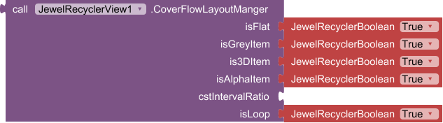
- Return type:
LayoutManager
| Parameter | Type |
|---|---|
| isFlat | JewelRecyclerBoolean (helper blocks) |
| isGreyItem | JewelRecyclerBoolean (helper blocks) |
| is3DItem | JewelRecyclerBoolean (helper blocks) |
| isAlphaItem | JewelRecyclerBoolean (helper blocks) |
| cstIntervalRatio | number |
| isLoop | JewelRecyclerBoolean (helper blocks) |
- Enums for JewelRecyclerBoolean:
True,False
17. TurnLayoutManager
Create turn layout manager.
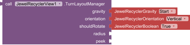
- Return type:
LayoutManager
| Parameter | Type |
|---|---|
| gravity | JewelRecyclerGravity (helper blocks) |
| orientation | JewelRecyclerOrientation (helper blocks) |
| shouldRotate | JewelRecyclerBoolean (helper blocks) |
| radius | number |
| peek | number |
- Enums for JewelRecyclerGravity:
Start,End,Bottom,Top,Center - Enums for JewelRecyclerOrientation:
Vertical,Horizontal - Enums for JewelRecyclerBoolean:
True,False
18. ChipsLayoutManager
Create chips layout manager.
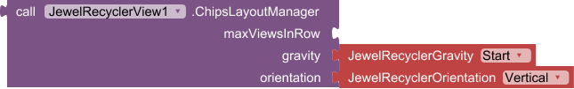
- Return type:
LayoutManager
| Parameter | Type |
|---|---|
| maxViewsInRow | number |
| gravity | JewelRecyclerGravity (helper blocks) |
| orientation | JewelRecyclerOrientation (helper blocks) |
- Enums for JewelRecyclerGravity:
Start,End,Bottom,Top,Center - Enums for JewelRecyclerOrientation:
Vertical,Horizontal
19. NotifyDataSetChanged
Notify any registered observers that the data set has changed.
20. NotifyItemMoved
Notify any registered observers that the item reflected at from has been moved to to.
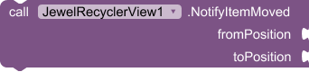
| Parameter | Type |
|---|---|
| fromPosition | number |
| toPosition | number |
21. NotifyItemRangeChanged
Notify any registered observers that the currently reflected count items starting at startPosition have been newly inserted.
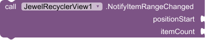
| Parameter | Type |
|---|---|
| positionStart | number |
| itemCount | number |
22. NotifyItemRangeInserted
Notify any registered observers that the currently reflected count items starting at startPosition have been newly inserted.
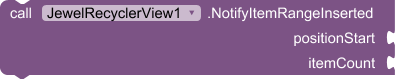
| Parameter | Type |
|---|---|
| positionStart | number |
| itemCount | number |
23. NotifyItemRangeRemoved
Notify any registered observers that the currently reflected count items starting at startPosition have been removed.
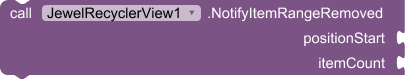
| Parameter | Type |
|---|---|
| positionStart | number |
| itemCount | number |
24. GetRootView
Get root view using child view.

- Return type:
component
| Parameter | Type |
|---|---|
| component | component |
25. GetRootViewBy
Get root view by adapter position. This position view should be showing in list.

- Return type:
component
| Parameter | Type |
|---|---|
| position | number |
26. GetPosition
Returns the Adapter position of the item represented by view.

- Return type:
number
| Parameter | Type |
|---|---|
| rootView | component |
27. StopScroll
Stop scrolling.
28. ClearListView
Clear the list views.
Designer:
JewelRecyclerView has total 19 designer properties.
Designer Properties
1. LeftSwipable
- Input type:
boolean - Default value:
False
2. SwipeLeftBackgroundColor
- Input type:
color - Default value:
&HFFFFFFFF
3. SwipeLeftTextColor
- Input type:
color - Default value:
&HFF000000
4. SwipeLeftText
- Input type:
string
5. SwipeLeftTextSize
- Input type:
non_negative_integer - Default value:
12
6. SwipeLeftIcon
- Input type:
asset
7. RightSwipable
- Input type:
boolean - Default value:
False
8. SwipeRightBackgroundColor
- Input type:
color - Default value:
&HFFFFFFFF
9. SwipeRightTextColor
- Input type:
color - Default value:
&HFF000000
10. SwipeRightText
- Input type:
string
11. SwipeRightTextSize
- Input type:
non_negative_integer - Default value:
12
12. SwipeRightIcon
- Input type:
asset
13. Draggable
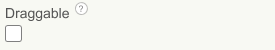
- Input type:
boolean - Default value:
False
14. FixedSize
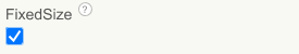
- Input type:
boolean - Default value:
True
15. OverScroll
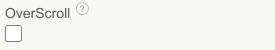
- Input type:
boolean - Default value:
False
16. NestedScrolling
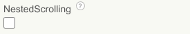
- Input type:
boolean - Default value:
False
17. AnimationDuration
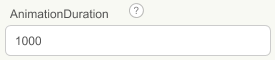
- Input type:
non_negative_integer - Default value:
1000
18. AlwaysAnimate
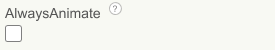
- Input type:
boolean - Default value:
False
19. ItemAnimator
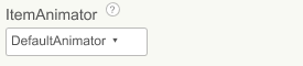
- Input type:
choices - Arguments:
Default,Landing,FadeIn,FadeInDown,FadeInUp,FadeInLeft,FadeInRight,FlipInTopX,FlipInBottomX,FlipInLeftY,FlipInRightY,SlideInLeft,SlideInRight,SlideInLeftRight,OvershootInLeft,OvershootInRight,OvershootInLeftRight,SlideInUp,SlideInDown,BounceIn,Swing,Pulse,Jelly,RollIn,ZoomOut,ZoomIn,FireworkBurst,CascadingTiles,ShimmerIn,PopOut,SpiralIn,TumbleIn,DriftIn,GlitchIn,SwingIn,BounceAndScale,ConfettiRain,SparkleIn,RippleIn,FlutterIn,BurstIn,FloatIn,ElasticIn,SwirlIn,CometIn,LanternIn,ScaleIn,ScaleInTop,ScaleInBottom,ScaleInLeft,ScaleInRight,Random
Setters:
JewelRecyclerView has total 27 setter properties.
1. ScrollToPosition
Scroll to position.
- Input type:
number
2. SmoothScrollToPosition
Smooth scroll to position.
- Input type:
number
3. AddGapDecorator
Add consistent gap between list items.
- Input type:
number
4. UpdateData
Update data.
- Input type:
listornested list
5. UpdateDataSmoothly
Update data smoothly (Powered by DiffUtil).
- Input type:
listornested list
6. NotifyItemChanged
Notify any registered observers that the item at position has changed.
- Input type:
number
7. NotifyItemInserted
Notify any registered observers that the item reflected at position has been newly inserted.
- Input type:
number
8. NotifyItemRemoved
Notify any registered observers that the item previously located at 'position' has been removed from the data set.
- Input type:
number
9. LeftSwipable
Set to true to enable swiping left.
- Input type:
boolean - Helper type:
JewelRecyclerBoolean - Helper enums:
True,False
10. SwipeLeftBackgroundColor
Set backgound color.
- Input type:
number
11. SwipeLeftTextColor
Set left label color.
- Input type:
number
12. SwipeLeftText
Set swipe left label text.
- Input type:
text
13. SwipeLeftTextSize
Set label text size
- Input type:
number
14. SwipeLeftIcon
Set label icon from asset
- Input type:
text - Helper type:
asset - Acceptable types:
.jpeg,.jpg,.png
15. RightSwipable
Set to true to enable swiping right.
- Input type:
boolean - Helper type:
JewelRecyclerBoolean - Helper enums:
True,False
16. SwipeRightBackgroundColor
Set background color.
- Input type:
number
17. SwipeRightTextColor
Set text color.
- Input type:
number
18. SwipeRightText
Set swipe right text
- Input type:
text
19. SwipeRightTextSize
Set text size.
- Input type:
number
20. SwipeRightIcon
Set icon from asset.
- Input type:
text - Helper type:
asset - Acceptable types:
.jpeg,.jpg,.png
21. Draggable
Set true to enable.
- Input type:
boolean - Helper type:
JewelRecyclerBoolean - Helper enums:
True,False
22. FixedSize
Set true to enable fixed size.
- Input type:
boolean - Helper type:
JewelRecyclerBoolean - Helper enums:
True,False
23. OverScroll
Set true to enable over sroll effect.
- Input type:
boolean - Helper type:
JewelRecyclerBoolean - Helper enums:
True,False
24. NestedScrolling
Set true to enable.
- Input type:
boolean - Helper type:
JewelRecyclerBoolean - Helper enums:
True,False
25. AnimationDuration
Set duration in milliseconds
- Input type:
number
26. AlwaysAnimate
Set true to enable.
- Input type:
boolean - Helper type:
JewelRecyclerBoolean - Helper enums:
True,False
27. ItemAnimator
Set Animation that take place on items as changes are made to the adapter.
- Input type:
text - Helper type:
JewelRecyclerAnimator - Helper enums:
Default,Landing,FadeIn,FadeInDown,FadeInUp,FadeInLeft,FadeInRight,FlipInTopX,FlipInBottomX,FlipInLeftY,FlipInRightY,SlideInLeft,SlideInRight,SlideInLeftRight,OvershootInLeft,OvershootInRight,OvershootInLeftRight,SlideInUp,SlideInDown,BounceIn,Swing,Pulse,Jelly,RollIn,ZoomOut,ZoomIn,FireworkBurst,CascadingTiles,ShimmerIn,PopOut,SpiralIn,TumbleIn,DriftIn,GlitchIn,SwingIn,BounceAndScale,ConfettiRain,SparkleIn,RippleIn,FlutterIn,BurstIn,FloatIn,ElasticIn,SwirlIn,CometIn,LanternIn,ScaleIn,ScaleInTop,ScaleInBottom,ScaleInLeft,ScaleInRight,Random
Getters:
JewelRecyclerView has total 24 getter properties.
Getter Properties
1. FirstVisibleItemPosition
Returns the adapter position of the first visible view.
- Return type:
number
2. FirstCompletelyVisibleItemPosition
Returns the adapter position of the first fully visible view.
- Return type:
number
3. LastVisibleItemPosition
Returns the adapter position of the last visible view.
- Return type:
number
4. LastCompletelyVisibleItemPosition
Returns the adapter position of the last fully visible view.
- Return type:
number
5. GetData
Returns given data as list.
- Return type:
listornested list
6. IsLeftSwipable
Returns true if enabled.
- Return type:
boolean
7. GetSwipeLeftBackgroundColor
Returns color as integer.
- Return type:
number
8. GetSwipeLeftTextColor
Returns color as integer.
- Return type:
number
9. GetSwipeLeftText
Returns text as string.
- Return type:
text
10. GetSwipeLeftTextSize
Returns label text size.
- Return type:
number
11. GetSwipeLeftIcon
Returns asset name as string.
- Return type:
text
12. IsRightSwipable
Returns true if enabled.
- Return type:
boolean
13. GetSwipeRightBackgroundColor
Returns color as integer.
- Return type:
number
14. GetSwipeRightTextColor
Returns text color as integer.
- Return type:
number
15. GetSwipeRightText
Returns text as string.
- Return type:
text
16. GetSwipeRightTextSize
Returns text size as integer.
- Return type:
number
17. GetSwipeRightIcon
Returns icon name as string.
- Return type:
text
18. IsDraggable
Returns true if enabled.
- Return type:
boolean
19. HasFixedSize
Returns true if enabled.
- Return type:
boolean
20. IsOverScroll
Returns true if enabled.
- Return type:
boolean
21. IsNestedScrolling
Returns true if enabled.
- Return type:
boolean
22. GetAnimationDuration
Returns duration as milliseconds.
- Return type:
number
23. IsAlwaysAnimate
Returns true if enabled.
- Return type:
boolean
24. GetItemAnimator
Returns the current animator name.
- Return type:
text
RecyclerComponents
Events:
RecyclerComponents has total 2 events.
1. Clicked
Event invoked when a registered component is clicked.
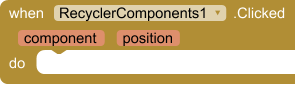
| Parameter | Type |
|---|---|
| component | component |
| position | number |
2. LongClicked
Event invoked when a registered component is long clicked.
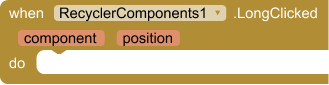
| Parameter | Type |
|---|---|
| component | component |
| position | number |
Methods:
RecyclerComponents has total 15 methods.
1. CreateComponent
Create a new component inside any parent component.
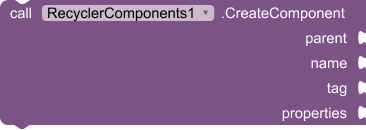
| Parameter | Type |
|---|---|
| parent | component |
| name | any |
| tag | text |
| properties | any |
2. GetComponent
Get component using tag. Make sure to set RootParent before using.
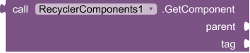
- Return type:
component
| Parameter | Type |
|---|---|
| parent | component |
| tag | text |
3. SetUniqueId
Set unique id of a view
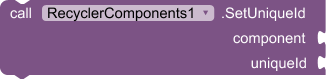
| Parameter | Type |
|---|---|
| component | component |
| uniqueId | text |
4. GetUniqueId
Get unique id from component.

- Return type:
text
| Parameter | Type |
|---|---|
| component | component |
5. SetProperty
Set a property for a component.
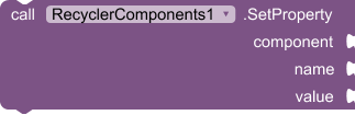
| Parameter | Type |
|---|---|
| component | component or list of components |
| name | text |
| value | string or list of values |
6. SetProperties
Set properties of a component. You can either use JSON string or dictionary to set properties.
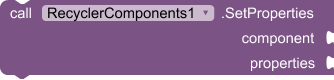
| Parameter | Type |
|---|---|
| component | component of list of components |
| properties | dictionary or list of dictionary |
7. GetProperty
Get a property value.
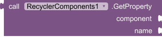
- Return type:
any
| Parameter | Type |
|---|---|
| component | component |
| name | text |
8. IsDynamicComponent
Returns true if the given component is dynamic.

- Return type:
boolean
| Parameter | Type |
|---|---|
| component | component |
9. GetComponentName
Get component name

- Return type:
text
| Parameter | Type |
|---|---|
| component | component |
10. GetComponentById
Make sure to set unique id before using this function.

- Return type:
component
| Parameter | Type |
|---|---|
| uniqueId | text |
11. CreateTemplate
Create components using JSON template.
Note: If you're using asset file so the file name should be end with (.json).
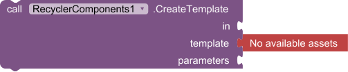
| Parameter | Type |
|---|---|
| in | component |
| template | text (asset blocks) |
| parameters | list |
- Acceptable types for template:
.json
12. RegisterForClick
Register components for click.
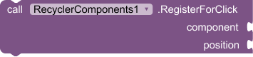
| Parameter | Type |
|---|---|
| component | component or list of component |
| position | number |
13. RegisterForLongClick
Register components for long click.
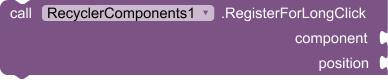
| Parameter | Type |
|---|---|
| component | component of list of components |
| position | number |
14. UnregisterListners
Unregister click and long click listeners for components.

| Parameter | Type |
|---|---|
| component | component of llist of components |
15. AnimateViewOnClick
Animate any component on click.
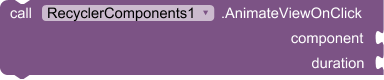
| Parameter | Type |
|---|---|
| component | component |
| duration | number |
Getter:
RecyclerComponents has total 1 getter property.
1. GetUniqueIds
Returns all used uniuqe ids.
- Return type:
list