🧩 CircularMotionView
An extension for MIT App Inventor 2.This Extension is developed by th using Fast.
A circular motion view component that displays boxes moving in a circular path.
Telegram | GitHub
Blogger | YouTube
Find More Extension
Terms & Conditions
 Specifications
 Package: io.th.circularmotionview.circularmotionview
 Size: 25.78 KB
 Version: 1.0
 Minimum API Level: 7
 Updated On: 2025-04-05T18:30:00Z
 Built & documented using: FAST-CLI
 v2.8.1
Buy on upi 180rs or USD - 2 
Output
Bloks


Demo Bloks
OutPut
Events:
CircularMotionView has total 3 events.
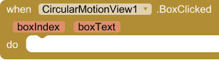
 BoxClicked
Triggered when a box is clicked. Returns the box's index (0 to NumberOfBoxes-1) and its current text.
| Parameter | Type |
|---|---|
| boxIndex | number |
| boxText | text |
AnimationStarted
Triggered when the animation starts after calling StartAnimation.
AnimationStopped
Triggered when the animation stops after calling StopAnimation.
Methods:
CircularMotionView has total 6 methods.
 Initialize
Initialize the circular motion view in a VerticalArrangement or HorizontalArrangement. This must be called before using any other functions.
| Parameter | Type |
|---|---|
| arrangement | component |
StartAnimation
Start the automatic circular motion animation. The boxes will move around the circular path.
StopAnimation
Stop the current animation. The boxes will remain in their current positions.
BoxTextColor
Set text color for a specific box by its index (0 to NumberOfBoxes-1).
| Parameter | Type |
|---|---|
| boxIndex | number |
| color | number |
BoxText
Set text for a specific box by its index (0 to NumberOfBoxes-1).
| Parameter | Type |
|---|---|
| boxIndex | number |
| text | text |
XYPosition
Set the exact X and Y position of the circular motion view's center point in pixels.
| Parameter | Type |
|---|---|
| x | number |
| y | number |
Setters:
CircularMotionView has total 17 setter properties.
 RotationSpeed
Set the speed of rotation in milliseconds. Lower values make it rotate faster. Default is 5000.
- Input type:
number
BoxColor
Set the background color of all boxes. Use the color blocks to select a color.
- Input type:
number
PathColor
Set the color of the circular path. Use the color blocks to select a color.
- Input type:
number
PathWidth
Set the width/thickness of the circular path line. Default is 4.
- Input type:
number
PathRadius
Set the radius of the circular path. This determines how large the circle will be. Default is 180.
- Input type:
number
Text
Set the text that appears inside all boxes. Leave empty for no text.
- Input type:
text
TextColor
Set the text color for all boxes. Use the color blocks to select a color.
- Input type:
number
TextSize
Set the text size for all boxes. Default is 14.
- Input type:
number
BoxSize
Set the size of each box in pixels. This affects both width and height. Default is 75.
- Input type:
number
NumberOfBoxes
Set the number of boxes that appear on the circular path. Default is 9.
- Input type:
number
GetBoxText
Get text from a specific box
- Input type:
number
BoxShape
Set the shape of all boxes. Available shapes: RECTANGLE, ELLIPSE, TRIANGLE_UP, TRIANGLE_DOWN, TRIANGLE_RIGHT, TRIANGLE_LEFT, TRAPEZIUM, PARALLELOGRAM, CAPSULE, LEAF, RHOMBUS, HEART_1, HEART_2, DROP, STAR_1, STAR_2, DIAMOND, PENTAGON, HEXAGON
- Input type:
text - Helper class:
Shape - Helper enums:
RECTANGLE,ELLIPSE,TRIANGLE_UP,TRIANGLE_DOWN,TRIANGLE_RIGHT,TRIANGLE_LEFT,TRAPEZIUM,PARALLELOGRAM,CAPSULE,LEAF,TRIANGLE_TOP_LEFT,TRIANGLE_TOP_RIGHT,RHOMBUS,HEART_1,HEART_2,DROP,STAR_1,STAR_2,DIAMOND,PENTAGON,HEXAGON
AutoRotation
Enable or disable automatic rotation. When disabled, the view can only be rotated manually.
- Input type:
boolean
TouchGesturesEnabled
Enable or disable touch gestures. When enabled, users can drag to rotate the view.
- Input type:
boolean
Visible
Show or hide the entire circular motion view including all boxes.
- Input type:
boolean
PositionX
Set the X coordinate of the circular motion view's center point in pixels.
- Input type:
number
PositionY
Set the Y coordinate of the circular motion view's center point in pixels.
- Input type:
number
Getters:
CircularMotionView has total 6 getter properties.
 BoxSize
Set the size of each box in pixels. This affects both width and height. Default is 75.
- Return type:
number
NumberOfBoxes
Set the number of boxes that appear on the circular path. Default is 9.
- Return type:
number
AvailableShapes
Get available shape styles
- Return type:
any
AutoRotation
Enable or disable automatic rotation. When disabled, the view can only be rotated manually.
- Return type:
boolean
TouchGesturesEnabled
Enable or disable touch gestures. When enabled, users can drag to rotate the view.
- Return type:
boolean
Visible
Show or hide the entire circular motion view including all boxes.
- Return type:
boolean
Thanks
TechHamara