🧩 Broken
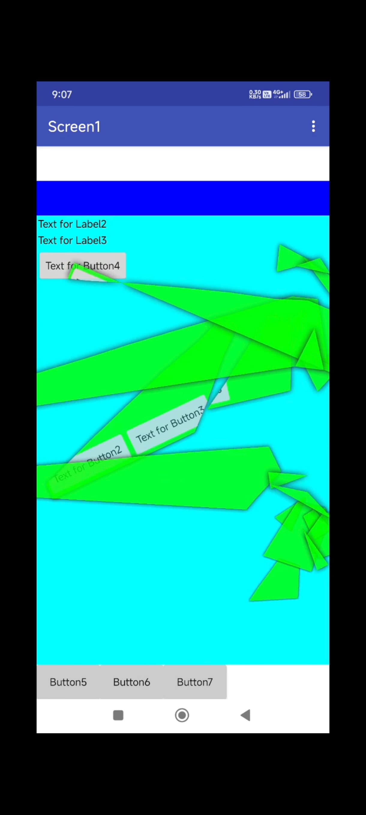
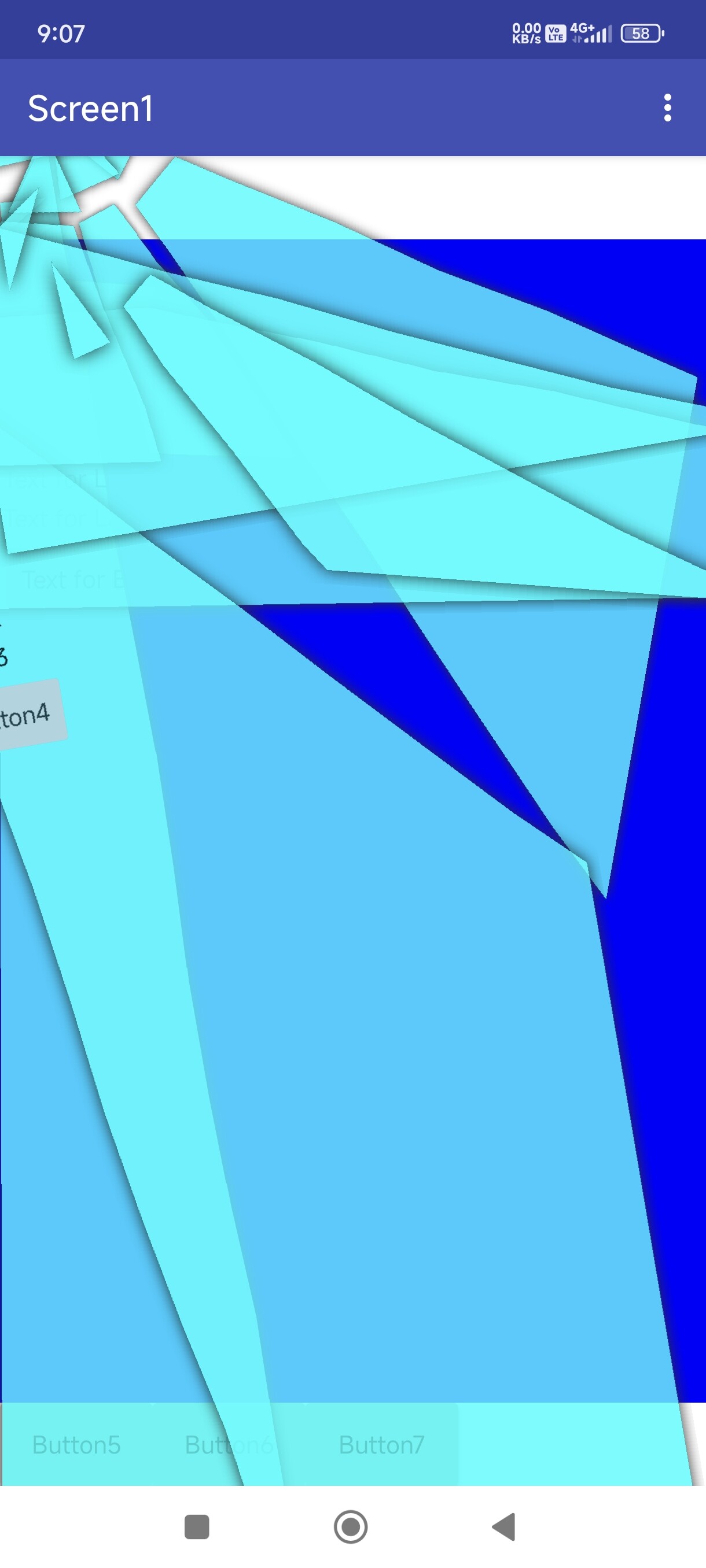
An extension for MIT App Inventor 2.This extension adds a realistic glass breaking effect to any view. It was developed by TechHamara using the Fast library, allowing for a seamless integration of this visually appealing feature into your projects. The glass breaking effect can be applied to any component, providing a unique and engaging user experience. The extension offers customization options for complexity, break duration, fall duration, and circle rifts radius, giving you full control over the animation. Additionally, it includes advanced features such as manual break point control, custom color selection, and animation stage management. The Broken extension is designed to be easy to use and integrate into your App Inventor projects, making it an excellent choice for adding a touch of realism and interactivity to your applications.
Telegram | GitHub
Blogger | YouTube
Find More Extension
Terms & Conditions
 Specifications
 Package: io.th.broken
 Size: 31.56 KB
 Version: 1.0
 Minimum API Level: 14
 Updated On: 2025-05-08T18:30:00Z
 Built & documented using: FAST v2.8.4
 Library Use by zhanyongsheng Thanks you for your awesome library.
 Buy On UPI 180rs or USD 2.
Buy-Now
 Find more info on GitHub
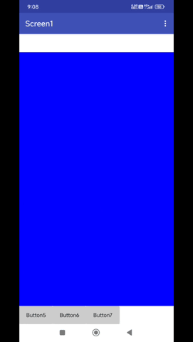
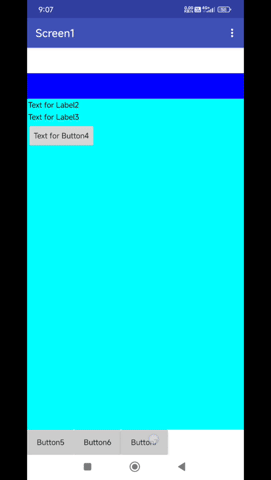
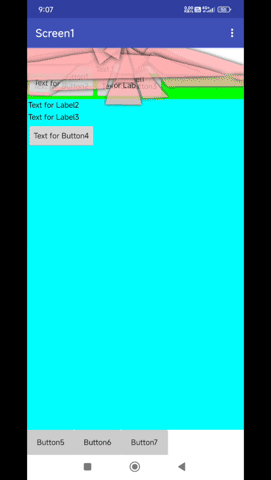
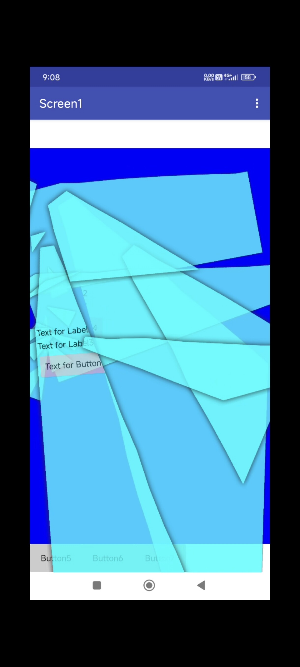
Demo

Blocks
Events:
Broken has total 6 events.
BreakStarted
Event triggered when the break animation starts
BreakCancelled
Event triggered when the break animation is cancelled
BreakRestarted
Event triggered when the break animation restarts
FallingStarted
Event triggered when the falling animation starts
FallingEnded
Event triggered when the falling animation ends
CancelEnded
Event triggered when cancel animation ends
Methods:
Broken has total 11 methods.
Initialize
Initialize BrokenView inside an arrangement.
| Parameter | Type |
|---|---|
| arrangement | component |
BreakComponent
Apply glass breaking effect to a component
| Parameter | Type |
|---|---|
| component | component |
Reset
Reset the BrokenView to its initial state
BreakComponentRandomly
Break a component at a random point
| Parameter | Type |
|---|---|
| component | component |
BreakAndHideComponent
Break and hide a component
| Parameter | Type |
|---|---|
| component | component |
Stage
Set the animation stage for the current component (0=Test, 1=Breaking, 2=Falling, 3=EarlyEnd)
| Parameter | Type |
|---|---|
| stage | number |
DoReverse
Reverse the breaking animation if possible
- Return type:
boolean
BreakComponentAtPoint
Break component at a specific point (x,y coordinates relative to the component)
| Parameter | Type |
|---|---|
| component | component |
| x | number |
| y | number |
BreakAndShowComponent
Break and show component (make visible if it was previously hidden)
| Parameter | Type |
|---|---|
| component | component |
BreakPosition
Set custom break position for all future breaks (relative to screen)
| Parameter | Type |
|---|---|
| component | component |
| x | number |
| y | number |
IsAnimating
Check if animation is in progress
- Return type:
boolean
Setters:
Broken has total 5 setter properties.
Enabled
Set the animation enabled state
- Input type:
boolean
Complexity
Set the complexity of the break effect (number of fragments, Default complexity is 12)
- Input type:
number
BreakDuration
Set the duration of the break animation in milliseconds
- Input type:
number
FallDuration
Set the duration of the falling animation in milliseconds
- Input type:
number
CircleRiftsRadius
Set the radius of circle rifts (set to 0 to disable circle rifts, Default circle rifts radius is 66)
- Input type:
number
Getters:
Broken has total 4 getter properties.
Complexity
Set the complexity of the break effect (number of fragments, Default complexity is 12)
- Return type:
number
BreakDuration
Set the duration of the break animation in milliseconds
- Return type:
number
FallDuration
Set the duration of the falling animation in milliseconds
- Return type:
number
CircleRiftsRadius
Set the radius of circle rifts (set to 0 to disable circle rifts, Default circle rifts radius is 66)
- Return type:
number
Buy on paypal
Pm me @TechHamara
Thanks
TechHamara
Feel free to contact us any quarry or suggestions.