BottomNav Extension: Customizable Bottom Navigation Bar with SVG Support and Animations 
Description
BottomNav is a premium MIT App Inventor extension designed to create a modern, customizable bottom navigation bar with support for up to 6 tabs. It offers three navigation styles (Default, Curved, Google), SVG icon integration, dynamic animations, and extensive customization options. Perfect for enhancing app navigation with a sleek and professional look.
Price: $5 USD or INR 500/-
Released On: Sep 20, 2025
Size: ~33 KB (approximate size)
Explanation
BottomNav transforms app navigation by providing a highly customizable bottom navigation bar. It supports SVG icons, text labels, or both, with three distinct navigation styles and animations. The extension allows for custom colors, fonts, and Google-style pill effects, making it ideal for creating engaging and visually appealing navigation experiences. It includes robust event handling for tab and SVG path interactions, ensuring seamless integration with App Inventor's layouts.
Features
- Three Navigation Styles: Default, Curved, and Google-inspired designs for varied aesthetics.
- Three Display Modes: Icon Only, Text Only, or Both for flexible tab configurations.
- SVG Icon Support: Use scalable vector graphics for high-quality icons with optional original color retention.
- Customizable Colors: Set background, selected icon, default icon, active tab text, and Google pill colors.
- Dynamic Animations: Choose from Default, Curved, or Google animations for tab transitions.
- Custom Font Support: Import fonts via assets for tab label styling.
- Up to 6 Tabs: Configure each tab with individual SVG icons and text labels.
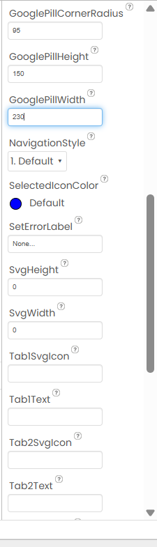
- Google Pill Customization: Adjust width, height, and corner radius for the Google-style pill effect.
- Responsive Design: Automatically adapts tab sizes to screen width and content.
- Event Handling: Supports TabClicked and SvgPathClicked events for interactive navigation.
- Layout Compatibility: Seamlessly integrates into Vertical or Horizontal Arrangements.
- Animation Control: Smooth transitions with customizable animation styles for enhanced UX.
How to Use
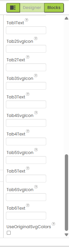
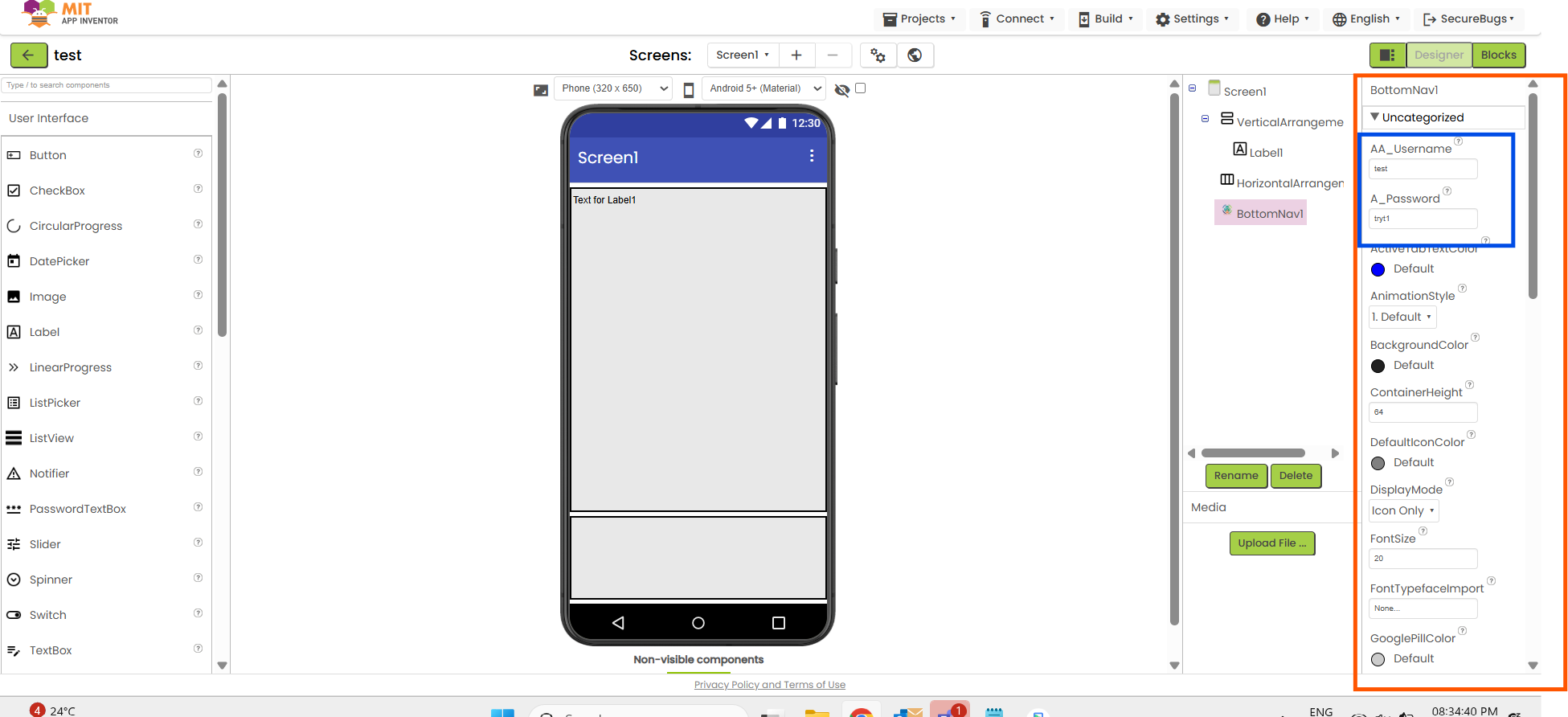
Designer Properties Images
How to Use (Block Steps)
- Add to Project:
- Import the .aix file via App Inventor’s Extensions tab.
- Drag the BottomNav component into your screen.
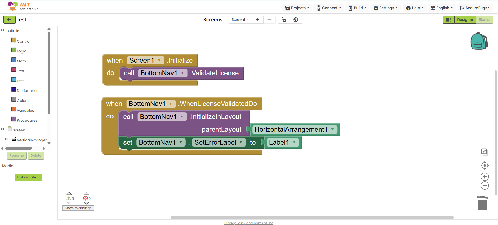
- Initialize Navigation Bar:
- Block: InitializeInLayout
- Parameters: parentLayout (component, e.g., HorizontalArrangement1)
- Example:
text
When Screen1.Initialize Call BottomNav1.InitializeInLayout parentLayout: HorizontalArrangement1
- Configure Tabs:
- Blocks: Tab1SvgIcon to Tab6SvgIcon, Tab1Text to Tab6Text
- Example:
text
Set BottomNav1.Tab1SvgIcon to "<svg>...</svg>"
Set BottomNav1.Tab1Text to "Home"
Set BottomNav1.Tab2SvgIcon to "<svg>...</svg>"
Set BottomNav1.Tab2Text to "Profile"
- Set Navigation Style:
- Block: NavigationStyle
- Parameters: style (text, e.g., "1. Default", "2. Curved", "3. Google")
- Example:
text
Set BottomNav1.NavigationStyle to "3. Google"
- Set Display Mode:
- Block: DisplayMode
- Parameters: mode (text, e.g., "Icon Only", "Text Only", "Both")
- Example:
text
Set BottomNav1.DisplayMode to "Both"
- Customize Appearance:
- Blocks: BackgroundColor, SelectedIconColor, ActiveTabTextColor, DefaultIconColor, GooglePillColor, etc.
- Example:
text
Set BottomNav1.BackgroundColor to color: #212121
Set BottomNav1.SelectedIconColor to color: #0000FF
Set BottomNav1.GooglePillCornerRadius to 10
- Handle Events:
- Block: TabClicked
- Parameters: id (integer, 1-6), name (text)
- Example:
text
When BottomNav1.TabClicked id: number name: text
If id = 1 then Open Screen "HomeScreen"
If id = 2 then Open Screen "ProfileScreen"
- Block: SvgPathClicked
- Parameters: id (integer, 1-6), name (text), pathId (text)
- Example:
text
When BottomNav1.SvgPathClicked id: number name: text pathId: text
Show Message "Path clicked: " + pathId
- Dynamic Updates:
- Blocks: SetIconColor, SetActiveTabTextColor, SetDefaultIconColor
- Example:
text
Call BottomNav1.SetIconColor color: #FF0000
Use Cases
- App Navigation: Create intuitive navigation for multi-screen apps (e.g., Home, Profile, Settings).
- Modern UI: Enhance apps with Google-style pill effects or curved designs.
- Interactive Apps: Use SVG path clicks for advanced interactions within tabs.
- Themed Interfaces: Customize colors and fonts to match your app’s branding.
- Dynamic Navigation: Update tab styles or colors based on user actions or app state.
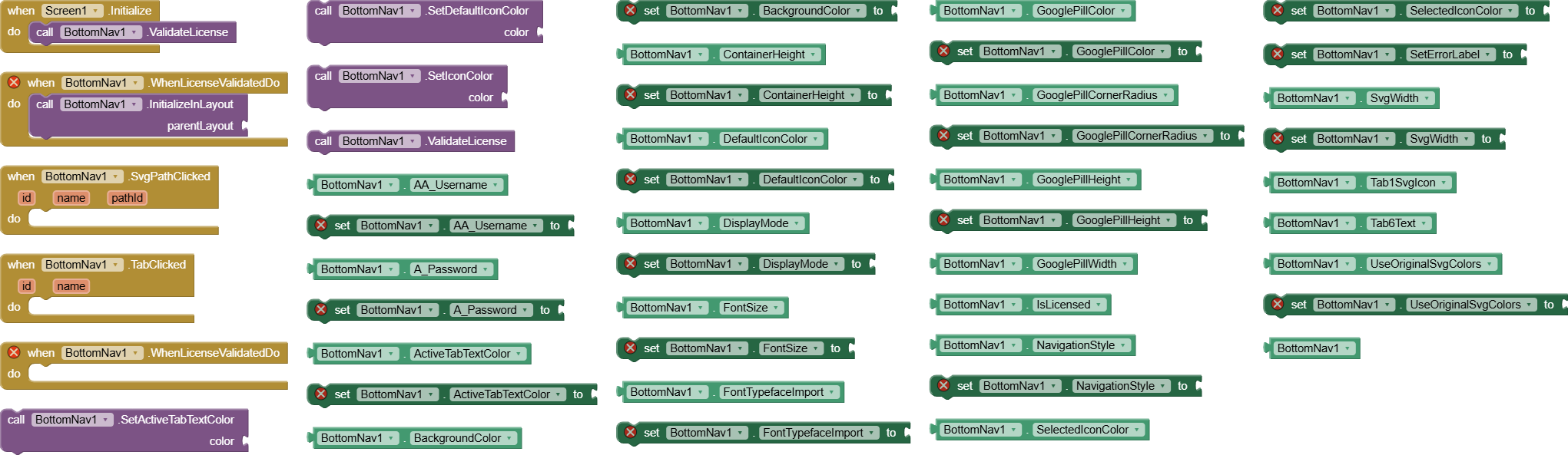
Blocks It contains🧩
To Purchase
BottomNav v1 Price: $5 USD or INR 500/-
- Send me a DM
- Contact me on Telegram: @ek_rahgir
File:
BottomNav.aix (32.7 KB)
Username & password required* (received upon purchase) Contact me!
Installation
- Import the .aix file via MIT App Inventor’s Extensions tab.
- Add BottomNav to your screen.
- Provide username & password (received upon purchase) for LifeTime Access.
- Configure properties in the designer or use blocks to set up tabs and styles.
Feedback
Try BottomNav and share your feedback or suggestions in the comments below! Your input helps us improve and develop more exciting extensions.
Created using : Apache ANT
Important Notes
If you are using Icon must read Extension discription on click more Information you redirected to Material Icon Git repos. You have to download file to show icons.
materialicon-regular.ttf Or click here to download
If usin SVG instead of icon make sure you'll paste whole svg path must inside
<svg>.... </svg>
Changelog
- v1 (Sep 2025): Initial release with support for 3 navigation styles (Default, Curved, Google), 3 display modes (Icon Only, Text Only, Both), SVG icon support, customizable colors, animations, Google pill effects, custom font import, and events (TabClicked, SvgPathClicked). Includes blocks for initialization, dynamic color updates, and tab configuration.