
Are you ready to leave flat, boring designs behind? Do you want to give your apps the stunning, modern Glassmorphism (Frosted Glass) effect seen in the latest high-end apps, without sacrificing performance or compatibility? like these ones :

Introducing BlixBlury , the all-in-one, high-performance UI engine for App Inventor, Kodular, and Niotron.
This is the extension you've been waiting for. Unlike other solutions that are limited to static images or only work on the newest Android versions, BlixBlury delivers a true, live, real-time blur . Your frosted layouts will dynamically update to reflect animations, videos, or any content moving behind them.
But it's more than just a blur. It's a complete UI toolkit designed to elevate your apps to a professional level.
Why BlixBlury is a Game-Changer:
-
 True Real-Time Glassmorphism: The high-performance engine provides a live blur that works across a massive range of Android versions, not just Android 12+. This is the feature you've been missing.
 -
 Complete UI Toolkit: Go beyond simple layouts with built-in, fully customizable, and beautifully blurred components like Draggable Frosted Bottom Sheets and Stunning Frosted Dialogs .
 -
 Dynamic Animated Gradients: Create vibrant, smoothly looping gradient backgrounds with just one block.
 -
 Optimized for Performance: Meticulously engineered to be fast and efficient, with automatic cleanup to prevent memory leaks.
 -
 Simple, Powerful Blocks: Implement breathtaking designs with an intuitive and easy-to-use block system.
Stop wrestling with complex workarounds and static images. BlixBlury is the definitive, drag-and-drop solution for creating UIs that will wow your users.
Blocks Documentation & Examples
Blocks
 Real-Time Blur Effects
These are the core functions for applying glassmorphism to your layouts.
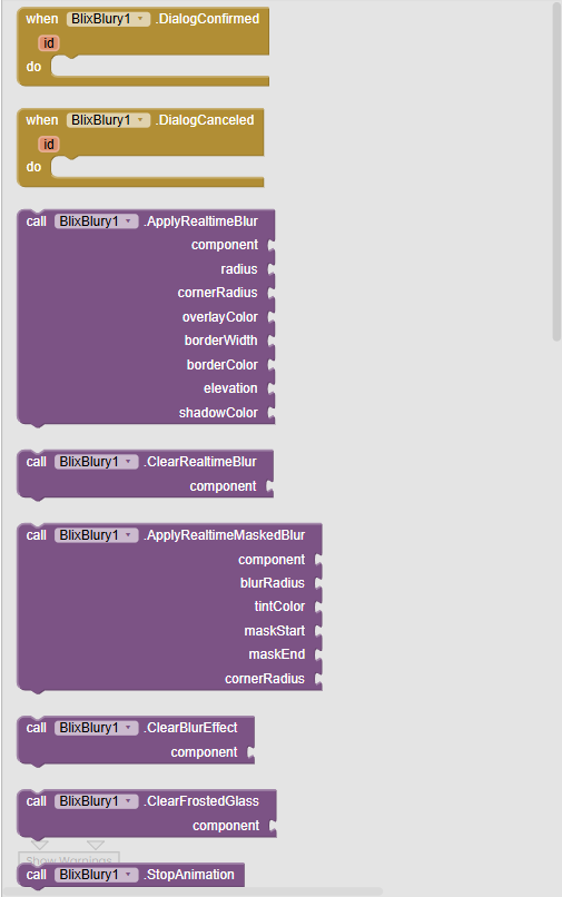
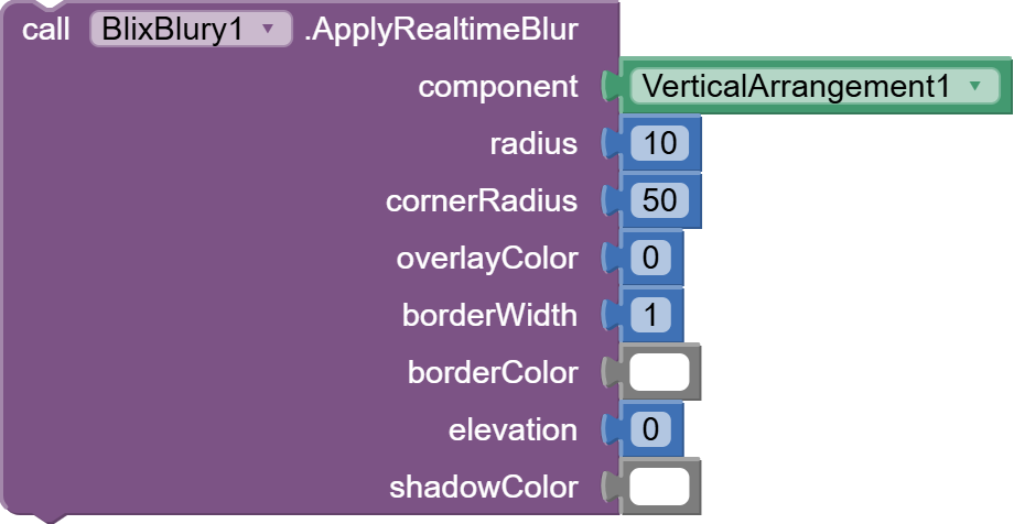
ApplyRealtimeBlur
Applies a live, frosted glass effect to any component. The blur automatically tracks the component's position and size, even during animations.
-
Parameters:
-
component: The layout or component to apply the blur to.
-
radius (Number): The intensity of the blur. Recommended: 15-25.
-
cornerRadius (Number): The roundness of the corners.
-
overlayColor (Color): A semi-transparent color laid over the blur (e.g., semi-transparent white for a classic frost effect).
-
borderWidth (Number): The thickness of the border.
-
borderColor (Color): The color of the border.
-
elevation (Number): Sets the shadow/elevation for the component.
-
shadowColor (Color): The color of the shadow (Android P+).
-
-
Example Usage:
Result:

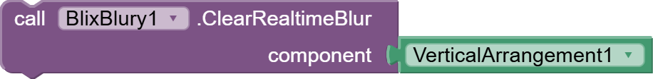
ClearRealtimeBlur
Safely removes the real-time blur effect from a component, restoring its original appearance.
-
Parameters:
- component: The component to clear the effect from.
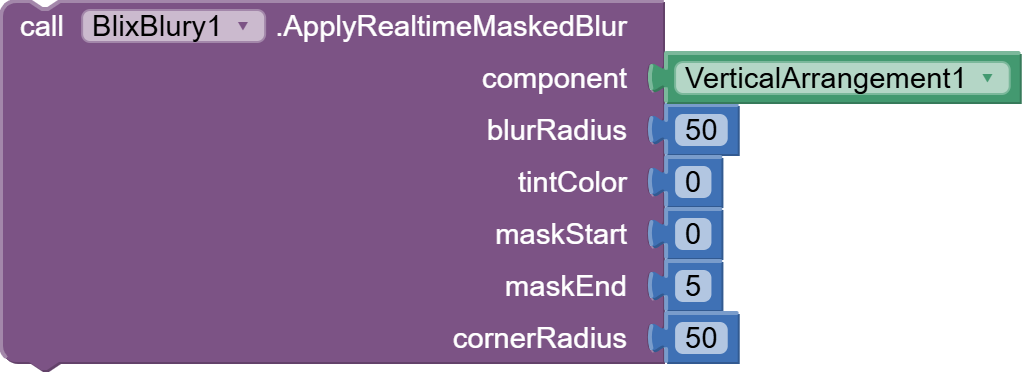
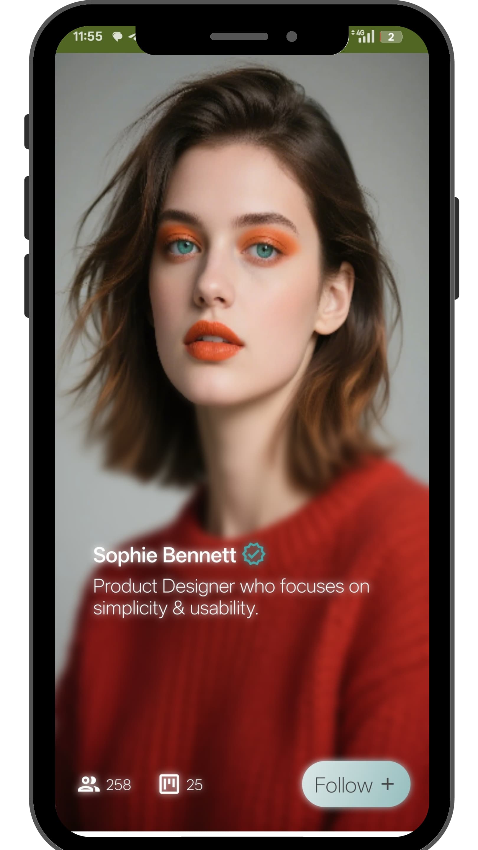
ApplyRealtimeMaskedBlur
Applies a real-time blur that fades in vertically. Perfect for the bottom of a list to show that there is more content to scroll.
-
Parameters:
-
component: The layout to apply the masked blur to.
-
blurRadius (Number): The intensity of the blur.
-
tintColor (Color): An overlay color for the effect.
-
maskStart (Number 0-100): The percentage from the top where the solid view starts to fade into a blur.
-
maskEnd (Number 0-100): The percentage from the top where the view is fully blurred.
-
cornerRadius (Number): The roundness of the corners.
-
-
Example Usage:
Result:
ClearBlurEffect
Removes the masked blur effect from a component.
-
Parameters:
- component: The component to clear the effect from.
Gradient Animation
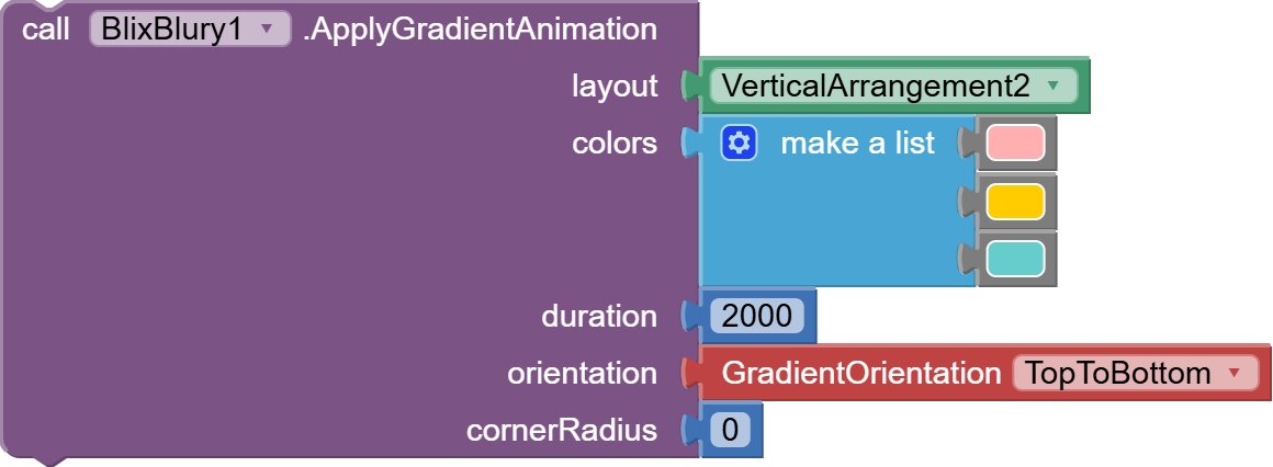
ApplyGradientAnimation
Applies a beautiful, smoothly looping animated gradient to a component's background.
-
Parameters:
-
layout: The component to apply the gradient to.
-
colors (List): A list of colors for the gradient.
-
duration (Number): The time in milliseconds for one full cycle through the colors.
-
orientation (Text): The direction of the gradient. (e.g., TopToBottom, LeftToRight, TopLeftToBottomRight).
-
cornerRadius (Number): The roundness of the corners.
-
-
Example Usage:
Result:


StopAnimation
Stops any currently running gradient animation.
Frosted Bottom Sheet
Create modern, swipeable bottom sheets with a beautiful blur background.
CreateFrostedBottomSheet
Initializes and prepares a bottom sheet. It takes your content layout and wraps it in a draggable, blurred panel.
-
Parameters:
-
contentComponent: The main layout that will be the content of your bottom sheet.
-
radius (Number): The blur intensity.
-
cornerRadius (Number): Roundness for the top corners of the sheet.
-
tintColor (Color): The color overlay for the blur.
-
borderWidth (Number): Thickness of the top border.
-
borderColor (Color): Color of the top border.
-
cancelable (Boolean): If true, tapping the dark background will dismiss the sheet.
-
ShowFrostedBottomSheet
Animates the created bottom sheet into view.
-
Parameters:
- duration (Number): The animation speed in milliseconds.
HideFrostedBottomSheet
Animates the bottom sheet out of view.
-
Parameters:
- duration (Number): The animation speed in milliseconds.
DestroyFrostedBottomSheet
Completely removes the bottom sheet from memory.
IsBottomSheetVisible
Returns true if the bottom sheet is currently visible on the screen.
- Example Usage:
Result:


 Frosted Dialog
Create stunning and modern pop-up dialogs.
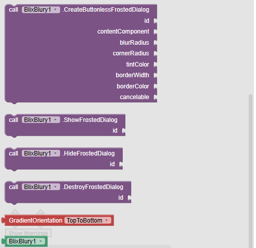
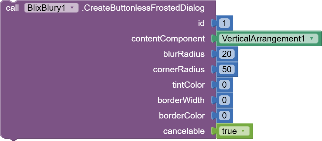
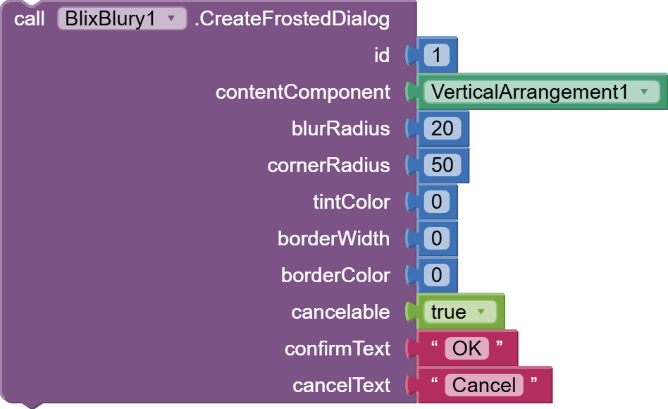
CreateFrostedDialog / CreateButtonlessFrostedDialog
Creates a dialog with a frosted glass background. You can create one with standard Confirm/Cancel buttons or one without any buttons for informational pop-ups.
-
Parameters:
-
id (Text): A unique ID to identify this dialog later.
-
contentComponent: The layout to show inside the dialog.
-
... (other parameters are for blur, border, corners, etc., similar to the bottom sheet)
-
cancelable (Boolean): If true, tapping the background scrim will hide the dialog.
-
confirmText / cancelText (Text): The text for the buttons.
-
ShowFrostedDialog / HideFrostedDialog / DestroyFrostedDialog
Functions to control the visibility and lifecycle of the dialog, identified by its id.
Events
-
DialogConfirmed
Fires when the user clicks the "Confirm" button. Returns the id of the dialog. -
DialogCanceled
Fires when the user clicks the "Cancel" button or dismisses the dialog. Returns the id of the dialog. -
Example Usage:
Results:

Results:

FAQ
-
Q: Does the real-time blur work on all Android versions?
- A: Yes! This is the extension's biggest strength. It uses a high-performance RenderScript engine to provide a real-time blur on older Android devices (Android 5.0+). On Android 12+, it can use the even more efficient native RenderEffect.
-
Q: Will this slow down my app?
- A: The extension is heavily optimized. While any real-time effect has a cost, BlixBlury is designed to be as performant as possible. For best results, use it on specific UI elements rather than the entire screen.
-
Q: Can I use this with other UI extensions?
- A: Generally, yes. However, since BlixBlury modifies the view hierarchy (by wrapping your component in another layout), it might conflict with other extensions that do the same thing to the same component. Apply BlixBlury first.
Video for the demo app :
Tools used :
-
 Built using: FAST v3.6.0
 -
BlurView library:
Purchase AIX and Demo AIA
You can make your payment securely via PayPal. After completing the payment, you will be automatically redirected to the download page for the extension. Credit card payments are also accepted.
If you prefer a different payment method, feel free to send me a private message, and I’ll assist you further.
Check out my YouTube Channel and join my Telegram Channel for updates and tutorials!