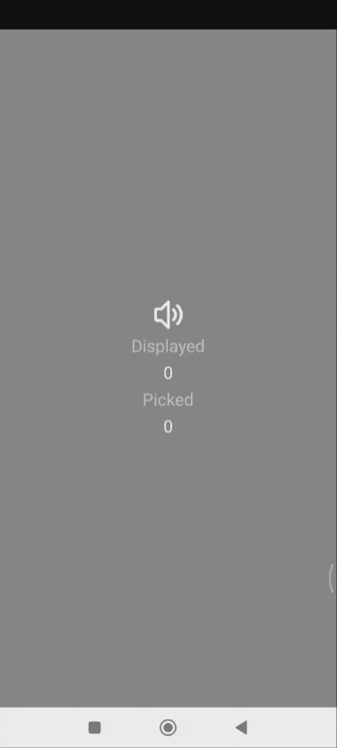
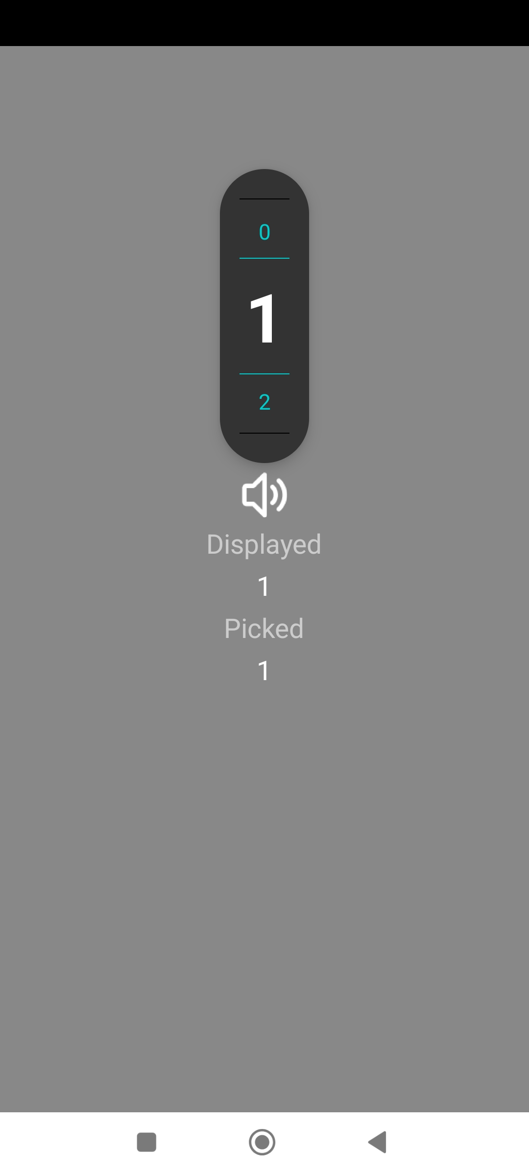
Displays a list of numbers or a list of texts that are selected by swiping or clicking.
Customize: colors, sizes, borders, dividing lines...
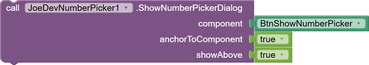
ShowNumberPickerDialog
Displays the number picker anchored to a component if the boolean is true. You can choose whether it displays above or below the component.
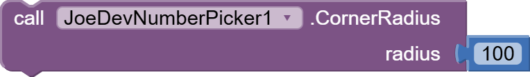
CornerRadius
Sets the radius of the dialog corners.
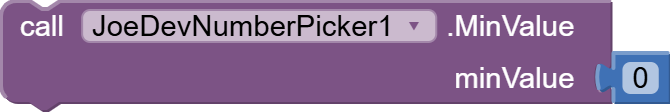
MinValue
Sets the minimum value.
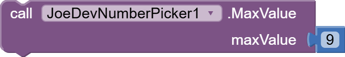
MaxValue
Sets the maximum value.
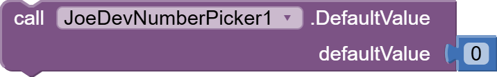
DefaultValue
Sets the value to be displayed when the NumberPicker is opened.
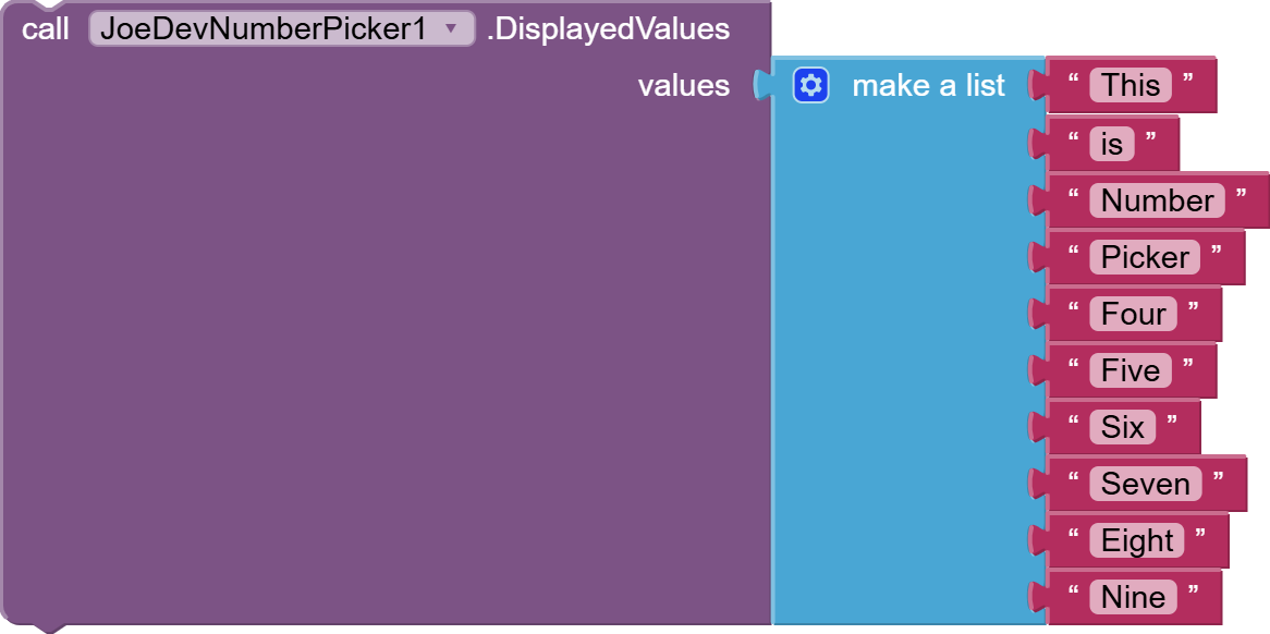
DisplayedValues
Establishes a list of values, whether numbers or text.
SaveSelectedValue
Saves the selected value.

RestoreSavedValue
Restores the saved value.

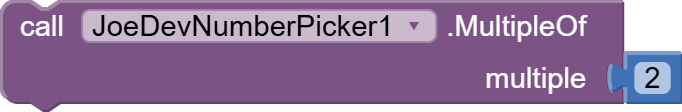
MultipleOf
Sets how many jumps the values will be displayed.
GetSelectedValue
Get the selected value.
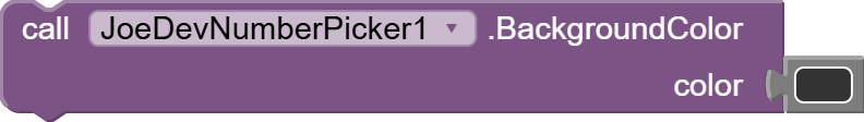
BackgroundColor
Changes the background color of the NumberPicker popup.
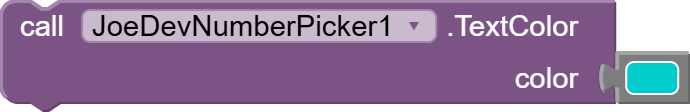
TextColor
Changes the color of the unselected text.
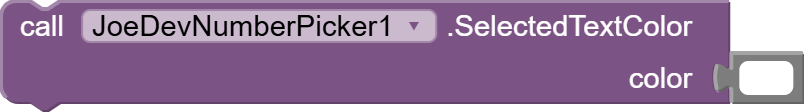
SelectedTextColor
Changes the color of the selected (center) text.
LineColor
Changes the color of the main dividing lines.

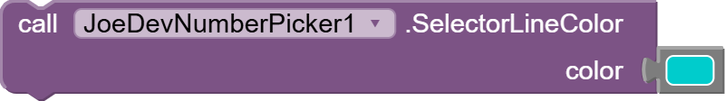
SelectorLineColor
Changes the color of the selector lines (above/below the center value).
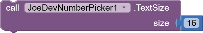
TextSize
Changes the size of the unselected text.
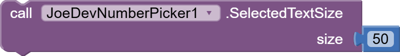
SelectedTextSize
Changes the size of the selected (center) text.
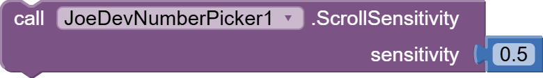
ScrollSensitivity
Adjusts the scroll sensitivity (0.1 = slow, 1.0 = normal).
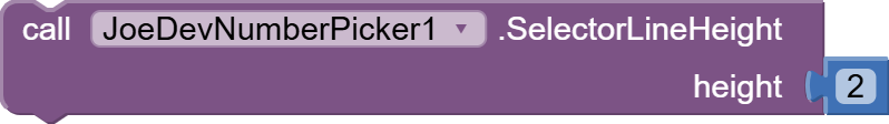
SelectorLineHeight
Adjusts the height of the selector lines.
SelectorLineMargin
Adjusts the margin around the selector lines.

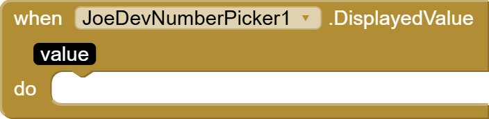
DisplayedValue
Fires every time the value displayed in the NumberPicker changes.
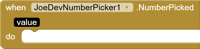
NumberPicked
It is triggered by clicking on the number in the center of the NumberPicker.
v1.0 July 02, 2025.
NumberPicker.aia (18.8 KB)
joejsanz.joedevnumberpicker.aix (13.9 KB)
JDK: 11
Minimum API Level: 21
Updated On: 2025-07-02T07:00:00Z
Built using: FAST v3.7.2-premium
Thanks.