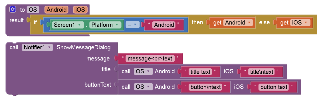
OK, but this still not puts a multiline text on notification button on iOS.
I did a bit of research on the internet, and as far as I can see, it is possible to use multiline text on the default UI notifications on iOS, it just needs to be set progrmatically.
Would it be possible to add this to the iOS version of the appinventor? I guess, this would not effect the existing options, it would just add an extra option in the background.
This would be helpful (for me). Otherwise I would need to implement notifications from scratch.
I guess the bigger question here is why is a newline needed in the button to start with? I think both the title and buttons tend to be a single line in pretty much every applications I've ever used. If anything, that would be an argument from removing the newline support entirely from both fields. What's the use case you need this for?
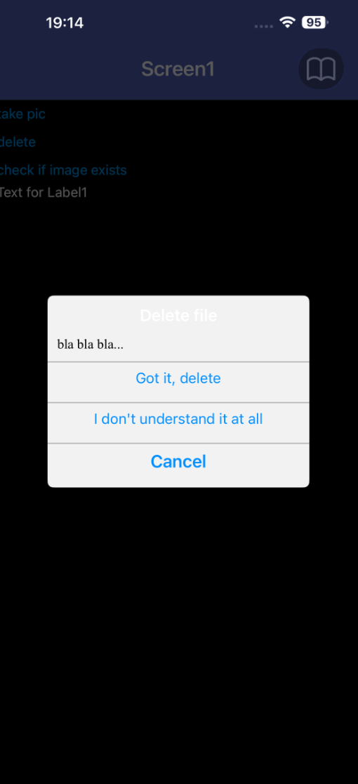
I am trying to develop a basic file organizer (add/delete directory, add/delete file, move around in the directory tree), because the file picker does not work on ios. This is not a complain, I understand that file manipulation on android and ios is quite restrictive and quite different. Nevertheless, I need a basic hierarchical data storage system.
For this, I want to have a double checking notification to confirm anything that cannot be redone.
Indeed, in usual notifications this confirmation is done by a simple “OK” button, but I do think that the message “I understand, delete” is much more user friendly.
I do not understand your comment about the argument for removing the newline support. Why remove an option? Why do you want to control what developers would like to do? An option is there for users to use if they want, it does not have to be used. I do not see the point not allowing something just because of a personal opinion.
If it is a lot of work, that is a good argument for not adding it, but if it is simply adding a flag in the background to allow “\n” in the text (I do not know), then I do not see the point not doing it.
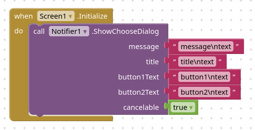
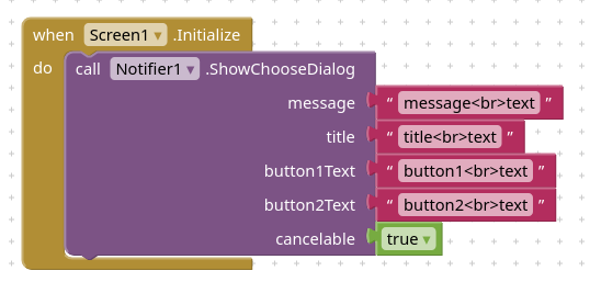
And while I am at it, adding “\n” in the message text in the notification does not work either (neither on Android or on iOS). It does not result in a new line. I had to look up a previous discussion to find that adding the html new line code works instead of \n, but this is not html.
If you take a closer look, the “OK” on the button is not an answer to the question in the message.
An answer would be “yes, I am sure” or in more detail “I am sure, delete permanently”.
If it fits on the screen (which it does), I do think that it would result in less messages like “I accidentally deleted a project, please recover it for me”.
This is why I would like to have longer messages on a button.
I rest my case. You contradict yourself in your last message in two different ways.
You don’t have to understand the reason to do what I ask (so you are missing the point).
If you don’t understand the reason, you are missing the point.
Again, I can take a no for an answer, but I did not get an explicit no as an answer. I get lectures on what I should do. These are noted (and interpreted as a no) and I move on.
There is an extension, called overlapview, by @VSATISH13 ( ) that allows you to overlap a portion of the screen with horizontal or vertical arrangements in which you can put a "simulated poopup" with labels to hold "long" messages and buttons.
Or, as an alternative, there is also another extension called awesomedialog-V3 by @Black_Knight ( ,) .
Please take a look to both, I believe that you can adapt what these exetnsions offer to your needs.
Or, as I did in some cases, just hide/show an horizontal arrangement, in which I put buttons (with just Yes/No) but with side-label(s) that contain explaining messages. The label(s) can be overwritten by the code that requires the showing of this arrangement, so just one arrangement that is configured by the running code.
Since you are the very first person to make this request, you ought to be able to explain a reason for it that is at least somewhat plausible. Unfortunately, that is not the case. Period.
However, if my example of a grammatically incorrect notification or the fact that currently the behavior is different on ios and android is not a plausible explanation for you, I cannot help it. Period.
uskiara, thank you for the suggestions. I will not use extensions because I would like the app to work on both android and ios.
I will explore the possibilities of hiding/showing arrangements or just live with the restrictions of the notifications as they are now (in my opinion they look more professional as far as UI design goes).
To the site administrators: I can see that this discussion does not go anywhere. I am happy if this whole thread is removed altogether. If I delete my original post, will it remove all answers?
OK, understood, no extensions. Therefore if you will use the hidden/shown arrangement (vertical or horizontal depends on ytour screen layout), you can populate it with canvases, sprites, buttons, labels or whatever, so to grow the user ffirendliness capabilities.
Please also remember that in buttons you can embed images, so if you create images with messages or drawings (of course this solution will determine the buttons' dimensions). Then the buttons may appear with a cute "appeal".... On the web there are free sites where you can create buttons with shades, gradients, blurring effects and specific labels. As an example: https://www.buttonmakers.net/ but there are many.
Why ? Any thread can be source of interest to anybody. Maybe some other user will face the same problem and will take benefit from this discussion. Or will suggest you how to solve.
Be patient and confident...