I’ve been mentioning for a while now that the internal scroll in the blocks section, both in all Firefox forks and in Firefox itself, skips and doesn’t provide smooth scrolling, which is frustrating. This forces users to rely only on browsers with Chromium engine or use a Chromium User Agent on Gecko engines. Since a new UI is still being implemented, I thought it might be worth checking if this is an issue with the builder or with the Gecko engines.
I use Firefox as my primary browser on MacOS. For me, the scroll on the blocks flyout does not skip, but it does scroll much faster than it does on Chrome.
The new UI is beautiful and I enjoy using it. Thank you for all your hard work!
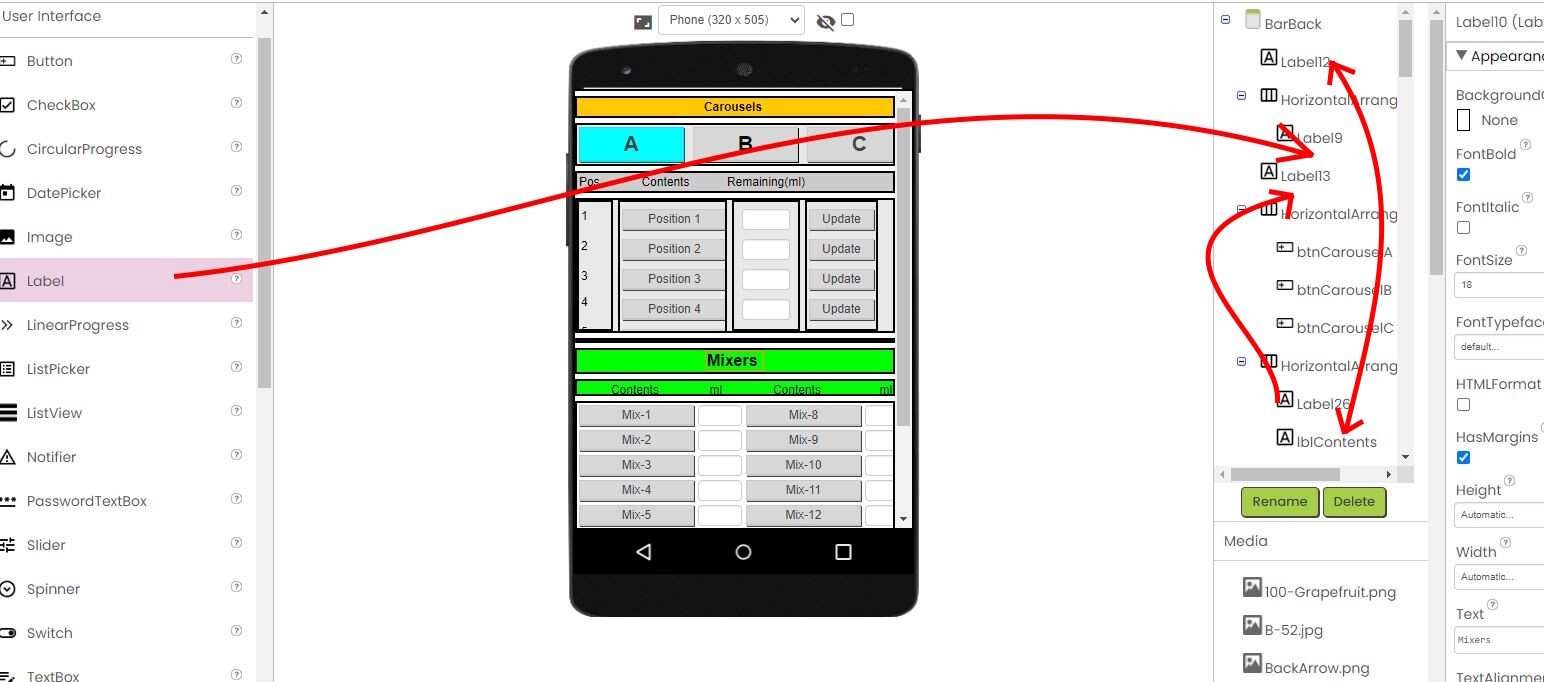
I have a suggestion that isn't so much about esthetics as it is about the nuts and bolts. When working on a dense design, it becomes increasingly difficult to insert and move components around in the designer. I would love to be able to drag/drop/move components in the component tree itself. You could see exactly where you're placing your component even when the designer becomes cramped.
Would this be possible without a ton of work? Would others find it useful?
Believe it or not, we have some keyboard shortcuts in the work from this summer's Google Summer of Code projects that adds this functionality from the keyboard. This is @Venky 's work. We are not the fastest at getting new features into production due to our small staff, but this is on my priority list.
This thread is just about the new UI. If you want to discuss potential block editor improvements, I'd first suggest you take a look at the following thread:
For some reason I can't see my objects anymore.I also loaded previous versions of my project and I have the same issue. I think there is something wrong with the interface cause I was able to see them. I have included .aia file Jim_test_chkbox.aia (3.9 MB)