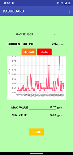
I have a html doc lineas-mod.txt (2.7 KB) that i got from the internet, with which I plot a line graph of the trend of output of my sensor. ! Attached below is how it looks on the app.
Over time a lot of values accumulate and the graph ends up being messy! I looked online and found this:http://jsfiddle.net/mbhavfwm/ a scroll bar arrangement keeping the y axis still and moving the x- axis which I thought will be a nice work around for the issue.
since I am not familiar with Java script, I just could not figure out how to fit them with my already existing code.(as such it was a great struggle to come this far!!)
I know this is not a MIT app inventor query, but any help is appreciated !!
Thanks!!!
